
Some of Our Sources
- Engadget
- Web Designer Wall
- You The Designer
- Naldz Graphics
- Web Design Ledger
- CSS Globe
- Specky Boy
- CSS Tricks
- Freelance Switch
- Daily Now
Help Webnuz
Referal links:
5 simple ways to improve your website UI (for developers)
I have noticed that a lot of developers are pretty good at the coding part of a project but struggle with design. They tend to think they don't have a natural talent for design and aesthetics.
A lot of search engine results and articles that I have come across either give a vague idea or they're detailed and would require a lot of time and practice to understand and implement.
So I've created a small list of tips that will help developers who want to make their interfaces look great without spending too much time worrying about complex design principles.
Before we get started, it's imperative that we get one thing clear, the methods and practices that I have mentioned below are not just for websites, they can be used with any other sort of interfaces and technologies.
1. Consistency
Stick to a similar aesthetic throughout your interface to make it look uniform. Most people use CSS frameworks like Bootstrap to combat this issue, which is not a bad idea if you are just learning to code, However, using frameworks like bootstrap will only make your projects look like all the other projects out there.
You can use CSS Variables very effectively to create a set of rules/constraints for a particular project. For example.
:root { --primary-color: #2b2923; --accent-color: #f4be1a; --image-ratio: 16/9; --box-shadow: 0 1px 3px rgba(0,0,0,0.12), 0 1px 2px rgba(0,0,0,0.24);}
If you are using a CSS pre processor like Sass / Less, which I strongly recommend you do, then you can create Mixins to achieve this. For example
// A mixin to have the same card styling through out the page@mixin card { box-shadow: rgba(100, 100, 111, 0.2) 0px 7px 29px 0px; padding: 20px; margin: 30px;}div { @include card(); }// A mixin to reset list styling@mixin list-reset { margin: 0; padding: 0; list-style: none;}ul { @include list-reset(); }Alternatively, you can also use one of these Design Systems/UI libraries.
- Material design by Google
- Polaris by Shopify
- Base Web by Uber
- Fluent by Microsoft
2. Hierarchy
Visual hierarchy is one of the most important things to look out for when building an interface because it could either make or break your whole user experience. By using visual hierarchy, you'll be able to draw and focus the user's eye on the most important elements of the page. When used effectively, it can drastically reduce the amount of effort required to use your interface.
You can achieve a good visual hierarchy by simply highlighting the element you want the user to focus on by manipulating these characteristics
- Size and scale - Size is a very basic characteristic of an element that can help give an element more importance than others. Increasing the size of an element is the easiest way to focus the user's attention on a particular element. Similarly, the size of the less important elements can be reduced.

- Color and contrast - Contrast is basically how far away 2 colors are on the color wheel from each other. More the contrast between the two elements, the more distinct they will look. So, to use this effectively for most common interfaces, the contrast between the background and the element that you want the user to focus on should be higher than all the other elements around. For example, have a look at this Call to action button. Since the contract is high, it stands out and grabs the user's attention easily.

*There are many other characteristics of an element that can be manipulated to create a very effective visual hierarchy. I found the ones mentioned above are the simplest to understand and use.
3. Colors
Colors are the first thing that people notice when they visit your site. Every website project needs a specific set of colors that will be used throughout the interface. This is called a color scheme. Without a color scheme, your interfaces will lack consistency and hence people would not want to stay longer on your page. Color schemes are a key component in any interface because they help define a brand's identity, for example, look at brands like Facebook, Snapchat, Instagram. They have a distinct color scheme that triggers certain emotions and associations in the user's eye.
Now the simplest way to get some good color palettes is taking the help of one of these amazing tools with thousands of free to use color palettes created by the community.
But if you have the time and you want to make your own color palette, then you can use one of these 3 types of color schemes that are simplest to create and look great for all kinds of interfaces(there are others)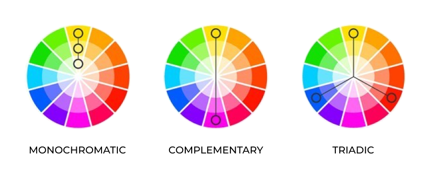
- Monochrome - A monochromatic color scheme is based on a single color (hue) and all the other colors in the palette are just different shades obtained by changing saturation and lightness.
- Complementary - 2 colors present on the opposite side of the color wheel to each other, form a complementary color scheme.
- Triadic - A triadic color scheme consists of three colors that are equally distant from each other in the color wheel.
If you want to know more about colors and different types of color schemes, I'd suggest watching this amazing video on Color Theory by a YouTube channel called Flow Studio .
Personal Tip: Try not to use the default colors like black, red, blue, green, yellow, etc. because these colors are harsh on the eyes. Prefer to use lighter shades that are comforting to the eyes. If you are using VS Code, then you can simply hover the cursor over a color, and then the color picker will appear. You can then drag the selector to easily select a lighter shade.
4. Font
When it comes to fonts, less is more. A golden rule is to use not more than 2 fonts in one project. We can get deeper into the subject of fonts, also called typography, but for the sake of simplicity let's stick to the basics.
These are outdated and overused fonts so avoid them:
Comic Sans, Papyrus, Times, New Roman, Arial, Courier New, Kristen ITC, Impact, Jokerman, Copperplate Gothic, Calibri, Courier, Brush Script, Souvenir, Curlz, Lobster (yeah that's font name)
Instead, use these fonts which look modern and minimal, and are not overused
Instead, use these fonts which look modern and minimal, and are not overused
- Playfair Display
- Bell gothic
- Helvetica
- Avant Garde
- Montserrat
- Josefin Sans
- Futura
- Rockwell
- Bembo
- Bodoni
- Sabon
- Akzidenz-Grotesk
- Garamond
- Recoleta
- Argesta
You can use this piece of code to use a downloaded font in your website
@font-face { font-family: fontName; src: url(font_file.woff);}h1 { font-family: fontName;}
Bonus typography tip
Use text stroke on heading and important text that you want to highlight.
What is text stroke? Text stroke is the border around each letter in a text.
It gives the interface a sleek and modern look. And it can be achieved using a single line of code.
h1 { -webkit-text-stroke: 2px red;}5. Spacing
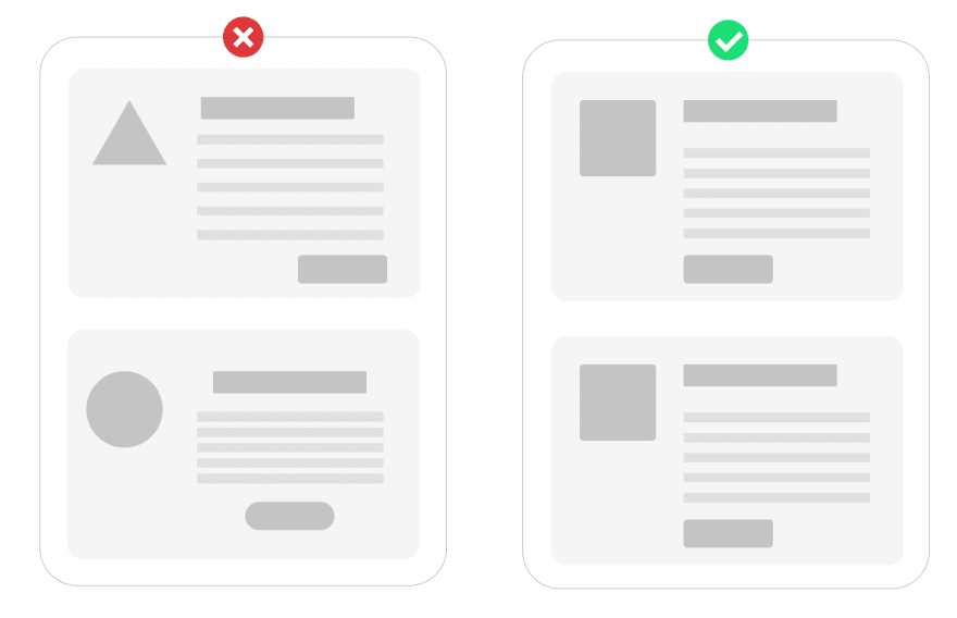
Last but not least, spacing. A good user interface should be clean and uncluttered, making it easy for users to understand and focus their attention on the important parts of the page. Spacing lets the users know that the elements closer to each other are related and vice versa. But this is something that most people get wrong because of which their interfaces are too cluttered and unorganized, which makes users leave the page soon. Therefore, make sure you give your layouts enough breathing room to make them look clean and easy to navigate.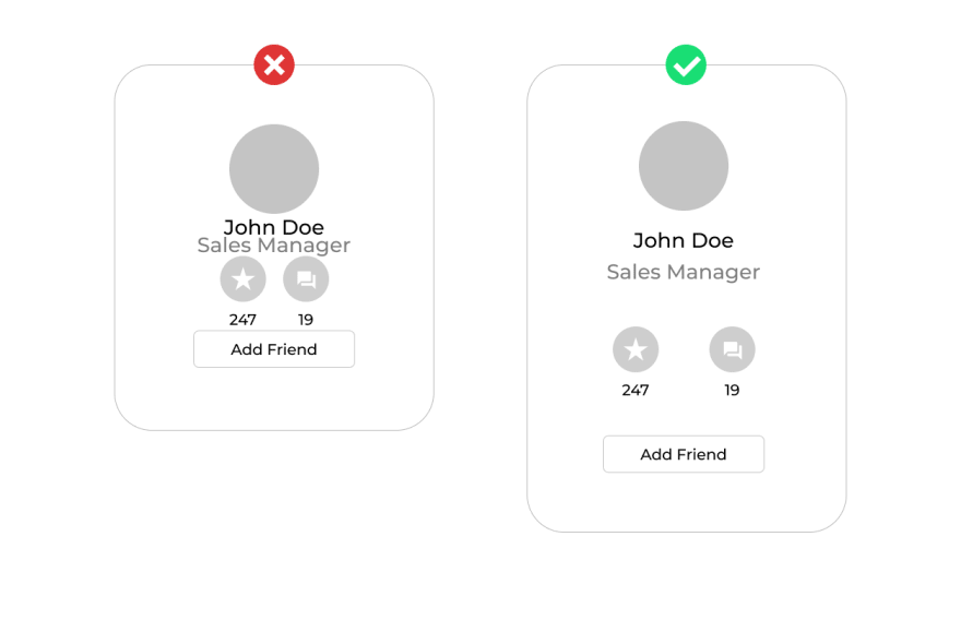
*There are tons of examples of user interfaces with bad spacing. Have a look at them to get a clear understanding of how to use spacing effectively.
Keep in mind that all the points mentioned above are only guidelines and suggestions (crafted for beginners) and it does not mean that your design won't turn out well if you go against these tips. A truly talented designer would let no rules and constraints limit their creativity and imagination.
Contact Me:
Original Link: https://dev.to/pulkit_jasti_8f40f769391b/5-simple-ways-to-improve-your-website-ui-for-developers-6p2
Dev To
More About this Source Visit Dev To