
An Interest In:
Web News this Week
- April 2, 2024
- April 1, 2024
- March 31, 2024
- March 30, 2024
- March 29, 2024
- March 28, 2024
- March 27, 2024
Some of Our Sources
- Engadget
- Mashable
- Technology Review
- Pearsonified
- Six Revisions
- TutsPlus - Design
- Reencoded
- CSS Globe
- Line 25
- Android Headlines
Help Webnuz
Referal links:
Using Material UI DataGrid component with refine app
Introduction
In this article, we'll show how to use Material UI <DataGrid/> component and refine's useDataGrid hook to render data from a mock API server in tabular form using a refine application.
refine is a React-based framework for rapidly developing data-driven applications through a collection of helper hooks, components, and data-providers. refine is a headless framework that doesn't include UI components by default but has support and configurations to inject any UI libraries or a framework of choices such as Material UI or Tailwind CSS.
Material UI is a React UI component library with a rich set of components and tools for bootstrapping elegant user interfaces. We'll use the <DataGrid/> component to render a list of employees from a mock server. We'll also look at some of the properties and custom configurations that can be used with the component.
Steps well cover:
- Setting up a refine application
- Creating mock API with Mockaroo and My JSON Server
- Material UI DataGrid component
- Adding styled-components
- refine's useDataGrid hook
- Rendering data with the DataGrid component
- Pagination, Filtering, and Sorting using the
useDataGridhook
Prerequisites
refine is a react application shipped with TypeScript by default. Our tutorial application will be written in typescript-react, so a good background in coding in React and TypeScript is essential. Also, ensure you have the following versions of node and npm to avoid running into errors with superplate:
- Node v16.14 or later
- Npm v8.3 or later
You can run node -v and npm -v on your terminal to confirm your installed versions before proceeding.
Setting up a refine application
There are two possible ways to set up a refine application: using superplate or adding the refine module into an empty React application. We'll go with the former method in this tutorial as it's the recommended way to get started.
Run the following command in your terminal to create a refine app with superplate:
npx superplate-cli -p refine-react datagridIn the command above, the -p flag specifies the project type which in our case, a refine-react project. datagrid is the name I chose as the app name for brevity. You can always choose any name you're comfortable with.
You will be asked a few questions by the installer. Select the following options to proceed:
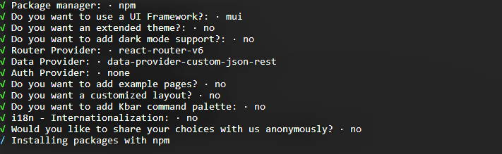
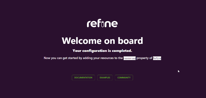
After superplate has finished creating our app, run npm run dev to start the development server and then navigate to localhost:8000 in the browser to view the app. If each went smoothly, the following should be rendered on the browser:
Creating mock API with Mockaroo and My JSON Server
The fake employee data we're going to render in the <DataGrid/> component will be created with Mockaroo and My JSON Server. Mockaroo is a random fake data generator for generating up to 1,000 realistic test data in JSON, CSV, and other formats.
My JSON Server is a fake online REST Server for prototyping application APIs without a backend. The REST Server for the JSON data we'll use in this tutorial is hosted here, and the fake JSON data created with Mockaroo is on GitHub.
Material UI DataGrid component
The Material UI DataGrid component is an extendable and feature-rich component used to display tabular data in React applications. Some of its powerful features include automatic pagination, table data filtering and sorting, and many other cool features.
The component is available in two versions, the MIT <DataGrid/> and Commercial <DataGridPro/> (Pro and Premium) versions. The MIT version is free-to-use while the commercial version is paid and extends the features of the MIT version such as the ability to filter and sort multiple columns at the same time.
The <DataGrid/> component requires two mandatory properties namely: rows and columns. The columns prop accepts an array of fields which are used as the table header while the rows prop accepts an array of objects (data) to be rendered within the table rows.
The following example shows a basic usage of the DataGrid component:
<DataGrid columns={[{ field: 'name' }]} rows={[ { id: 1, name: 'React' }, { id: 2, name: 'MUI' }, ]}/>Although refine is a headless framework that can be used with any UI framework of choice, it has built-in support for a few UI frameworks, such as Material UI. The refine-mui module, for example ships with some common Material UI components such as DataGrid, GridColumn, and so on.
We'll see how to leverage these components with refine's useDataGrid hook in our refine app in the coming sections.
Adding styled-components
We'll use styled-components to style our app, as refine doesn't control how we choose to style our applications. So let's go ahead and install it with its types definition as follows:
npm install styled-components && npm install --save-dev @types/styled-componentsNext, create two folders: components and pages in the src folder. We'll be writing the bulk of our code in these folders.
Then, create a Layout.tsx file in the components folder and add the following code to it:
// src/components/Layout.tsximport React from 'react';import { LayoutProps } from "@pankod/refine-core";import styled from 'styled-components';const Wrapper = styled.div` width: 80%; margin: 50px auto; height: 100%;`;const Layout: React.FC<LayoutProps> = ({children}) => { return ( <> <Wrapper> {children} </Wrapper> </> );}export default Layout;Above, we're creating a div to wrap our app content through the children prop and then aligning it in the center of the page.
refine's useDataGrid hook
In addition to integrating MUI components, refine provides a clean interface through the useDataGrid hook for implementing some properties that can be used with MUI <DataGrid/> component. The hook simplifies working with features such as pagination, sorting, and filtering which come as out-of-box.
For instance, if you have a page component where you want to render tabular data, you might do something like the below:
// src/pages/example.tsximport React from'react'import { useDataGrid, DataGrid, GridColumns } from "@pankod/refine-mui"const Table: React.FC = () => { const { dataGridProps } = useDataGrid(); const columns: GridColumns = [ { field: "id", headerName: "ID", }, { field: "name", headerName: "Name" }, { field: "Age", headerName: "Age" }, ]; return ( <DataGrid {...dataGridProps} columns={columns} autoHeight /> )}export default Table;It's important to note that in the above example, we're not passing the rows prop to the <DataGrid/> component. This is because the dataGridProps variable automatically injects the rows values into the <DataGrid> component through the native <Refine/> component's dataProvider prop available in the src/App.tsx file of your refine application.
The dataProvider prop is used to read data from an API endpoint and then make the data available in the entire application.
Refer to refine data provider documentation for detailed usage
Rendering data with the <DataGrid/> component
We'll use the mock API we created with Mockaroo and My JSON Server as the data source for our DataGrid component.
To get started, create a folder in the pages folder named employees, and then in this folder, create a file named employees.tsx.
Add the following code to the employees.tsx file:
// src/pages/employees.tsximport React from 'react';import { useDataGrid, DataGrid, GridColumns, List } from '@pankod/refine-mui';const EmployeeList: React.FC = () => { const { dataGridProps } = useDataGrid(); const columns = React.useMemo<GridColumns>( () => [ { field: 'id', headerName: 'ID', Width: 30 }, { field: 'full_name', headerName: 'Full Name', minWidth: 150, flex: 1, valueGetter: (params) => `${params.row.first_name || ''} ${ params.row.last_name || '' }`, }, { field: 'email', headerName: 'Email', minWidth: 250, }, { field: 'department', headerName: 'Department', minWidth: 150, }, { field: 'role', headerName: 'Role', minWidth: 150, }, { field: 'level', headerName: 'Level', Width: 30, }, ], [] ); return ( <List> <DataGrid {...dataGridProps} checkboxSelection disableSelectionOnClick columns={columns} autoHeight /> </List> );};export default EmployeeList;Let's understand what's going on above.
The columns variable defines the column fields for our data. We also wrapped the fields in a React.Memo higher order component for memoizing the values and then created fields for each of the properties from our resource endpoint. We also used the valueGetter attribute to compose a value from two different fields.
Next, edit App.tsx in the src folder to the following:
// src/App.tsximport { Refine } from '@pankod/refine-core';import { CssBaseline, GlobalStyles, ThemeProvider, LightTheme,} from '@pankod/refine-mui';import routerProvider from '@pankod/refine-react-router-v6';import dataProvider from '@pankod/refine-simple-rest';import Layout from './components/Layout';import EmployeeList from './pages/employees';function App() { return ( <ThemeProvider theme={LightTheme}> <CssBaseline /> <GlobalStyles styles={{ html: { WebkitFontSmoothing: 'auto' } }} /> <Refine Layout={Layout} routerProvider={routerProvider} dataProvider={dataProvider( 'https://my-json-server.typicode.com/Mich45/employee-data' )} resources={[{ name: 'employees', list: EmployeeList }]} /> </ThemeProvider> );}export default App;Here's a breakdown of what is going on above:
The native <Refine/> component accepts a dataProvider prop which specifies the source of our data (the fake REST API we created earlier), and a resources prop which takes an array of object properties:
- The
nameproperty is the name of the resource we are expecting from the REST API - this value must match the resource we created in the REST API. In our case,employees. - The
listproperty takes a page component to render the data. This is theEmployeeListcomponent we're importing from thepages/employeesfolder.
We also added a layout component (Layout.tsx) to the Layout prop. This is to customize the look and feel of our app.
Now, if you navigate to localhost:8000/employees, you should see the following:
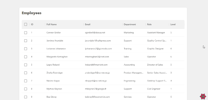
Voila! We've successfully displayed our data from a REST API in a MUI DataGrid component. In the next section we'll look at how we can use the useDataGrid hook to simplify operations such as pagination, sorting, and filtering.
Pagination, Filtering, and Sorting using the useDataGrid hook
The useDataGrid hook simplifies operations such as pagination, sorting, and filtering on the <DataGrid/> component through a flexible API. In this part, we'll leverage the hook to add pagination, sorting, and filter features to our employees table data.
Pagination
Pagination lets us display a certain number of rows on a DataGrid at a time and is enabled by default. It cannot be disabled either. It is available at the bottom of the DataGrid component like so:

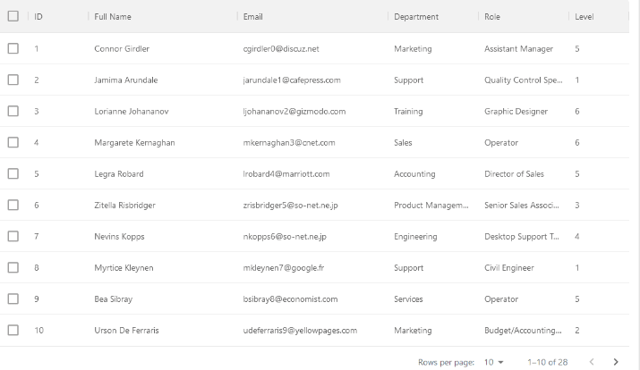
For example, our employees list has a total of 28 rows, but we may want to render just 10 rows per page. Heres a demo showing how we can render 10 rows of items on the initial page render with the initialPageSize property (defaults to 25).
This is similar to using the initialState prop on the DataGrid component. We can also define how many rows the user can choose to view per page using the rowsPerPageOptions prop.
Update the employees.tsx with the following codes:
// src/pages/employees.tsximport React from 'react';import { useDataGrid, DataGrid, GridColumns, List } from '@pankod/refine-mui'; ...// ====>const { dataGridProps } = useDataGrid({initialPageSize: 10}); const { pageSize, onPageSizeChange, ...restDataGridProps } = dataGridProps; // <==== ...return ( <List> // ====> <DataGrid {...restDataGridProps} checkboxSelection disableSelectionOnClick columns={columns} pageSize={10} onPageSizeChange={onPageSizeChange} rowsPerPageOptions={[10, 15]} autoHeight /> // <==== </List> );export default EmployeeList;Which renders our grid like this:
You can refer to the pagination documentation for additional props on pagination.
Sorting
The DataGrid component lets us sort the data in the rows based on one criterion at a time. Sorting is enabled for all columns by default in the MIT version and can also be disabled either for all columns or a single column.
We can sort the rows in three orders: ascending (ASC), descending (DESC) or null (sorting will be disabled).
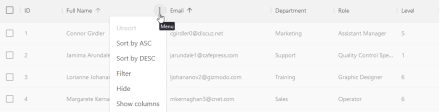
To sort the rows, click or hover on any column header, this displays an arrow indicator pointing up or down depending on your sorting order. When it's ascending the arrow points upward, and points downward for descending. Alternatively, we can also access it from the grid column menu.
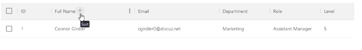
Initial sort order
We can initialize a sorting order for each or all fields in the grid using the intialSorter property of the useDataGrid component. This lets us sort the rows on the initial page render.
// src/pages/employees.tsxconst { dataGridProps } = useDataGrid({initialSorter: [{ field: 'level', order: 'desc' }]});The above example will sort the rows using the level column on the initial render in descending order like so:

Controlled sorting
We can also sort rows externally using the setSorter function from the useDataGrid hook. The following code shows how we can sort the rows by clicking on custom buttons outside the DataGrid component.
// src/pages/employees.tsximport React from 'react';import styled from 'styled-components';import { useDataGrid, DataGrid, GridColumns, List, // ====> Button, ButtonGroup, // <====} from '@pankod/refine-mui'; // ====>const ButtonsWrapper = styled.div` width: 100%; margin: 20px 0;`;// <====const EmployeeList: React.FC = () => { // ====> const { dataGridProps, setSorter } = useDataGrid(); // <==== const columns = React.useMemo<GridColumns>( () => [ { field: 'id', headerName: 'ID', Width: 30 }, { field: 'full_name', headerName: 'Full Name', minWidth: 150, flex: 1, valueGetter: (params) => `${params.row.first_name || ''} ${ params.row.last_name || '' }`, }, { field: 'email', headerName: 'Email', minWidth: 250, }, { field: 'department', headerName: 'Department', minWidth: 150, }, { field: 'role', headerName: 'Role', minWidth: 150, }, { field: 'level', headerName: 'Level', Width: 30, }, ], [] ); // ====> const handleSorting = (order: 'asc' | 'desc') => { setSorter([ { field: 'level', order, }, ]); }; // <==== return ( <List> // ====> <ButtonsWrapper> <ButtonGroup variant="outlined"> <Button onClick={() => handleSorting('asc')}>Asc</Button> <Button onClick={() => handleSorting('desc')}>Desc</Button> </ButtonGroup> </ButtonsWrapper> <DataGrid {...dataGridProps} checkboxSelection columns={columns} autoHeight /> // <==== </List> );};export default EmployeeList;Here's a GIF showing the result of the above example.

Refer to the sorting documentation to learn more about the feature.
Filtering
Filtering lets us search the rows for values in the DataGrid component based on one criterion at a time.
We can access the sort feature by either clicking on the filter item in the column menu:
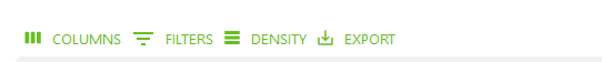
or by using the filter button in the grid toolbar:
You can import the GridToolbar component and use it like so:
// src/pages/employees.tsximport { GridToolbar } from "@pankod/refine-mui"<DataGrid {...dataGridProps} checkboxSelection columns={columns} components={{ Toolbar: GridToolbar }} autoHeight />The filter feature works by searching the rows for values that match a given filter operator. The list of operators which can be used in the sortModel can be found here.
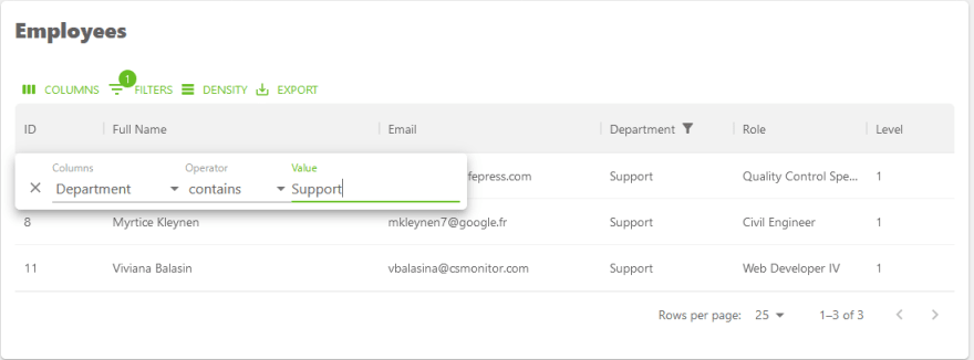
For instance in our employees table we can filter the department column for rows that contain a Support value by using any of the above methods.
Here's the code for the above example. Update the employees.tsx with highlighted code.
// src/pages/employees.tsximport React from 'react';import { useDataGrid, DataGrid, GridColumns, List, //highlight-next-line GridToolbar,} from '@pankod/refine-mui';// ====>const { dataGridProps} = useDataGrid();// <====... // ====>const { filterMode, filterModel, onFilterModelChange, ...restDataGridProps} = dataGridProps;// <====return ( <List> // ====> <DataGrid {...restDataGridProps} filterMode={filterMode} filterModel={filterModel} onFilterModelChange={onFilterModelChange} columns={columns} components={{ Toolbar: GridToolbar }} autoHeight /> // <==== </List> );export default EmployeeList;Controlled filtering
We can also choose to filter the table externally by using the setFilters function of the useDataGrid hook to set a filter state. The function accepts three properties to filter the table.
field- the column field in the table to apply the filteroperator- the criterion to filter the tablevalue- the value to search for
Here's an example showing how we can use a custom checkbox to search the rows for employees with role that equals Recruiter.
Update the employees.tsx with highlighted code:
// src/pages/employees.tsximport React from 'react';import { useDataGrid, DataGrid, GridColumns, List, GridToolbar, // ====> FormControlLabel, Checkbox, // <====} from '@pankod/refine-mui';const EmployeeList: React.FC = () => { const { dataGridProps, setFilters } = useDataGrid(); const columns = React.useMemo<GridColumns>( () => [ { field: 'id', headerName: 'ID', Width: 30 }, { field: 'full_name', headerName: 'Full Name', minWidth: 150, flex: 1, valueGetter: (params) => `${params.row.first_name || ''} ${ params.row.last_name || '' }`, }, { field: 'email', headerName: 'Email', minWidth: 250, }, { field: 'department', headerName: 'Department', minWidth: 150, }, { field: 'role', headerName: 'Role', minWidth: 150, }, { field: 'level', headerName: 'Level', Width: 30, }, ], [] ); const { filterMode, filterModel, onFilterModelChange, ...restDataGridProps } = dataGridProps; // ====> const handleFilter = ( e: React.ChangeEvent<HTMLInputElement>, checked: boolean ) => { setFilters([ { field: 'role', value: checked ? 'Recruiter' : undefined, operator: 'eq', }, ]); }; // <==== return ( <List> // ====> <FormControlLabel label="Filter Employees with Recruiter Role" control={<Checkbox onChange={handleFilter} />} /> // <==== <DataGrid {...restDataGridProps} filterMode={filterMode} filterModel={filterModel} onFilterModelChange={onFilterModelChange} columns={columns} components={{ Toolbar: GridToolbar }} autoHeight /> </List> );};export default EmployeeList;Which gives the following result when you click on the checkbox:

Refer to the filtering documentation for more information on available settings and advanced usage.
Conclusion
In this article we introduced you to the MUI <DataGrid/> component and how to use it to render tabular data. We also learned how to simplify operations such as pagination, sorting and filtering on the component using the useDataGrid hook.
We hope this article helps you in getting started with the <DataGrid/> component in your refine applications.
Where to go next? Check the useDataGrid hook documentation here and the MUI X <DataGrid/> documentation for additional usage information and reference.
Writer: Michael Hungbo
Live StackBlitz Example
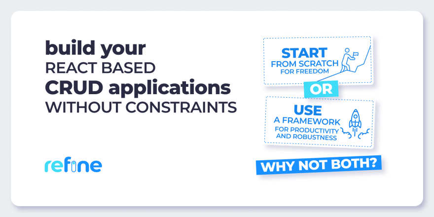
Build your React-based CRUD applications without constraints
Building CRUD applications involves many repetitive task consuming your precious development time. If you are starting from scratch, you also have to implement custom solutions for critical parts of your application like authentication, authorization, state management and networking.
Check out refine, if you are interested in a headless framework with robust architecture and full of industry best practices for your next CRUD project.
refine is a open-source React-based framework for building CRUD applications without constraints.
It can speed up your development time up to 3X without compromising freedom on styling, customization and project workflow.
refine is headless by design and it connects 30+ backend services out-of-the-box including custom REST and GraphQL APIs.
Visit refine GitHub repository for more information, demos, tutorials, and example projects.
Original Link: https://dev.to/refine/using-material-ui-datagrid-component-with-refine-app-558k
Dev To
 An online community for sharing and discovering great ideas, having debates, and making friends
More About this Source Visit Dev To