
An Interest In:
Web News this Week
- April 27, 2024
- April 26, 2024
- April 25, 2024
- April 24, 2024
- April 23, 2024
- April 22, 2024
- April 21, 2024
Some of Our Sources
- The Logo Smith
- Six Revisions
- Abduzeedo
- Noupe
- Crazy Leaf Design
- Reencoded
- CSS Globe
- Android Dissected
- Daily Now
- Hashedout
Help Webnuz
Referal links:
How to Build Scalable Architecture for your Next.js Project
All code from this tutorial as a complete package is available in this repository.
If you find this tutorial helpful, please share it with your friends and colleagues! For more like it you can subscribe on Youtube or follow me on Twitter.
This tutorial is available as a video lesson if you prefer that format:
Table of Contents
- What is Next.js?
- Introduction
- Project Setup
- Engine Locking
- Git Setup
- Code Formatting and Quality Tools
- Git Hooks
- VS Code Configuration
- Debugging
- Directory Structure
- Adding Storybook
- Creating a Component Template
- Using the Component Template
- Adding a Custom Document
- Adding Layouts
- Deployment
- Next Steps
- Wrapping Up
What is Next.js?
"Next.js gives you the best developer experience with all the features you need for production: hybrid static & server rendering, TypeScript support, smart bundling, route pre-fetching, and more. No config needed."
As described in their words above, Next.js is very much an all-in-one fullstack modern application building solution. It includes first class support for Typescript and React, while offering easy solutions for some of the most common requirements in a modern application like routing, API, postCSS tools, and code-splitting.
It also supports both static site generation (for lightning fast static HTML pages that can be hosted anywhere) or with managed hosting services like Vercel/AWS/etc that run a Node server and support full on-demand data loading and server-side rendered pages.
Next.js has quickly become one of the most in demand skills in the web development space. This tutorial aims to act as kind of a "practical" extension to the documentation and help you set up a project using a lot of best practices that will improve your chances of keeping everything management as you scale.
Introduction
This tutorial is not meant to replace the official documentation, which is absolutely fantastic. I highly recommend you take a read through at least the basic features section before you begin this tutorial, so you'll be familiar with the terminology and tools and some of the components they provide that are similar, but usually "more powerful" versions of their vanilla HTML counterparts.
Please review the table of contents to get an idea of each of the topics we will be touching in this extensive tutorial. I will freely acknowledge many of them are strict and opinionated configurations, if any of tem don't appeal to you then in most cases you can simply skip over those sections and should still be able to complete the tutorial without too much trouble.
Now, with all that said, if you are ready, let's dive right in!
Project Setup
We'll begin by creating a default Next.js application with a Typescript template.
npx create-next-app --ts nextjs-fullstack-app-templatecd nextjs-fullstack-app-templateFirst we will test to make sure the app is working. We're going to be using yarn for this example, but you could just as easily use NPM if you choose.
yarn installyarn devYou should see the demo app available on http://localhost:3000

Also recommended to run
yarn buildTo ensure you can successfully do a production build of the project. It's recommended (but not required) to close your dev server when running a Next.js build. Most of the time there is no issue but occasionally the build can put your dev server in a weird state that requires a restart.
You should get a nice little report on the command line of all the pages built with green coloured text implying they are small and efficient. We'll try to keep them that way as we develop the project.
Engine Locking
We would like for all developers working on this project to use the same Node engine and package manager we are using. To do that we create two new files:
.nvmrc- Will tell other uses of the project which version of Node is used.npmrc- Will tell other users of the project which package manager is used
We are using Node v14 Fermium and yarn for this project so we set those values like so:
.nvmrc
lts/fermium.npmrc
engine-strict=trueThe reason we are using v14 instead of v16 for Node is that later in the tutorial we will be deploying on Vercel which unfortunately still does not support Node 16. Perhaps by the time you read this tutorial it might. You can follow the progress here.
You can check your version of Node with node --version and make sure you are setting the correct one. A list of Node version codenames can be found here
Note that the use of engine-strict didn't specifically say anything about yarn, we do that in package.json:
package.json
"name": "nextjs-fullstack-app-template", "author": "YOUR_NAME", "description": "A tutorial and template for creating a production-ready fullstack Next.js application", "version": "0.1.0", "private": true, "license" : "MIT" "homepage": "YOUR_GIT_REPO_URL" "engines": { "node": ">=14.0.0", "yarn": ">=1.22.0", "npm": "please-use-yarn" }, ...The engines field is where you specify the specific versions of the tools you are using. You can also fill in your personal details if you choose.
Git Setup
This would be a good time to make our first commit to our remote repo, to make sure our changes are backed up, and to follow best practices for keeping related changes grouped within a single commit before moving to something new.
By default your Next.js project will already have a repo initialized. You can check what branch you are on with git status. It should say something like:
On branch mainChanges not staged for commit: (use "git add <file>..." to update what will be committed) (use "git restore <file>..." to discard changes in working directory) modified: README.mdUntracked files: (use "git add <file>..." to include in what will be committed) .npmrc .nvmrcThis tells us we are on the main branch and we have not staged or made any commits yet.
Let's commit our changes so far.
git add .git commit -m 'project initialization'The first command will add and stage all files in your project directory that aren't ignored in .gitignore. The second will make a commit of the state of your current project with the message we wrote after the -m flag.
Hop over to your preferred git hosting provider (Github for example) and create a new repository to host this project. Make sure the default branch is se tto the same name as the branch on your local machine to avoid any confusion.
On Github you can change your global default branch name to whatever you like by going to:
Settings -> Repositories -> Repository default branchNow you are ready to add the remote origin of your repository and push. Github will give you the exact instructions when you create it. Your syntax may be a little different than mine depending on if you are using HTTPS rather than SSH.
git remote add origin [email protected]:{YOUR_GITHUB_USERNAME}/{YOUR_REPOSITORY_NAME}.gitgit push -u origin {YOUR_BRANCH_NAME}Note that from this point on we will be using the Conventional Commits standard and specifically the Angular convention described here
The reason being like many other features in this project to simply set a consistent standard for all developers to use to minimize train-up time when contributing to the project. I personally have very little concern as to what standard is chosen, as long as everyone agrees to follow it that is the most important thing.
Consistency is everything!
Code Formatting and Quality Tools
In order to set a standard that will be used by all contributors to the project to keep the code style consistent and basic best practices followed we will be implementing two tools:
ESLint
We'll begin with ESLint, which is easy because it automatically comes installed and pre-configured with Next.js projects.
We are just going to add a little bit of extra configuration and make it a bit stricter than it is by default. If you disagree with any of the rules it sets, no need to worry, it's very easy to disable any of them manually. We configure everything in .eslintrc.json which should already exist in your root directory:
.eslintrc.json
{ "extends": ["next", "next/core-web-vitals", "eslint:recommended"], "globals": { "React": "readonly" }, "rules": { "no-unused-vars": [1, { "args": "after-used", "argsIgnorePattern": "^_" }] }}In the above small code example we have added a few additional defaults, we have said that React will always be defined even if we don't specifically import it, and I have added a personal custom rule that I like which allows you to prefix variables with an underscore _ if you have declared them but not used them in the code.
I find that scenario comes up often when you are working on a feature and want to prepare variables for use later, but have not yet reached the point of implementing them.
You can test out your config by running:
yarn lintYou should get a message like:
No ESLint warnings or errorsDone in 1.47s.If you get any errors then ESLint is quite good at explaining clearly what they are. If you encounter a rule you don't like you can disable it in "rules" by simply setting it to 1 (warning) or 0 (ignore) like so:
"rules": { "no-unused-vars": 0, // As example: Will never bug you about unused variables again }Let's make a commit at this point with the message build: configure eslint
Prettier
Prettier will take care of automatically formatting our files for us. Let's add it to the project now.
It's only needed during development, so I'll add it as a devDependency with -D
yarn add -D prettierI also recommend you get the Prettier VS Code extension so that VS Code can handle the formatting of the files for you and you don't need to rely on the command line tool. Having it installed and configured in your project means that VSCode will use your project's settings, so it's still necessary to add it here.
We'll create two files in the root:
.prettierrc
{ "trailingComma": "es5", "tabWidth": 2, "semi": true, "singleQuote": true}Those values are entirely at your discretion as to what is best for your team and project.
.prettierignore
.yarn.nextdistnode_modulesIn that file I've placed a list of directories that I don't want Prettier to waste any resources working on. You can also use patterns like *.html to ignore groups of types of files if you choose.
Now we add a new script to package.json so we can run Prettier:
package.json
... "scripts: { ... "prettier": "prettier --write ." }You can now run
yarn prettierto automatically format, fix and save all files in your project you haven't ignored. By default my formatter updated about 5 files. You can see them in your list of changed files in the source control tab on the left of VS Code.
Let's make another commit with build: implement prettier.
Git Hooks
One more section on configuration before we start getting into component development. Remember you're going to want this project to be as rock solid as possible if you're going to be building on it in the long term, particularly with a team of other developers. It's worth the time to get it right at the start.
We are going to implement a tool called Husky
Husky is a tool for running scripts at different stages of the git process, for example add, commit, push, etc. We would like to be able to set certain conditions, and only allow things like commit and push to succeed if our code meets those conditions, presuming that it indicates our project is of acceptable quality.
To install Husky run
yarn add -D huskynpx husky installThe second command will create a .husky directory in your project. This is where your hooks will live. Make sure this directory is included in your code repo as it's intended for other developers as well, not just yourself.
Add the following script to your package.json file:
package.json
... "scripts: { ... "prepare": "husky install" }This will ensure Husky gets installed automatically when other developers run the project.
To create a hook run
npx husky add .husky/pre-commit "yarn lint"The above says that in order for our commit to succeed, the yarn lint script must first run and succeed. "Succeed" in this context means no errors. It will allow you to have warnings (remember in the ESLint config a setting of 1 is a warning and 2 is an error in case you want to adjust settings).
Let's create a new commit with the message ci: implement husky. If all has been setup properly your lint script should run before the commit is allowed to occur.
We're going to add another one:
npx husky add .husky/pre-push "yarn build"The above ensures that we are not allowed to push to the remote repository unless our code can successfully build. That seems like a pretty reasonable condition doesn't it? Feel free to test it by committing this change and trying to push.
Lastly we are going to add one more tool. We have been following a standard convention for all our commit messages so far, let's ensure that everyone on the team is following them as well (including ourselves!). We can add a linter for our commit messages:
yarn add -D @commitlint/config-conventional @commitlint/cliTo configure it we will be using a set of standard defaults, but I like to include that list explicitly in a commitlint.config.js file since I sometimes forget what prefixes are available:
commitlint.config.js
// build: Changes that affect the build system or external dependencies (example scopes: gulp, broccoli, npm)// ci: Changes to our CI configuration files and scripts (example scopes: Travis, Circle, BrowserStack, SauceLabs)// docs: Documentation only changes// feat: A new feature// fix: A bug fix// perf: A code change that improves performance// refactor: A code change that neither fixes a bug nor adds a feature// style: Changes that do not affect the meaning of the code (white-space, formatting, missing semi-colons, etc)// test: Adding missing tests or correcting existing testsmodule.exports = { extends: ['@commitlint/config-conventional'], rules: { 'body-leading-blank': [1, 'always'], 'body-max-line-length': [2, 'always', 100], 'footer-leading-blank': [1, 'always'], 'footer-max-line-length': [2, 'always', 100], 'header-max-length': [2, 'always', 100], 'scope-case': [2, 'always', 'lower-case'], 'subject-case': [ 2, 'never', ['sentence-case', 'start-case', 'pascal-case', 'upper-case'], ], 'subject-empty': [2, 'never'], 'subject-full-stop': [2, 'never', '.'], 'type-case': [2, 'always', 'lower-case'], 'type-empty': [2, 'never'], 'type-enum': [ 2, 'always', [ 'build', 'chore', 'ci', 'docs', 'feat', 'fix', 'perf', 'refactor', 'revert', 'style', 'test', 'translation', 'security', 'changeset', ], ], },};Then enable commitlint with Husky by using:
npx husky add .husky/commit-msg 'npx --no -- commitlint --edit "$1"'# Sometimes above command doesn't work in some command interpreters# You can try other commands below to write npx --no -- commitlint --edit $1# in the commit-msg file.npx husky add .husky/commit-msg \"npx --no -- commitlint --edit '$1'\"# ornpx husky add .husky/commit-msg "npx --no -- commitlint --edit $1"Feel free to try some commits that don't follow the rules and see how they are not accepted, and you receive feedback that is designed to help you correct them.
I'm going to create a new commit now with the message ci: implement commitlint.
You can see the result of the complete culmination of this setup in the screenshot below, hopefully yours looks similar:

VS Code Configuration
Now that we have implemented ESLint and Prettier we can take advantage of some convenient VS Code functionality to have them be run automatically.
Create a directory in the root of your project called .vscode and inside a file called settings.json. This will be a list of values that override the default settings of your installed VS Code.
The reason we want to place them in a folder for the project is that we can set specific settings that only apply to this project, and we can share them with the rest of our team by including them in the code repository.
Within settings.json we will add the following values:
.vscode/settings.json
{ "editor.defaultFormatter": "esbenp.prettier-vscode", "editor.formatOnSave": true, "editor.codeActionsOnSave": { "source.fixAll": true, "source.organizeImports": true }}The above will tell VS Code to use your Prettier extension as the default formatter (you can override manually if you wish with another one) and to automatically format your files and organize your import statements every time you save.
Very handy stuff and just another thing you no longer need to think about so you can focus on the important things like solving business problems.
I'll now make a commit with message build: implement vscode project settings.
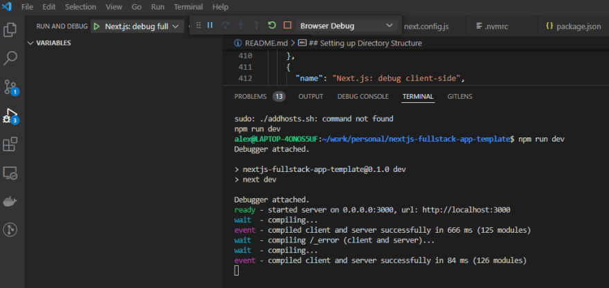
Debugging
Let's set up a convenient environment for debugging our application in case we run into any issues during development.
Inside of your .vscode directory create a launch.json file:
launch.json
{ "version": "0.1.0", "configurations": [ { "name": "Next.js: debug server-side", "type": "node-terminal", "request": "launch", "command": "npm run dev" }, { "name": "Next.js: debug client-side", "type": "pwa-chrome", "request": "launch", "url": "http://localhost:3000" }, { "name": "Next.js: debug full stack", "type": "node-terminal", "request": "launch", "command": "npm run dev", "console": "integratedTerminal", "serverReadyAction": { "pattern": "started server on .+, url: (https?://.+)", "uriFormat": "%s", "action": "debugWithChrome" } } ]}With that script in place you have three choices for debugging. CLick the little "bug & play icon" on the left of VS Code or press Ctrl + Shift + D to access the debugging menu. You can select which script you want to run and start/stop it with the start/stop buttons.
In addition to this, or if you are not using VS Code, we can also set up some helpful debugging scripts in your project.
First we will install the cross-env which will; be necessary to set environment variables if you have teammates working on different environments (Windows, Linux, Mac, etc).
yarn add -D cross-envWith that package installed we can update our package.json dev script to look like the following:
package.json
{ ... "scripts": { ... "dev": "cross-env NODE_OPTIONS='--inspect' next dev", },}This will allow you to log server data in the browser while working in dev mode, making it easier to debug issues.
At this stage I'll be making a new commit with message build: add debugging configuration
Directory Structure
This section is now going to cover setting up the folder structure in our project. This is one of those topics that many people will have extremely strong opinions about, and for good reason! Directory structure can really make or break a project in the long term when it gets out of control, especially when fellow team members have to spend unnecessary time trying to guess where to put things (or find things).
I personally like to take a fairly simplistic approach, keep things separated basically in a class model/view style. We will be using three primary folders:
/components/lib/pagescomponent- The individual UI components that make up the app will live in herelib- Business/app/domain logic will live in here.pages- Will be the actual routes/pages as per the required Next.js structure.
We will have other folders in addition to this to support the project, but the core of almost everything that makes up the unique app that we are building will be housed in these three directories.
Within components we will have subdirectories that kind of group similar types of components together. You can use any method you prefer to do this. I have used the MUI library quite a bit in my time, so I tend to follow the same organization they use for components in their documentation
For example inputs, surfaces, navigation, utils, layout etc.
You don't need to create these directories in advance and leave them empty. I would just create them as you go while building your components.
This section is simply designed to explain how I will be setting up this project, there are many other ways you might choose to organize yours and I would encourage you to choose whatever works best for you and your team.
At this point I will be making a commit with message rfc: create directory structure
Adding Storybook
One of the great modern tools available to us if you aren't already familiar with it is called Storybook.
Storybook gives us an environment to show off and test the React components we are building outside of the application we are using them in. It's great tool to connect developers with designers and be able to verify components we have developed look and function as per design requirements in an isolated environment without the overhead of the rest of the app.
Note that Storybook is meant as a visual testing tool, we will be implementing other tools later for functional unit testing and end-to-end testing.
The best way to learn how to use Storybook is installing it and trying it out!
npx sb init --builder webpack5We'll be using the webpack5 version to stay up to date with the latest version of webpack (I'm unsure why it is still not yet the default. Maybe it will be by the time you are using this tutorial).
When Storybook installs it automatically detects a lot of things about your project, like how it is a React app, and other tools you are using. It should take care fo all that configuration itself.
If you get a prompt about the eslintPlugin, you can say "yes". We are going to configure it manually though, so no worries if you get a message saying it didn't auto-configure.
Open up .eslintrc.json and update it to the following:
.eslintrc.json
{ "extends": [ "plugin:storybook/recommended", // New "next", "next/core-web-vitals", "eslint:recommended" ], "globals": { "React": "readonly" }, // New "overrides": [ { "files": ["*.stories.@(ts|tsx|js|jsx|mjs|cjs)"], "rules": { // example of overriding a rule "storybook/hierarchy-separator": "error" } } ], "rules": { "no-unused-vars": [1, { "args": "after-used", "argsIgnorePattern": "^_" }] }}I have added // New to mark the two new sections and lines that are Storybook specific.
You'll notice that Storybook has also added as /stories directory to the root of your project with a number of examples in. If you are new to Storybook I highly recommend you look through them and leave them there until you are comfortable creating your own without the templates.
Before we run it we need to make sure we are using webpack5. Add the following to your package.json file:
package.json
{ ... "resolutions": { "webpack": "^5" }}Then run
yarn installTo ensure webpack5 is installed.
Next we have to update the .storybook/main.js file:
storybook/main.js
module.exports = { stories: ['../**/*.stories.mdx', '../**/*.stories.@(js|jsx|ts|tsx)'], /** Expose public folder to storybook as static */ staticDirs: ['../public'], addons: [ '@storybook/addon-links', '@storybook/addon-essentials', '@storybook/addon-interactions', ], framework: '@storybook/react', core: { builder: '@storybook/builder-webpack5', },};Here we have changed the pattern for stories files so that it will pick up any .stories files inside our components (or other) directories.
We have also exposed Next.js's "public" folder as a static directory so we can test things like images, media, etc in Storybook.
Lastly, before we run Storybook itself, let's add some helpful values in storybook/preview.js. This is the file where we can control the defaults for how our stories render.
storybook/preview.js
import '../styles/globals.css';import * as NextImage from 'next/image';const BREAKPOINTS_INT = { xs: 375, sm: 600, md: 900, lg: 1200, xl: 1536,};const customViewports = Object.fromEntries( Object.entries(BREAKPOINTS_INT).map(([key, val], idx) => { console.log(val); return [ key, { name: key, styles: { width: `${val}px`, height: `${(idx + 5) * 10}vh`, }, }, ]; }));// Allow Storybook to handle Next's <Image> componentconst OriginalNextImage = NextImage.default;Object.defineProperty(NextImage, 'default', { configurable: true, value: (props) => <OriginalNextImage {...props} unoptimized />,});export const parameters = { actions: { argTypesRegex: '^on[A-Z].*' }, controls: { matchers: { color: /(background|color)$/i, date: /Date$/, }, }, viewport: { viewports: customViewports },};There are a few personal preferences in the above, but you can configure it how you want. Be sure to set the default breakpoints to match whatever is important to you in your app. We are also adding a handler so that Storybook can handle Next's <Image> component without crashing.
Now we are ready to test it. Run:
yarn storybookIf all goes well you'll see a message in your console that looks like:
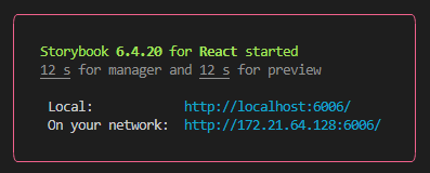
And you'll be able to access it on http://localhost:6006

I would encourage you to play around and get familiar with the examples if you've never used it before.
At this stage I'll be making a commit with message build: implement storybook.
Creating a Component Template
It's time to bring together all the configuration we have done and look at how we might create and implement our first component using the standards we have set for ourselves.
We'll just create a simple card. Create the following directory structure:
/components/templates/base
And inside that directory we'll create BaseTemplate.tsx. This will follow a standard pattern of filename matching the directories leading up to it. This allows us for example to have other types of cards in the cards directory like PhotoCard or TextCard etc.
BaseTemplate.tsx
export interface IBaseTemplate {}const BaseTemplate: React.FC<IBaseTemplate> = () => { return <div>Hello world!</div>;};export default BaseTemplate;Every single one of our components is going to follow this exact structure. Even if it does not use props it will still export an empty props interface for the component. The reason for this is it will allow us to replicate this exact structure across many components and files, and interchange components/imports using the same expected pattern and just find/replace the names of the components.
When you begin working with the stories and mock props etc it will become quickly apparent how convenient and powerful it is to maintain a consistent naming scheme and interface for all your component files.
This goes back to the consistency is everything point we made earlier.
Next I am going to make a style module file that lives next to the component. By default Next.js gives you a /styles directory which I personally do not use, but if you prefer to keep all your styles in the same place that's a fine choice. I just prefer to keep them with the components.
BaseTemplate.module.css
.component {}As a standard empty template for where your top level styles will go on your component. You can update your BaseTemplate as follows:
BaseTemplate.tsx
import styles from './BaseTemplate.module.css';export interface IBaseTemplate {}const BaseTemplate: React.FC<IBaseTemplate> = () => { return <div className={styles.container}>Hello world!</div>;};export default BaseTemplate;Now we have a clean template for our styling.
Let's add an example prop to our template so we can handle the standard we'll be using for components props:
BaseTemplate.tsx
import styles from './BaseTemplate.module.css';export interface IBaseTemplate { sampleTextProp: string;}const BaseTemplate: React.FC<IBaseTemplate> = ({ sampleTextProp }) => { return <div className={styles.container}>{sampleTextProp}</div>;};export default BaseTemplate;With each component we create we're going to want a very quick and easy way to test it in different environments (Storybook for example, but also the app, and maybe our unit tests). It will be handy to have quick access to data to render the component.
Let's create a file to store some mock data for this component to use for testing:
BaseTemplate.mocks.ts
import { IBaseTemplate } from './BaseTemplate';const base: IBaseTemplate = { sampleTextProp: 'Hello world!',};export const mockBaseTemplateProps = { base,};This structure may seem a bit convoluted, but we'll see the benefits soon. I am using very intentional consistent naming patterns so this template is very easy to copy and paste to each new component you create.
Now let's create a create a story for this component:
BaseTemplate.stories.tsx
import { ComponentStory, ComponentMeta } from '@storybook/react';import BaseTemplate, { IBaseTemplate } from './BaseTemplate';import { mockBaseTemplateProps } from './BaseTemplate.mocks';export default { title: 'templates/BaseTemplate', component: BaseTemplate, // More on argTypes: https://storybook.js.org/docs/react/api/argtypes argTypes: {},} as ComponentMeta<typeof BaseTemplate>;// More on component templates: https://storybook.js.org/docs/react/writing-stories/introduction#using-argsconst Template: ComponentStory<typeof BaseTemplate> = (args) => ( <BaseTemplate {...args} />);export const Base = Template.bind({});// More on args: https://storybook.js.org/docs/react/writing-stories/argsBase.args = { ...mockBaseTemplateProps.base,} as IBaseTemplate;I'm not going to get into all the details of what each different part of a stories file entails, for that your best resource is the official Storybook documentation.
The goal here is to create a consistent easily copy/paste-able pattern of component building and testing.
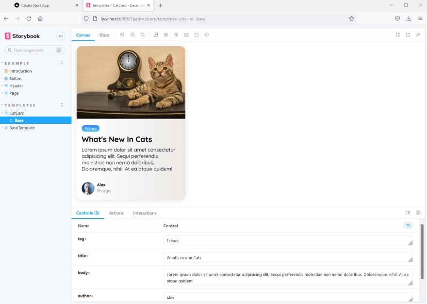
Let's try this one out. Run:
yarn storybookIf all goes well you will be greeted by your fine looking base component (if not I encourage you to revisit the previous section and check if you missed any of the configurations).

Now that we're starting to create more files it's good to get into the habit of running yarn lint before doing your commits to make sure everything is clean and ready to go. I'm going to make a commit with message build: create BaseTemplate component.
Using the Component Template
Since we have our template, let's go through the process of using it to create a real component.
Create components/cards directory. Then copy the entirety of the base directory from templates into cards and rename it cat. We are going to make a CatCard. Rename each of the files to match. When done it should look like this:

Now you can press ctrl + shift + F (or mac equivalent) in VS Code to do a full project search and replace. Include only components/cards/cat and do a replace for CatCard to replace BaseTemplate. It should look like the following:

Now you're ready to work, you've got a clean pre-generated template to work from that includes a story and mock data for your card. Pretty handy! Let's make it look like a real card:
(For the record I did not create this beautiful card, it's based on an example created here by the talented Lyon Etyo)
CatCard.tsx
import styles from './CatCard.module.css';import Image from 'next/image';export interface ICatCard { tag: string; title: string; body: string; author: string; time: string;}const CatCard: React.FC<ICatCard> = ({ tag, title, body, author, time }) => { return ( <div className={styles.container}> <div className={styles.card}> <div className={styles.card__header}> <Image src="/time-cat.jpg" alt="card__image" className={styles.card__image} width="600" height="400" /> </div> <div className={styles.card__body}> <span className={`${styles.tag} ${styles['tag-blue']}`}>{tag}</span> <h4>{title}</h4> <p>{body}</p> </div> <div className={styles.card__footer}> <div className={styles.user}> <Image src="https://i.pravatar.cc/40?img=3" alt="user__image" className={styles.user__image} width="40" height="40" /> <div className={styles.user__info}> <h5>{author}</h5> <small>{time}</small> </div> </div> </div> </div> </div> );};export default CatCard;Set the styles:
CatCard.module.css
@import url('https://fonts.googleapis.com/css2?family=Quicksand:[email protected]&display=swap');.container { margin: 1rem;}.container * { box-sizing: border-box; padding: 0; margin: 0;}.card__image { max-width: 100%; display: block; object-fit: cover;}.card { font-family: 'Quicksand', sans-serif; display: flex; flex-direction: column; width: clamp(20rem, calc(20rem + 2vw), 22rem); overflow: hidden; box-shadow: 0 0.1rem 1rem rgba(0, 0, 0, 0.1); border-radius: 1em; background: #ece9e6; background: linear-gradient(to right, #ffffff, #ece9e6);}.card__body { padding: 1rem; display: flex; flex-direction: column; gap: 0.5rem;}.tag { align-self: flex-start; padding: 0.25em 0.75em; border-radius: 1em; font-size: 0.75rem;}.tag-blue { background: #56ccf2; background: linear-gradient(to bottom, #2f80ed, #56ccf2); color: #fafafa;}.card__body h4 { font-size: 1.5rem; text-transform: capitalize;}.card__footer { display: flex; padding: 1rem; margin-top: auto;}.user { display: flex; gap: 0.5rem;}.user__image { border-radius: 50%;}.user__info > small { color: #666;}And set the mock data:
CatCard.mocks.ts
import { ICatCard } from './CatCard';const base: ICatCard = { tag: 'Felines', title: `What's new in Cats`, body: 'Lorem ipsum dolor sit amet consectetur adipisicing elit. Sequi perferendis molestiae non nemo doloribus. Doloremque, nihil! At ea atque quidem!', author: 'Alex', time: '2h ago',};export const mockCatCardProps = { base,};Note that this uses an image of a cat (/time-cat.jpg) from the project's public directory. You can find it in the project repository.
The only thing we need to update in CatCard.stories is to change the story title from templates/CatCard to cards/CatCard
We do need to update our next.config.js because we are using a domain we haven't explicitly stated as permitted (for the avatar). Simply update your config file to look like this:
next.config.js
/** @type {import('next').NextConfig} */const nextConfig = { reactStrictMode: true, images: { domains: ['i.pravatar.cc'], },};module.exports = nextConfig;Alternatively you could just place the avatar image in your own public directory, but for the sake of learning the process of using an external domain, we'll leave this setup in place.
Now nun Storybook, and if you're lucky, you'll be greeted with:
This component can then easily be dropped anywhere in your actual application. Use the mock props in the short term while testing and replace with real props when you're ready!
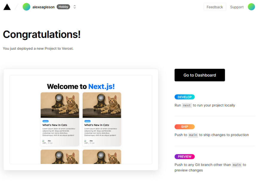
pages/index.tsx
import type { NextPage } from 'next';import Head from 'next/head';import Image from 'next/image';import CatCard from '../components/cards/cat/CatCard';import { mockCatCardProps } from '../components/cards/cat/CatCard.mocks';import styles from '../styles/Home.module.css';const Home: NextPage = () => { return ( <div className={styles.container}> <Head> <title>Create Next App</title> <meta name="description" content="Generated by create next app" /> <link rel="icon" href="/favicon.ico" /> </Head> <main className={styles.main}> <h1 className={styles.title}> Welcome to <a href="https://nextjs.org">Next.js!</a> </h1> <div className={styles.grid}> <CatCard {...mockCatCardProps.base} /> <CatCard {...mockCatCardProps.base} /> <CatCard {...mockCatCardProps.base} /> <CatCard {...mockCatCardProps.base} /> </div> </main> <footer className={styles.footer}> <a href="https://vercel.com?utm_source=create-next-app&utm_medium=default-template&utm_campaign=create-next-app" target="_blank" rel="noopener noreferrer" > Powered by{' '} <span className={styles.logo}> <Image src="/vercel.svg" alt="Vercel Logo" width={72} height={16} /> </span> </a> </footer> </div> );};export default Home;Let's take a look at the final masterpiece with:
yarn dev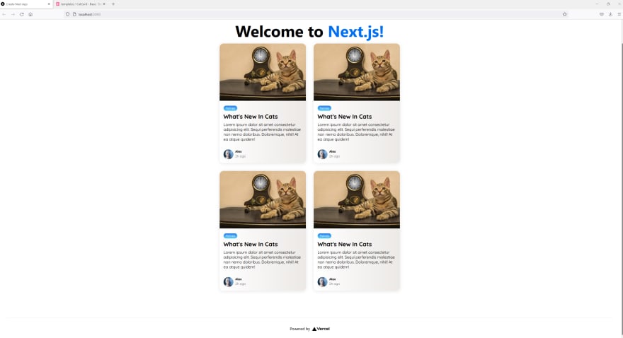
Adding a Custom Document
Though it is not necessary at this stage you will likely want to have more fine grained control over what is in the <head> of your app. Creating a custom _document.tsx in your pages directory allows you to do that. Create that file now.
pages/_document.tsx
import Document, { Head, Html, Main, NextScript } from 'next/document';class MyDocument extends Document { render() { return ( <Html> <Head> <link rel="preconnect" href="https://fonts.googleapis.com" /> <link rel="preconnect" href="https://fonts.gstatic.com" /> <link href="https://fonts.googleapis.com/css2?family=Quicksand:[email protected]&display=swap" rel="stylesheet" /> </Head> <body> <Main /> <NextScript /> </body> </Html> ); }}export default MyDocument;Note that I have removed the @import URL font from components/cards/cat/CatCard.module.css and placed that Google font here in the head to preload.
Anything else you need to do or customize in your <head> element can now be done in this file.
Be aware that this <Head> is not the same as the one imported from next/head. They will both work together and this one is used solely for data you would like loaded on every single page.
For more info on how to use a custom _document see the documentation.
Adding Layouts
Layouts are an important concept in Next.js. They help you manage state between pages. For this section we will be using the same basic template as provided in the official example and simply customizing it to fit our project.
Create a new directory called layouts in components. We will be copying our templates/case directory again two times. One to callprimary and one called sidebar. It should look as follows when complete:

Do a case-sensitive find/replace for BaseTemplate inside each of the files as well to replace with PrimaryLayout and SidebarLayout respectively.
If you have any difficulty with this step, feel free to just take the structure from the repo.
All credit to _leerob and JJ Kasper from Vercel for the structure of these layout templates_
Update the content of PrimaryLayout.tsx and PrimaryLayout.module.css to be:
components/layouts/primary/PrimaryLayout.tsx
import Head from 'next/head';import styles from './PrimaryLayout.module.css';export interface IPrimaryLayout {}const PrimaryLayout: React.FC<IPrimaryLayout> = ({ children }) => { return ( <> <Head> <title>Primary Layout Example</title> </Head> <main className={styles.main}>{children}</main> </> );};export default PrimaryLayout;components/layouts/primary/PrimaryLayout.module.css
.main { display: flex; height: calc(100vh - 64px); background-color: white;}.main > section { padding: 32px;}Then for sidebar:
components/layouts/sidebar/SidebarLayout.tsx
import Link from 'next/link';import styles from './SidebarLayout.module.css';export interface ISidebarLayout {}const SidebarLayout: React.FC<ISidebarLayout> = () => { return ( <nav className={styles.nav}> <input className={styles.input} placeholder="Search..." /> <Link href="/"> <a>Home</a> </Link> <Link href="/about"> <a>About</a> </Link> <Link href="/contact"> <a>Contact</a> </Link> </nav> );};export default SidebarLayout;components/layouts/sidebar/SidebarLayout.module.css
.nav { height: 100%; display: flex; flex-direction: column; width: 250px; background-color: #fafafa; padding: 32px; border-right: 1px solid #eaeaea;}.nav > a { margin: 8px 0; text-decoration: none; background: white; border-radius: 4px; font-size: 14px; padding: 12px 16px; text-transform: uppercase; font-weight: 600; letter-spacing: 0.025em; color: #333; border: 1px solid #eaeaea; transition: all 0.125s ease;}.nav > a:hover { background-color: #eaeaea;}.input { margin: 32px 0; text-decoration: none; background: white; border-radius: 4px; border: 1px solid #eaeaea; font-size: 14px; padding: 8px 16px; height: 28px;}Now that these templates have been created, we need to use them. We are going to update our Home page and create another page called about.tsx to show how to use shared layouts and persist component state between pages.
First we need to add a type which extends the default NextPage interface as for some reason it does not include the getLayout function out of the box. Create a custom type file that will handle that for us inspired by this solution
pages/page.d.ts
import { NextPage } from 'next';import { ComponentType, ReactElement, ReactNode } from 'react';export type NextPageWithLayout<P = {}> = NextPage<P> & { getLayout?: (_page: ReactElement) => ReactNode; layout?: ComponentType;};You can now use that NextPageWithLayout interface in place of NextPage when you need to create pages with custom layouts.
Now let's update our home page:
pages/index.tsx
import CatCard from '../components/cards/cat/CatCard';import { mockCatCardProps } from '../components/cards/cat/CatCard.mocks';import PrimaryLayout from '../components/layouts/primary/PrimaryLayout';import SidebarLayout from '../components/layouts/sidebar/SidebarLayout';import styles from '../styles/Home.module.css';import { NextPageWithLayout } from './page';const Home: NextPageWithLayout = () => { return ( <section className={styles.main}> <h1 className={styles.title}> Welcome to <a href="https://nextjs.org">Next.js!</a> </h1> <CatCard {...mockCatCardProps.base} /> </section> );};export default Home;Home.getLayout = (page) => { return ( <PrimaryLayout> <SidebarLayout /> {page} </PrimaryLayout> );};and also create a new about page in the pages directory:
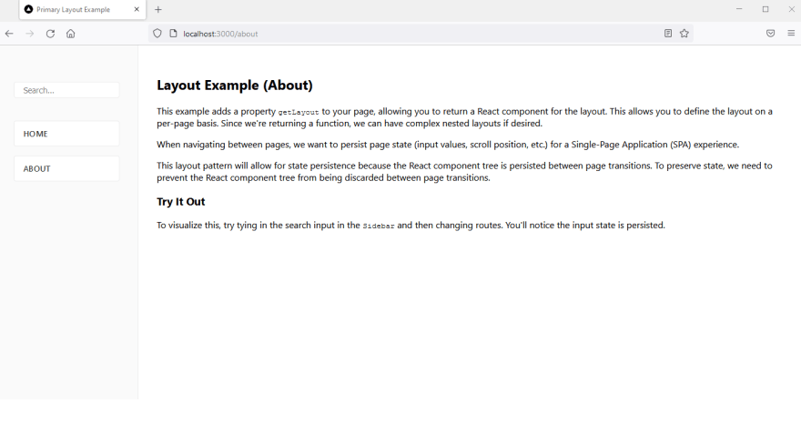
pages/about.tsx
import PrimaryLayout from '../components/layouts/primary/PrimaryLayout';import SidebarLayout from '../components/layouts/sidebar/SidebarLayout';import { NextPageWithLayout } from './page';const About: NextPageWithLayout = () => { return ( <section> <h2>Layout Example (About)</h2> <p> This example adds a property <code>getLayout</code> to your page, allowing you to return a React component for the layout. This allows you to define the layout on a per-page basis. Since we're returning a function, we can have complex nested layouts if desired. </p> <p> When navigating between pages, we want to persist page state (input values, scroll position, etc.) for a Single-Page Application (SPA) experience. </p> <p> This layout pattern will allow for state persistence because the React component tree is persisted between page transitions. To preserve state, we need to prevent the React component tree from being discarded between page transitions. </p> <h3>Try It Out</h3> <p> To visualize this, try tying in the search input in the{' '} <code>Sidebar</code> and then changing routes. You'll notice the input state is persisted. </p> </section> );};export default About;About.getLayout = (page) => { return ( <PrimaryLayout> <SidebarLayout /> {page} </PrimaryLayout> );};Finally, in the mocks files I have updated PrimaryLayout.mocks.ts to use children: '{{component}}' as a placeholder value to show in Storybook where a component would go, and I have removed the mock props in SidebarLayout.mocks.ts (though I do not remove the file, so I have the interface ready to go in case I ever need to add props).
I have also changed the story titles from templates/... to layouts/....
Finally we can test it out. Save and run
yarn devClick between the two routes on the sidebar (Home and About) to toggle between pages. Note that the layouts used will persist without needing to reload (as was our intention) and you are left with a super fast and snappy experience.

On the Storybook side, we can even view and test out layout components independent of the application. The PrimaryLayout isn't too useful without content inside of it, but the sidebar is quite nice to have.
yarn storybook
Deployment
Our final step will be to show the process of deployment of a Next.js app.
We will be using Vercel as it is the simplest and most straightforward deployment solution for a Next.js app (primarily due to the fact that Vercel owns Next and so one can always assume they will offer best in class support).
Be aware Vercel is absolutely not the only option, other major services like AWS, Netlify, etc all work as well if you choose to go that route.
Ultimately you just need a service where you can run the next start command presuming you're not using an entirely statically generated site (in which case any static hosting tool would work and no custom Next server would be required).
Deploying on Vercel as a hobby user is completely free. To begin we will create an account on Vercel.
Once logged in, click + New Project and give Vercel access to your Github repositories. You can give global access, or you can select only the repository you want to deploy. I am going to select this repository called nextjs-fullstack-app-template.
Once you have selected it you'll need to configure it. In the Build and Output Settings section make sure you replace the default NPM commands with your yarn commands (unless you are using NPM).

We have not used any environment variables yet so no need to add any.
Once that's it just click Deploy and you're done! It's that easy.
(The screenshot above is a bit out of date, I originally wrote the deployment section before the layout section, but you get the idea)
Not only is your site deployed now, it will continue to get re-deployed automatically every time you commit to your primary branch. If you don't want this behavior, then it's easy to configure in the Vercel dashboard.
The nice thing is that you already configured your yarn build command to ensure a working production build before you can push you code, so you can push with confidence in presuming your deployment will be successful.
The only thing you need to keep in mind are the differences between your two environments. It's still possible for your build to succeed locally but fail on Vercel if for example your scripts are different (using NPM instead of yarn or vice versa) or more commonly if you are missing environment variables.
We will be adding env values in future tutorials so you will need to make sure those values are configured in both your local and production environment, since they are secrets and should never be committed to a public (or even private if can be avoided) repository.
Next Steps
I hope you found this tutorial and learned something about setting up a solid and scaleable Next.js project for you and your team.
This is the first part of what is intended to be a multi-part series on creating a production quality Next.js app.
Some of my ideas for future installments are below, I'd encourage you to leave some feedback about which ones you'd find most useful (or other ones if you don't see them below).
- How to build a fullstack Next.js app using API routes and Tailwind CSS
- How to add a global state manager to your Next.js app with Recoil
- How to implement unit and end-to-end testing in a Next.s app with jest and playwright
- How to create a CI/CD pipeline with Github actions and Vercel
- How to implement SSO authentication and internationalization in a Next.js app using NextAuth and i18next
- How to connect a database to your Next.js app with Prisma and Supabase
- How to manage multiple applications in a monorepo with Next.js and Nx
Stay tuned and please don't hesitate to ask any questions, I'm happy to answer if I can!
Wrapping Up
Remember that all code from this tutorial as a complete package is available in this repository.
Please check some of my other learning tutorials. Feel free to leave a comment or question and share with others if you find any of them helpful:
Original Link: https://dev.to/alexeagleson/how-to-build-scalable-architecture-for-your-nextjs-project-2pb7
Dev To
 An online community for sharing and discovering great ideas, having debates, and making friends
More About this Source Visit Dev To