
An Interest In:
Web News this Week
- April 12, 2024
- April 11, 2024
- April 10, 2024
- April 9, 2024
- April 8, 2024
- April 7, 2024
- April 6, 2024
Some of Our Sources
- Joshua Blankenship
- Spoon Graphics
- Six Revisions
- My Ink Blog
- Reencoded
- CSS Globe
- Stylized Web
- Spyre Studios
- Design Modo
- Android Dissected
Help Webnuz
Referal links:
Media Query (CSS)
What is Media Query
Media Query is introduced on CSS3. Media Query is a very useful tool. Media Query in CSS is used to make responsive designs for various platforms. We use the @media rule to include a block of CSS properties only if a particular condition is true. You have to mention breakpoint's, it defines where certain parts of the design will behave differently. Media queries can be used to check many things, such as:
- Width and height of the viewport
- Width and height of the device
- Orientation (Landscape/Portrait)
- Resolution
You can also use media queries to specify that specific styles are only for printed documents or for screen readers (media-type: print, screen, or speech). Media queries can also be used to change the layout of a page depending on the orientation of the browser.
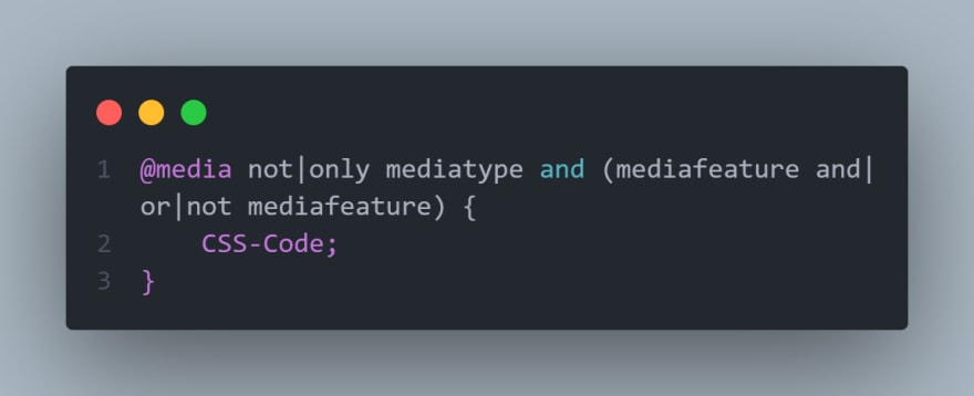
Structure:
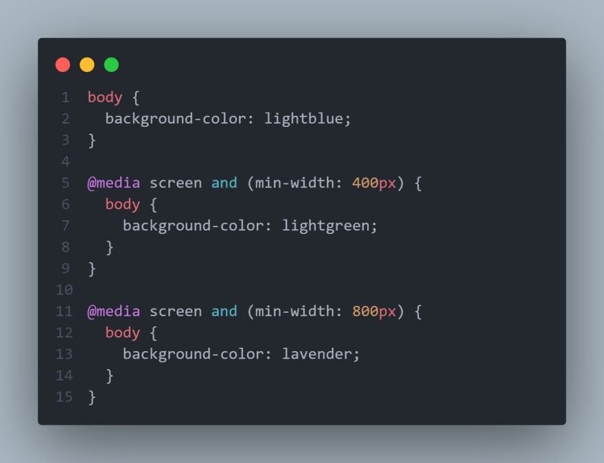
Demo:
Meaning of and, only & not:
And : For using two or more media query breakpoints or media types.
Only : For using media query on an Older version of browsers.
Not : For inverting the meaning of an entire media query.
You can use external CSS for different media to keep CSS file's more clean and organized.

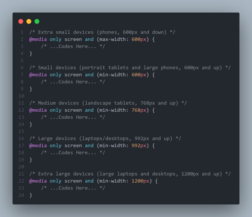
Typical Device Breakpoints
There are tons of screens and devices of different sizes, so it is tough to create an exact breakpoint for each device. To keep things simple you could target five groups:
Browser Support
The table data define the first version of the browser support the Media Query -

Original Link: https://dev.to/iftakher_hossen/media-query-css-3akc
Dev To
 An online community for sharing and discovering great ideas, having debates, and making friends
More About this Source Visit Dev To