
An Interest In:
Web News this Week
- April 26, 2024
- April 25, 2024
- April 24, 2024
- April 23, 2024
- April 22, 2024
- April 21, 2024
- April 20, 2024
Some of Our Sources
- Just Creative
- Pearsonified
- Smashing Apps
- You The Designer
- Naldz Graphics
- Reencoded
- CSS Globe
- Android Dissected
- Daily Now
- Hashedout
Help Webnuz
Referal links:
Master Frontend Development By Cloning These Websites
Why clone websites?
Frontend development has everything to do with the client side. Everything the user can see and interact with on their web browser.
Studies show that if a website does not load within 2 seconds, users bounce. How do you think users react if a website design is not up to par with modern designs and trends?
That being said, design has just as much importance as all the frontend programming going on in the background. After all, developers are tasked to implement a professional design into a working website all the time. It's very much an important piece of a frontend developers arsenal. Get good at it!
The goal
Master this frontend skill, by cloning these websites as close to identical as possible.
Try to incorporate functionality, like modals and drop downs. Include responsive design, like mobile navigation, and grids.
All websites listed below are similar, but just different enough to force different design concepts. For example, majority of these websites have:
- Large homepage banners
- Big block designs
- Reversed grid columns
- Full or half page menus
- Sticky or absolute positioned navigations
- Galleries
- Dropdown / accordions
- Minor animations like fade, or type effects
- Two grid columns
- Responsive design and more!
TIP: You can also use web scrapers to download all the assets you find on websites.
Extract Pics
Image Downloader
BONUS
If you want to go full on leet mode, add javascript functionality. Like routing, dynamic content, 3rd party APIs ( i. google maps ) etc.
If you push your project up to the web, make sure to not claim your designs or assets as your own!
Websites for you to clone!
1. Netflix

When logged in Netflix is a pretty simple design. Horizontal rows, galleries, with a big featured banner.
2. Hulu
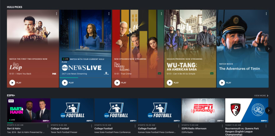
Just like Netflix, the logged in experience in Hulu is pretty similar. Has a large featured banner, and basically rows of movies or tv shows with every few rows having a featured section.
3. Apple

You'll know what I mean by "big block" design. Apple does this well. It's clean, intuitive and pretty straight forward. If you break everything down into smaller components, you'll see how easy it would be to implement the design.
4. Airbnb

Airbnb is such a beautiful website! The assets are amazing. Break this design down into smaller components, and you'll see how it's just a bunch of big rows and small rows. Blocks either spanning multiple columns, or the entire row.
5. SpaceX
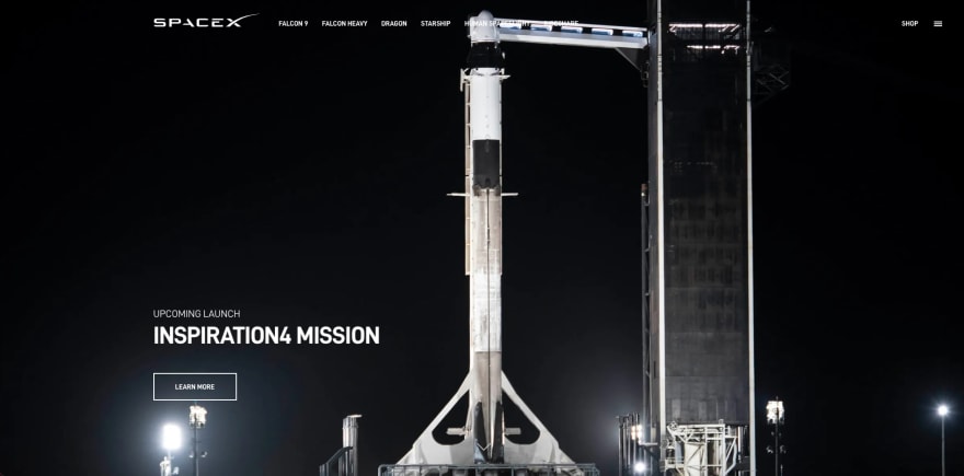
Super easy design. SpaceX is basically multiple fullscreen images with fade up content and a link section.
6. NVIDIA
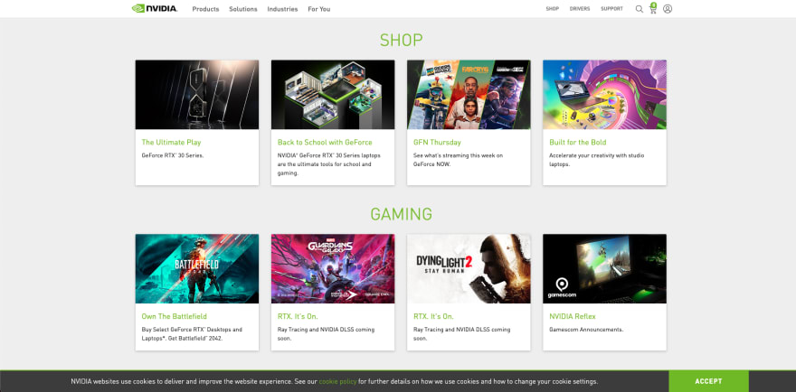
Another easy, but professional looking design. Just a banner, grid layout, and rows.
7. Razer
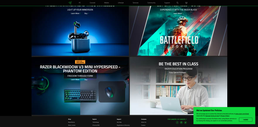
A mix of a large home banner, full page featured sections, and big box design. Have fun with this sick color scheme!
8. Salesforce

Another great website to polish your css skills. A mix of banners, rows, columns, reverse columns, big box design, but also has featured list, multiple call to actions, and fun images.
9. Adobe
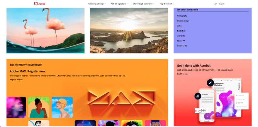
Another big box design. But also features some cool background gradients.
10. Microsoft

Features a modal, big banners, multiple featured sections, big call to action. Pretty straight forward, but professional looking design.
11. Blockchain
Learn about blockchain while you clone this one. This design incorporates a few more difficult design concepts. It also features a big banner, call to actions, gradient effects, but also has big box designs as links and dynamic accordions. So not only does the accordion tab drop more content below it, it changes the image beside it! You probably have a tool of choice for this
12. Paypal

Features a big banner, call to action, and reverse rows. Straight forward, but effective design.
13. Slack
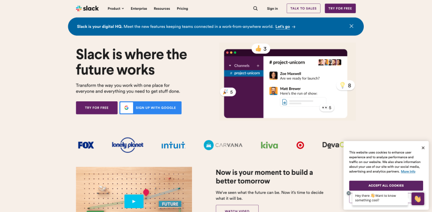
Slack features a fun homepage banner. In the banner is a toast banner, a call to action, a google sign in button, and a row of icons featuring companies that use Slack. The rest of the layout is a simple grid system with a typical reverse row design. Minimal animations, like hover effects.
14. Discord

Probably my favorite looking website on the list. It has fun vibrant colors, a minimalistic homepage banner featuring a call to action, reverse row grid layout, and a nice big featured section.
15. Amazon
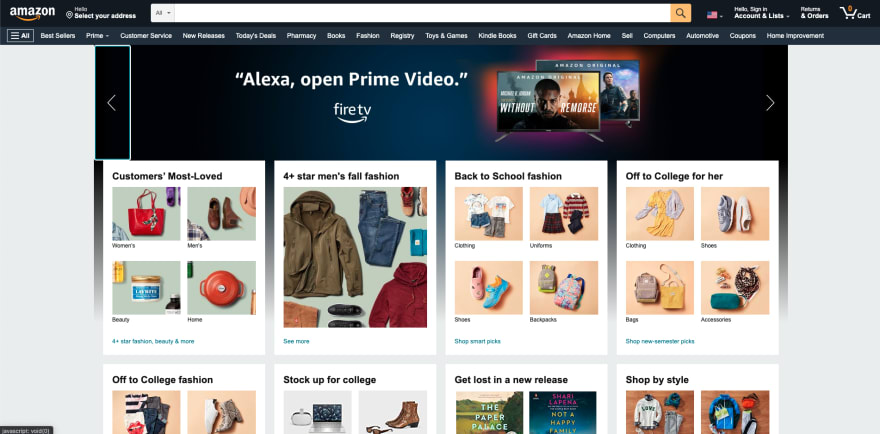
The king of e-commerce. This is a straight up "show off" mockup. If you can nail Amazons design, your frontend dev design skills are up to industry standard. Features a slightly more complex grid layout, with content spanning one or more rows and columns. Has a search bar in the navigation. Also has recommended section, hover effects, carousels, etc. Have fun with this behemoth!
16. Playstation
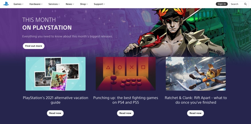
Playstation.com has a nice large homepage banner featuring a slide show with a nice fade in effect. You can code this from scratch, or use your favorite library. Cloning website really gets you thinking about your tools. Also features single row gallery, large featured banners, dynamic content on click, multiple full screen call to actions, and minor animations. This is probably my second favorite looking website. Really enjoy the subtle animations and UI. It also really helps you polish multiple design concepts.
17. Nintendo
Ahhhh, childhood memories! Well, kind of, more of a Sega player. But I digress! Nintendo.com has a nice colorful homepage banner with a minimal call to action beneath it. Has a continuously scrolling single row gallery which is new on the list. So this will offer some great practice. Again, you can use a library for this as you don't need to re-create the wheel every time. Other than that, straight forward big box grid design and single row galleries. One row will help you practice "quick favoriting" items.
Conclusion!
That's a wrap on "Master Frontend Development By Cloning These Websites " I really believe cloning one or multiple of these website, will drastically improve your CSS. There's a lot of analytical thinking that comes with cloning websites, as you break down designs from larger to smaller components. And you also need to think about the best tools as you approach new problems. Then there is responsive design. A mobile or desktop first approach? For example, do you think Microsoft.com should prioritize the desktop or mobile experience? If it was up to me, I'd like to think most people wait till they can access a desktop to make very large purchases like desktops and laptops. Therefore I'd probably prioritize the desktop. This is a big part of a Frontend Developers job! Whether you're freelancing or working for a company. Designs are either up to you, or by professional designers. Master this part of Frontend Development!
Follow me on Twitter
for byte-sized web dev content!

Check out these other beginner friendly articles also written by me!

Original Link: https://dev.to/hyggedev/master-frontend-development-by-cloning-these-websites-1m08
Dev To
More About this Source Visit Dev To