
An Interest In:
Web News this Week
- April 1, 2024
- March 31, 2024
- March 30, 2024
- March 29, 2024
- March 28, 2024
- March 27, 2024
- March 26, 2024
Some of Our Sources
- BoingBoing
- Joshua Blankenship
- Smashing Apps
- Crazy Leaf Design
- Web Design Ledger
- CSS Globe
- Specky Boy
- Spyre Studios
- Freelance Switch
- Codrops
Help Webnuz
Referal links:
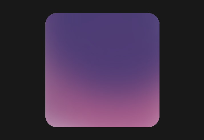
Aurora UI - how to create with CSS
Design trends are changing like new javascript frameworksat least one a day. Today I would like to introduce you to another trend named by my friend Michal Malewicz. It's called Aurora UI, and you can find here an article written by Michal.
What is the Aurora trend?
This trend is not that new. For example, Stripe has been using it in their header for a long time. It's getting more popular on services like Dribbble or Behance.

It's characteristic features are:
- blurred shapes
- similar colours
- smooth transitions between colours
How to create it with CSS?
There are at least three ways to create this effect.
- blurred shapes
- blurred gradients
- blurred images
Blurred shapes
The first method is to create three ovals overlaying on each other. Create big ones and position them:
- first one on the top of the container
- two in the bottom corners
Then we need to add filter: blur() and lower the opacity slightly.
HTML
<div class="wrapper"> <div class="base one"></div> <div class="base two"></div> <div class="base three"></div></div>CSS
.wrapper { width: 400px; height: 400px; background: #fff; position: relative; overflow:hidden; border-radius: 40px;}.base { position: absolute; filter: blur(60px); opacity: 0.8;}.one { border-radius: 100%; width: 600px; height: 600px; background-color: #373372; left:-50px; top:-300px; z-index: 3;}.two { width: 500px; height: 800px; background-color: #7C336C; bottom:-30px; left:-80px;}.three { border-radius: 100%; width: 450px; height: 450px; bottom:-80px; right:-100px; background-color: #B3588A;}Radial gradient
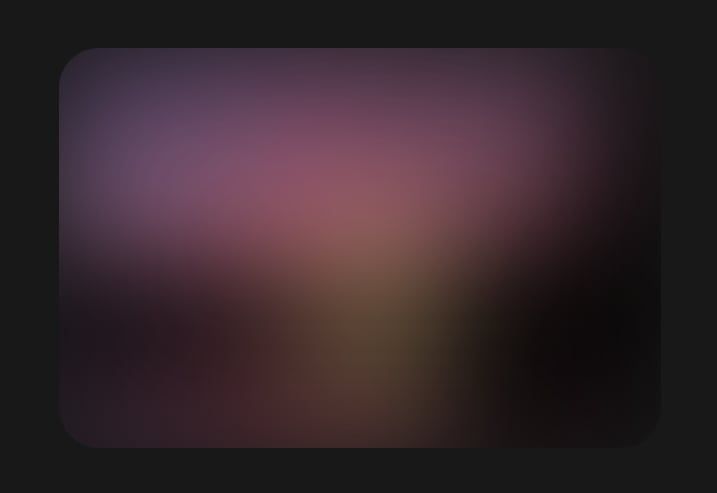
The second method is to use gradient colours! Instead of solid colours, we can use a radial-gradient to create our effect.
Let's add three radial-gradients from a solid colour to transparent:
- top left
- top right
- bottom left

HTML
<div class="wrapper"></div>CSS
.wrapper { width: 400px; height: 400px; position: relative; overflow:hidden; border-radius: 40px; background-color: #fff; background-image: radial-gradient(at top left, #F0ACE0, transparent), radial-gradient(at top right, #FFA4B2, transparent), radial-gradient(at bottom left, #A7D3F2, transparent); background-size: 100% 100%; background-repeat: no-repeat;}Blur an image
The easiest way to create this effect is... to choose a good image and add some filter: blur().
HTML
<div class="wrapper"> <img src="ourImg.png"/></div>CSS
.wrapper { height: 400px; position: relative; overflow:hidden; border-radius: 40px;}img { filter: blur(60px);}Animated background
You can also animate your backgrounds to make them look better! Here is a small example of rotating backgrounds.
I used transform:rotate(1turn) translate(100px) rotate(-1turn); to create movment on circle path.

HTML
<div class="wrapper"> <div class="base one"></div> <div class="base two"></div> <div class="base three"></div> </div>CSS
@keyframes fly { 100% { transform:rotate(1turn) translate(100px) rotate(-1turn); }}@keyframes flyPlus { 100% { transform:rotate(-1turn) translate(100px) rotate(1turn); }}.wrapper { width: 400px; height: 400px; background: #fff; position: relative; overflow:hidden; border-radius: 40px;}.base { position: absolute; filter: blur(60px); opacity: 0.8;}.one { border-radius: 100%; width: 600px; height: 600px; background-color: #373372; left:-50px; top:-300px; z-index: 3; animation: fly 12s linear infinite; transform:rotate(0) translate(80px) rotate(0);}.two { width: 500px; height: 800px; background-color: #7C336C; bottom:-30px; left:-80px;}.three { border-radius: 100%; width: 450px; height: 450px; bottom:-80px; right:-100px; background-color: #B3588A; animation: flyPlus 8s linear infinite; transform:rotate(0) translate(100px) rotate(0);}You can play with all backgrounds here.
And that's it! You can combine Aurora with glassmorphism to create even better UI.
Thanks for reading!
You can follow me on Twitter or sign up for my newsletter!
Original Link: https://dev.to/albertwalicki/aurora-ui-how-to-create-with-css-4b6g
Dev To
 An online community for sharing and discovering great ideas, having debates, and making friends
More About this Source Visit Dev To