

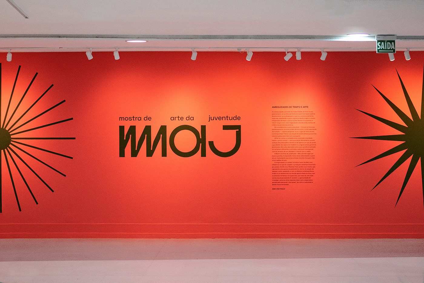
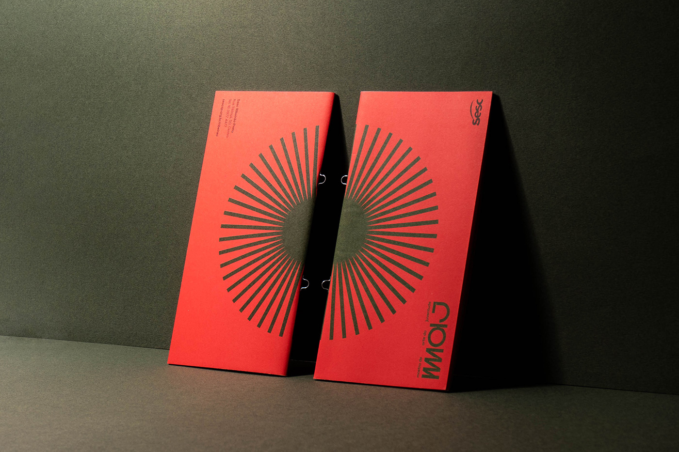
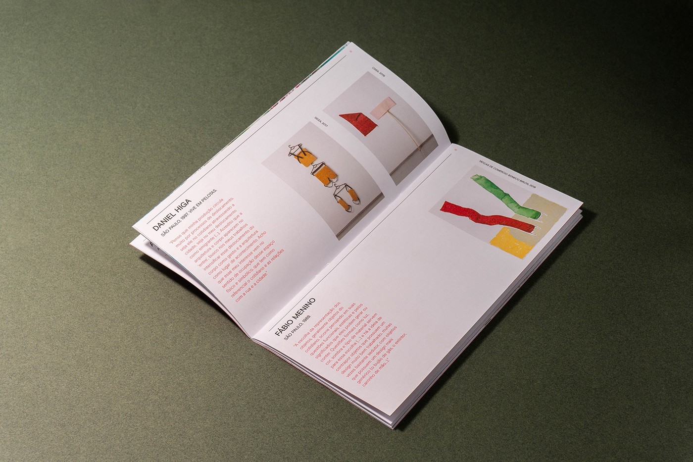
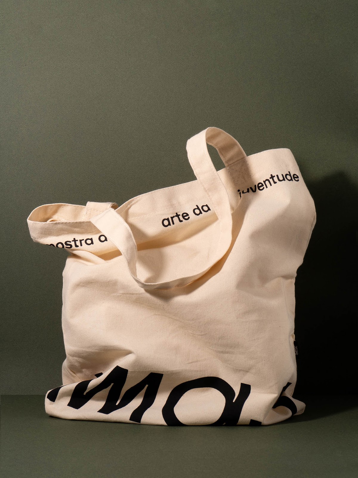
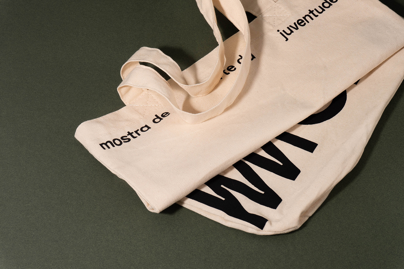
In 2019, the MAJ (Youth Art Exhibition) celebrated its 30th anniversary and Sesc invited Polar to develop the projects new logo, as well as the branding, visual identity, and signage of the commemorative edition. Following the format of traditional art salons, the exhibition sheds light on contemporary young art production. Currently, it is one of the main cultural events in the interior of the state of So Paulo and places the city of Ribeiro Preto on the Brazilians visual arts map.
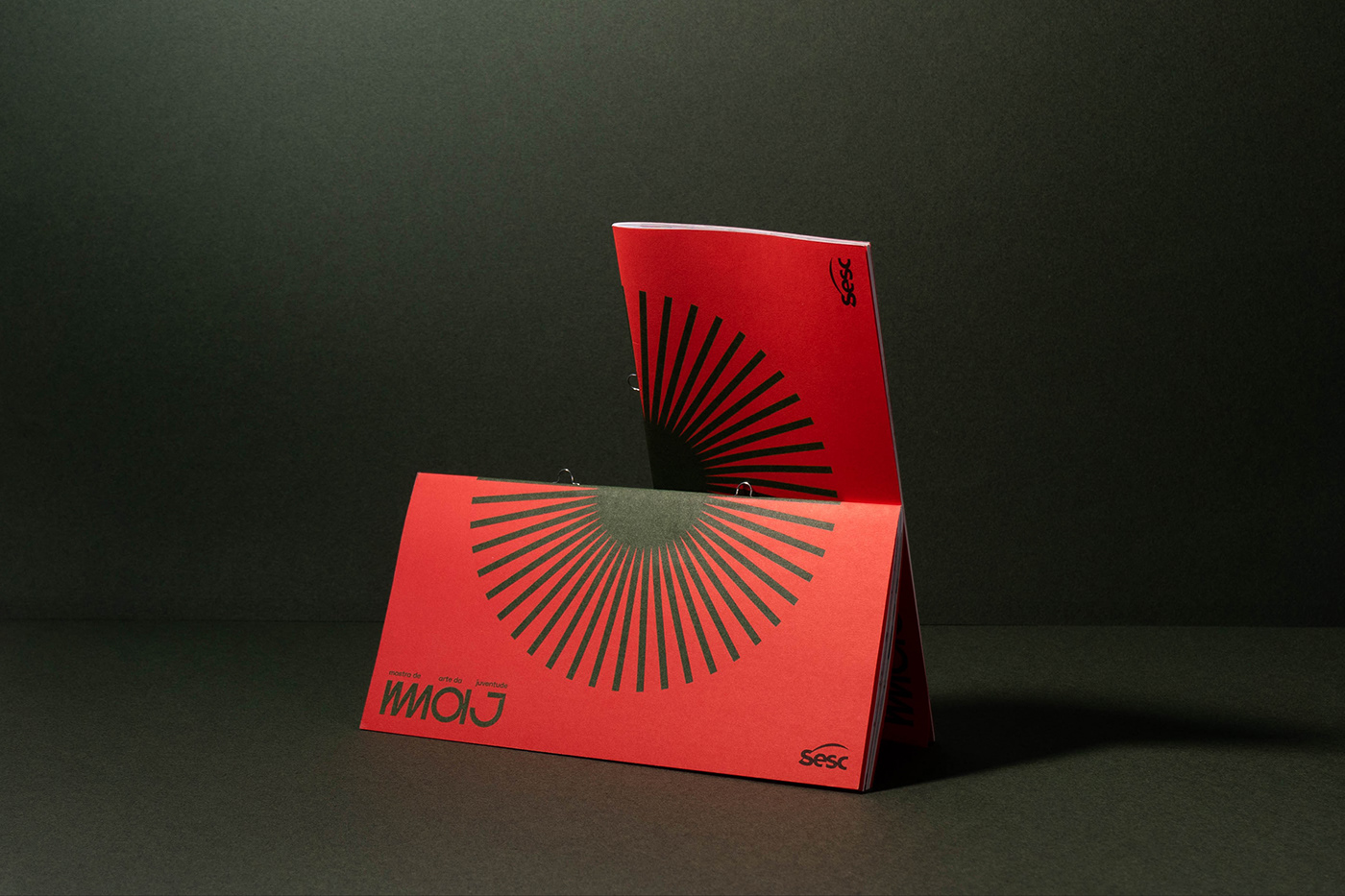
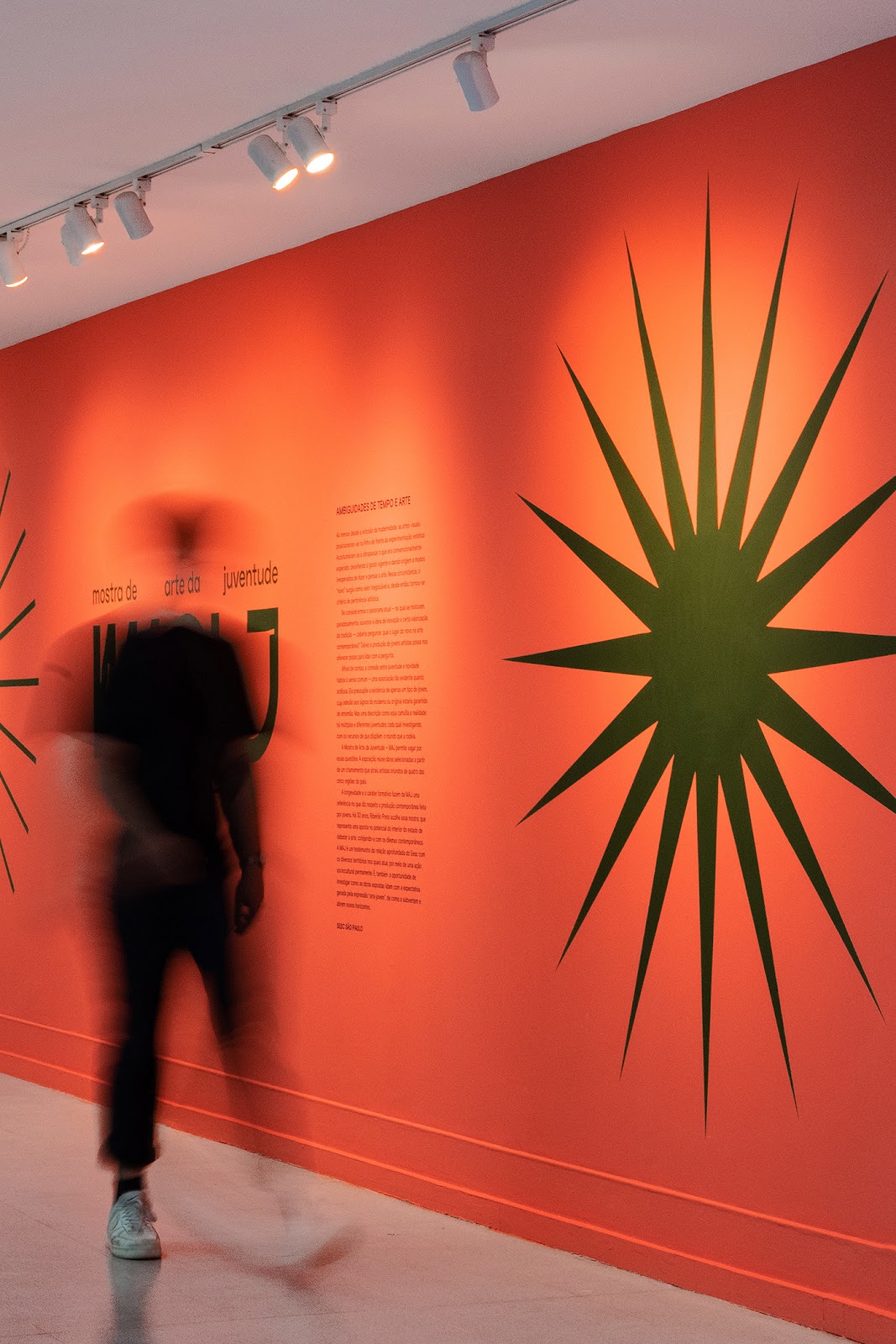
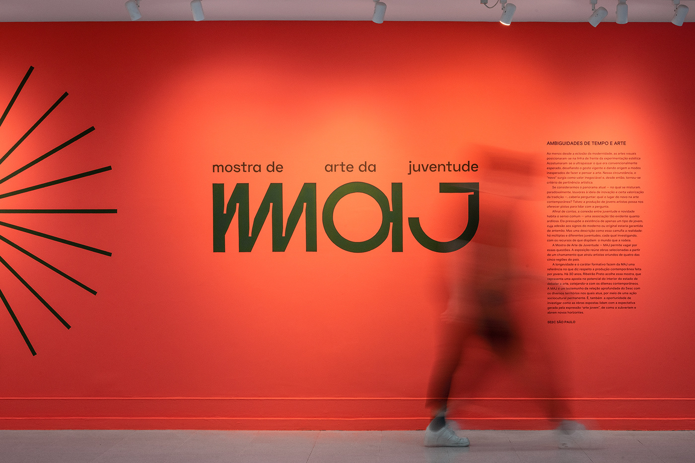
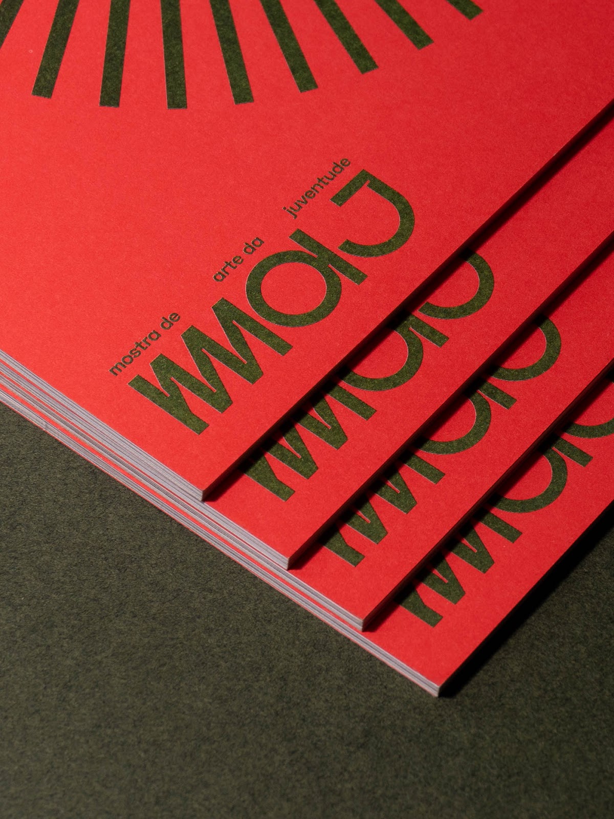
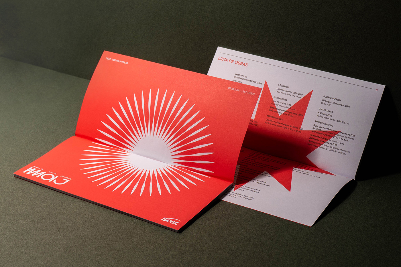
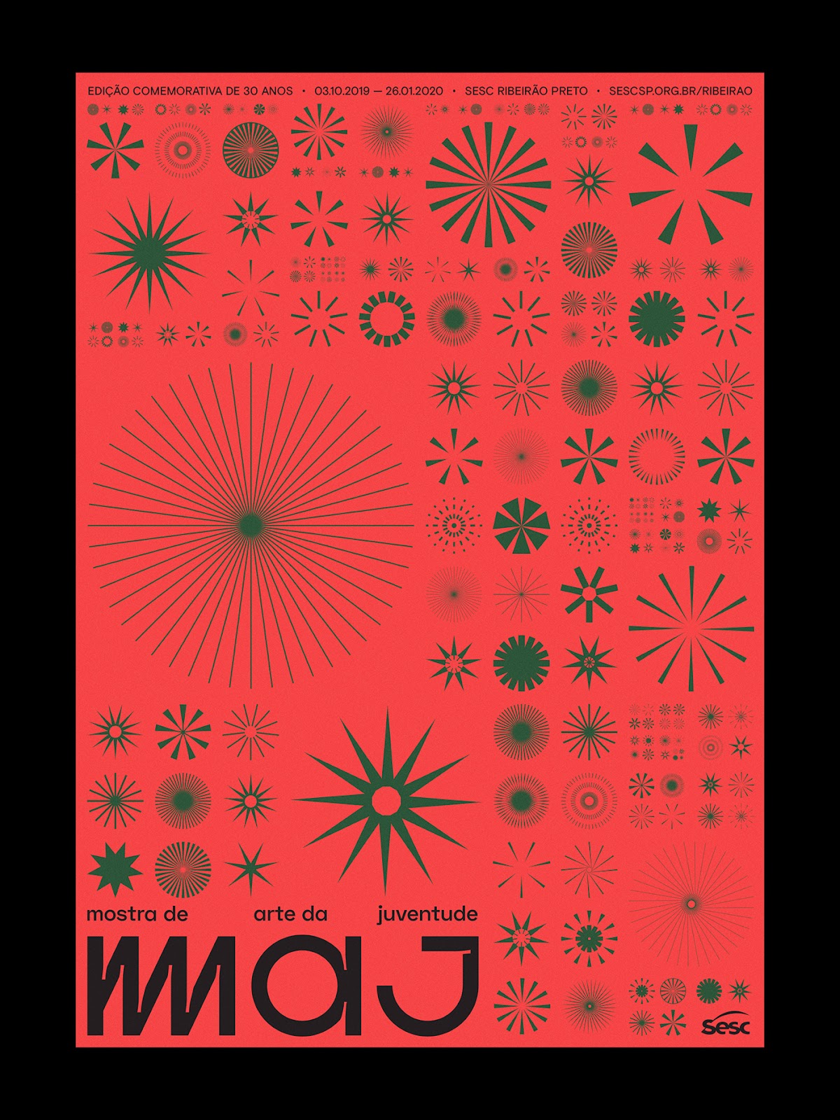
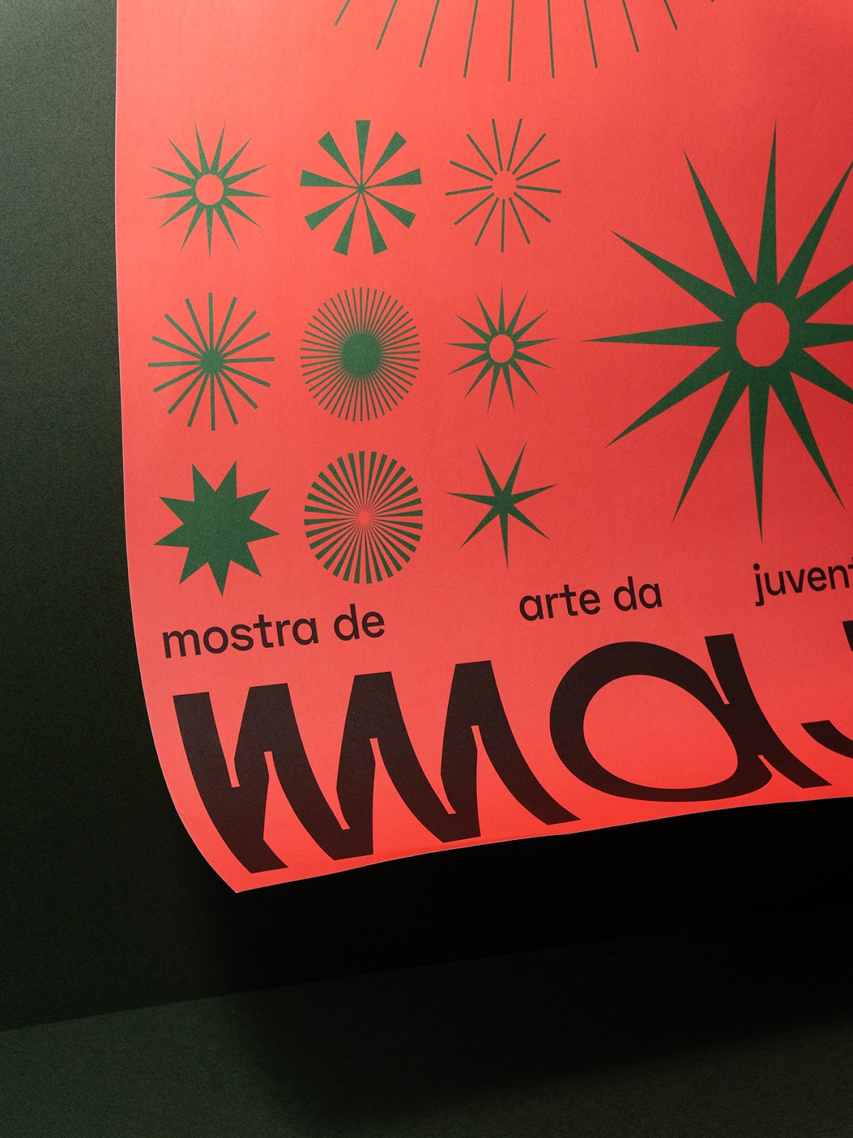
The new MAJ logo was designed combining geometric shapes with ink traps that pushes it away from a typically modernist solution. The highlight is the character M, which gains an extra leg to reproduce the boost given to MAJs featured artists.
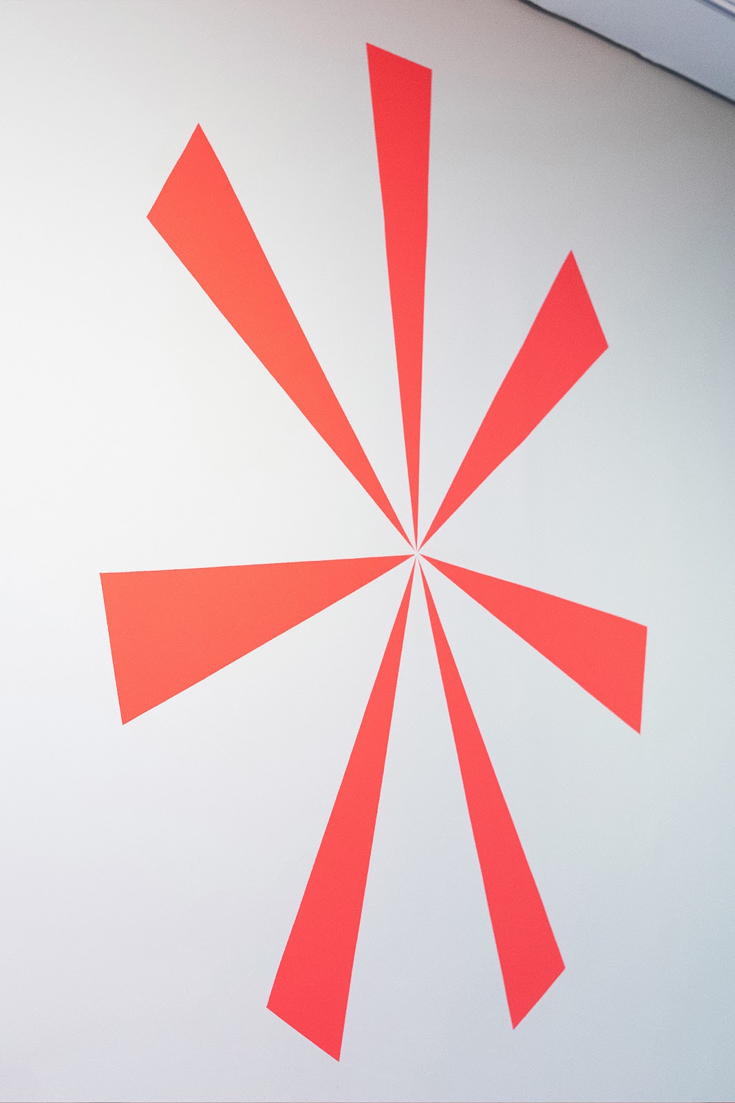
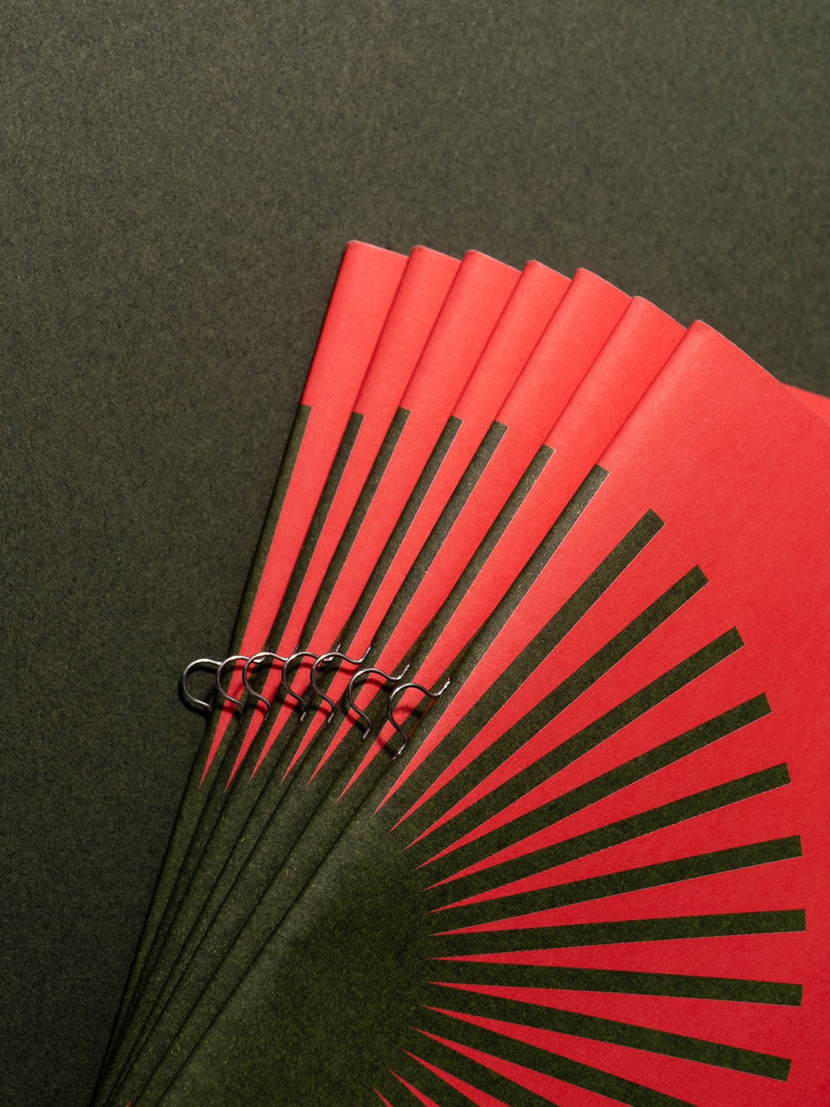
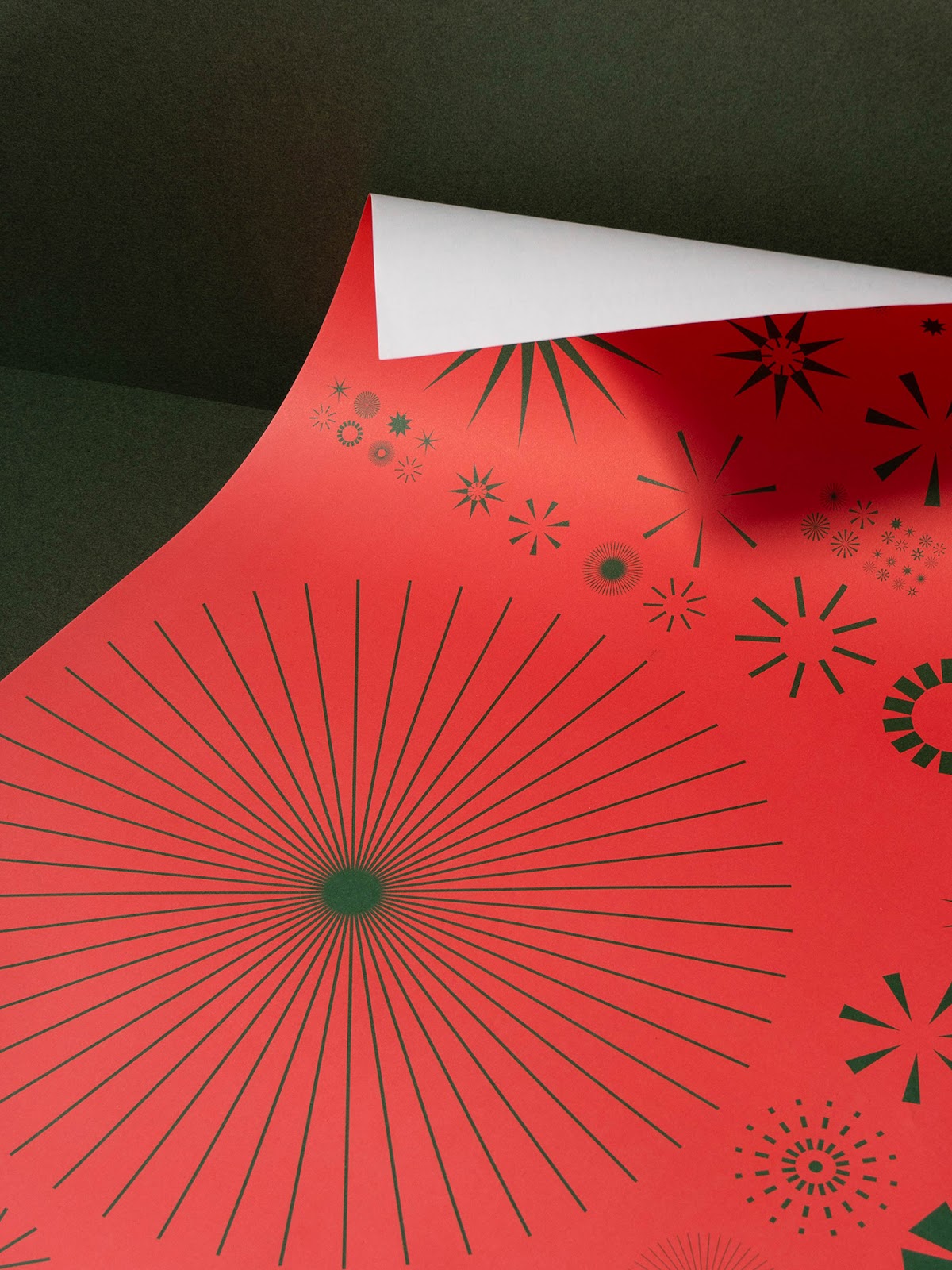
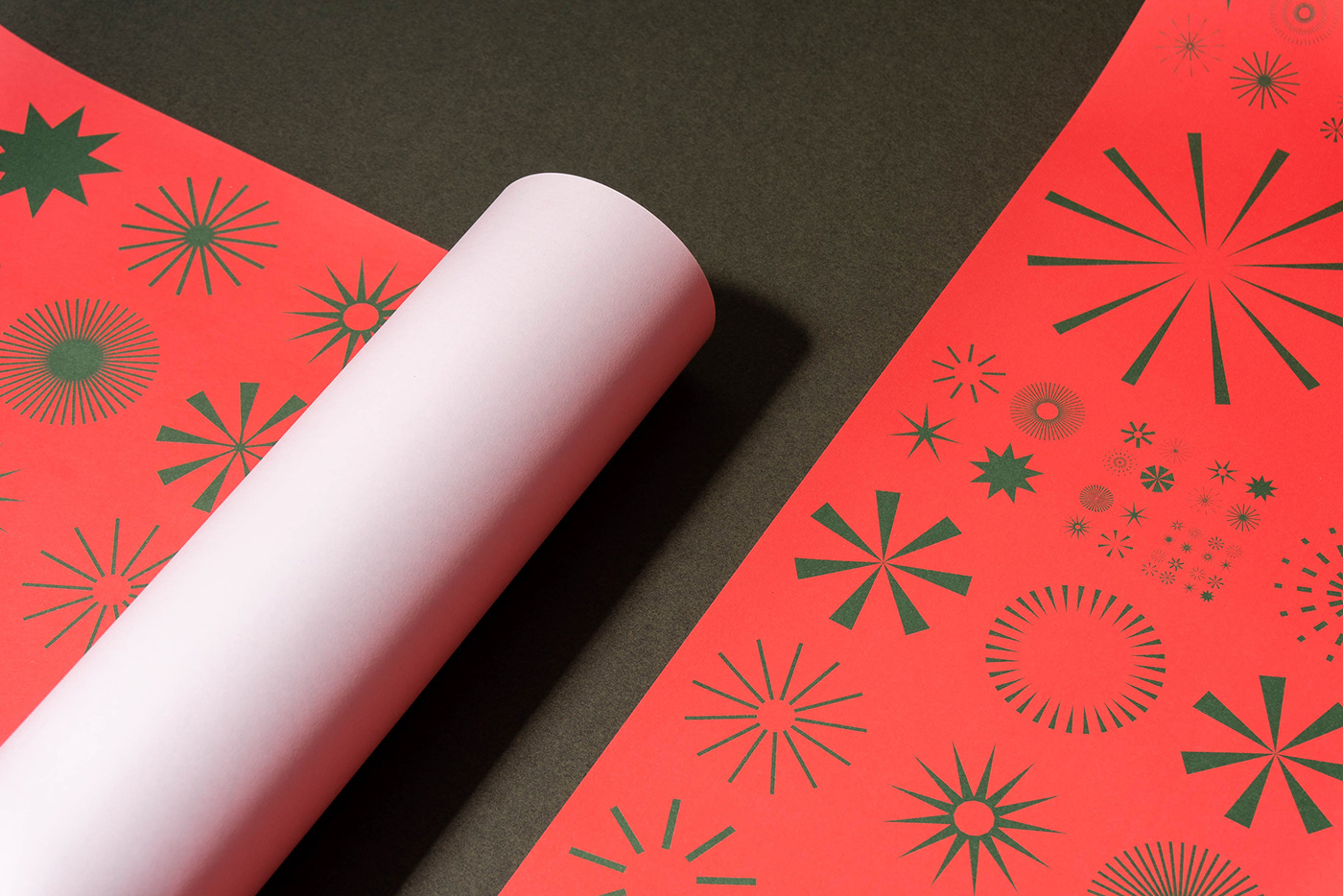
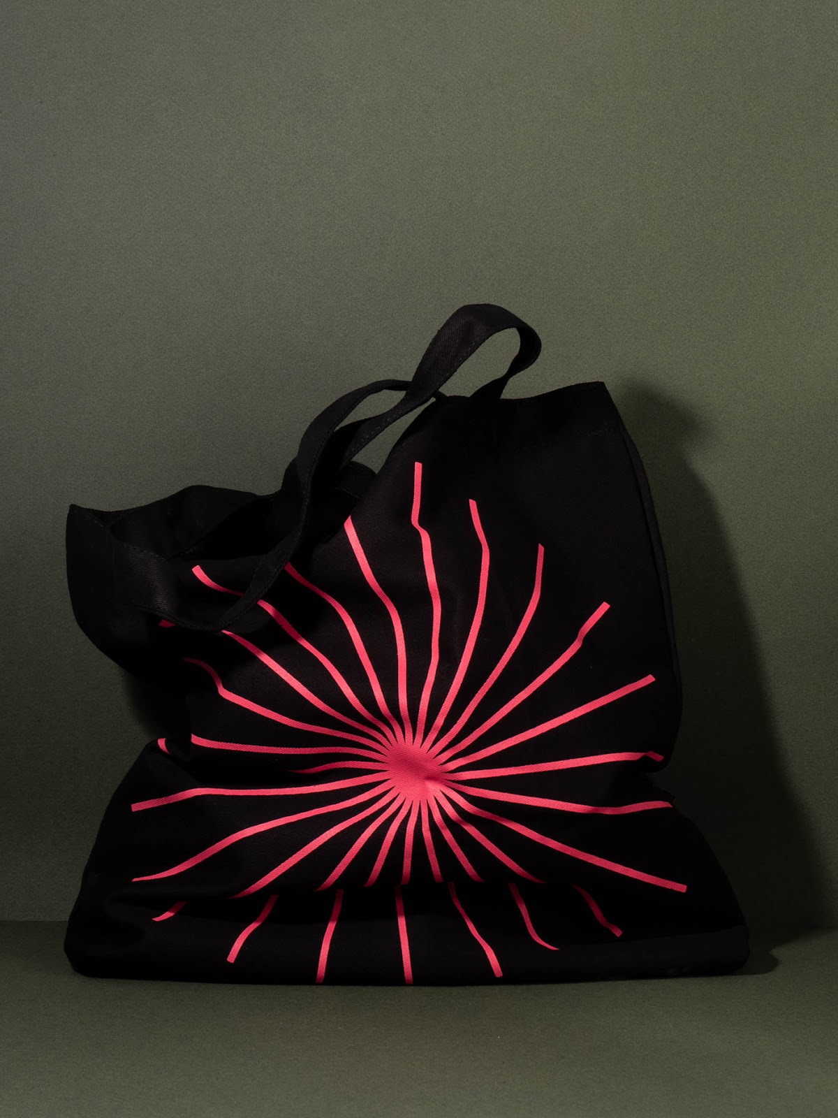
The 30-year editions visual identity simultaneously pays tribute to the new artists discovered and the city of Ribeiro Preto. We created a series of graphics that refer to sparks, representing young talents at the time of expansion and professional growth, as well as Ribeiro s powerful sun.


 Abduzeedo is a collection of visual inspiration and useful tutorials