
An Interest In:
Web News this Week
- April 3, 2024
- April 2, 2024
- April 1, 2024
- March 31, 2024
- March 30, 2024
- March 29, 2024
- March 28, 2024
Some of Our Sources
- BoingBoing
- Engadget
- TutsPlus - Code
- Pearsonified
- TutsPlus - Design
- Noupe
- Fudge Graphics
- Stylized Web
- Willems Lab
- Dev To
Help Webnuz
Referal links:
How to Make Good PowerPoint Slide Designs Even Better in 2020

Great presentations are supported by well-designed slides. Most PowerPoint graphic design you see is rather invisible. It's only when something is wrong with a slide design (think of screaming colors for example) that you'll notice how design can be a problem.
In this PowerPoint design tutorial, we cover the basics of presentation design. As you'll notice, subtle details go a long way in designing a visually pleasing presentation. You'll learn:
Visual Hierarchy. Understanding the basics of visual hierarchy and how you can use it effectively in a presentation.
Slide Layout. Turning the design principles of visual hierarchy into effective PowerPoint slide designs.
Typography. Choosing the right typefaces.
Color. The basics of color theory.
Details. The extras that make your presentation great.
Finally, we'll look into the process of how you can apply all the above while working on a presentation in PowerPoint.
Also, if you're looking to use ready-made presentation designs to shorten the process, I recommend checking out the trending PowerPoint templates on Envato Elements. It can save valuable time when you need to get a beautiful presentation, done quickly.
We also have thousands more modern and attractive PowerPoint templates on Envato Elements and GraphicRiver. So, check those out as well.
Now, let's dive into the fundamental principles of design that are behind a great PowerPoint presentation.
1. Visual Hierarchy
Any type of design starts with visual hierarchy. What exactly is visual hierarchy? This refers to the arrangement of elements in a way that it implies importance. With other words, by designing elements with a stronger contrast than others, you can influence how we perceive what we see.
The theory of visual hierarchy helps you define the structure of your PPT design slides. Good visual hierarchy assures that the right elements are catching your attention.
You can achieve visual hierarchy through several design techniques:
- Use contrasting colors to make certain elements stand out more.
- Play with the size of text or photos to make something stand out more than something else.

The above concepts are known as adding visual weight to an element. How does this work in practice?
Below, you see two slides with exactly the same copy. One's got no visual hierarchy applied. The other one uses simple color and typography (that you'll learn more about later) to apply visual weight to certain content.


Remember that by design some content will appear more important than other content if you apply visual hierarchy correctly. This is a principle you should use to your advantage. Ask yourself what needs to stand out in your presentation.
For Example
You're giving a financial presentation. You want your audience to recall that the third quarter of last year performed poorly because of a lack of marketing effort.
What's unrealistic is to believe your audience will recall the exact amount of sales numbers, who exactly performed poorly, and the full list of marketing actions that were a failure.
A presentation gives a lot of information in a short time span, and unfortunately the attention of people is quite brief. Focus on key messages and use visual hierarchy to make those ideas stick out.
Now that we understand how visual hierarchy works now, let's learn more about designing PowerPoint slide layouts.
2. Slide Layout Design
Based on how visual hierarchy works, you can apply this knowledge to create effective PowerPoint slide designs.
For each slide, the trick is to understand what the most important message is that you need your audience to grasp. Based on that, you can assure through PowerPoint design principles, that this will be the content that people remember.
This goes further than just designing one slide. For example, you might have a few slides in a row about the same topic. But, the final slide with the conclusion could be the slide you want to add that extra visual weight to in order for your audience to pay notice. For example, by adding an image for the first time or making the text bigger as usual. This is applying visual hierarchy to your slide layouts as well.

One of the most effective presentation design tricks to apply is that less is more, in most cases. When you've got key statistics, such as percentages for example, the following design method helps:
- First, display the graph (or all the statistics) that display the context of the key number.
- Display the key percentage on a single slide, without any further elements as a follow-up to make people pay attention to this number.
This is known as letting your design (and content) breathe. The idea you should keep in mind is that you should try and give your content (and thus your design) a hidden order.
Repetition is another trick to help you emphasize a key message. Displaying a graph and then an individual statistic on two separate slides is a good example of effective repetition.
If you're looking for some inspiration for slide layouts, look at this collection of PowerPoint templates. Or dive into this curated selection of trending PPT presentation designs:

3. Typography
The right choice of typography goes a long way in improving the design of your PowerPoint presentation.
A general lesson is this: good fonts are invisible and bad typography choices are noticed straight away. For example, if your whole presentation has Comic Sans as a font choice, people will notice. When you notice a font, it's often because the legibility of the font is quite poor. If something is difficult to read, it requires much more attention from your audience to pay attention to your presentation.

Hence that traditional font choices are often the best to use for PowerPoint presentation design. Stick to Helvetica, Arial or Gill Sans for example. Use the regular version for your body text and use the bold version for your title. Make your font size big enough to ensure readability (eg. 18pt) and make titles bigger (eg. 34pt).

It's also possible to mix fonts, but when you're just starting out, I'd recommend not trying to mix fonts as it's easy to mess up. If you're curious, you could always try to search for good font combinations.
If you're intrigued by typography, there are plenty online resources to help you. I personally enjoy Typewolf, for example.
The simple rule for typography is that solid typography goes unnoticed. Unnoticed typography means it's legible and with that, you've accomplished already a lot in terms of typography. Of course, typography is a way to customize a design and make presentations much more unique. But, when starting out, I recommend sticking to the basics.
Something else to think about is how much text you use on your slides. It's rarely useful to write down full sentences in presentations. It's much better to use bullet lists of key facts and make sure that people are paying attention to you while you're giving your presentation. Remember our 'Improving our marketing' slide? Let's clean that one up so you'll notice the difference.

4. Color
Color is a complex topic. A good understanding of the basics goes a long way. It's important in presentation design to understand that colors express a certain feeling, much like photography does. Brighter, more vibrant colors often come across more playful. Darker colors often feel a little cooler (and more professional).
Notice how in the Hornette PowerPoint presentation design template slide colors are playful and creative. If you dig further into the PPT download, there are some simple minimal slides and a darker set to work with as well.

Of course, the colors of your presentation design highly depend on the context of your presentation. If you're making a professional presentation, chances are high you're working with the colors of your brand. That makes presentation design much easier. I recommend sticking to brand colors instead of experimenting for the sake of design.
In other cases, you might have to choose colors from scratch. In that case, don't panic yet.
The easiest way to pick a color palette is to work with a single primary color (take blue for example) and work with greys as supporting colors (whites, greys, blacks). Using one, or two colors and keeping the rest simple works well. Again, take a look at our marketing slide above for a good example!
If you're a little more daring, you can learn more about color theory. You've got complementary and contrasting colors for example.
An easy way to get started with being a little bit more adventurous with color is to use a resource such as Adobe Color. By browsing the 'Explore' section you can discover wonderful color palettes. Another way to see some nice palettes is to use design sites as Dribbble or Behance and see what colors are being used in a single design as inspiration.

5. Details
Finally, and perhaps the most interesting way to improve the design of your presentations is getting the details right. You'd be surprised how some subtle elements can pack a lot of punch to improve your presentation visually.
Photography
A presentation wouldn't be complete without the use of photography. Photography is the easiest way to improve your PowerPoint presentation. A simple trick to improve the design of your presentation is to use high-quality stock photography. You can find thousands of gorgeous professional stock photos on Envato Elements.

Using premium stock photos such as those found on Envato Elements means your presentation will be unique. You won't be using the same old stock photography everyone else is using. Plus, you can find photos that match not only your brand, but also the topic of your presentation such as landscapes, city or coffee vibes, office settings, and much more.
Or, if the budget is tight, consider using images from Unsplash. It's got free-to-use gorgeous photography that feels much different from imagery used on other free stock photography websites.
Icons
Another simple way to visually enhance your presentation is to use icons. Icons are great to use when you've got little text in your presentation and don't want to continuously be using photography.
Ideally, you use icons from a single icon kit. This assures that all icons do have the same style. What's excellent is that a lot of PowerPoint themes you can buy include an icon kit. If not, you can find icon kits online on marketplaces like Envato Elements or GraphicRiver.
Charts
When working with data, adding some type of chart can help in your presentation.
Charts as a design element are something to pay attention to, as it's easy to overwhelm your audience with a bunch of data. Here are some thoughts about using charts to your advantage:
- Don't use too many charts. Rather use them sparingly and only when they add value to what you've got to say.
- Make sure that the data is easily legible. This, by avoiding fancy animations or unnecessary 3D design for example.
- Have a follow-up slide explaining the key takeaway of your chart.
The Marketofy PowerPoint template has a data-driven presentation design. It's one of the most popular PPT templates on GraphicRiver. It includes many infographics, charts, diagrams, to work with quickly.

Learn more about how to create charts in PowerPoint:

Discover more helpful infographic and data-driven PowerPoint presentation design templates:
 Microsoft PowerPoint35 Best Infographic PowerPoint Presentation Templates—With Great PPT Data Slides
Multimedia
If possible, adding some multimedia to your presentation can help in many ways. First, it makes your presentation feel interactive. An interactive element can help you explain what words and pictures can't.
For example, if you've got a digital product such as a mobile app, displaying a video where you demo some features might be an intriguing option to improve the experience of your presentation.
Transitions and Animations
Finally, another design element to consider is the transitions between your slides and animations on your slides.
The above is a little tricky. It's very easy to overdo the use of animations and transitions up to the point it distracts your audience tremendously. A good rule (that often works really well) is that 80% of your presentation doesn't really need a transition between slides or an animation.
Only use transitions and animations where it matters: when you want to assure that your audience remembers what you're saying. The principles of visual hierarchy apply here as well.
Learn more about how to use animations in your PowerPoint presentation designs:

How to Follow a Good PowerPoint Design Principles
Finally, let's dive into how you can apply all the lessons above while working on a PowerPoint presentation design:
Step 1. Plan Your Content Before the Design

Before you start working on the design of your PPT slides, it's much more productive to be thinking about your content and your key messages. Ask yourself what your audience should remember after seeing your presentation.
Based on that, optimize your slides to support those key messages and make sure that your content and your key message stands out. That's where all the above PowerPoint graphic design advice kicks in. When you're presenting your key message, that's where you can cleverly use animations to highlight your animation for example.
In summary, start with your key message. The opportunity to design will follow. Learn more about the presentation writing process:

Step 2. Now Begin With Presentation Design Basics
Once you've got your content is figured out, next you should define what the foundations of your slide design should be. This is defined by your selection of color and typography. Pick a primary color and a font you'd like to work with and you're off for a good start.
Step 3. Collect Your Photography
Presumably, you'll be using some sort of photography (or other imagery) in your presentation. Start collecting images you like, to select them for your PowerPoint presentation once you start designing.
After you're all set with the above, start with the actual design.
Step 4. Define Your Slide Layout(s)
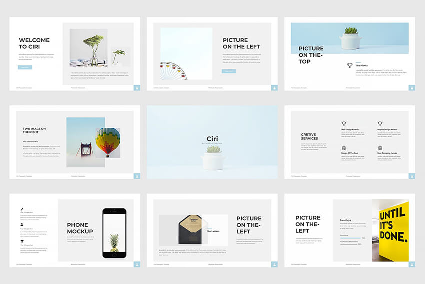
Finally, it's time to work on the layout of each individual slide. It's not necessary to create a unique layout for each slide, but some variety helps. Typically, for a presentation of about 20 slides, I work on about six to eight layouts I use throughout my PowerPoint presentation design. For this presentation, for example, I've designed three layouts. You can see them below for some inspiration:
A layout can be quite simple. For example, a simple title with a subtitle or a slide containing a photo. Or, a layout can be complex. For example, combining some bullet points and a graph.
The trick is to create enough layouts as you see fit and pay attention to the design of the slide layout individually.
Once you've designed all layouts, put your PowerPoint design together and see how your presentation flows. Make sure to practice your presentation at least once! Then, fine-tune your design and finish your presentation!
How to Quickly Design Great Slides in PowerPoint With PPT Templates
So, with basic PowerPoint design principles in mind, let’s take a basic presentation and quickly turn it into a standout PowerPoint graphic design with the help of a professional PPT template.
For the purposes of this tutorial, I’ve designed a very basic presentation in PowerPoint that consists of five slides:
- title slide
- about slide
- product slide
- picture and text slide
- text slide
I’ll be using the Minimalism Clean PowerPoint template to customize the design of my basic presentation.

Download the template above or follow along with your favorite premium template. Let's get started:
Step 1. Find Slides You Want To Use
The first step in the process is to find the slides you want to use to customize the template. The easiest way to do this is to switch to the Slide Sorter view. Delete any slides you don’t want by clicking to select them and then right-clicking on those slides and selecting Delete.

Step 2. Customize Your Title Slide
The title slide is one of the most important slides in your presentation. When done right, it can pique the interest of your audience so it’s a good idea to make sure it captures their attention. As you can see from the screenshot below, my original slide uses a simple underlined title.

Using the Minimalism PPT template, I’ve customized the title slide so it includes a full-width photo and a colored background behind the title. I’ve also changed the fonts so the result makes the slide title look more polished and professional.

Step 3. Layer Text and Images
Your presentation will have a variety of different slides. Some slides might be purely text based, while others might have a combination of text and images. Get creative and experiment with layering text over images to spice up your slide design.
For example, the original presentation I’ve created had a basic text slide for the About section.

Thanks to the Minimalism template, I’ve made it more visually interesting by playing with the text layout and layering text over images.

Step 4. Break Away From the Grid
If you’re presenting products, services or showcasing team members, chances are you’ll use many photos on one slide. But that doesn’t mean you've got to place them side by side.
Break away from the grid and place images in different positions or break them apart with text. Your slides will be more interesting this way. That means your audience will be more engaged throughout the presentation.
As you can see, I had a basic, grid-based slide with two images side by side.

With a slide from the Minimalism template that breaks away from the grid and adds text between the images, I’ve made the product slide more interesting and engaging.

Step 5. Spice Up Text With Icons
Another way to spice up your text-based slides is to use icons. Icons are great visual cues that help us visualize important points. In the example below, I’ve used a text-based slide with a simple title and a plain bulleted list.

Using a slide from the Minimalism template, I’ve made that slide more engaging by adding icons instead of bullet points and rearranging the text to fit more points onto one slide.

5 Best PowerPoint Presentation Design Templates (for 2020)
To save time designing a PowerPoint presentation getting a premade PowerPoint template is the best starting point. You can find plenty of PowerPoint templates over on Envato Elements.

Each of the PowerPoint templates features an attractive design and comes with premade slides as well as extra elements such as charts, icons, and graphs. It'll be an invaluable resource and help you make an effective slide design.
Take a look at the best PowerPoint presentation design templates from Envato Elements.
1. Nextar - Multipurpose PowerPoint Presentation Design Template

The Nextar template has a modern and trendy graphic design for PowerPoint. It comes with 30 unique slides and three premade color schemes. The template is versatile enough to be used in business or corporate presentations as well as webinars, pitch decks, and more. On top of that, the template's got image placeholders so all you've got to do is drag and drop in your images.
2. Brusher - Trendy PowerPoint Presentation

The Brusher template is a trendy PowerPoint template. It’s a great choice if you’re looking to enhance your PowerPoint presentations with graphics. The template features bold brush strokes that make it easy to draw attention to particular sections of your presentation. You'll also get a grand total of 120+ slides and five premade color schemes as well as image placeholders and creative illustrations.
3. Native - Minimalist PowerPoint Presentation Design Template

Try the Native PowerPoint template if you want a template that uses a minimalist design style. This template is perfect for small businesses that want a professional and clean presentation look. The template includes over 20 premade color schemes and 84 individual slides. The slides are animated, and you'll also get custom icons that you can use to improve your PowerPoint presentation.
4. Mild - PowerPoint Presentation Template

Consider the MILD template if you want to use photos in your presentation design. The template includes image placeholders so you can easily replace them with your own photos. The template comes with a custom icon pack and 35 premade slides as well as over 50 color schemes.
5. Sprint - Bold PowerPoint Template

The Sprint template features a bold and modern design that’s perfect for startups as well as established corporations. The template comes with 20 master slides. You'll also get matching charts, diagrams, tables, and other data visualization elements. This template is a perfect choice if you want to quickly design a PowerPoint presentation.
Find more great PowerPoint presentation design templates in this article:

Discover More Great PowerPoint Templates
The templates above are just a small sample of what’s available on our marketplaces in terms of PowerPoint templates. To see even more great PowerPoint designs, check out the articles below:
 Microsoft PowerPoint25 Best Fully-Customizable PowerPoint Templates (Make Custom Quick 2020)
.jpg) Business25 Best Sales PowerPoint Templates (PPT Presentation Examples for 2020)
Business25 Best Sales PowerPoint Templates (PPT Presentation Examples for 2020) Microsoft PowerPoint25 Best PowerPoint Slide Design Templates (PPT Downloads for 2020)
More Great PowerPoint Tutorial Resources
Here are Microsoft PowerPoint tutorials from Envato Tuts+ and resources to help take your PowerPoint skills further:
How to Learn PowerPoint Quickly (Complete Beginner's Guide)

19+ PowerPoint Presentation Tips: To Make Good PPT Slides in 2019 (Quickly)

How to Work With Views in Microsoft PowerPoint
Make Great Presentations (Free eBook Download)
Take the tips you learned in this article further with our eBook: The Complete Guide to Making Great Presentations (grab it now for FREE).
It'll help walk you through the complete presentation process. Learn how to write your presentation, design it like a pro, and prepare it to present powerfully.

Apply PowerPoint Design Principles to Your Next Presentation
That's it! We covered the basics of effective PowerPoint presentation design. You've just learned how design PowerPoint (PPT) slides. As a key takeaway, remember that good design is often subtle. The best design is typically invisible.
Instead of trying to design everything, keep it simple and focus on a process that works for you. For example, design a few layouts you could use. Only use animations where it makes sense. Keep your colors simple.
If you lack time, I recommend starting from a professional PPT template and customizing it to your needs.
Here are some excellent PowerPoint templates to look at on Envato Elements. Download unlimited presentation designs, web templates, and graphic assets for a single monthly fee. Or, discover more trending PowerPoint template designs on GraphicRiver.
Designing is much easier if you don't make it unnecessarily difficult for yourself.
Editorial Note: The tutorial was originally published in March of 2017. It's been comprehensively revised to include new information—with special assistance from Brenda Barron.
Original Link: https://business.tutsplus.com/tutorials/how-to-make-your-powerpoint-presentation-design-better--cms-28172
Freelance Switch
More About this Source Visit Freelance Switch