
An Interest In:
Web News this Week
- April 26, 2024
- April 25, 2024
- April 24, 2024
- April 23, 2024
- April 22, 2024
- April 21, 2024
- April 20, 2024
Some of Our Sources
- Simplebits
- Joshua Blankenship
- Smashing Apps
- Abduzeedo
- TutsPlus - Design
- You The Designer
- My Ink Blog
- Freelance Switch
- Android Dissected
- Codrops
Help Webnuz
Referal links:
Making magic with before and after pseudo elements
The before and after pseudo elements are used to add things like text and or styling outside the DOM. This means you cannot count on them being indexable by search engines and are only readable by screen readers depending on a users screen reader + browser combination.
They are however one of my favourite things to use because it allows you to add extra styling without adding extra elements. Consider for instance adding an icon to a button or extending the clickable area of a link.
In this article I talk about some basics you should know about pseudo elements, you can also skip straight to the fun stuff.
What are pseudo elements?
Pseudo elements are keywords you can add to a css selector that allow you to style a specific part of the selected element. For example ::first-letter can be used to add styling to the first character of an element.
Pseudo elements are recognisable by the double colons syntax, you should use ::before and not :before (although that is also supported in all browsers) to distinguish it from pseudo classes like :hover and focus. This article focusses on ::before and ::after but you can find other pseudo elements here.
The naming suggests the elements to be inserted before and after an element but are actually inserted before and after the content of the element. This means that before has a lower z-index and after a higher z-index than the selected element.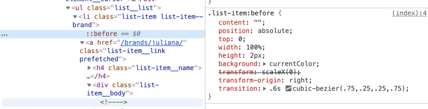
The content property
Before and after pseudo elements need the content property to do their magic. This may have made you say "duh" out loud just now if youve only been using it to pre- or append text because that's when you actually needed the content property. Even if you dont use the pseudo elements to show text youll need to leave it empty for it to even show up in your browsers inspector.
.list-item::before { content: ''; /* Even if you don't need the content element you have to add it. */}Inheritance
Pseudo elements inherit their parents inheritable behavior, for instance if you add a before to an anchor (a) tag it will inherit its font-family and font-size properties but also the fact that if you click it its still a link. This is incredibly useful for if you want to make an entire block clickable but do not want to add an anchor link around the entire thing.
Fun stuff
Pseudo elements don't just have to be useful; a while ago I created a blowfish with css and used some before and after elements to add some shadows and spikes:
You can also use it to create photoshop-like effects like the duo tone effect, Spotify used to be a big fan of this effect. I had to do some research on what Photoshop actually does in this ready made effect and found a simple way to do it in sort of layers while using the mix-blend-mode property.
In order for this to work you'll need two layers with different blend modes and one black and white picture. I actually just used filter: greyscale(1); on the image.
The blend moded layers are:
- A layer with a vibrant
background-colorlikehotpinkandmix-blend-mode: multiply; - A layer with a dark
background-colorlikeblueandmix-blend-mode: lighten;You can also uselinear-gradientbackgrounds which give a really cool effect but aren't animatable and I wanted to switch between color combinations.I had to add a container to put the before and after on because setting them on self closing elements like<img />is still very unreliable.
The simplified version of the code is:
<div class="container"> <img src="https://media.mnn.com/assets/images/2017/06/closeup_meerkat_face.jpg.653x0_q80_crop-smart.jpg" /></div>.container { position: relative; /* Necessary to make sure the before and after elements know what their bounds are. */ width: 500px; /* Optional; to create a constraints for the image . */ height: 500px;}.container img { width: 100%; height: 100%; object-fit: cover; filter: grayscale(1); /* Duo tone looks better with a black and white image */}.container::before, .container::after { content: ''; position: absolute; top: 0; left: 0; right: 0; bottom: 0; z-index: 1; /* Make sure that also the before element is on top of the content of .container */}.container::before { background: hotpink; mix-blend-mode: multiply;}.container::after { background: blue; mix-blend-mode: lighten;}I spruced it up a bit and added a hover animation, I also created one with a very lazy keyframe animation, but it doesn't seem to work in Safari (BOOOO!).
Now you
There are a lot more crazy things you can accomplish with pseudo elements, which are your favourites?
Original Link: https://dev.to/cydstumpel/making-magic-with-before-and-after-pseudo-elements-2fb2
Dev To
 An online community for sharing and discovering great ideas, having debates, and making friends
More About this Source Visit Dev To