
Some of Our Sources
- Engadget
- Technology Review
- Joshua Blankenship
- Six Revisions
- Vandelay Design
- FanExtra - PSD
- Fudge Graphics
- Line 25
- Specky Boy
- Spyre Studios
Help Webnuz
Referal links:
How to Make Maps in Google Slides With Templates
Google slides map templates can be used in both PowerPoint and Google slides.
Using a map template can save time over making your own map in a slide’s presentation. Map templates not only save you time but ensure that your presentation is high-quality.

You can find premium map presentation templates for Google Slides on Envato Elements and GraphicRiver. In this article, you'll learn how to use a Google Slides template to customize your maps. But before we do that, you'll look at a specially-curated list of Google Slides templates with maps.
Best Google Slides Map Presentation Templates (Envato Elements)
While you may be tempted to download a free editable US map or other free map, premium templates, such as those available through Envato Elements are actually the better deal. They'll provide you with the most professional template and the most options.
Here's a curated list of three of the best Google Slides templates with maps:
1. Americane - North America Map

The Americane template has about 26 different maps included in in it. Along with the maps, the template package includes world flags.
2. Eurove -Editble Maps

Eurove is a map presentation has about 23 different map templates on over 100 presentation slides. With world flags and two different color schemes this template makes it easy for you to quickly create a professional map presentation.
3. Creatic - Maps for Presentations

This is a multipurpose presentation. So along with other slides you also get a USA map and world map slide. This template is great for anybody doing a presentation about business in other states or in other countries.
How to Customize Maps in Google Slides
Let's learn how to customize a maps template in Google Slides.
1. Open a Map Slide
.jpg)
Open Google Slides from your Google Drive. Click File. Then click Import > Presentations and select the template. Or click Upload and drag the template file onto your presentation.
Then once the template finishes uploading, pick which slides you want to use. If you want all of the slides select All in the top right corner, then click Import slides in the lower right corner. Now you've got the entire template loaded in Google Slides.
Note: For this tutorial, we'll be using Europa template from Envato Elements.
2. Change the Color of Part of a Map
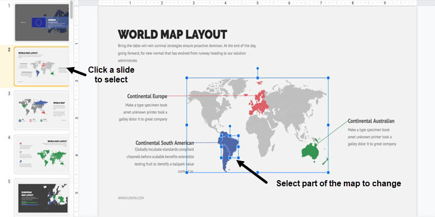
First, click on the slide in the template you want to edit. For this tutorial, I'll select slide #2, World Map Layout.
You can change the color of the country in this slide presentation template. In this map, I'll make Brazil pink instead of blue.
This feature is great if you want to talk about a specific country instead of a whole region. Changing the color of a specific country instead of the region also makes the country stand out.
.jpg)
To change the color of part of the map, click in the part you want to change. Go the toolbar and click the Fill Color tool (it looks like a paint bucket). A color palette appears. Choose the color you would like to use from the palette. Now the part of the map you selected is a different color.
2. Add Labels
.jpg)
Another helpful feature is the ability to add a label. Using labels makes it easy for the audience to find the area on the map that you're discussing in your presentation. For this part of the tutorial we'll use slide #3, World Map. In this example, I chose to add a label to the map of North America.
Select the Line tool in the tool bar and draw your line. I started the line at the North America map. Then, use the Line Color tool (it looks like a pencil) to change the color of your line. I chose green to match the color of the North America map.
.jpg)
The next step is to create a text box to complete the label. You can do this by clicking the Text box icon in the toolbar. Create a box sized appropriately for the label you'll be using.
Next, pick a font and size of font that match your template or presentation theme. Type your label. In this case, I typed "North America." Now you've got a labeled map of North America.
Labels aren't just for labeling a country, region or continent. You can use labels to call out city names, counties, rivers or statistics for a certain area. Using labels calls out the important feature of your map and provides the viewer of the map with the visual information they need to understand your presentation.
3. Change the Background of the Map

For this section of the tutorial I'll use slide #5, European Map Layout. This template background comes in black. If you don’t like the black background and want to change the color of the background of the slide you can easily do that.
Changing the background of the slide enables you to personalize your presentation and can help you to better match the theme of your presentation.

To change the background of the slide, select the slide that you want to change to a new background color. Then select the Fill Color tool from the tool bar. Next, select the color you want from the color palette. You can keep trying different colors until you get the color that you want. Now you've successfully changed the background of your map.
4. Add a Chart
If you want to add a chart to a slide with map on it but aren't sure how to do it—keep reading!
In this tutorial, I add a chart to slide #2. You can do this by going to the tool bar and select Insert. You'll get a drop-down menu. From this drop-down menu select Chart.

You'll get another menu where you can select the kind of chart you would like to insert into your slide. Choose between a pie chart, bar graph, or a column and line graph. Choose the type of chart that'll look best in your slide and portray the data in an easy to understand format. The chart will appear on your slide.

Now that you've got the chart that you wanted added to you slide you can edit it to fit your theme. To edit the chart, right click on it. You'll see a menu on the right side of your page. select Format Options. The Format Options panel opens.
With the Format Options panel you can:
- Change the size and position of the chart.
- Recolor the chart.
- Change the brightness, transparency and contrast (under the Adjustments option).
- Add a drop shadow to the chart.
- Add a reflection to the chart.
5. Add an Icon

Slides #51 through 62 contain icons you can use with your map presentation. For this presentation, I'll use slide #56. You can easily add icons to other slides in your presentation. When choosing an icon to use for your presentation, choose carefully.
Icons are great to add to a map to visually convey information. Icons are also a great tool to use when you need to point out something in a smaller space and don't have enough room for a label. Icons help your audience understand the points that you're trying to make.
The first step after you've selected an icon you want to use is to copy the icon. Right click on the icon with your mouse and choose Copy from the popup menu.

The second step is to paste the icon onto your slide by putting your cursor on the map where you want the icon. Right click with your mouse and choose Paste on the pop-up menu.
Now you've got an icon on your slide. You can move the icon wherever you need it to be on the slide.
You can also change the color by selecting the icon. Click Fill Color. Choose which color you would like the icon to be. Changing the color of the icon helps it to better match the theme of your presentation while also drawing more attention to what you want the audience to see.
5 Tips for Using Templates With Editable Maps
Templates with editable maps are a great time saver if you need to show territories, discuss regions, or include any other geographic information in your presentation. Here are five tips to help you get the most from using editable maps.
1. Use Formatting Carefully
If you color a country or region in a map for presentation, it'll help you to highlight the area that you want to talk about. Labels can also make it easier to point out the area that you're talking about.
If there are many things you need to talk about or if there are many regions you're talking about, try breaking up the places you're talking about into separate slides. If you highlight or label too many places the audience will get overwhelmed. When a slide is cluttered with labels it can distract the audience from what you're trying to say.
Also, when with labels choose a font that's easy to read even from a distance. This will make sure that your audience can read the labels on the map. Fancy fonts can be distracting for the audience too.
2. Add a Map Key

If you decide to add a lot of icons to your map slide, then it's a good idea to have a map key. A map key is a box in the corner of your slide that says what the icons or colors you used mean.
A key will save you from having to explain what the icons and colors mean. It also makes sure that your audience understands every icon, or every color, used on the slide.
In the example above I created a small map key, but you can make a bigger one. When you use a map key, make sure that the key isn't so big that it distracts from the rest of the slide. The map key is meant to be a helpful tool, not a distraction. Having a map key also helps you remember what the icons mean.
3. Add Icons
Add icons to the map for presentation instead of text. Adding symbols can help make sure that you don't have too much text on the map. They make it easy to understand the meaning you're trying to portray, so you don’t have to add as much text to the slide.
There are many icons that are easy to interpret the meaning of. For example, I used the home icon.
4. Have a Q&A Section

Having a question and answer section in a presentation is a good idea if the subject is a complicated one or if you think that your audience may have questions. Having a question and answer section allows you to engage with your audience. Engaging with your audience makes your presentation more exciting.
Google Slides makes it easy to have a question and answer section because they offer the ability for people to submit their questions beforehand. Other audience member can even up vote questions that they also want to know the answer to.
To have people submit their questions before hand click on View in the toolbar. Next, click Present. This will bring you to Presenter View. From Presenter View click Q&A. In the popup window under the tab Audience Tools you'll notice the Start New button.
When you click the Start New button you're accepting questions. The link in the blue bar to your audience is to the URL where the audience can ask questions. Now you know before you give your presentation what the questions will be.
5. Be Consistent
Throughout your presentation you should use an appropriate color scheme. You can choose the color scheme that your presentation comes with or you can choose the colors in your color scheme. If you decide to use your own color scheme, make sure that the colors go together. Using clashing colors can be distracting for the audience.
An example of distracting colors are bright orange and bright purple. Bright orange and bright purple would be distracting for the audience since the colors clash and both colors are bright. If you want to use bright colors in your color scheme use one bright color and make the other color paler than the bright color. The bright color can be used to highlight important areas on a map or important text.
Grab our Free Presentations eBook!
You can also find more information about creating an effective presentation in our eBook on making great presentations. Grab this PDF Download now for FREE with your subscription to the Tuts+ Business Newsletter:

Learn More About Map & Other Presentation Templates
Would you like to learn more about using maps in presentations? Here are some additional resources for you:
.jpg) Microsoft PowerPoint20 Amazing Editable Maps for PowerPoint
Microsoft PowerPoint20 Amazing Editable Maps for PowerPoint Microsoft PowerPointHow to Make Interactive Maps in PowerPoint With Templates
 Presentations18+ Best Google Slides Presentation Themes (Premium Templates to Download - 2019)
Customize a Map Template Today
Now you've looked over some map templates from Envato Elements. You've learned how to customize maps in Google Slides. We've also shared tips about how to make your map presentation better.
Why not customize a map presentation template today? If you didn't find a template you liked on Envato Elements, you can find more editable maps on GraphicRiver.
Original Link: https://business.tutsplus.com/tutorials/make-maps-google-slides-with-templates--cms-33262
Freelance Switch
More About this Source Visit Freelance Switch