
An Interest In:
Web News this Week
- April 4, 2024
- April 3, 2024
- April 2, 2024
- April 1, 2024
- March 31, 2024
- March 30, 2024
- March 29, 2024
Some of Our Sources
- Slashdot
- BoingBoing
- Engadget
- Web Designer Wall
- Abduzeedo
- Naldz Graphics
- Line 25
- Specky Boy
- Spyre Studios
- The Verge
Help Webnuz
Referal links:
10 Presentation Design Tips (To Make the Best Pitch Deck)
If you're not a designer, it can be tough to design a compelling and beautiful presentation. It's even harder to design a presentation for your startup, knowing you'll be going into an investor pitch or standing in front of a room presenting for an important business meeting.
When there's a potential deal on the line, the pressure is on! In this tutorial, we cover ten impactful presentation design tips. Discover how to create a better pitch deck design.

The strategies below will help you craft your pitch deck and preparing it for any important business presentation. Pitching is challenging, and the most powerful pitches are supported by well-designed decks. The purpose of a good investor pitch deck is to:
- Bring across your message clearly, including only your critical points.
- Provide necessary context so people have what they need to make a decision.
- Conclude what next action steps are, including your ask, after delivering your presentation.
Support the previous points listed with a concise narrative that tells your business story and is backed by well-crafted slides.
Before we jump into these slide design tips, get a quick professional start to designing your pitch deck with a professional PowerPoint template. You'll find PPT templates on Envato Elements or trending PPT designs on the GraphicRiver marketplace.
We've got high-quality presentation designs, with a ton of creative slide options—ready for you to download and customize.
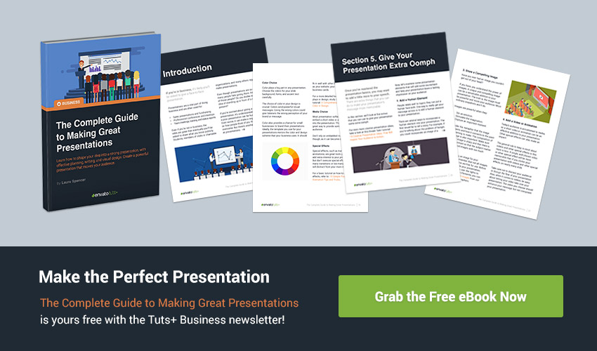
Also, quickly download our eBook: The Complete Guide to Making Great Presentations. It's available for FREE with the Tuts+ Business Newsletter. Learn how to write, design, and deliver the perfect presentation.

Without further ado, let's dive into these presentation design tips.
1. One (Powerful) Photo Is a Thousand Words
First and foremost, never underestimate the power of strong photography in your presentation designs.
.jpg)
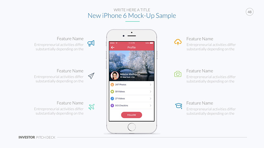
Photography is a powerful tool to convey your message visually. Whether it's emotional photos to deliver a more impactful message, beautiful product photography to convince the value of your product, or striking visuals to enhance otherwise dull slides, photography is useful in many situations.
Presentation Tip: Consider your slides as supporting material while you're presenting. You want the crowd to pay attention to you and your narrative and secondarily your presentation slides. Not the other way around.
Aim to keep to a single photo for each point you make. It's often enough supporting material for you to tell your story and get your message across.
It's wise to keep text to the very minimum in your presentation. This ensures people are paying attention to you instead of getting distracted because you've overdone it with your slide designs.

Photography can be used in creative ways. For example, the Eureka presentation template uses brushes as a mask for photography to give photography in their slide designs a creative vibe. Keep your message clear and enhance it with just a dash of minimal creativity.
Discover more creative PowerPoint templates and tutorials on how to use them:
 Presentations20+ Creative PowerPoint Templates - For Presenting Your Innovative Ideas
 Microsoft PowerPointHow to Make Creative PowerPoint Presentations (With Unique Ideas)
2. Use the Right Colors, Contrast, and Whitespace
Color
When you start learning how to design, colors and the effective use of whitespace is one of the first few subjects that are covered. Because design comes down to effective communication, you can understand the importance of colors and whitespace in your presentation design.
Learning how to use colors effectively is challenging if you're starting out. This is why it's important to find color schemes that do the work for you. Or work from an existing presentation template design, which already has a color scheme in place
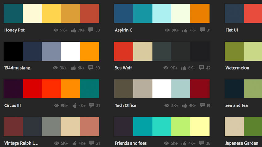
If your company has a style guide, you can use that as a foundation to pick the right colors from. If not, you can use a website such as Adobe's Color, which has a nice selection of ready-made color themes.
Contrast
Contrast is something to keep in mind as well when designing presentations. You want to make sure that your text is legible. You can assure this by having enough contrast between your slide background color (typically white or light-grey) and having an opposite text color (such as black for example).
If you're adding text on your photography, legibility becomes even more important. You can assure this by adding a black overlay with 60% transparency, for example. This makes the image darker and makes text much easier to read.

You can also use contrast to grab people's attention. For example, using a black background color and yellow text creates a strong contrast. Effective use of contrast, especially using it strategically across your presentation, helps people pay attention in the moments when you want them to really dial in.

The Investor Pro presentation template is one of several design pitch presentation examples of using contrasts correctly. By limiting the use of colors and only applying colors in strategic areas during the presentation, you can make your contrasts more meaningful.
White Space
Finally, you've got white space. The easiest way to deal with white space effectively is to give your slides enough breathing room.
Simply put, don't put too many elements on a single slide. Give every element on a slide enough space; this makes your slide easier to digest. Otherwise, your slides will come across as unprofessional and disorganized, and will just end up confusing your audience.
3. Say No to Animations (Mostly)
One of the trickier aspects of slide design to master is the use of animations. In general, the use of animations isn't recommended because:
- They tend to slow your presentation, especially if you're adding a transition animation between each slide.
- They tend to distract the audience while you're constructing an argument or story.
- Finally, they might feel cheesy while you're pitching in a professional context (such as when asking for funding from potential investors).
There are scenarios in which the use of animations makes sense—for example, if you're highlighting certain functionality of a product, or building a story with illustrations, or even subtly animating graphs or statistics.
In those scenarios, the animation helps you with your objective. However, if you're using animations just for the sake of using animations, it means your presentation is probably better off without any in it at all.

4. Prepare Effective Content and Typography
In any presentation, your content matters more than your design. This is why, even in a list of presentation design tips, I still would like to emphasize that you should feel rock solid about the content that you'll present.
To be capable of designing a slide more effectively, it helps to prepare your content separately first. Learn more about how to write your PowerPoint presentation before you design your deck. Work on an overview of the message(s) and story you're bringing. Then, you can use that as a foundation to start designing from.
Simultaneously, it's also a matter of using the right typography to present your content. In general, the use of a sans-serif font is highly recommended as it tends to be more readable on digital screens. Here's a balanced slide design from the Investor Pro Pitch Deck - PowerPoint Template:
The correct font sizing is also important. Make sure the font size is large enough so that in the context you're presenting everyone can read the text on your slides. If you're pitching in a large conference room, the person at the end of the table should still be capable of following along with your presentation just fine.
5. Be Clever (or Even Funny)
Now this has less to do with visual design, but it's still an important tip to keep in mind.
The most effective presentations are the ones that are remarkable and memorable. Especially for pitches where you're competing against other startups, this is important. Your objective is that your audience remembers you and your message after the presentations.
This is why emotional design often helps you craft an excellent presentation. If you connect with people emotionally, they tend to remember your presentation much better than the average person who pitches.
You can hit an emotional nerve typically in two ways:
By Being Funny. By making people laugh, they'll automatically feel more positive about the story you're telling. This is a powerful cognitive dissonance. The risk is to not appear as a comedian: you're still pitching in a professional context, but a laugh every now and then is a welcome relief.
By Being Clever. If you surprise people by providing new insights, they'll remember your presentation better, as you provided value on a personal level for the audience.
In other words, focus on interesting angles for your content. If you can provide meaningful insights or present serious topics from a unique angle, it helps you to stand out in the crowd of typically boring business presentations.
6. You've Got 20 Minutes
Whenever you're spending concentrated time on a single task, we consider this to be your attention span.
On average, we've got an attention span of less than 20 minutes on a task we're not intrinsically motivated to complete.
Keep this in mind for your presentation. Most pitch presentations are limited in time by default, but should you have the option to present for an hour, ideally try and stick to only 20 minutes or even less is better.
It forces you to make your message more concise, as well as keeping people engaged for only as long as their mind is fresh. Once you're past the 20-minute point, it becomes more difficult to convince people of the value of your innovative product or service.
.jpg)
7. Apply the Rule of Three
Another psychological trick is that people tend to remember everything better in pairs of three. You can read more about this on Wikipedia.
An example of applying the rule of three can be describing product benefits: a product that's beautiful, sustainable, and high-quality. The slide design from the Eureka PowerPoint Template below is set up with the rule of three:

This can be helpful while designing slides. If you're adding keywords or benefits or any other type of list on a slide, it works much better to summarize them in three elements (or add an extra one if you only have two).
As a rule of thumb, try to avoid bullet points. For example, if you're highlighting product features, it's much more worthwhile to add three beautiful product screenshots, or illustrations, to your slide design versus writing product features in text.
8. Convey a Single (Focused) Message
When you're designing a presentation, it's best to stick to a single message.
Forcing yourself to focus on one message helps you to put all your energy in getting your point across clearly.
Practically, this translates into the following:
- What's the single message of my presentation as a whole?
- What's the single message of my next slide?
Especially the last question—the message of your slide—helps you identify what the best possible design for your slide would be. The ideal slide design might be a few words, a strong photo, or perhaps even a single number.
The easiest advice to apply is to simply use as little text as possible.

A great presentation template that's got some excellent slides you can use as a foundation for your presentation is the Simplicity premium PowerPoint template.
9. Tell Engaging Stories
In presentation deck design, one aspect I always try to keep in mind is the notion of flow. The idea of flow is that your slides transition smoothly into each other. This has to do with bringing a great story but also with assuring that your slide design supports the story is important.
The most interesting presentations deliver a story. Rather than just listing facts and features, including a story tends to engage people better. It's often true that the best people in business are great storytellers.

For investor pitch decks, you typically have a presentation flow that looks a little like the following:
- Start by outlining the problem the product is trying to solve. This is often accomplished by telling a personal story.
- The presentation often includes photography to make it easier for people to visualize the story.
- This is followed by presenting the product and how exactly the product solves the problem.
- Include data that backs up the points that you make.
- Finally, there's a plan on how the product will ultimately become a profitable business.
As you can see, any well-thought-out presentation has a number of stories that you're telling the audience. Consider this to be your table of contents for your presentation. In the above example, this is:
- Problem
- Solution
- Practical Plan
In a pitch deck, one of the best ways that you can tell a story is by showing data. Investors and audience members alike care about data to ensure that their investment (of time or money) is a good one. Use a slide design like the one below from Latitud to bring data to life, visually.

Now, each story you're telling often requires different slide designs in order to support the story better. For the above design pitch presentation example, this might be the following:
Problem. Mainly photography and data slides to provide visual support and evidence.
Solution. Mainly textual and illustrative slides using the rule of three to provide content.
Practical Plan. Typically slides constructed with a single message, whether it's a number, a strategy or a chart to convince stakeholders.
When you think of your presentation as a collection of stories, it'll help you figure out what type of slide design packs the most punch and tells your story in the clearest way.
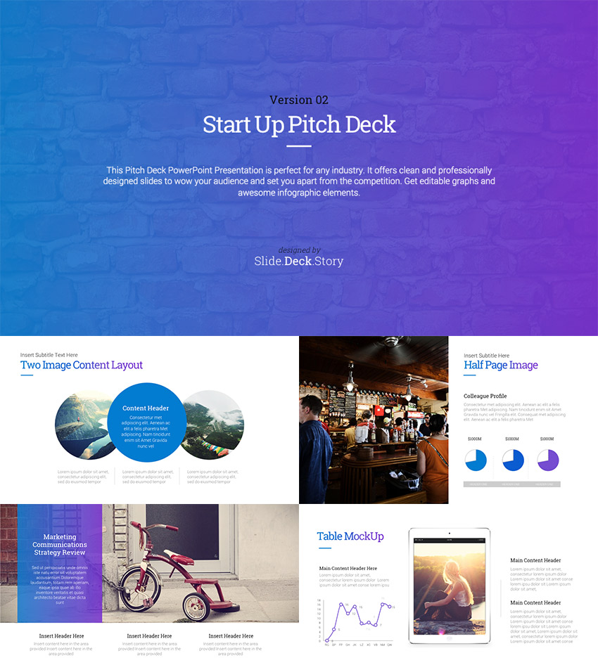
If you're looking for a variation of different slide designs to support your narrative, the following Pitch Deck template is a great source of inspiration:
10. End Remarkably
If you're able to do all of the above, you've already done an amazing job. If you're looking for the little extra to make the difference, ending your presentation in an unforgettable way is how to do it.
The most famous example would be Apple's "one more thing" as Steve Jobs concluded his presentation by making another, often even more exciting announcement during his product Keynotes. The following YouTube video, from Apple Explained, looks into the phrase further:
By giving the notion you're wrapping up your presentation, only to conclude with something more amazing (number of active users or a unique new feature you're about to release for example), you make sure that your message will stick better.
Surprise is a powerful tool. By showing impressive facts when the audience expects it the least, you've just delivered a remarkable pitch.
Learn more about how to create engaging presentations that grab an audience's attention and persuade effectively:
5 Great Pitch Deck Design Examples (You Can Use Today!)
Serial entrepreneurs finally have a design option that won't cost them more money with each company launch, thanks to Envato Elements. The flat-rate model means that each and every pitch deck is included with a single subscription.
Envato Elements is the perfect service if you want to experiment with many pitch designs. There are hundreds of templates that are perfectly suited for pitch decks, as well as supporting assets like stock photos and graphics. Open a template, add your idea, and present with confidence.

Let's look at five of my favorite design pitch presentation examples that are included with your Envato Elements subscription:
1. Pitch Werk

Pitch Werk is a pitch design template that's consistently ranked as a top choice for launching a company. It includes all the key slide designs that investors and potential employees will look for in your big idea pitch. Customize this easily, choosing from five color schemes to never re-use the same slide twice.
2. Nia Pitch Deck

Nia makes great use of space on the slide, balancing beautiful elements with white space that keeps it readable. One of my favorite features are the custom image masks (shapes) that you can update with drag and drop placeholders. This transforms your standard images into stylish and modern shapes as you can see in Nia's preview images.
3. Latitud Business Pitch Deck

Latitud has all the go-to slides that an aspiring entrepreneur could possibly need. With more than 70 slide designs, it's hard to imagine anything missing from this presentation deck when you prepare to launch your big idea.
4. Fintech Startup Pitch Deck Presentation

Fintech, a portmanteau of "finance" and "technology" is certainly one of the most popular types of startup in 2019. This deck captures the spirit of that segment with fresh and modern slide designs that are catered at financially savvy audiences. However, this pitch deck design is flexible enough to be used for many niches with a bit of adaptation.
5. Pitch Vol. 3 Pitch Deck Presentation

Pitch volume 3 is the latest rendition of a popular series of pitch design templates. You'll notice that this slide deck has a great balance of data charts and graphs that can help you show your startup metrics to interested investors.
For even more templates that you can use for design pitch presentation examples, we've got a couple of great resources. Browse the 25 Best Pitch Deck Templates for a deep set of pitch ideas. Or, learn a bit more about the individual slide concepts in The 10+ PPT Slides Every Investor Pitch Deck Needs.
Grab This eBook on Making Great Presentations (Free Download)
Download The Complete Guide to Making Great Presentations now for FREE with a subscription to the Tuts+ Business Newsletter.
It'll help you learn the complete process of how to write, design, and deliver great presentations. Get your ideas formed into a powerful presentation that'll move your audience.
Apply These Design Tips to Craft Your Pitch Deck for Investors
Well-prepared content in combination with beautifully crafted slide designs is the recipe for engaging presentations.
By making it even more remarkable by applying the presentation tips above, you ensure that you can stand out in the crowd and get the attention of investors with your pitch deck design.
Need to kickstart your next presentation using the above techniques? We've got a number of great pitch deck templates featured in this article:

If you're looking access to hundreds of professional PowerPoint templates, we've got a powerful (unlimited use) offer from Envato Elements.
Or, take a look at our most popular PowerPoint templates on Envato Market. Our PPT template selection offers plenty of design flexibility, without the headache of having to start from zero.
Best of luck with your pitch!
Editorial Note: This tutorial was originally published in May of 2016. It's been revised to make it current, accurate, and up to date by our staff--with special assistance from Andrew Childress.
Original Link: https://business.tutsplus.com/tutorials/10-presentation-design-tips-for-the-best-pitch-deck--cms-24860
Freelance Switch
More About this Source Visit Freelance Switch