
An Interest In:
Web News this Week
- April 14, 2024
- April 13, 2024
- April 12, 2024
- April 11, 2024
- April 10, 2024
- April 9, 2024
- April 8, 2024
Some of Our Sources
- Techcrunch
- Web Designer Wall
- Spoon Graphics
- Smashing Magazine
- You The Designer
- CSS Globe
- CSS Tricks
- Codrops
- Dev To
- Hashedout
Help Webnuz
Referal links:
How to Create Webinar Landing Pages (That Get Registrations)
There is no doubt that webinars are one of the most powerful strategies for generating more sales, increasing your revenue, and building your audience. Due to their interactive nature, you can connect with your audience and let them get to know you and your brand. This, in turn, creates brand trust and makes your audience more likely to buy your product or service.
But, before you hold your webinar, you need an audience and a way to generate a list of attendees. The best way to do that is with a high-converting landing page template. If you've been wondering how to create the best webinar landing pages that get you more registrations, you're in the right place.
In this article, we'll discuss the essential elements of a high-converting webinar landing page, how to drive traffic to your registration page, and showcase examples of the best webinar landing pages that you can use for your inspiration.
Webinar Landing Page Best Practices
A great webinar landing page will inform visitors what the webinar is about, share the time and date when the webinar is taking place, and convince the visitors to register and attend the webinar.
It should include the following elements:
- An enticing headline
- Convincing copy
- Call to action
- Registration form
- Helpful visuals such as images and video
Let’s discuss each of those elements below.
1. Craft an Enticing Headline
According to research done by Copyblogger, nearly 80% of people will read your headline, but only 2% will click through and read the rest. When you take that into consideration, it's clear that your headline plays a rather important role on your webinar landing page. Your headline needs to encourage visitors to read the rest of the page.
In other words, your headline serves as a hook and should intrigue the visitors and pique their curiosity so they continue reading. Here are a few tips that'll help you craft enticing headlines:
- Use numbers such as "5 Ways to...", "7 Secrets That Will Help You Avoid...", etc.
- Lead with a key benefit that speaks to their pressing problem
- Consider using a reference to a popular movie, book, or other cultural influence
- Frame your headline as a question
- Include an emotion
Once you've got your title, consider using a tool like Headline Analyzer by CoSchedule to see how compelling your title is and how you can improve it.
You can also include a subheading that offers an additional explanation on the topic of the webinar, like a brief summary. Your subheading should be clear and drive visitors further down your page to support your headline and get them to actually read the rest of your copy.
2. Write Compelling Copy
Your body copy will take up the most space on the page, which means it needs to help convert those visitors into actual registrants. You might be tempted to include as much information as possible in your copy, however, this can actually have a negative effect. Remember, nobody likes a wall of text so it's better to keep your copy down to a minimum.
Here are a few tips that'll help you share all the necessary information and still keep your copy lean:
- Briefly introduce your topic and why it matters.
- Make sure the benefits are immediately clear so your audience knows what they can expect to gain by attending your webinar.
- Use keywords naturally.
- Keep the copy conversational by using ''you'.'
- Include testimonials to create trust.
- Consider creating urgency by limiting the number of available seats.
3. Include a Call to Action
If your headlines are your hook and your body copy is the meat of the page that pushes visitors towards conversion, your call to action is what will make those visitors convert.
Your call to action button should stand out on the page and make it clear what the next step is. Make sure to:
- Use contrasting colors for your CTA button.
- Your actual call to action should use action words such as "Save my seat" or "I'm in!" You can also try adding arrows after words like so: "Save my seat >>"
- Try to include your button above the fold. A good place to place it is below the headline and once again below the body copy.
- Focus on getting registrations to your webinar, don't try to sell anything here.
4. Don't Forget the Registration Form
Once people click on your CTA button, it should take them to the registration form. You can either have the registration form on a separate page or have it appear as a lightbox popup. Since your landing page worked so hard for you so far, make sure to implement the following tips on your registration form to avoid visitors changing their mind:
- Keep the form simple. Ask only for their name and email. Since you aren't selling them anything there is no point in asking for their physical address
- Make sure the form is easy to fill out on mobile devices as well as on desktop computers
- Offer the ability to save the date and time to their calendar
5. Add Video and Images to Support Your Copy
Lastly, consider adding video and images that'll support your body copy and create a sense of trust in your audience. Considering video can help increase conversions by 80%, it's a good idea to include a brief video that welcomes your visitors and explains what the webinar will be about.
As far as images go, include images of you and any other speaker that'll be on the webinar as well as images from past clients and customers in their testimonials. An attractive header image behind your headline can help explain the topic of the webinar as well.
How to Drive Traffic to Your Webinar Landing Page
Now that your webinar landing page is done, it’s time to drive targeted traffic to it. While optimizing your landing page for SEO is not a bad idea, especially if you plan on running the webinar regularly, it won't help you gain traffic immediately. As such, you'll need to implement a few other techniques to gain visitors to your landing page:
Consider paid advertising. Using paid ads such as Facebook Ads or Pinterest Promoted Pins is a great way to reach a larger audience for a low cost and increase not only the number of pageviews, but also the number of people who register for your webinar.
Promote on social media. Make sure to write several updates for various social media channels and incorporate them into your social media scheduler of choice.
Link to your landing page in social media bio. As your webinar date approaches, replace the link in your bio with a webinar registration page and point to it in your bio description.
Send an email to your list. Don’t forget to send an email campaign to your existing list and invite them to join you on the webinar.
Use negative keywords in your ad campaigns. Using negative words in your ad campaigns will help you filter out the audience that wouldn't be a right fit for your webinar and fine tune your targeting.
10 Best Webinar Landing Page Examples For Your Inspiration
Now that we've covered how to create a webinar landing page that gets registrations, let's take a look at some of the best webinar landing page examples that you can use as an inspiration.
1. Microsoft Azure
This webinar landing page by Microsoft does a great job of explaining what you'll get by attending. The headline is clear and the copy uses a list of bullet points to provide a summary of the topic that'll be covered. The registration form allows visitors to choose between two dates or to watch a webinar on the demand and then offers a simple Submit button.

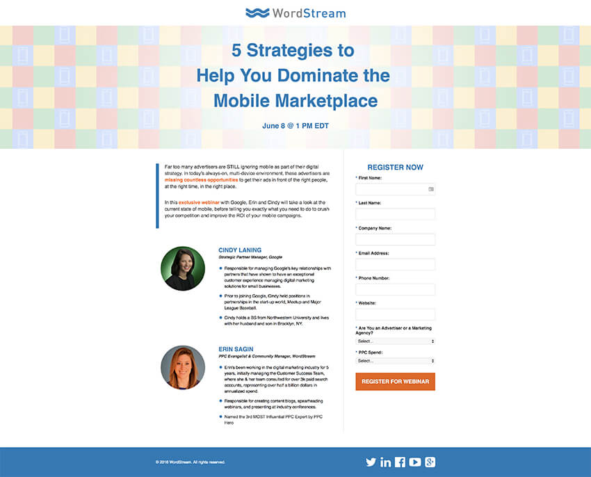
2. WordStream
WordStream’s webinar registration page uses their brand's blue color throughout the page, which is an excellent way of reinforcing their brand. In contrast the call to action button on the webinar form uses a complimentary orange, which makes it stand out from the rest of the page. Their copy is also easy to understand and bullet points of speakers' achievements is a nice way to showcase their credibility.
3. Content Marketing Institute
Content Marketing Institute uses a brief paragraph summary to describe their webinar and then goes on to present the key speakers. The speaker’s bio, along with their photo, gives proof of their expertise while the webinar form on the left makes it easy to register.

4. Nvidia
Nvidia does a great job of filtering out the audience with its technical title, but the copy itself makes it very clear what you'll learn in the webinar. Their form is a little on the long side, however, it's another way to not only filter their attendees but also to gain insight into their audience.

5. Kapost
Kapost's webinar landing page uses a blue background above the fold as a means of using color psychology and creating a sense of trust for the visitors. They also use an orange button, which stands out from the rest of the page. Their entire page gives plenty of information about the webinar, down to the expected duration and breaks and the most important topics that'll be covered.

6. Hootsuite
Hootsuite does a great job of creating an enticing headline that makes the topic clear and encourages readers to find out more. The webinar form is rather prominent above the fold and next to a brief description of the webinar, which is a good way to increase the number of signups. You'll also notice that they've included social media icons so registrants can share the webinar sign up page and help Hootsuite increase the number of registrations.

7. Julie Stoian
At first glance, it looks like there is a lot going on with Julie Stoian's webinar landing page. However, when you look closer, you'll notice her headline uses clear language as well as numbers that promise to teach you how to build any type of business. She also makes use of urgency with a timer right above the registration form. The rest of the page is designed to boost her authority by sharing her background story in both written and video format and she also added logos of places that featured her.

8. Upwork
An attractive image along with a clean and easy to fill out webinar form makes Upwork's webinar registration page very effective. They share the most important details above the fold and the CTA button stands out against the image. The speaker information is shown below the fold in the form of a brief bio and a headshot.

9. Deluxe
Deluxe's webinar registration page is rather minimal, but it still manages to convey the benefits that the webinar will focus on. You can reveal more information by clicking the More link or skip straight to the webinar sign-up form, which increases the likelihood of visitors signing up.

10. Groove
The last page on our list comes from Groove and makes it easy to not only see the title, but also the date and time of the upcoming webinar. The orange copy would be a little harder to read if they didn’t use a dark overlay on the image, but the webinar form on the right is very easy to spot and fill out.

Create a High-Converting Webinar Landing Page
A high-converting webinar landing page can help you increase the number of registrations for your webinar. Thanks to easy-to-use landing page templates, you can have your webinar landing page up and running in a matter of hours. Find the perfect webinar landing page template over on Envato Elements and then use the tips in this article to design your high-converting webinar landing page.
Original Link:
Freelance Switch
More About this Source Visit Freelance Switch