
An Interest In:
Web News this Week
- April 27, 2024
- April 26, 2024
- April 25, 2024
- April 24, 2024
- April 23, 2024
- April 22, 2024
- April 21, 2024
Some of Our Sources
- BoingBoing
- Simplebits
- Pearsonified
- Smashing Apps
- Creative Curio
- My Ink Blog
- CSS Globe
- 24 Ways
- Specky Boy
- Dev To
Help Webnuz
Referal links:
How to Make Great Charts in Microsoft PowerPoint
I constantly meet people who describe themselves as "visual learners." They use graphics to understand the world.
This shouldn't be a surprise in the Internet era. It makes perfect sense that it's easier to look at a chart and draw conclusions than work through an oversized spreadsheet. I think of charts as the alternative to messy lists of data.

When we're giving presentations, we have to keep this in mind. If our audience is full of visual learners, we need graphics that drive the key points of a presentation. A few well-placed charts and graphics will ensure your audience comes away understanding your important points.
It should come as no surprise that PowerPoint makes it easy to create charts. You can build and customize charts and graphs right inside of the app.
In this tutorial, I'll teach you how to create charts inside of Microsoft PowerPoint. Instead of overwhelming your audience with a spreadsheet, show them a graphic that summarizes your findings. Let's get stared.
How to Make a Chart in PowerPoint (Watch & Learn)
The screencast below is a step-by-step guide to building your first chart in PowerPoint. I'll walk you through building a chart right inside of PowerPoint.
Here's what I'll cover:
- How to insert your first chart on a PowerPoint slide.
- How to add and modify data using Excel inside of PowerPoint.
- How to tweak the look and feel of your chart to help it stand out.
After you watch the video, keep reading the tutorial below to find out more. I'll cover additional types of charts and how to customize their style as well.
Quick Tip: Use a PowerPoint Template With Great Charts
To save time, you can also work with already made charts, infographics, and pre-made styles with a professional PowerPoint template. For one with dozens of professional charts and graphs built in, check out the popular Marketofy PPT template set:

Now let's dig into the written part of this tutorial to learn more about working with PowerPoint charts:
How to Make Your First Chart in PowerPoint
To insert your first chart, find the Insert tab on PowerPoint's ribbon menu. Click on the Chart icon to launch the Insert Chart menu.

The Insert Chart menu will open with a variety of chart templates. On the left side, you'll see a variety of PowerPoint chart types, such as Column, Line, Pie, Bar and more.
Start off by clicking on a chart type on the left side. You'll want to consider the type of data you're showcasing when choosing a chart type. Here are a few common PowerPoint chart types, and the type of data they're used to show:
Column - Column charts are a classic way to show values, with vertical lines showing values based upon their height.
Line - Line charts are used to show data over a series of time, and how the value fluctuates over a time series.
Pie - Pie charts show parts of the whole as slices, and help you relate the individual pieces to the total.
Bar - Bar charts are the horizontal counterpart to column charts, showing values as bars running from left to right.
Area - Area charts are similar to line charts, but highlight the area underneath the line as a sum.
There are several other advanced charts (like Histograms and Waterfalls) inside of PowerPoint, so try them out for more advanced charting.

After you've selected a chart category, there are several variants of those charts available at the top. Click on one of the thumbnails above to select a more specific chart style.
In the screenshot below, you can see several variants of pie charts. There are 3D pie charts, doughnut style circular charts, and even fancy "Pie of Pie" charts! Choose one of these styles, and then click OK to insert a chart.

Inputting Data into PowerPoint
No matter which chart style you choose, you'll need to input data into PowerPoint to bring a chart to life.
These days, you really can't only install just one app from the Microsoft Office suite. They work too well together. You can easily see why after inserting a chart, as an Excel spreadsheet window opens inside of PowerPoint 2016 to add your data. That's useful.
For my example, I'm going to create a pie chart. After inserting the chart, you'll see an Excel spreadsheet window open to add your data in.

Depending on the type of chart you chose, your spreadsheet may look different than my example. A stacked bar chart, for example, might have multiple columns with numeric values inside of the spreadsheet.
Here's the reason I love using PowerPoint to build charts: as I input the data, the chart will update in real time. Each time that I change the values in the spreadsheet, the chart will change to align with my data.
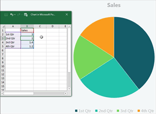
What if we wanted to add another slice to our PowerPoint pie chart? In this case, we'll need to add another row to our data. Grab the handles of the box around your data, and pull it down to include other rows.
In the screenshot below, you can see what I mean. I clicked on the purple box (first column) and pulled it down two rows to add additional months to my data. Then, I pulled down the values column (in blue) to include other amounts in the pie chart.

These are the basics of adding data to your charts. PowerPoint starts with basic data populated in a spreadsheet, and you can modify it to include your own data.

If you need to reopen this spreadsheet view and edit your data, simply right click on the chart and choose Edit Data. The embedded spreadsheet view will reopen so that you can update the data.
After you've finished updating your data, we can think about styling it and changing the look and feel of the PowerPoint chart.
Customizing Chart Styles in PowerPoint
I always master the data in a chart before I begin styling it. But when I'm finished with building out my charts, PowerPoint has plenty of options to change the look and feel of a chart.
You can work quickly with PowerPoint chart tools. Here are a few of my favorite ways to style PowerPoint charts with just a few clicks:
1. Working With PowerPoint Chart Styles
With your chart selected, find the Design button on the PowerPoint ribbon, just under the Chart Tools tab. No matter which type of chart you're working with, there are many preset styles to change the look of your chart in PowerPoint.
Click on one of these styles to apply it to your chart. Many of these will add some shadow or depth to the chart, which can really help your chart stand out. Try out some of these styles for different ways to view the same data.

2. Change Chart Colors in PowerPoint
In addition to styles that add depth or contours to your charts, you can also easily change the color scheme with just a couple of clicks within PowerPoint chart tools.
While you're still on the Chart Tools > Design menu, find the Change Colors button near the left side of the ribbon.

The built-in color schemes will pair with your presentation. You can also typically select monochromatic styles for something less flashy.
3. Format Chart Area in PowerPoint
To really get under the hood with your PowerPoint presentations, you can right click on the chart and choose Format Chart Area.
In Excel 2016, a panel will open up on the right side. This menu has every imaginable feature to customize your charts.
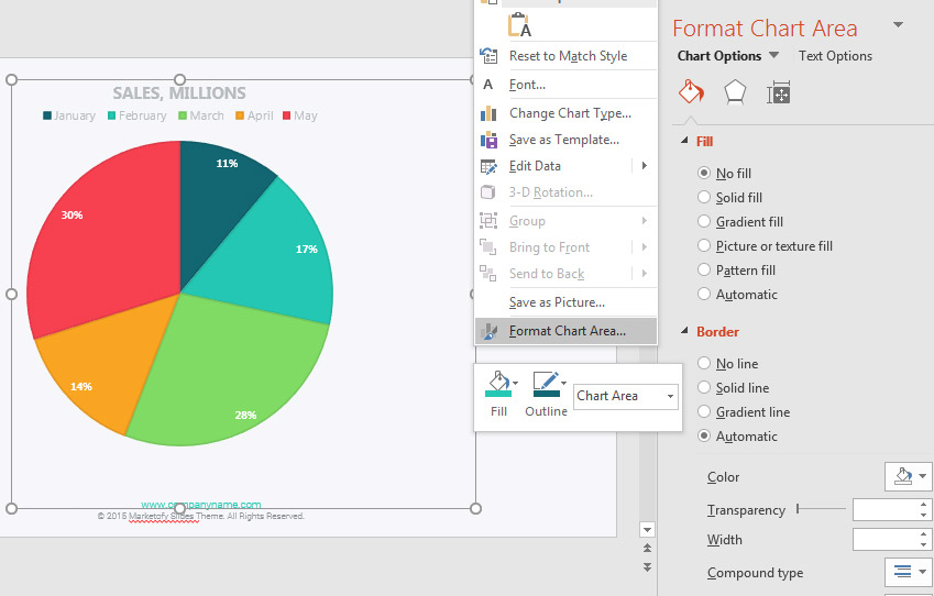
The good news is that this menu is easy to use, and has every feature you could possibly need. Try out some of the self-explanatory options to add Fill (background color of a chart) or a Border around the edge of a chart.
As you can see, it's easy to change up the style of your presentation with just a few clicks. Try the built-in styles and color schemes as a way to make your charts stand out from the rest of your presentation.
Recap and Keep Learning More About PowerPoint
In this tutorial, you built your first chart in Microsoft PowerPoint. Use well-placed charts in your presentations to break up thick sections of data or bullet points.
Check out our Ultimate Guide to the Best PowerPoint Templates or jump over to trending best selling PPT templates on GraphicRiver. Also, if you need more PowerPoint designs to work with that have plenty of great charts and infographics built into them, then browse through:

Don't stop learning here. Check out these tutorials to learn more about improving your PowerPoint presentations:
- SmartArt is similar to charts, but is more focused on data overlaid on top of graphics. Check out How to Get Started With Using SmartArt in PowerPoint.
- Animations pair well with charts, and Sven Lenaerts' 10 Simple PowerPoint Animation Tips and Tricks is the perfect primer on PowerPoint animation.
- If a chart isn't the right tool to showcase your data, a table might be a good alternative. Check out How to Style Tables in PowerPoint in 60 Seconds.
How do you use charts in PowerPoint? Let me know if you have any questions about this tutorial in the comments.
Original Link:
Freelance Switch
More About this Source Visit Freelance Switch