
An Interest In:
Web News this Week
- April 28, 2024
- April 27, 2024
- April 26, 2024
- April 25, 2024
- April 24, 2024
- April 23, 2024
- April 22, 2024
Some of Our Sources
- Engadget
- Just Creative
- Joshua Blankenship
- Spoon Graphics
- Smashing Apps
- Noupe
- Fudge Graphics
- Willems Lab
- Daily Now
- Dev To
Help Webnuz
Referal links:
How to Make Professional Charts in Google Sheets
Charts are visual summaries of our data. It's much easier to find meaning in a beautifully illustrated pie chart or bar graph than a list of data. A well-placed chart in your presentation can help your audience have an "aha!" moment to understand your data.
When I have a large list of data, I frequently will throw it into a chart quickly to analyze it. If I'm looking for trends, or the largest part of the whole, it will quickly jump out in a chart. Charts are all about bringing meaning to your data.
One of my favorite tools to create charts is Google Sheets. It's free and lives inside your browser, so no need to purchase another tool like Microsoft Excel. In this tutorial, I'll teach you how to use Google Sheets to easily create attractive charts.
How to Quickly Make Google Sheets Charts (Watch & Learn)
If you want to get started with charts in Google Sheets, check out the screencast below. I'll walk you through creating your very first chart inside of Google Sheets.
The tutorial below has more examples of how to use charts in Google Sheets. Read on to become a master of visual data.
How to Make Your First Google Sheets Chart
If you've not created your Google account, start off by jumping over to the Google Drive homepage. You can login with your existing Google account, or create a free Google account to get started.
1. Create a Sheet
After you've logged into your Google Drive account, create a new sheet by clicking on New and choosing Google Sheets. This will create a new spreadsheet where you can add your data, and then build charts utilizing that data.

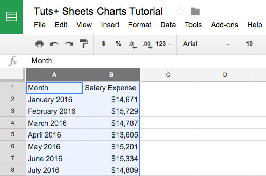
2. Add Your Data
Every chart begins with data inside of a Sheet. Each record should be on its own line in the spreadsheet.

If you want the chart to show a summary of your data, make sure and group the data before creating a new chart. For example: sum up your results by month instead of using each individual day will keep your chart nice and clean.
3. Highlight the Data
After you've logged your data inside of a spreadsheet, highlight the columns that you wish to include inside of your chart. My favorite way to do this is simply to click on the column headers (the vertical lines with letters above them) and highlight them.
It's best to highlight the entire column. This way, adding more rows to the data later on will automatically include them in the chart, and it will update in real time.
You can also highlight only the columns that you want to include your data. Click on a column to include it in the chart, and then hold Ctrl on Windows (Cmd on Mac) and click on another column header.
4. Choose Insert > Chart
Once you've selected your data, find the Insert menu just above the spreadsheet. Choose Chart to insert your chart into your Google Sheets.

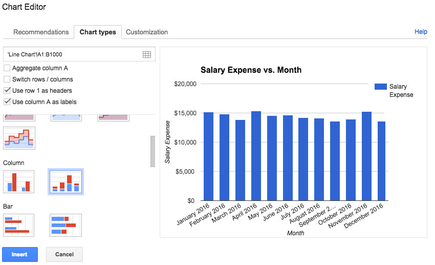
5. Choose a Google Sheets Chart Format
Now that you've launched the Google Sheets chart creator, you can choose between a variety of different chart formats The type of chart that you choose should be based upon the format of the data you're working with, and the way you wish to present the data (more on that in a minute.)
After you launch the chart editor, there are several tabs to create your first chart. One of my favorite features of Sheets is that it suggests chart types. It actually looks at the data you selected, and suggests a chart that fits the data structure. The Recommendations tab contains several ideas and variants to present your data.

If you don't like the recommendations, choose the Chart Types menu to choose from all of the possible chart formats. You can select form a variety of chart types, and also slight variations on each chart type (like smooth lines instead of jagged ones for line charts.)
You can also choose Customization to tweak the presentation of your chart. I prefer to insert my chart first, and then tweak it as needed.
6. Customize Your Google Chart
After you've placed your chart into your Google Sheet, you can customize it to look exactly the way you want, including updating the title of the chart and changing its presentation style.

To access the editing options, right click (control click on Mac) on your newly placed chart and choose Advanced Edit. This opens up the chart editing options to design the chart to your liking.
There are a litany of options for customizing your chart, ranging from changing the chart title or the colors of your line. Below, you can see an example of a modified chart:

Notice that you can also switch back to the Chart types tab on the menu if you want to change the entire chart.
You've created your first Google Sheets chart. Now, it's time to think about how best to use them and how each type differs. Let's keep learning.
4 Common Types of Google Charts (And When to Use Them)
Google Sheets allows you to create a variety of different charts. Here are visual examples of each type of chart with guidance on when you might use each one.
1. Line Charts
When to Use Them - To show your audience how the data has changed over time.
Example - Show the company's salary expense, month-by-month.
A line chart is great for time series data. For example, if you want to see how your company is performing each month, you could plot the revenues over time to show the fluctuations in the company's results.

2. Area Charts
When to Use Them - Visualizing two related parts that make up a total.
Example - Show the total employee cost by stacking the salaries and benefits.
Area charts give you a sense of scale by coloring in the area below the lines. I like to use these to "build up" a cost or amount by stacking the bars on top of each other.
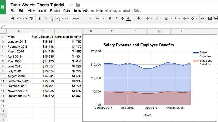
Sheets features a variety of ways to present area charts. In the example above, I've got my employee costs illustrated in a chart. The combination of salaries and benefits are the total employee cost.
3. Column Charts / Bar Charts
When to Use Them - Showing the height of each item, and comparing it to related items.
Example - Use a stacked bar chart to represent the values of your daily steps, easily comparing it other days.
Column and bar charts are similar, as they use vertical lines to show values. Column charts use vertical lines, while bar charts are horizontal lines. In either case, they can help you understand the magnitude of the items they represent.

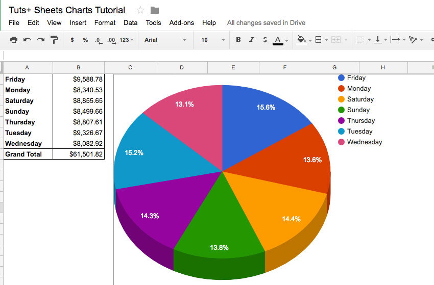
4. Pie Charts
When to Use Them - Showing how the parts relate to the whole.
Example - Showing the percentage of your time you spend on each project.
A pie chart is a classic presentation tool, showing how the parts of data relate to the whole. You can use a pie chart to draw attention to how much time is being spent on certain types of work, for example.
A Google Sheets pie chart will automatically help you calculate the percentages. Put your data in two columns and create a pie chart to automatically divide up your values into categories.

Which Google Sheets Chart Type Should I Use?
Choosing any chart does come down to personal choice, as many of the styles have overlap in how they could be used with your data. It's easy to switch between chart styles or tweak the specifics in Sheets.
My top tip for using charts is to start by thinking about what you're trying to tell the audience. Think about what that data means, and choose Google chart styles that convey that message.
Recap and Keep Learning
Many people identify themselves as visual learners. I think the best part about charts is that they acknowledge that we all learn and understand in different ways. Your audience is likely full of visual learners, and charts can help drive your message.
Envato Tuts+ has a wealth of resources about spreadsheets and presentations. Check out these tutorials to keep learning:
- The advantage of Google Sheets is its ability to connect to other web services, like Google Finance. Try out stock tracking with How to Track Stock Data in Google Sheets.
- Sheets also allows you to connect to other services using IFTTT like Twitter, Dropbox, and more.
- Melissa Murphy has a great tutorial on how to Turn Your Google Docs Form Responses Into Beautiful Visualizations, which will teach you surveying and charting in one tutorial.
Do you have any questions about charts? The comments are open for questions or tips of your own.
Original Link:
Freelance Switch
More About this Source Visit Freelance Switch