
An Interest In:
Web News this Week
- April 20, 2024
- April 19, 2024
- April 18, 2024
- April 17, 2024
- April 16, 2024
- April 15, 2024
- April 14, 2024
Some of Our Sources
- Slashdot
- Engadget
- Technology Review
- Smashing Apps
- Stylized Web
- CSS Tricks
- Spyre Studios
- Freelance Switch
- Web Resource Source
- TechPowerUp
Help Webnuz
Referal links:
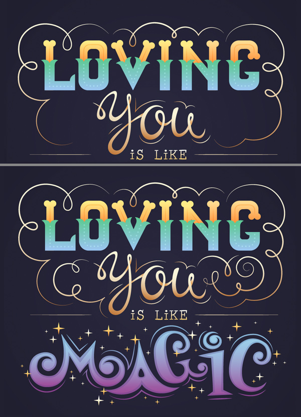
How to Design a "Love" Lettering Card in Adobe Illustrator
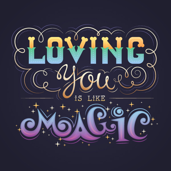
Love is in the air! Love is everywhere! In this tutorial we’ll go through an inspiring process and create an intricate lettering postcard. We’ll be combining various techniques, starting from working with basic geometric shapes and tools and moving on to freehand writing, using the drawing tools of Adobe Illustrator! We’ll finish up by working with colors and adding some ornate details.
By the end of this tutorial, you will have an elegant lettering postcard that can become a lovely present to a dear person.
What is more, you can apply the same techniques to make any other
hand-lettering card or poster, whether it is an original birthday congratulation postcard,
a greeting card, or a stylish wedding invitation. If you feel as if you’re out of
ideas, I highly recommend browsing throughEnvato Market to find yourlettering inspiration! And if you’re ready, let’s jump right into the process!
1. Shape the Letters of Love
Step 1
Start by making a New Document of 450 x 450 px
size.
I usually start creating my lettering cards
from rough sketches, searching for ideas and balanced compositions. Your sketch
doesn’t have to be perfectly aligned and neat. Here is the one I’ve made; it
looks quite quirky and uneven, because I've made it very fast in order to fix my idea on paper. I’ll be using this sketch just as a reference
for my future card. I place it on a separate layer, double-click the layer, and tick the Template checkbox to make the layer 50% transparent and to lock
it.

Step 2
Let’s start shaping the word “loving” fromthe letter L. Use the Rectangle Tool
(M) to make an 8 x 50 px
light-yellow shape. Make another stripe
on top, setting its size to 10 x 25 px andfilling it with turquoise.

Step 3
Now let's render the decorative elements of
the letter, which will be used for all other letters as well. Take the Ellipse Tool (L),make two 12.5 x 12.5 pxoverlapping circles, and place them on the left side of the turquoise stripe, as shown in the screenshot below. The
color of the circles doesn’t matter—I’m just making them contrasting and visible.
Select both circles and click Minus Front
in the Pathfinder panel to cut the
top circle off.

Step 4
Now that we have the crescent shape, let’s
make it fit the turquoise stripe. Select both the stripe and the crescent, take
the Shape Builder Tool (Shift-M),
hold Alt and click the bottom piece of
the crescent to delete it.

Step 5
Use the Eyedropper Tool (I) to pick the color from the stripe and apply it
to the decorative element. Double-click
the Reflect Tool (O) and flip the
shape over the Vertical Axis. Click theCopy button to add a reflected shape and attach it to the opposite side of the
turquoise stripe. This way we create a retro floral look for our letter.

Step 6
Let’s select all the turquoise pieces and Unite them in the Pathfinder into a single shape. Use the Delete Anchor Points Tool (-) to get rid of the unneeded points at
the edges of the merged shape. If the shape looks deformed or non-symmetrical,
use the Direct Selection Tool (A) to
fix the anchor points and the anchor handles. Remember to hold Shiftif you want to position the handles straight
horizontally or vertically.

Step 7
Now add a 30 x 10 px rectangle for the horizontal part of the letter L. Create
another small6 x 7.5 pxrectangleand place it on the right side of the shape.

Step 8
Select the top right corner of our small
rectangle with the Direct Selection Tool
(A) and use the Live Corners
feature to make it fully rounded.
Let’s use the Align panel to position the
shapes properly. Select both the horizontal stripe and the rounded rectangle
and then click the horizontal stripe once again to make it a Key Object (it will be marked with a
thicker selection). Click Horizontal
Align Right in the Align panel
to align the shapes to the right.
Align all other parts of the letter, if
needed.

Step 9
Now let’s decorate the top of the letter.
Make a 7 x 7 px yellow circle and
place it on the left side of the yellow vertical stripe. Hold Alt-Shift and drag the circle to the
right, making a copy. Now our letter L has a softer, rounded look.

Step 10
Let’s add some more decorative elements.
Use the Line Segment Tool (\) or the
Pen Tool (P), hold Shift and make a
vertical stripe in the center of the letter. Set the Stroke color to darker yellow. Head to the Stroke panel and set the Weight
to 1 pt. Setthe Profile to Width Profile 1
in the bottom of the Stroke panel, making
the line thicker in the middle and thin at the ends.
Select the line and press Control-[ several times to place it
beneath the turquoise shape.

Step 11
Add a cornered line on top of the turquoise
shape and make the Strokecolor light-turquoise. And here is the easiest way
to make the dotted line: in the Stroke
panel, tick the Dashed Line
checkbox, set the dash to 0 px and thegap to 4 pt. Set the Weight to 1.5 pt, and here you have it!

Step 12
Now let’s make the letter O. Take the Rounded Rectangle Tool and make a 30 x 52.5 px shape. You can adjust the Corner Radius to your liking from the
top control panel.
Use theGuidesto align the letters to the top. You can drag theGuidesright onto your Artboard from theRulers (Control-R).
Make another rounded rectangle on top of
the first one. I use the vertical stripe of our previous letter to make
sure that the outline of the letter O will have the same width. This helps me
to adjust the size of the inner shape.
When you’ve adjusted the size of the
inner rectangle, select them both and use theMinus
Front function of the Pathfinder
to cut the shape out, making a hole.

Step 13
Select the letter O and go to Object > Path > Offset Path. Set
the Offset value to 1.5 px, forming a rim outside the
letter. Fill the new shape with turquoise color and Align it to the bottom
of the letter L, using the horizontal stripe of the L as a Key Object.

Step 14
Select the turquoise element of the O and
take the Eraser Tool (Shift-E). Hold
Alt and delete the top half of the
shape.
Use the horizontalGuideto make the elements of the letters of the same height.
Copythe turquoise vertical stripe from the letter L and
use the Eraser Tool (Shift-E) to
delete the stripe, leaving only the decorative “tail”. Attach the tails to the
letter O, making them fit the turquoise shape of the O.
Select all the turquoise elements of the O
and press Shift-Control-] to Bring them to Front.

Step 15
Create another rounded rectangle above the
O, switching it to Stroke color. Use the Scissors Tool (C) and click the marked
anchor points to split the shapes into two parts. Change the appearance of the
parts, applying the same settings of the Strokeas we have for the letter L.

Step 16
Now let’s make the letter V. Duplicate the
yellow vertical stripe from the letter L twice and rotate the stripes, making
them overlap at the bottom and form a V-shape.
Select both stripes and use the Shape Builder Tool (Shift-M) while
holding Alt to delete the unneeded
pieces.

Step 17
Use the Offset Path function with 1.5
px Offset value and fill the created shape with turquoise. Align the new shape to the bottom of the previous letter.

Step 18
Erase the top part of the turquoise shape
and attach floral decorative elements to it. Finish up the letter by
adding decorative strokes.

Step 19
Shape the next two letters—I and N—from
the vertical parts of the letter L. Use the copies of these parts and combine
them with each other, making letters of one and the same style.

Step 20
And, finally, the letter G. Make a copy of
the letter O and use the Eraser Tool
(Shift-E) to erase a piece on its right side. Fix the decorative strokes or
make new ones if they look deformed after transformation.
Duplicate the yellow circles and a tiny
rounded rectangle from the letter L, and finish up with the letter G.

Good job! The first word of our card is
ready! Let’s move on and do some handwriting!

2. Use the Blob Brush Tool for the
Handwriting
Step 1
Now let's write the word “you” in a
freehand manner. You can use your own handwriting or select a nice
handwritten font to your liking as a reference and draw above it.
Double-click the Blob Brush Tool (Shift-B)
to open the Options window. You can
see my settings in the screenshot below. I’m using a graphic tablet to make the
process more comfortable and smooth, and I change the size of the brush with the[ and ] keys. If you're using a mouse, move the Fidelity slider to Smooth in order to get flowing lines.

Step 2
The Blob
Brush Tool (Shift-B) allows us to draw with shapes, so we can’t edit the
lines as strokes. However, we can use the Direct
Selection Tool (A) to move the anchor points and adjust the position of the anchor handles.
This way we can vary the thickness of the letter, making some of its parts
thicker and the others thinner, imitating real-life handwriting on paper.

Here is how my word looks. I was
tracing the letters right above the sketch and edited them to make the
lettering look smooth and flowing.

Step 3
Now we’ll imitate a typewriter font. We
could use some of the built-in fonts and just type the word, but let’s
stick to the overall style of our image and give it a handwritten look.
First of all, let’s select a nice
typewriter font, like Courier, Consolas or any other to your liking. I’m using
the Prestige Elite Std font to type the phrase “is like”, setting the size to 12 pt and the color to a light tint
of grey.
Lock the object in the Layers panel, arm yourself with the Blob Brush Tool (Shift-B) and start drawing out the letters. I make
them look a bit different than the original.
Finally,group (Control-G) each letter and move them a bit closer to each
other.

Step 4
Now let’s move to the word “magic”. I’m
using my sketch as a reference to form the cartoon-like letters. Use the Pencil Tool (N) to draw a curved swirly
letter and fill it with dark-blue color. My vector letter doesn’t look exactly
like the one on the sketch, because the sketch is rather rough.
If you feel uncomfortable drawing with the Pencil Tool (N) without a proper
sketch, you can make a clean sketch with smooth letters, place it in Adobe Illustrator, and then just trace above with the Pencil Tool (N). This will help you to control the lines and make the
drawing process easier.
I’m using the Direct Selection Tool (A) to move and edit any points of the letter
that don’t look right. Try to make the swirls of the letter look more or less symmetrical.

Step 5
Now let's draw the letter A. Notice how the
left side of the A fits nicely the swirl of the letter M. This helps to
build a certain connection between the letters.
Draw a small shape on top of the A and use theMinus Front function of the Pathfinder to cut it out, forming a
rounded hole.

Step 6
Continue using the Pencil Tool (N) and draw the next letter. Place the G above the A
and rotate it to the left a bit, making it fit the arc of the A.
Add a straight
letter I with a playful swirly dot on top of it.
Finish up by drawing a rounded
C, rotating it to the opposite side, to the right. Edit the letters, if needed, making them smooth.

Step 7
Adjust the position of the letters, making
them correspond with each other, placing some of them higher and the others
lower, rotating them in opposite directions in order to give the word a playful
cartoon look.

Step 8
Use the Pencil Tool (N) again, but this time switch the Fill color to none and the Stroke color to dark blue. Make smooth, rounded strokes around the letters. In the Stroke
panel, set the Weight to 1 pt and the Profile to Width Profile 1.
Now the word looks detailed.
Let’s move on and combine the words into a romantic card!

3. Combine the Words Into a Love Postcard
Step 1
First of all, let’s create a 450 x 450 px rectangle and fill it with a
very dark violet-blue color. Send
the rectangle to Back (Shift-Control-[),
forming the background.
Our letters look flat at this stage, and we
can either leave them like that or try applying gentle gradients to give our image
some more depth and make the letters look intricate.
Start by changing
the colors of the letter L in the word “loving”. Select all the yellow elements
and fill them with linear gradient from orange to yellow, giving it a touch of
gold. Use the Gradient Tool (G) to
place the gradient vertically.
Then select the turquoise elements and
apply a vertical linear gradient from turquoise to blue, making the letter look
glowing.
Recolor all the remaining letters of the
word as well.

Step 2
Now let’s work on the word “you”. Start by
applying a linear gradient from light brown to light beige, setting the
gradient diagonally.

Step 3
Now let’s make the letter Y look three-dimensional by adding subtle shadows in the places where the lines overlap. Copy the Y and Paste in Front (Control-C > Control-F). Fill the copy with a
contrast blue color.
Zoom in the loop of the letter and use the Scissors Tool (C) to click the four
anchor points at the overlapping part of the letter, marked in the screenshot
below. Now that the shape is split into several parts, keep it selected, take the
Eraser Tool (Shift-E), and use it as
shown below.

Step 4
Now select the unneeded elements, leaving
only a few of the pieces, which will be turned into shadows.

Step 5
Set the Blending Mode of the shape to Multiply
and fill it with linear gradient from light brown to white. You can also set
the Opacity of the white tip of the
gradient to 0%, making it fully
transparent. Use the Gradient Tool (G)
to position the gradient in the right direction.
These gentle shadows help us to separate
the parts of the letter, making them look three-dimensional.

Step 6
Do the same for the rest of the letters,
forming the pieces that will be turned into shadows. I’ve marked these shapes
with black color in the screenshot below.
Switch these shapes into Multiply Blending Mode and apply linear
gradients, as we did in the previous step. Now our word looks quite three-dimensional!

Step 7
Move to the next part of our card and
fill the phrase “is like” with an elegant gold-beige linear gradient by
selecting all the letters and applying a gradient to all of them at once. Add
two thin horizontal lines by each side of the phrase.

Step 8
And, finally, the last word of our card:
“magic”. Select all the letters and apply a linear gradient from blue on top to
lilac at the bottom.
Color the strokes as well, making them fit the palette of the word. You can either leave them as strokes and apply the colors manually or Object > Expand Appearance and color them together with the letters by selecting the whole word and applying a vertical gradient.

Step 9
Let’s make the letters a bit more detailed
and intricate. Select the letter M and applyOffset Path with -2.5px
Offset value, creating a smaller shape inside. Fix the inner shape, if
needed, by moving the anchor points and handles with the Direct Selection Tool (A).
Fill the created shape with a vertical
linear gradient from dark blue to dark violet and switch the Blending Mode to Screen, making the shape semi-transparent and bright.
Use the same technique to add bright
elements to each letter.

Step 10
Let’s add some more magic to our image by
creating sparkling stars. Use the Star
Tool (you can find it in the same drop-down menu as other geometric shapes)
to make a 4-pointed star. Hold the Control key while making the star to adjust
its thickness, making it bulgy.
Make a group of stars of different sizes,
filling them with lighter and darker golden gradients, and speckle the stars
around the word “magic”.

Step 11
Use the Pencil Tool (N) to draw a swirly line at the top left side of the
word “loving”. Switch to Stroke color
and apply a linear gradient from brown to light beige. You can’t edit the
direction of your Stroke gradient
with the Gradient Tool (G), but you can adjust its Angle from the Gradient panel.
In the Stroke
panel, set the Weight to 2 pt and the Profile to Width Profile 1.

Step 12
Add more swirls and twirls around the word
“loving”, forming a frame. Add some swirls by both sides of the word “you” as
well.
Step 13
Finish up the swirls by adding thin light-violet
strokes and thin dotted strokes, making the swirls look ornate.

Lovely! Our Lettering Postcard Is Finished!
Great job, my friends! We’ve finished our
elegant lettering "love" postcard, which you can print, put in a frame, and
proudly present to your beloved person. It is made by you and, as you know,
hand-made gifts created with love are the best.
I hope you’ve enjoyed the process of
creating this card and will use these tips and tricks to create other
lettering cards or posters.
By the way, I’ve got another lettering
tutorial for you! It is easy and fun, so check it out!

Original Link:
TutsPlus - Design
More About this Source Visit TutsPlus - Design