
An Interest In:
Web News this Week
- April 20, 2024
- April 19, 2024
- April 18, 2024
- April 17, 2024
- April 16, 2024
- April 15, 2024
- April 14, 2024
Some of Our Sources
- Web Designer Wall
- Just Creative
- Joshua Blankenship
- TutsPlus - Design
- Vandelay Design
- Web Design Ledger
- CSS Globe
- CSS Tricks
- Android Dissected
- Daily Now
Help Webnuz
Referal links:
February 4, 2016 09:24 am PST
Original Link: http://feeds.boingboing.net/~r/boingboing/iBag/~3/L3Ko9wxYB1E/a-close-look-at-the-new-uber-l.html
A close look at the new Uber logo reveals infuriatingly untidy details
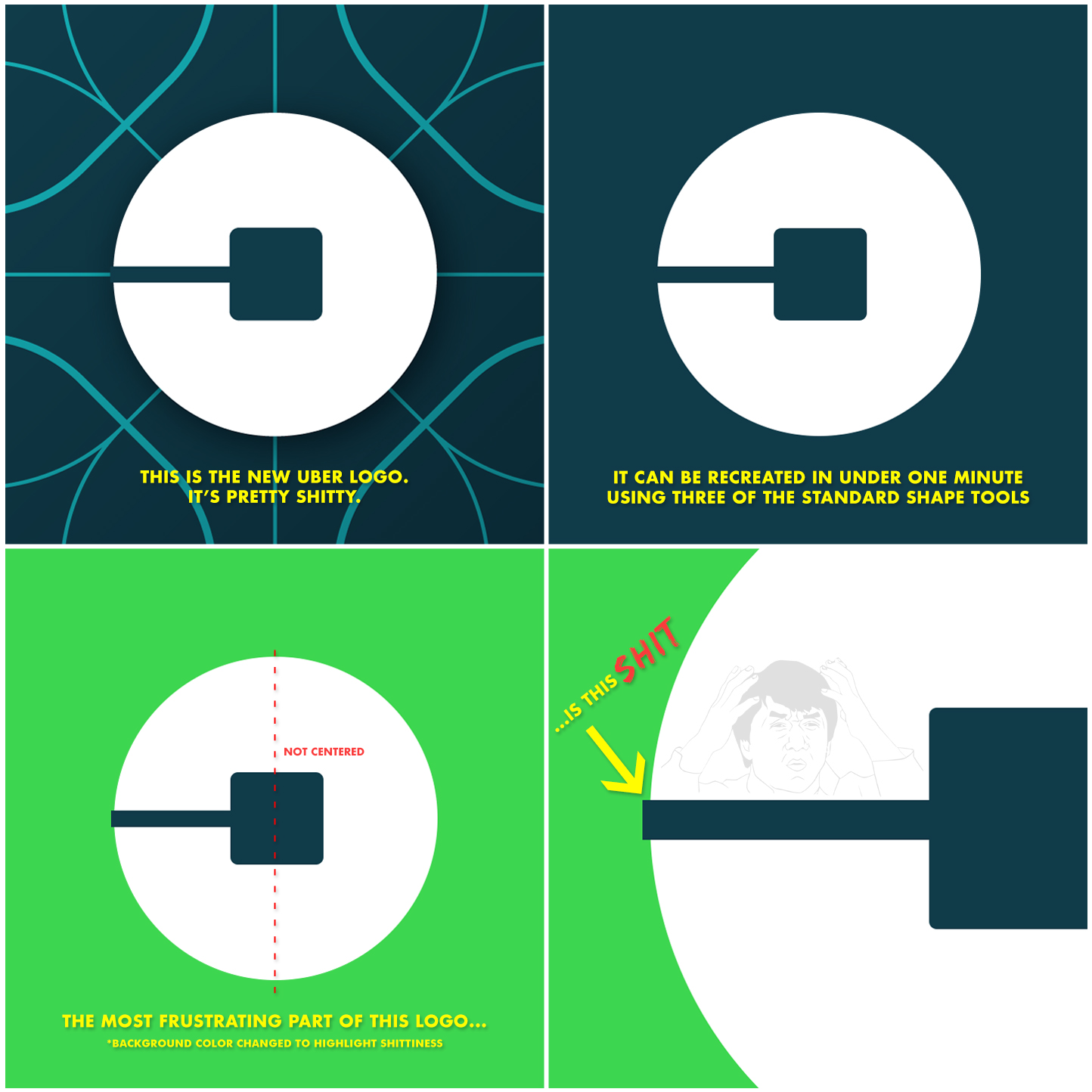
This person has three problems with the new Uber logo. The first problem ("It can be recreated in under one minute using three of the standard shape tools) does not bother me. I actually think that's cool. But the uncentered square and the overhanging line really do suck!
Original Link: http://feeds.boingboing.net/~r/boingboing/iBag/~3/L3Ko9wxYB1E/a-close-look-at-the-new-uber-l.html
Share this article:
Tweet

View Full Article
