
Some of Our Sources
- Slashdot
- Simplebits
- Web Designer Wall
- The Logo Smith
- Abduzeedo
- Creative Curio
- Inspiredology
- Freelance Switch
- Android Dissected
- Android Headlines
Help Webnuz
Referal links:
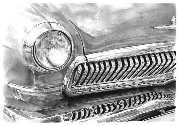
How to Draw Realistic Metallic Effects With Pencil

Cars can be a form of art in themselves, and many artists have created beautiful drawings of them over the years, yet chrome and metal can be difficult to draw and render with just pencils. In this tutorial I will be taking you through my process of creating a fully rendered drawing of a section of a car, from blank paper to the final image.
What You Will Need

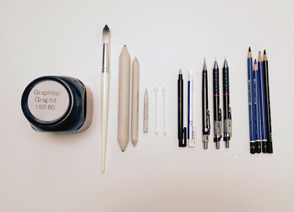
- Drawing paper or newsprint
- Drawing board (optional)
- Masking tape
- Pencils (Types 7B to 3H)
- Mechanical pencils (Types 6B to 2H)
- Pencil sharpener
- Steel ruler
- Black coloured pencil
- Tissue paper
- Cotton buds
- Kneaded eraser
- Gum eraser
- Tombow Square and Circular detailed erasers
- Varied size blending nubs
- Tub of graphite powder
- Soft paint brush
- Artists fixative
1. How to Make a Grid Digitally
Step 1
To begin with, make sure you have a reasonable quality
digital photograph, as it will be very important for working with later on in
this tutorial. I used thisimage from PhotoDune.
Using Adobe Photoshop, open the photograph at a reasonable size. I prefer to work with A4 size paper (11¾ x 8¼ inches). To begin with it might
be best to use a black and white photo so that it is easier to pick out tones
and to see the edges.

In the View button
on the top bar, look for the Show
option within this and click Grid to
show a default grid on your image.

Step 2
This may need adjustment in order to make it easier to draw the image, so look for thePreferencesoption within theEditbutton and adjust the grid lines to the size you require. For this tutorial we are going on a gridline division of 8 cm by a subdivision of 2 cm.

Step 3
Once your grid is set up correctly, pressShift-Command-4to take a screen shot from
the computer, and then paste the screen shot on top
of your original photo layer. Using the resize command Command-T,adjust your image so it matches the canvas size. Then crop the edges
with the Crop Tool, found to the left of the screen.

Step 4
You may want to label your grid axes both across the top and
down the side as shown below. I prefer to label mine 1, 2, 3 across the top and
A, B, C down the sides. Doing this can help you keep track of your grid and ensure you do not get lost in the reference.

At this point you can choose to print off your image to use
as a reference or, as I prefer to do, you can transfer the image to a tablet
device and use that as your reference source. I find the advantage with this is
you do not lose image quality, which you might run the risk of doing if you decide
to print the image, and also you can use the tablet device to zoom in on
specific areas.
2. Prepare Your Paper
For this particular tutorial we will be working on A4 size
paper (11¾ x 8¼ inches). If you have a drawing board to hand, secure your paper
onto it with tape so that is does not slide around as you are drawing.

3. Drawing Your Grid
Step 1
Start by measuring out how big you want this drawing to be.
You can either work to the exact size of the paper or, as I will be doing for
this tutorial, you can work slightly smaller. With your steel ruler, measure
out a box whose width is half a
centimetre smaller than the size of the paper.

Step 2
Use your ruler to measure out the size of your grid. At this
point it is best to avoid drawing too small a box, as this can complicate
the construction of the image. My best advice would be to use a box that is
either 1x1 inches or larger. For this tutorial I have decided to use a box
measuring 1½ x 1½ inches exactly.

Step 3
Draw out your grid on the paper using a sharp 2B pencil with a moderate touch, as you
may need to erase these lines in the process. Pressing too hard on the paper or
using too hard a lead can leave unwanted indentations on the paper.

Step 4
Label your grid axis 1, 2, 3 across the top and A, B, C down
the sides as explained earlier. Make sure the labelling is identical to the one
on the photograph. (For the purpose of explaining this tutorial I will be not doing this.)

4. Constructing Your Image
Step 1
For drawing it is best to continue using the 2B pencil. Before
starting to draw, be sure to sharpen your pencil, as one of the most common
mistakes I see with this type of work is artists using a blunt pencil to draw.Using the reference, choose a focus point to begin your
drawing. Personally, I would choose to start with the headlight as it is a main
point of the image. Use a moderate to light touch with your pencil when drawing, as you may need to erase some lines later on.

Step 2
Continue drawing out basic shapes to define areas of the
image. If you have labelled your grid as explained earlier, it should be easy
for you to draw these points on the image.

Step 3
Once you have all the basic shapes in place, we now have to
fill in the details. At this point, take care when drawing and be sure to go
back to your reference regularly, as a poor drawing at this stage will cause problems when we come to rendering.
Clean up any loose lines with your putty eraser and
make sure you have a clean image to work with for the next stage. I find it best to lightly draw in where your reflections will go, because it can be a very useful guide. Lastly, you may want to leave your grid lines on your page to keep track of where you are on both paper and reference. However, for the purposes of the tutorial I will be removing these.

5. Rendering Your Image
Step 1
Now that we have the outline of the image, we can begin to fill
in the details and create our effects.

We will be using two main methods of applying graphite to
the paper with pencils and graphite powder:
- Cross hatching
- Circulism

Cross
hatching is applied by a series of strokes in a diagonal direction going one
way, then repeating the motion in the opposite direction. Levels of tone can be
built up in this method by bringing hatchings closer together or repeating the
motions time and again. Circulism involves rotating your pencil with moderate
pressure in a circular motion whilst moving the pencil across the page. Like hatching, this can be used to build up tone depending on pressure
applied to the paper and how many times you repeat the motions.
Cross hatching can be used for light tones and is very easy
to blend with either your tissue paper or blending nub. I use circulism more
for darker tones, and it is especially useful for black areas as it gives good
coverage on the paper.
Step 2
Start by using a small amount of graphite powder on your
soft paint brush to lay down a light base tone on the paper. Apply it using the circulism method described earlier. Continue reloading your brush
with powder and working into the paper. Remember only to cover a limited area
of the body at this stage.

Step 3
Once the first layer is put down on the paper, take a cotton
bud and work over the top of this layer using the circulism method, again with
graphite powder picking out darker tones. Be sure to follow your reference at
this stage to check where these are. Continue applying more graphite powder as
and where needed to build up tone, but avoid drawing in heavy black tones at
this point as a mistake is very hard to correct.

Step 4
After building up the layers with the cotton bud, I would
then use a piece of tissue paper to further blend the layers together and help
create the seamless gradients we are trying to achieve. For smaller areas such as around the lights and in tight
corners around the grille, a small blending nub or another clean cotton bud might
be needed for additional blending.
At this point, check your reference, and if your image is not
quite matching the reference, additional tone may need to be added. For this I
would use a soft lead (either a 5B
or a 6B) and use a tight cross
hatching technique. Additional blending with your tissue paper will be needed
here.

Step 5
Now you should have your base tones laid down on the paper and
we can begin to draw out highlights. We start by using the putty eraser, as it
is not as harsh as the gum eraser. On an image like this I find the putty
eraser is ideal at creating dull reflections.
After thisyou can use the small Tombow erasers for more detailed
work, such as creating specular highlights and sharpening up reflections.If you need to create any big white areas, such as in the
top left of this image, the gum eraser can be used to achieve these. Apart from
cleaning up the edges at the end of this tutorial, this is probably the only
time we will be using the gum eraser.

Step 6
By now, you will hopefully have a piece of the image which
is starting to look more like the reference you are working from. To tighten
this area down such as around the headlights, take a mechanical pencil
(preferably a 4B). Using a hard
touch, work around the edge of the headlight to give the effect of a rubber
surround, but again around the highlight areas adjust your pressure on the
paper, as you may need to erase this line to give the effect of glare from the
sun.

6. Rendering Chrome
Step 1
Now that we have an area of the bodywork rendered, let’s go into
the super-shiny parts of a car, the chrome parts! In my opinion, this is what
makes a car pretty and gives it a real sparkle.
Begin by applying a small amount of graphite powder onto a
cotton bud rather than a paint brush, and work it into the paper. As with
the body work, pay attention to your reference and apply tone accordingly.
As chrome
is a very reflective material, it is possible that just a single layer of
graphite may need to be applied.From here we will be using a 3B or a 5B pencil to
begin filling in darker areas of the headlamp surround. Using a light touch
with the cross hatching method is the best way of working here.

Step 2
For light tones near the specular highlights, a standard HB pencil or a mechanical 2H pencil will be required. Using tight
cross hatching, layer in a base tone with the 2H mechanical pencil and then go
over this using the same method with the HB pencil.
To finish off, use a small
blending nub to blend the two layers together, thus creating a seamless
effect.For highlighted areas, use the small Tombow eraser to sculpt these out, taking care as you go. If you have built up the
layers using the right touch, this step should be achieved easily.

Step 3
Now that we have filled in most other tones, we can move on
to the really dark tones and blacks to really bring the area together. Using
either a mechanical 4B or 6B pencil, begin filling these areas
with tight lines and circulism. At this point, pay close attention to the
details—in our reference image, for example, you might notice there are trees reflected in
this image, so it is worthwhile to include them. It can be time-consuming, but it
matters at the end.

Step 4
For true black tones it is now time to use your black
coloured pencil and fill in the black areas around the headlight using tight
circulism.

7. Working Inside the Headlight and Rendering Glass
Working on the inside of the headlamp involves the same
process as rendering chrome on the outside. Be sure to remember to work from light
tones building up to darker ones.For rendering glass effects, it is best to use your Tombow
erasers and carve out areas of light within the headlamp.
Once you have done
this, go back with your mechanical pencils, preferably a HB and a 2B, and begin
filling in the small details that are cut into the glass for projecting
different beams of light. Remember to use a light touch at this point, as
it is easy to make a mistake with fine details such as these, and repeated use
of the erasers may be required.

8. Working on the Bonnet and Grille
Step 1
If at any point you find yourself becoming tired, I must
emphasise that it is important to take a break from your drawing for ten minutes
or so to refresh your eyes and yourself. One of the worst things an artist can
do is to carry on working when they become too tired. That is when mistakes
happen, which you often don't notice until it is too late.
By now you should have a basic idea of how to go about applying
tones showing both metal and chrome surfaces. We shall now continue from left
to right of the car, or vice versa for anyone who is left-handed.
Continue applying base tones with graphite powder and brush
across the bonnet surface. As this is a wide area, you can break this section
up into halves if that makes it easier and more comfortable.Apply additional graphite with cotton buds, and use tissue
paper to continue blending these two together. As earlier, use your putty eraser to draw out tone
where needed.

Step 2
Work in shadows with a 3B
or a 5B pencil using circulism. Blending can be done using a cotton bud or a broad blending nub.At this point you might notice I am leaving gaps in the
image around the edge of the bonnet and grille. These are for our black areas, and again it is best to leave thisuntilright at the end, once you are happy with the light and mid tones.

Step 3
We now move on to the grille. For this part of the image you
may notice a human figure reflected in the top left of the grille in your
reference image. It would serve you well to include this figure in the drawing.
Picking out small details like this will really impress viewers of your work.

Step 4
Continue moving across and down, working your way to the
bumper at the bottom right of the page.

9. Applying Black Areas
Step
1
Once
you have finished rendering all of your mid tones, you can now move on to your
blacks. As mentioned earlier, it is best to apply these with a hard touch using
the circulism method. You may also find it beneficial to usetwo black pencils for this stage, as
using hard pressure on the paper does blunt your pencil very quickly. It can
be very helpful for tight areas to have another sharp black pencil in reserve.

Step
2
Underneath
the grille the blacks do extend out a way, and the best way to blend this
together is to take a sharp 7B pencil
and, using tight cross hatching, extend the black areas towards the bumper at
the bottom right of the image. Further dark tones can be applied using a 6B pencil if you choose to do so.

10. Finishing Touches
You
should now have an image that is virtually complete! It is at this point I
would recommend you go over your work and check it carefully against your reference
to make sure you have not missed any details. If you have been careful and have
taken your time with this image, hopefully you will find that this is not the
case.
To
seal your work, you should now spray your drawing with artist’s fixative. This
substance prevents any accidental smudging of your drawing when it is in
storage or on display.
And Finally You Have a Masterpiece!
Pencil
drawing and rendering can be a time-consuming process in today’s digital age
but, as you can hopefully see from your completed image, with some of the
simplest of tools you can create an image of great beauty!
Original Link:
TutsPlus - Design
More About this Source Visit TutsPlus - Design