
An Interest In:
Web News this Week
- April 3, 2024
- April 2, 2024
- April 1, 2024
- March 31, 2024
- March 30, 2024
- March 29, 2024
- March 28, 2024
Some of Our Sources
- Engadget
- Techcrunch
- Web Designer Wall
- Smashing Magazine
- Creative Curio
- Web Design Ledger
- 24 Ways
- Stylized Web
- Spyre Studios
- Codrops
Help Webnuz
Referal links:
Dark Mode in 3 Lines of CSS and Other Adventures
Dark Mode is a design trend where the color scheme of a website is changed to a dark background with light-colored text and elements. It's also referred to as Night Mode or Dark Theme. The purpose of Dark Mode is to reduce eye strain in low light environments, conserve battery life on mobile devices, and create a sleek and modern aesthetic.
Many popular websites and applications now offer a Dark Mode option heres TailwindCSS:
If youre a developer, you most likely already know how to toggle Dark Mode in Dev Tools (for those who dont know, go to the rendering tab!):

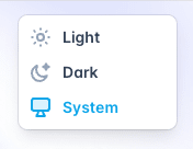
If you want to toggle on Dark Mode for your operating system (and thus all apps supporting Dark Mode), go to System Settings. On a Mac, youll find it under System Settings > Appearance:

There are a lot of tutorials out there already on how to implement dark mode for a webiste.
This tutorial will look into different approaches, including some rad new CSS-features, thatll allow you to ditch JavaScript.
Ready? Lets get started.
Dark Mode using System Colors
First, well create a simple HTML-document with a headline:
<body> <h1>Hello Darkness, My Old Friend</h1></body>In a stylesheet, well add:
body { color-scheme: light dark;}This will tell the browser, that our document can accept both a light and a dark color-scheme.
If you run this snippett in a browser, even with Dark Mode on, it will be light.
Your browser UI will be dark, though.

Thats because the user-agent-stylesheet does not have any default colors set up.
We can fix that quickly, by using System Colors:
body { background-color: Canvas; color: CanvasText; color-scheme: light dark;}Lets check our snippet again:

Much better! Dark Mode for your entire website in 3 lines of CSS!
Lets dive a bit more into System Colors. From the specs:
In general, the
<system-color>keywords reflect default color choices made by the user, the browser, or the OS. They are typically used in the browser default stylesheet, for this reason.
Heres a Light Mode-demo, showing the available System Colors in Safari:
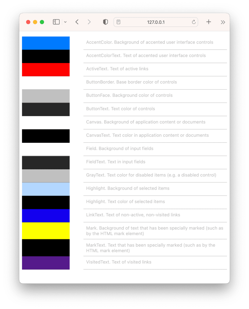
If we switch to Dark Mode, some colors are changed completely (like Canvas and CanvasText as weve already encountered), while others are only slightly changed:

Using System Colors for Dark Mode is a bit of a simplified Dark Mode-experience.
Yes, it will work but pure black and white is a bit boring.
We can spice it up using color-mix in CSS. We can mix a bit of CanvasText (black or white) into Canvas (white or black) for the background-color, and the opposite for color:
body { background-color: color-mix(in srgb, Canvas, CanvasText 2.5%); color: color-mix(in srgb, CanvasText, Canvas 15%);}This results in a softer look:

Deducting saturation from a color, is a widely used way to make variations of colors in Dark Mode.
Using relative colors in CSS, we can do exactly that:
background: hsl(from ActiveText h calc(s - 30%) l);Unfortunately, relative colors dont work with System Colors in any browsers yet!
NOTE: System Colors can be overwritten with forced colors (although used rarely) so dont rely too much on this technique.
Lets move on to another technique, thatll allow us to fine-control our Dark Mode colors.
Using a prefers-color-scheme media-query
To specify specific colors for light and dark mode, I recommend using CSS Custom Properties, and then update these using a prefers-color-scheme media-query.
With Light Mode as our default, lets add the colors to a :where(body)-section, to separate them from our regular body-styles:
/* Properties */:where(body) { --background-color: #FFF; --text-color: #222;}body { background-color: var(--background-color); color: var(--text-color);}Then, for Dark Mode, well simply update these colors-properties:
@media (prefers-color-scheme: dark) { :where(body) { --background-color: hsl(228, 5%, 15%); --text-color: hsl(228, 5%, 80%); }}Lets check it out:

But what if we want the users to choose which version of our website they want, indepently of the System Settings?
They might prefer a system set to Dark Mode, but our website in Light Mode.
Lets create a toggler!
Creating a color-scheme toggler
Using JavaScript
If you go to a site like TailwindCSS, youll notice that a dark-class is added to the html-node when you select dark from the color-scheme-toggler. This is done with JavaScript:
window.matchMedia('(prefers-color-scheme: dark)').matches)) { document.documentElement.classList.add('dark')} else { document.documentElement.classList.remove('dark')}Open Props is using a similar method, but updating a data-theme-attribute instead, and then defining properties in two blocks:
[data-theme=light] { --nav-icon: var(--gray-7); /* etc */}[data-theme=dark] { --nav-icon: var(--gray-5); /* etc */}Using CSS
Using some brand new CSS-techniques, we can create a toggler without JavaScript.
Well create a toggler with 3 states:
- Light (forced)
- Auto (system default, could be either light or dark)
- Dark (forced)
First, some basic markup:
<fieldset> <label> <input type="radio" name="color-scheme" id="color-scheme-light" value="0"> Light </label> <label> <input type="radio" name="color-scheme" value="auto" checked> Auto </label> <label> <input type="radio" name="color-scheme" id="color-scheme-dark" value="1"> Dark </label></fieldset>After adding some basic styles (see the Codepen-demo below), it renders like this:

Well add a --darkmode-property and container-type to the html-element:
html { --darkmode: 0; container-name: root; container-type: normal;}Well be using @container style()-queries, so we need to set the node as a container.
Since we dont want to observe inline-size-changes, we just add the value normal.
If the user picks a forced value, well update --darkmode:
html:has(#color-scheme-light:checked) { --darkmode: 0; }html:has(#color-scheme-dark:checked) { --darkmode: 1; }And finally, well use a container style()-query to check, if --darkmode is set to 1:
@container root style(--darkmode: 1) { body { --background-color: hsl(228, 5%, 15%); --text-color: hsl(228, 5%, 80%); }}NOTE:
@container style()-queries only works behind-a-flag in Chrome at the moment, its early days, so do not use in production.
Now, after selecting Dark, our toggler (and page) looks like this:

Simple and effective!
Storing state
If we want to store the users choice, Im afraid we need a bit of JavaScript!
First, lets add an identifier to our <fieldset>:
<fieldset id="colorScheme">Then, in JavaScript:
colorScheme.addEventListener('change', event => { localStorage.setItem('color-scheme', event.target.value)})Now, all we have to do is setting the property to the localStorage-value when the document has been loaded:
window.addEventListener("load", event => { const scheme = localStorage.getItem('color-scheme') || 'auto' if (scheme) { document.documentElement.style.setProperty('--darkmode', scheme) }})To select the correct mode in the toggler, add this to the if-block:
const selected = [...colorScheme.elements].filter(element => element.value === scheme)if (selected) selected[0].checked = true;Demos
Toggler
System Colors
Photo-credit: Sora Shimazaki
Original Link: https://dev.to/madsstoumann/dark-mode-in-3-lines-of-css-and-other-adventures-1ljj
Dev To
 An online community for sharing and discovering great ideas, having debates, and making friends
More About this Source Visit Dev To