
An Interest In:
Web News this Week
- April 28, 2024
- April 27, 2024
- April 26, 2024
- April 25, 2024
- April 24, 2024
- April 23, 2024
- April 22, 2024
Some of Our Sources
- Technology Review
- Smashing Apps
- Web Designer Depot
- Reencoded
- Line 25
- Wal You
- Freelance Switch
- Codrops
- Daily Now
- Dev To
Help Webnuz
Referal links:
Applying a Custom Design System to a Third-Party Component Library? Storybook Makes it Easy.
Ready for a hot take? I believe that the core of every great, functional design system is a component library. Theres no better tool for getting everyone on the same page and seeing your design choices in action than a component library. But that doesnt mean that our component libraries need to be built from scratch. Using a third-party component library can be an excellent way to jump-start our design systems and save a ton of time and effort.

Storybook, a tool for building and documenting UI components, has become integral to the creation and maintenance of component libraries and design systems. Because Storybook offers an interface for non-developers, allowing anyone to explore, play with, and manipulate the components and documentation, its perfect for collaboration. Often, Storybook is mentioned in the context of building component libraries from scratch, but it doesnt have to be used that way. Storybook is still a powerful tool for customizing, documenting, and sharing our design systems even if theyre built on top of a third-party component library.
Building on top of an existing library doesnt always sound as cool as the I made this entirely by hand stories, but I would argue that its infinitely more practical and far more realistic. Unless you work somewhere that requires very complex and unique components, I dont see any reason why you should build your own component library. Why reinvent the wheel?
The only asterisk on that statement is ensuring that the library we choose is style-agnostic enough that it wont be a struggle to overlay our custom design system on top. If were constantly fighting with the CSS, its not going to be worth it. Strongly design opinionated libraries can be challenging unless, of course, were committed to using their design system for the entirety of the life of our products. In this example, I chose to build my design system on top of the KendoReact component library, which allowed for a seriously high degree of custom styling.
Why I Built This
Before we get to the how, perhaps youre asking why we should even bother to load a third-party component library into a tool like Storybook. After all, were not building it ourselves and theres already existing documentation. Those things are true...but only somewhat. There are significant benefits to loading our component library into Storybook, regardless of whether we built it from scratch or started with something pre-made:
Make Development and Testing Easy
If were significantly changing the look and feel of our components with our design system, then its really helpful to have a place where we can see how each component will look with the new styles applied. Storybook is the perfect place for developers to do this and test their work.

Storybook is fantastic for testing components in isolation. When were using a pre-made component library its easy to assume that we dont need to test as thoroughlywhich is only true if were not adjusting or changing the components at all from their default state. However, if were making adjustments to the look and feel of the components to fit your design system, its a smart idea to test especially around accessibility.
Allow Non-Developers Easy Access
The Storybook UI allows non-developers to easily explore the available suite of components and preview each one in isolation. This can be hugely helpful when it comes to closing the designer/developer communication gap, but also benefits Project Managers, QA testers, and more all of whom will appreciate the ability to see each component with the new styles, exactly as they will be used in the application.
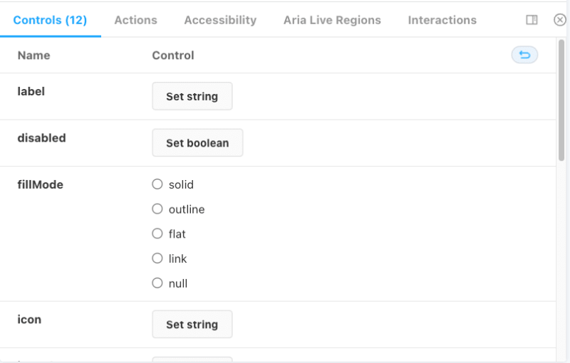
Storybook Controls allow non-developers to adjust the parameters of various components and understand what properties are available to edit. This means they can do things like input custom button text, change various colors, adjust default states, and more to change how the component will look and immediately see the results in the viewport panel.
Document and Share
If were creating our own design system, our components will need additional, contextual documentation. When should a developer use a Window component, as opposed to a Dialog, as opposed to a Modal? When do we reach for a Line Chart instead of a Bar Chart? The KendoReact component library offers over 100 components, some of which could potentially be used to solve the same problem in different ways.
Adding documentation about when and where to use each component within the context of our application is a crucial aspect of a design system. This makes the work easier for developers and designers, who no longer have to make individual in-the-moment decisions. This consistency ultimately makes the app more intuitive and improves the UX. However, contextual, app-specific documentation simply cannot exist within generic third-party library docs which means its our job to write it as part of our design system documentation.
On that note, when were putting together a design system, its important to have one place that functions as the single source of truth. Design systems include multiple resources: Figma files, written documentation, component libraries, style guides, and more. When these resources are scattered, its difficult for people to know where to lookand when they dont know where to look, theyll just do their work without it. To improve design system adoption internally, we need to make it as easy as humanly possible for everyone to find and reference. Because Storybook has support for linking design files, writing documentation, previewing components, and more, it makes an ideal one-stop hub for our design system. Its a simple task to publish our Storybook instance to a URL that can be bookmarked and accessed by everyone.
How I Built This
Before we get too far into this section, I want to point out that if you also want to build on top of the the KendoReact library, then you dont have to do most of this Ive already done it for you! Im sharing this how-to process as a guide for the curious. Perhaps youre doing something similar with a different component library, or maybe you just like to peek behind the curtain and see how things are made if so, read on! You can preview the finished product here.
However, if you want to skip the how its made part and just start loading your design system in, fork the repo and jump to the section about applying styles and writing documentation.
Setting Up the Storybook Instance
Because Storybook is meant to be installed into an existing project, the first thing I needed to do was roll up a new React app. I used Create React App (CRA) so that I could take advantage of the KendoReact CRA templates to automatically install and configure my setup. If thats not your situation, you can use whatever you prefer to get a React app set up and install your chosen component library.
Once I had a new project set up, I ran npx storybook init to install Storybook. That command installs the required dependencies, sets up the build and run scripts, and establishes the default Storybook config (including a few demo stories). Once that completes, you should be able to use npm run storybook to run the app locally and make sure everything is working according to plan.
Importing External Components Into Stories
The Storybook docs have a fantastic breakdown of the details around how stories work and the easiest ways to write them, so I wont re-write all that information here. The only minor difference was that rather than writing components from scratch in the story, I imported my components from the KendoReact library.
Because of how stories are named and managed within Storybook, I quickly noticed one small hitch I needed to adjust how I was importing the external components so they wouldnt conflict with the names of the exported stories.
For example, when I created a story for my button component, I named it Button. However, each story component will include the KendoReact component we import as well which, in this case, is also named Button. In order to ensure that I could still name my Storybook story component Button and not have to worry about having two identically named components, my imports needed to be adjusted to import X as Y rather than just importing X:
import { Button as KendoButton } from "@progress/kendo-react-buttons";Then, when I used the KendoReact button inside my Storybook Button story, I needed to call it as KendoButton.
export const Button = ({...props }) => { return ( <> <KendoButton {...props}> {props.label} </KendoButton> </> );};Configuring Controls With PropTypes
Storybook has an immensely handy built-in generator for their Controls, the elements that allow users to adjust component properties via the Storybook UI. These Controls are a huge part of what makes Storybook so valuable to non-developers and developers alike, so its crucial for us to get them right. Thankfully, Storybook makes it easy to do so by automatically generating Controls based on component PropTypes.

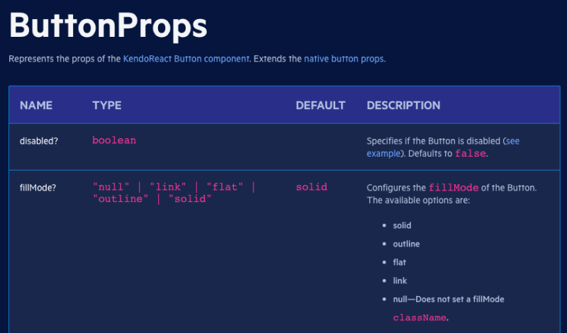
Luckily, every KendoReact story is accompanied by extensive documentation including an API reference that clearly defined all the props available for each component and their possible configuration options. I used this documentation to write PropTypes for my stories, so users can play with all the possible ways to adjust, customize, and configure KendoReact components.
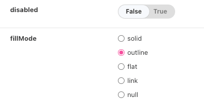
For example, the above disabled and fillMode props are listed like so in my Button story:
Button.propTypes = { disabled: PropTypes.bool, fillMode: PropTypes.oneOf(['solid', 'outline', 'flat', 'link', 'null'])}Storybook takes those PropTypes and automatically determines the best UI input option to reflect it. Here, my bool prop became a switch input in Controls, and my oneOf became a selection of radio buttons. This happens without any additional input required from me beyond the definition of PropTypes (which I would be doing anyway when writing components)!
Applying Custom Styles
Of course, for Storybook to be valuable to us as a Design System management tool, our components need to reflect the custom styling weve done in order to change their look and feel. Thankfully, this was as easy as dragging and dropping a few CSS files!
At the top of every story file, I imported the same things: React, PropTypes, the component in question (and any dependencies), and my .scss file.
import React from 'react';import PropTypes from 'prop-types';import { Button as KendoButton } from "@progress/kendo-react-buttons";import './assets/index.scss';Storybook comes configured with that .assets folder, so I decided to place any supporting files in there. That included things like images for photo-based components, mock data in .js or .json format for charting components, and of course my styles. If youre writing your styles from scratch, this is the place to do it!
I, however, opted to save some time and use the Progress ThemeBuilder application to export the styles for my established LKARS design system. If youre interested, you can learn more about the creation of that design system and how I use it in coordination with KendoReact, Storybook, Figma, and ThemeBuilder in this article.
For now, the most important thing to know is that ThemeBuilder allows me to export complete CSS or SASS files for my design system, automatically configured to work perfectly with the KendoReact suite of components. That set of files includes an index.scss that imports a _tokens.scss and an _overrides.scss file. All of these were dragged into my assets folder and automatically applied to every component in Storybook, since index.scss was imported in each story. You can do the same with your own global stylesheets.
**Note:* While I kept a personal version of my Storybook project that included my custom design system styles applied to the KendoReact components, I removed them for the publicly shared project. If you fork the repo on GitHub, the LKARS design system styles will not be included.*
Installing Add-ons
Storybook offers a notable library of addons that can be used to change, extend, or adjust the behavior of the Storybook UI. For the most part, I wanted to keep this project fairly vanilla since I intended it to be a base for other people to fork and use as the basis for their own projects. However, there were three addons that I believe to be truly essential, which I did install and will be included with the project if you fork it:
- @storybook/addon-a11y
- aria-live-storybook-addon
- storybook-addon-pseudo-states
Note that all of these addons are accessibility-related. KendoReact is, by default, built to be accessible. You canread moreabout their commitment to accessibility and the technical specifications we meet. However, custom styling and changes can sometimes create inaccessible components. I encourage folks to use the accessibility testing addons to ensure that the components are still meeting accessibility standards.
Beyond that, I refrained from customizing the Storybook instance so that everyone can have a fresh start for their new project. Check outthe Storybook Integrations Libraryto find more useful addons! Any currently installed addons can also be removed by deleting them from .storybook/main.js.
Conclusion
Theres more to a design system than just a component library, of course but thats where design and implementation come together for the first time. Its where the design rubber hits the road and we start to get the feel for how our application is going to look and function. Regardless of what team a person is on or how much they understand about the design process, seeing and interacting with all of the various UI components just makes things click. Its truly invaluable.
Original Link: https://dev.to/kathryngrayson/applying-a-custom-design-system-to-a-third-party-component-library-storybook-makes-it-easy-160j
Dev To
 An online community for sharing and discovering great ideas, having debates, and making friends
More About this Source Visit Dev To