
An Interest In:
Web News this Week
- April 27, 2024
- April 26, 2024
- April 25, 2024
- April 24, 2024
- April 23, 2024
- April 22, 2024
- April 21, 2024
Some of Our Sources
- Technology Review
- Simplebits
- Team Treehouse
- Pearsonified
- The Logo Smith
- My Ink Blog
- Reencoded
- Freelance Switch
- Design Modo
- Hashedout
Help Webnuz
Referal links:
Create a Glass Effect Using Only Two CSS Properties
We have seen this UI in many website. It is a very simple effect but it looks very cool. Essentially all you need are two CSS properties. So let's get started.
Creating the background
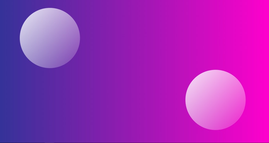
I am using a simple gradient from uigradients.com. You can use any gradient you want. I am using the one called "Cosmic Fusion".
We create a div with class "container".
<div class="container"></div>Then we add the following styles to the container.
.container { height: 100vh; width: 100%; display: flex; justify-content: center; align-items: center; position: relative; background: #ff00cc; background: -webkit-linear-gradient( to right, #333399, #ff00cc ); background: linear-gradient( to right, #333399, #ff00cc ); }We make sure the container takes up the whole screen. We align the contents within the container to the center. We also add the gradient to the background using the linear-gradient property. -webkit-linear-gradient is used for certain browsers. We give a default color in case the browser doesn't support gradients.
linear-gradient
The linear-gradient property takes in a direction and a list of colors. The direction can be specified using the to keyword. The colors are specified using the rgb or rgba function. The rgb function takes in three values for red, green and blue. The rgba function takes an additional value, alpha. The alpha value specifies the opacity of the color. The alpha value can be any value between 0 and 1. 0 means the color is completely transparent and 1 meaning completely opaque.

Adding the circles
We create two div elements with class circle1 and circle2.
<div class="circle1"></div><div class="circle2"></div>We add the following styles to the circles.
.circle1,.circle2 { background: white; background: linear-gradient( to right bottom, rgba(255, 255, 255, 0.9), rgba(255, 255, 255, 0.1) ); height: 20rem; width: 20rem; position: absolute; border-radius: 50%;}The circles have a height and width of 20rem. We give them a position of absolute so that they can be positioned relative to the container. We give them a border-radius of 50% so that they become circles.
We add a linear gradient to the background of the circles. We give the circles a default color in case the browser doesn't support gradients.

ummmm... I promise the circles are there somewhere.
Positioning the circles
To position the circles we add the following styles to the circles.
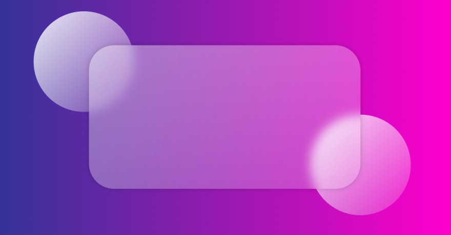
.circle1 { top: 10%; left: 10%; transform: translate(-10%, -10%);}.circle2 { top: 70%; left: 80%; transform: translate(-50%, -50%);}We give the first circle a top value of 10% and a left value of 10%. It moves the circle 10% from the top and 10% from the left. We then use the transform property to translate the circle by -10% in both the x and y direction. This is done so that the circle is positioned relative to the top left corner of the container.
A similar thing is done with the second circle.
Adding the glass card
We create a div element with class glass-card within the container. We add the following styles to the glass card.
.glass-card { background: white; background: linear-gradient( to right bottom, rgba(255, 255, 255, 0.4), rgba(255, 255, 255, 0.2) ); backdrop-filter: blur(1rem); width: 60%; height: 60%; z-index: 1; display: flex; justify-content: center; align-items: center; border-radius: 5rem; box-shadow: 0 0 1rem rgba(0, 0, 0, 0.2);}And here they are.... The two properties used to create the glass effect.
linear-gradientbackdrop-filter
The linear gradient create a semi transparent white background.
The backdrop-filter property is used to apply graphical effects like blur and saturation to the background of an element. It is supported by most modern browsers. It is not supported by Internet Explorer.
We add a blur effect whose value can be changed according to requirement.
In order to make sure the circles are behind the glass we add the z-index property which moves the card above the circles.
Adding the content
We add a simple heading to the glass card.
<h1>Glass UI</h1>We add some styling to the heading to make it look pretty.
.glass-card h1 { font-size: 5rem; color: white; text-align: center; font-family: 'Montserrat', sans-serif; font-weight: 700; text-transform: uppercase; letter-spacing: 0.5rem; text-shadow: 0 0 1rem rgba(0, 0, 0, 0.2);}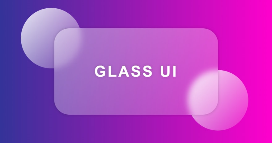
Voila! We are done.
Try it out for yourself. You can find the full code here.
Also check out this amazing video by dev ed, A complete glass UI dashboard.
Original Link: https://dev.to/chinmaymhatre/create-a-glass-ui-using-only-two-css-properties-3k9h
Dev To
 An online community for sharing and discovering great ideas, having debates, and making friends
More About this Source Visit Dev To