
An Interest In:
Web News this Week
- April 20, 2024
- April 19, 2024
- April 18, 2024
- April 17, 2024
- April 16, 2024
- April 15, 2024
- April 14, 2024
Some of Our Sources
- Simplebits
- Web Designer Wall
- Joshua Blankenship
- Spoon Graphics
- TutsPlus - Design
- Vandelay Design
- Web Design Ledger
- CSS Globe
- Stylized Web
- The Verge
Help Webnuz
Referal links:
React Aria - Improve accessibility of React components in refine app
Introduction
In this tutorial, we'll walk you through how to use React Aria to build a web application in a refine application. You'll create components using React Aria and use them to build a demo application.
Steps we'll cover includes:
- Introduction
- What is React Aria?
- What is refine?
- Why use React Aria?
- Bootstrapping a refine app
- Creating React components
- Adding Server side rendering
What is React Aria?
React Aria is a library of React Hooks that provides accessible UI primitives for your design system. It provides accessibility and behavior for many common UI components so you can focus on your unique design and styling. It implements adaptive interactions to ensure the best experience possible for all users, including support for mouse, touch, keyboard, and screen readers.
What is refine?
refine is a a collection of helper hooks, components and providers that helps you build React-based CRUD apps like admin panels, dashboards and internal tools.It's a headless framwork and the core is fully independent of UI. The core components and hooks can be use without any UI dependency.
Why use React Aria?
Here are some of the reasons you should consider using React Aria in your web application
It is easily accessible
React Aria offers complete screen reader and keyboard navigation support, as well as accessibility and behavior that adhere to WAI-ARIA Authoring Practices. To offer the greatest experience for every user, every component has been tested on a wide range of screen readers and devices.
It is adaptive
No matter the UI, React Aria maintains consistent functionality. It enables interactions with the mouse, touch, keyboard, and screen reader that have been tried on a range of browsers, gadgets, and platforms.
International
Over 30 languages are supported by React Aria, which also has right-to-left behavior and the internationalized date and number formatting, among other features.
It is fully customizable
No rendering is implemented by React Aria, nor is a DOM structure, style approach, or design-specific information imposed. It enables interactions, behavior, and accessibility while letting you concentrate on your design.
Bootstrapping a refine app
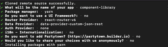
Now let's go ahead and set up a refine project to create a component library using React Aria. To do that, run the command below.
npx superplate-cli -p refine-react component-libraryThe above command will prompt you to complete options for your project. Your selection should look like the screenshot below.
Then wait while refine installs the required packages for this project. Once that is done, let's install React Aria. React Aria published all components as a separate module for adoptable sake, so you can choose to install the components independently or as all the package.
Eg
npm install @react-aria/button]
To save our time, we'll install all the component which is packaged under the @react-aria scope with the command below.
yarn add react-ariaNow change the directory to the project folder and run the application with the command below.
cd component-library && yarn devAdding Tailwind CSS
We will use Tailwind CSS for the UI of the example app.
You can prefer any UI library or design system since it's not affecting the usability.
Install tailwindcss and its peer dependencies via npm, and then run the init command to generate both tailwind.config.js and postcss.config.js.
npm i -D tailwindcss postcss autoprefixernpx tailwindcss initAdd the paths to all of your template files in your tailwind.config.js file.
module.exports = { content: ["./src/**/*.{js,jsx,ts,tsx}"], theme: { extend: {}, }, plugins: [],};Add the @tailwind directives for each of Tailwinds layers to your src/index.css file.
// "src/index.css"@tailwind base;@tailwind components;@tailwind utilities;Add css file import to src/App.tsx.
// App.tsx...import 'index.css';Creating React components
We'll use the React hooks provided by Aria to create component libraries for our Refine application. React Aria offers accessibility and behavior for React hooks. You must define the DOM structure for your component and send the DOM props supplied by each React Aria hook to the proper elements because it does not provide any rendering.
Additionally, it allows you total control over the DOM by enabling you to add additional components for styling or layout control, such as CSS classes, inline styles, CSS-in-JS, etc. We'll explore some of them and how they work. To get started, create a component folder in the src folder of our React project to save the component libraries.
mkdir src/componentsCreate Button component
Let's start with the button component, and we'll use the useButton hook. The useButton hook takes care of several cross-browser discrepancies in interactions and accessibility capabilities, so you can focus on the styling.
Create a Button.tsx in the component folder and add the code snippet below.
// Button.tsximport React, { ElementType, RefObject } from 'react';import { useButton } from '@react-aria/button';import { AriaButtonProps } from 'react-aria';export default function Button(props: AriaButtonProps<ElementType> | any) { const ref: RefObject<any> = React.useRef(); const { buttonProps } = useButton(props, ref); return ( <button {...buttonProps} ref={ref} className="flex items-center self-end rounded-lg bg-indigo-500 mb-5 px-5 py-2.5 mt-3 text-center text-sm font-medium text-white hover:bg-indigo-600 sm:w-auto" > {props.children} </button> );}In the above code snippet, we imported the useButton hook and called it, passing the props along with a ref to the DOM node for this component to get the buttonProp property. Then we spread the props returned from the hook into the button element that we want to render, passing the ref and the style props.
Create Input component
Next, let's create the input component library using the useTextField hooks. The useTextField hook offers a text field's behavior and accessibility implementation.
Create an Input.tsx file in the component folder and add the code snippet below.
// Input.tsximport React, { RefObject } from 'react';import { useTextField } from '@react-aria/textfield';import { AriaTextFieldProps } from 'react-aria';export default function Input(props: AriaTextFieldProps) { const ref: RefObject<any> = React.useRef(); const { inputProps: { className, ...inputProps }, } = useTextField(props, ref); return ( <div className="w-full"> <input {...inputProps} ref={ref} className={`border-2 border-slate-300 hover:border-sky-200 focus:border-sky-400 active:border-sky-400 rounded-md py-1.5 px-2.5 w-full ${className}`} /> </div> );}We called the useTextField, passing the props along with a ref to the DOM node for this component to get the inputProps property. Then we spread the props returned from the hook into the input element that we want to render, passing the ref and the style props.
Create Header Component
To create a Header component, we'll use the useHover hook. This hook handles the pointer hover interactions for an element. Create a Header.tsx file in the component directory and add the code snippet below.
// Header.tsximport React, { ElementType } from 'react';import { useHover } from '@react-aria/interactions';import { AriaButtonProps } from 'react-aria';export default function Header(props: AriaButtonProps<ElementType> | any) { let { hoverProps, isHovered } = useHover({}); return ( <div {...hoverProps} style={{ background: isHovered ? '#167B73' : '#2D9E96', color: 'white', padding: 4, cursor: 'pointer', display: 'block', }} tabIndex={0} > <div style={{ display: 'flex', justifyContent: 'space-between', fontSize: '10px', }} > {props.children} </div> </div> );}We'll use the isHovered props to know when the mouse or pen goes over the element, and we will change the background color of the elements in the header. Then we spread the hoverProps into the div element that we want to render, passing an initial tabIndex of 0.
Create Modal Component
We'll take advantage of the useDialog, useOverlay, usePreventScroll, and useModal.
Create a Modal.tsx file in the component folder and add the code snippet below.
// Modal.tsximport React, { ElementType, RefObject, PropsWithChildren } from 'react';import { AriaButtonProps, OverlayProvider } from 'react-aria';import { OverlayTriggerState } from '@react-stately/overlays';import { useOverlay, usePreventScroll, useModal, OverlayContainer,} from '@react-aria/overlays';import { useDialog } from '@react-aria/dialog';import { FocusScope } from '@react-aria/focus';function ModalDialog(props: AriaButtonProps<ElementType> | any) { const { title, children } = props; const ref: RefObject<any> = React.useRef(); const { overlayProps, underlayProps } = useOverlay(props, ref); usePreventScroll(); const { modalProps } = useModal(); const { dialogProps, titleProps } = useDialog(props, ref); return ( <div style={{ position: 'fixed', zIndex: 100, top: 0, left: 0, bottom: 0, right: 0, background: 'rgba(0, 0, 0, 0.5)', display: 'flex', alignItems: 'center', justifyContent: 'center', }} {...underlayProps} > <FocusScope contain restoreFocus autoFocus> <div {...overlayProps} {...dialogProps} {...modalProps} ref={ref} className="w-full bg-white text-black p-7 max-w-xl" > <h3 {...titleProps} className="mt-0 pb-4 border-b border-slate-200 border-solid text-xl mb-6 font-bold" > {title} </h3> {children} </div> </FocusScope> </div> );}type ModalProps = { title: string; overlayState: OverlayTriggerState;};export default function Modal(props: PropsWithChildren<ModalProps>) { const { title, overlayState: { close, isOpen }, children, } = props; return ( <OverlayProvider> {isOpen && ( <OverlayContainer> <ModalDialog title={title} isOpen onClose={close} isDismissable > <div style={{ display: 'flex', justifyContent: 'center', alignItems: 'center', flexDirection: 'column', }} > {children} </div> </ModalDialog> </OverlayContainer> )} </OverlayProvider> );}In the above code snippet, we imported the Aria hooks we need for this component, and we created a ModalDialog component to create a dialog for the modal. In the ModalDialog, we used the useOverlay hook, which returns the overlayProps and underlayProps props to handle the user interactivity outside a dialog and to close the modal.
Then we used the useDialog hook, which returns dialogProps and titleProps to get the props of the dialogue and its title. Also, we used the FocusScope component to specify the focus area to be controlled by the dialog.
Lastly, we used the ModalDialog we created to create a dialog for the modal and pass in the required props. Also, we wrapped the application in an OverlayProvider hook so that it can be hidden from screen readers when a modal opens.
You can learn more about creating a modal from this link.
Using React Aria components
Now let's use the components libraries to create a small application. To do that, we'll create a Layout.tsx file in the components folder and add the code snippets below.
import { useMenu, useNavigation, LayoutProps } from '@pankod/refine-core';export const Layout: React.FC<LayoutProps> = ({ children }) => { const { menuItems } = useMenu(); const { push } = useNavigation(); return ( <div className="App"> <div className="flex min-h-screen flex-col"> <div className="mb-2 border-b py-2"> <div className="container mx-auto"> <div className="flex items-center gap-2"> <img className="w-32" src="https://refine.dev/img/refine_logo.png" alt="Logo" /> <ul> {menuItems.map( ({ name, label, icon, route }) => ( <li key={name} className="float-left"> <a className="flex cursor-pointer items-center gap-1 rounded-sm px-2 py-1 capitalize decoration-indigo-500 decoration-2 underline-offset-1 transition duration-300 ease-in-out hover:underline" onClick={() => push(route || '') } > {icon} <span>{label ?? name}</span> </a> </li> ) )} </ul> </div> </div> </div> <div className="bg-white">{children}</div> </div> </div> );};We'll start connecting to our API by adding a resource to our application.
Creating a List page
Firstly, we'll create a CategoryList page to show data from API in a table.
Now, create a new folder named pages/category under /src. Under that folder, create a list.tsx file with the following code:
// pages/category/list.tsximport React from 'react';import { useTable, ColumnDef, flexRender } from '@pankod/refine-react-table';export const CategoryList: React.FC = () => { const columns = React.useMemo<ColumnDef<any>[]>( () => [ { id: 'id', header: 'ID', accessorKey: 'id', width: 50, }, { id: 'title', header: 'Title', accessorKey: 'title', }, ], [] ); const { getHeaderGroups, getRowModel } = useTable<any>({ columns, refineCoreProps: { permanentSorter: [ { field: "id", order: "desc", }, ], }, }); return ( <div className="container mx-auto pb-4 max-w-3xl w-full"> <table className="min-w-full table-fixed divide-y divide-gray-200 border"> <thead className="bg-gray-100"> {getHeaderGroups().map((headerGroup) => ( <tr key={headerGroup.id}> {headerGroup.headers.map((header) => ( <th key={header.id} colSpan={header.colSpan} className="py-3 px-6 text-left text-xs font-medium uppercase tracking-wider text-gray-700 " > {flexRender( header.column.columnDef.header, header.getContext() )} </th> ))} </tr> ))} </thead> <tbody className="divide-y divide-gray-200 bg-white"> {getRowModel().rows.map((row) => { return ( <tr key={row.id} className="transition hover:bg-gray-100" > {row.getVisibleCells().map((cell) => { return ( <td key={cell.id} className="whitespace-nowrap py-2 px-6 text-sm font-medium text-gray-900" > {flexRender( cell.column.columnDef.cell, cell.getContext() )} </td> ); })} </tr> ); })} </tbody> </table> </div> );};Refer to official refine documentation for details about creating a list page
We need to import and initialize the CategoryList pages to <Refine /> component.
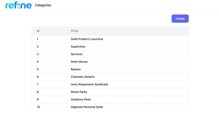
// App.tsximport { Refine } from '@pankod/refine-core';import routerProvider from '@pankod/refine-react-router-v6';import dataProvider from '@pankod/refine-simple-rest';import { Layout } from 'components/Layout';import 'index.css';import { CategoryList } from 'pages/category/list';function App() { return ( <Refine routerProvider={routerProvider} dataProvider={dataProvider('https://api.fake-rest.refine.dev')} resources={[ { name: 'categories', // ====> list: CategoryList, // <==== }, ]} Layout={({ children }) => <Layout> {children}</Layout>} /> );}export default App;You should see the output below on the browser.
Creating a record
We'll create a new <CategoryCreate> page responsible for creating a single record:
Until this point, we were basically working with reading operations such as fetching and displaying data from resources. Now we are going to start creating records by using @pankod/refine-react-hook-form
// pages/category/createimport { Controller, useForm } from '@pankod/refine-react-hook-form';import { HttpError } from '@pankod/refine-core';import { useOverlayTriggerState } from '@react-stately/overlays';import Modal from '../../components/Modal';import Input from '../../components/Input';import Button from '../../components/Button';export const CategoryCreate: React.FC = () => { const state = useOverlayTriggerState({}); const { refineCore: { onFinish }, control, handleSubmit, formState: { errors }, } = useForm<{ title: string }, HttpError, { title: string }>({ refineCoreProps: { onMutationSuccess: () => { state.close(); }, }, }); return ( <div className="container"> <div className="w-full flex justify-end"> <Button onPress={state.open}>Create</Button> </div> <Modal overlayState={state} title="Create a category"> <form onSubmit={handleSubmit(onFinish)} className="w-full flex flex-col gap-4" > <Controller control={control} name="title" rules={{ required: 'field is required' }} render={({ field }) => ( <> <Input {...field} type="text" placeholder="Title" /> {errors?.title && ( <div className="text-red-500 text-xs mt-1 font-semibold"> {errors.title.message} </div> )} </> )} /> <Button type="submit">Create</Button> </form> </Modal> </div> );};We also import CategoryCreate page to show create button and modal page when clicked.
// "pages/category/list"import React from 'react';import { useTable, ColumnDef, flexRender } from '@pankod/refine-react-table';// highlight-next-lineimport { CategoryCreate } from './create';export const CategoryList: React.FC = () => { ... return ( // highlight-next-line <CategoryCreate /> ...};Note: resources is a property of <Refine/> representing API Endpoints. The name property of every single resource should match one of the endpoints in your API!
Now if you click the Create button you should see the form modal below.

By now, we can add a new record to the category resource.
Adding Server side rendering
SSR, or server-side rendering, is the process of rendering components to HTML on the server as opposed to only on the client. A comparable strategy is static rendering, except instead of pre-rendering pages to HTML on each request but rather at build time.
To make components using React Aria work with SSR, you will need to wrap your application in an SSRProvider. This signals to all nested React Aria hooks that they are being rendered in an SSR context. Update the index.tsx file with the code snippet below.
import {SSRProvider} from 'react-aria';<SSRProvider> <App /></SSRProvider>Conclusion
Throughout this tutorial, weve implemented how to create a component library in React using React Aria. We started by understanding what React Aria is and why you should consider using it for creating component libraries. Then we created some component libraries using React Aria and used it to build a signup form. You can learn more about React Aria from the official docs.
Writer: Ekekenta Clinton
Live StackBlitz Example
Build your React-based CRUD applications without constraints
Low-code React frameworks are great for gaining development speed but they often fall short of flexibility if you need extensive styling and customization for your project.
Check out refine, if you are interested in a headless framework you can use with any custom design or UI-Kit for 100% control over styling.
refine is an open source, React-based framework for building CRUD applications without constraints.
It can speed up your development time up to 3X without compromising freedom on styling, customization and project workflow.
refine is headless by design and it connects 30+ backend services out-of-the-box including custom REST and GraphQL APIs.
Visit refine GitHub repository for more information, demos, tutorials and example projects.
Original Link: https://dev.to/refine/react-aria-improve-accessibility-of-react-components-in-refine-app-3kg0
Dev To
 An online community for sharing and discovering great ideas, having debates, and making friends
More About this Source Visit Dev To