
Some of Our Sources
- Technology Review
- Simplebits
- Team Treehouse
- Abduzeedo
- Fuel Your Creativity
- Fudge Graphics
- CSS Globe
- CSS Tricks
- Willems Lab
- TechPowerUp
Help Webnuz
Referal links:
React Portals: create and open modals with keyboard keys
Hi there!
In this post we will create the following:


When we finished to build this app, it will be look like this.
The goal when building this app is to provide a mechanism to open a modal pressing the button on the screen or when we press F1 to F3 keys of ours keyboards to achieve the same objective.
To begin with, i've use vite to build this project, but you can use any other tools like create-react-app or build from scratch using webpack and react.
This project was made using TypeScript and Material-UI to not begin from scratch styling our components.
First, we need to know what a React portal is.
React docs says:
Portals provide a first-class way to render children into a DOM node that exists outside the DOM hierarchy of the parent component.
Normally, when you return an element from a components render method when you have an class component or when you return JSX using functional component, its mounted into the DOM as a child of the nearest parent node. However, sometimes its useful to insert a child into a different location in the DOM.
Basically it is here when the React Portals come to the rescue.
Here you can find the full code here in this Github Repo
First we're gonna clean up our App.tsx component./src/App.tsx
function App() { return ( <div> Hello world!!! </div> );}export default App;Lets create a ButtonComponent.tsx file in the following path:./src/components/Button/index.tsx
import { Button } from "@material-ui/core";export const ButtonComponent = ({ children, variant, color, handleClick,}) => { return ( <Button variant={variant} color={color} onClick={handleClick}> {children} </Button> );};So good, so fine! but, if you remember we're using TypeScript right?
So, let's create an interface for the props in the following path:
./src/types/Interfaces.tsx
import { ReactChildren } from "react";export interface IButtonProps { children: JSX.Element | ReactChildren | string; variant: 'contained' | 'outlined' | 'text' | undefined; color: 'primary' | 'secondary' | 'default' | undefined; handleClick: () => void;}and... we're gonna return to our previous component and add the new created interface.
import { Button } from "@material-ui/core";import { IButtonProps } from "../../types/Interfaces";export const ButtonComponent = ({ children, variant, color, handleClick,}: IButtonProps) => { return ( <Button variant={variant} color={color} onClick={handleClick}> {children} </Button> );};Now we need to return to our App.tsx component and add our new ButtonComponent created
./src/App.tsx
import { ButtonComponent } from "./components/Button";function App() { return ( <div> <ButtonComponent variant="contained" color="primary" handleClick={handleClick} > Open Modal [F1] || [F2] || [F3] </ButtonComponent> </div> );}export default App;We're going to create a custom hook to handle the Keypress events logic and made it reusable across our components.
./src/hooks/useKeyEvents.tsx
import { useState, useEffect } from "react";export const useKeyEvents = (key: string, callback: () => void): boolean => { const [keyPressed, setKeyPressed] = useState<boolean>(false); useEffect(() => { const handleKeyDown = (e: KeyboardEvent) => { if (e.key === key) { e.preventDefault(); setKeyPressed(true); callback(); } }; window.addEventListener("keydown", handleKeyDown); return () => { window.removeEventListener("keydown", handleKeyDown); }; }, [key, callback]); return keyPressed;};We're gonna use React Context API to handle our global state so we need to create our Context:
./src/context/keyeventContext.tsx
import { createContext, useContext } from "react";const initialState = { isOpen: false, setIsOpen: () => {}, handleClick: () => {}};const KeyEventContext = createContext(initialState);export const useKeyEventContext = () => useContext(KeyEventContext);export default KeyEventContext;Now, we're gonna return to our Interfaces.tsx file and add a new Interface for our Context
./src/types/Interfaces.tsx
// Our previous Interfaceexport interface IEventContext { isOpen: boolean; setIsOpen: React.Dispatch<React.SetStateAction<boolean>> handleClick: () => void;}and now, we import our interface in our keyeventContext.tsx file and added to our createContext function as generic type.
import { createContext, useContext } from "react";import { IEventContext } from "../types/Interfaces";const initialState = { isOpen: false, setIsOpen: () => {}, handleClick: () => {}};const KeyEventContext = createContext<IEventContext>(initialState);export const useKeyEventContext = () => useContext(KeyEventContext);export default KeyEventContext;we need to create our Provider component to wrap our App component:
./src/context/keyeventState.tsx
import React, { useState } from "react";import KeyEventContext from "./keyeventContext";import { useKeyEvents } from "../hooks/useKeyEvents";export const KeyEventState: React.FC = ({ children }) => { const [isOpen, setIsOpen] = useState<boolean>(false); const handleClick = () => { console.log('Our <ButtonComponent /> was clicked'); }; useKeyEvents("F1", () => { console.log('F1 pressed'); }); useKeyEvents("F2", () => { console.log('F2 pressed'); }); useKeyEvents("F3", () => { console.log('F3 pressed'); }); return ( <KeyEventContext.Provider value={{ isOpen, setIsOpen, handleClick }}> {children} </KeyEventContext.Provider> );};We need to import our useKeyEventContext created in our keyeventContext.tsx in our App.tsx file component
import { ButtonComponent } from "./components/Button";import { useKeyEventContext } from "./context/keyeventContext";function App() { const { isOpen, setIsOpen, handleClick } = useKeyEventContext(); return ( <div> <ButtonComponent variant="contained" color="primary" handleClick={handleClick} > Open Modal [F1] || [F2] || [F3] </ButtonComponent> </div> );}export default App;We import our KeyEventState and wrap our App Component in the main.tsx file
import React from 'react'import ReactDOM from 'react-dom'import App from './App'import { KeyEventState } from './context/keyeventState'ReactDOM.render( <React.StrictMode> <KeyEventState> <App /> </KeyEventState> </React.StrictMode>, document.getElementById('root'))And we test our App until now to see what we're achieving.


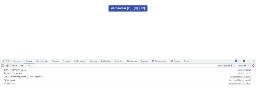

Wow, it's working! but we need yet to create our Modal component using React portals so...
./src/components/Portal/index.tsx
import { useState, useLayoutEffect } from "react";import { createPortal } from "react-dom";type State = HTMLElement | null;function createWrapperAndAppendToBody(wrapperId: string) { const wrapperElement = document.createElement("div"); wrapperElement.setAttribute("id", wrapperId); document.body.appendChild(wrapperElement); return wrapperElement;}function Portal({ children, id = "modal-id" }) { const [wrapperElement, setWrapperElement] = useState<State>(null); useLayoutEffect(() => { let element = document.getElementById(id) as HTMLElement; let systemCreated = false; if (!element) { systemCreated = true; element = createWrapperAndAppendToBody(id); } setWrapperElement(element); return () => { if (systemCreated && element.parentNode) { element.parentNode.removeChild(element); } }; }, [id]); if (wrapperElement === null) return null; return createPortal(children, wrapperElement as HTMLElement);}export default Portal;Create another Interface named IPortalProps in our Interfaces.tsx file
/// Our previous interfaces ...export interface IPortalProps { id: string; children: JSX.Element | ReactChildren | string;}and we import and use our new created interface in our Portal component
import { useState, useLayoutEffect } from "react";import { createPortal } from "react-dom";import { IPortalProps } from "../../types/Interfaces";type State = HTMLElement | null;// Our createWrapperAndAppendToBody functionfunction Portal({ children, id = "modal-id" }: IPortalProps) { const [wrapperElement, setWrapperElement] = useState<State>(null); // Our useLayourEffect logic & other stuff return createPortal(children, wrapperElement as HTMLElement);}export default Portal;We create a Modal component
./src/components/Modal/index.tsx
import { useEffect, useRef } from "react";import { CSSTransition } from "react-transition-group";import { Paper, Box } from "@material-ui/core";import { ButtonComponent } from "../Button";import Portal from "../Portal";function Modal({ children, isOpen, handleClose }) { const nodeRef = useRef(null); useEffect(() => { const closeOnEscapeKey = (e: KeyboardEvent) => e.key === "Escape" ? handleClose() : null; document.body.addEventListener("keydown", closeOnEscapeKey); return () => { document.body.removeEventListener("keydown", closeOnEscapeKey); }; }, [handleClose]); return ( <Portal id="modalId"> <CSSTransition in={isOpen} timeout={{ enter: 0, exit: 300 }} unmountOnExit nodeRef={nodeRef} classNames="modal" > <div className="modal" ref={nodeRef}> <ButtonComponent variant="contained" color="secondary" handleClick={handleClose} > Close </ButtonComponent> <Box sx={{ display: "flex", flexWrap: "wrap", "& > :not(style)": { m: 1, width: "20rem", height: "20rem", }, }} > <Paper elevation={3}> <div style={{ display: "flex", alignItems: "center", justifyContent: "center", marginTop: '4rem', }} > {children} </div> </Paper> </Box> </div> </CSSTransition> </Portal> );}export default Modal;And we create another Interface for Props in our Modal component
// All interfaces previously created so farexport interface IModalProps { isOpen: boolean; children: JSX.Element | ReactChildren | string; handleClose: () => void;}So, we import our new interface in our Modal component
/// All others previous import import { IModalProps } from "../../types/Interfaces";function Modal({ children, isOpen, handleClose }: IModalProps) {// All logic stuff for the Modal component}And we create a new css file to add styles for our Modal
./src/components/Modal/modalStyle.css
.modal { position: fixed; inset: 0; background-color: rgba(0, 0, 0, 0.3); display: flex; flex-direction: column; align-items: center; justify-content: center; transition: all 0.3s ease-in-out; overflow: hidden; z-index: 999; padding: 40px 20px 20px; opacity: 0; pointer-events: none; transform: scale(0.4); } .modal-enter-done { opacity: 1; pointer-events: auto; transform: scale(1); } .modal-exit { opacity: 0; transform: scale(0.4); }And we install react-transition-group package into our project to add some transition animations on our Modal component giving it a very good looking effect and we import our new created modalStyle.css file to our Modal file
./src/components/Modal/index.tsx
//All other imports import "./modalStyle.css";function Modal({ children, isOpen, handleClose }: IModalProps) {// All logic of our Modal component}Until now our ButtonComponent is placed at the left upper corner, so we're going to create a new LayOut Component to Wrap our to position it to the center.
./src/components/Layout/index.tsx
import Box from "@material-ui/core/Box";export const LayOut: React.FC = ({ children }) => { return ( <div style={{ width: "100%" }}> <Box display="flex" justifyContent="center" m={2} p={2} bgcolor="background.paper" > {children} </Box> </div> );};So, now we are going to finish our App importing our Layout Component and our new Modal to the App Component.
./src/App.tsx
import { ButtonComponent } from "./components/Button";import { LayOut } from "./components/Layout";import Modal from "./components/Modal";import { useKeyEventContext } from "./context/keyeventContext";function App() { const { isOpen, setIsOpen, handleClick } = useKeyEventContext(); const handleClose = () => setIsOpen(false) return ( <div> <LayOut> <ButtonComponent variant="contained" color="primary" handleClick={handleClick} > Open Modal [F1] || [F2] || [F3] </ButtonComponent> <Modal isOpen={isOpen} handleClose={handleClose}> Hi there, i'm a modal </Modal> </LayOut> </div> );}export default App;You are going to think, yay! we did it so far! we're done! but no, we need to add a little change on our keyeventState.tsx file to complete the functionality desired.
./src/context/keyeventState.tsx
import React, { useState } from "react";import KeyEventContext from "./keyeventContext";import { useKeyEvents } from "../hooks/useKeyEvents";export const KeyEventState: React.FC = ({ children }) => { const [isOpen, setIsOpen] = useState<boolean>(false); const handleClick = () => { setIsOpen(true); }; useKeyEvents("F1", () => { setIsOpen(true); }); useKeyEvents("F2", () => { setIsOpen(true); }); useKeyEvents("F3", () => { setIsOpen(true); }); return ( <KeyEventContext.Provider value={{ isOpen, setIsOpen, handleClick }}> {children} </KeyEventContext.Provider> );};And the magic happens when you press your F1 to F3 keys and ESC key to close our Modal.
We did it so far in this article until now, but remember only practice makes a master.
Remember to keep improving and investigating new things to add to your projects and get better and better.
Tell me your thoughts about this post in the comments and see ya in another post!
Original Link: https://dev.to/djra26111990/react-portals-create-and-open-modals-with-keyboard-keys-1gc2
Dev To
 An online community for sharing and discovering great ideas, having debates, and making friends
More About this Source Visit Dev To