
An Interest In:
Web News this Week
- April 26, 2024
- April 25, 2024
- April 24, 2024
- April 23, 2024
- April 22, 2024
- April 21, 2024
- April 20, 2024
Some of Our Sources
- Engadget
- Techcrunch
- The Logo Smith
- TutsPlus - Design
- You The Designer
- Reencoded
- Specky Boy
- Codrops
- Android Headlines
- TechPowerUp
Help Webnuz
Referal links:
A Journey of making our Dashboard Close to Perfect.
You can check out our dashboard and Opensource repo here:
 devtron-labs / devtron
Software Delivery Workflow For Kubernetes
![]()
Devtron is an open source software delivery workflow for kubernetes written in go
Explore documentation
WebsiteBlogJoin DiscordTwitter
Menu
- Why Devtron
- Features
- Getting Started
- Documentation
- Compatibility Notes
- Community
- Contribute
- Vulnerability Reporting
- License
Why Devtron?
It is designed as a self-serve platform for operationalizing and maintaining applications (AppOps) on kubernetes in a developer friendly way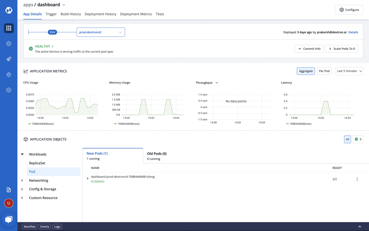
Features
Zero code software delivery workflow- Workflow which understands the domain of kubernetes, testing, CD, SecOps so that you dont have to write scripts
- Reusable and composable components so that workflows are easy to contruct and reason through
- Deploy to multiple kubernetes cluster
- Multi level security policy at global, cluster, environment and application for efficient hierarchical policy management
- Behavior driven security policy
- Define policies and exception for kubernetes resources
- Define policies for events for faster resolution
- One place
This post was originally published on the Devtron website by our design lead, Utkarsh.
I was part of the leadership team of a fast-growing company and it was in May 2017 when we decided that we needed to become a better agile team. We realised that we wanted to become better at estimations and at reacting/taking action on feedback as we were growing at a very fast pace.
As a team, we spent considerable time reading practices adopted by other companies and then sitting in the room with a whiteboard and having passionate discussions on what would work best for us.
We knew that there was no best method or right way to go about everything, therefore, we experimented with different approaches, but always found it difficult to quantify the effectiveness of those changes. It was always about the gut feel, and what the majority of the team felt.
I was particularly happy when we decided to explore the science around the impact of agile practices at Devtron. Now, people fortify their gut feeling with data. But that was only half the battle, we were yet to figure out how to present it in a way that meaningful insights could be derived out of it.
In this blog, we are going to share the journey of evolution of this product, the initial failure and the way forward, , how we evolved our product to what it is today. The journey is still ongoing, and would love to have your feedback and thoughts on how we can make it better.
The science behind the metrics
As the whole reason to adopt agile is to do more frequent and stable deployments, it was a no brainer to have the following metrics:
- Deployment Frequency: How frequently are you deploying code.
- Change Failure Rate: How often deployments fail.
- Mean Time to Recovery(MTTR): How fast can you recover from failures.
Apart from the above metrics which measure the current performance of the team, we also decided to introduce two other metrics which aid in improving the above metrics.
In order to have higher deployment frequency and less failure rate the surface area of the release should be as small as possible and therefore we introduced:
Lead Time: Time gap between the oldest non-deployed commit in the release and the release date. This should be small because older commits may result in merge issues and incomplete testing.
Deployment Size: It is the number of lines changed between the release in question and the previous release. This number should again be as small as possible as smaller change means better testing and fewer bugs. It is based on the principle less code, less bugs, no code, no bugs.
The First Cut
We launched a version of the Deployment Metrics a few months back. This is how it looked in the first version. Lets see what we did and what went wrong.
We had put cards on the top which mentioned cycle time and deployment size for the latest deployment, time since the failure and time it took to recover from failure.
Graph below shows different data points related to each release. X axis denoted time, Y axis could be switched between cycle time and lead time. Ridges denoted number of deployments, circle size denoted size of deployment and green colour denoted successful deployment while red denoted failure.
Hover state showed this information in a tooltip. Users could view these metrics for a set of relative time ranges, i.e; last 15 days, 30 days upto 6 months.
We thought that we had done a good job of putting all data contextually so as to help developers make informed decisions, and that it would see good uptake from developers who want to adopt better DevOps practices.
Outcome (v1)
Over a period of a few months, we waited for users feedback on this page. What happened next was any product designers worst nightmare. It appeared that almost none of our users were engaging with this page. Moreover, we didnt find much adoption internally as well. This meant that the developers at Devtron themselves were not able to leverage it to improve their metrics.
In fact, I clearly remember in one of the meetings around May 2020 when one of the developers threw up his hand and said he was exasperated trying to find whether our process change has been able to mitigate the impact of remote working. That is when we decided to step back and take a closer look at the reasons why this might be happening and how we can make these metrics more usable.
Learnings
We did an intensive half-day session with a focus of tearing down the existing feature and design. Every developer in the company communicated why they were not using it. We realised our biggest mistake was to design this page without looking at the sample data.
The biggest problem was posed by the huge variation in data points.
- Cycle time may vary from a few days for regular releases to a few hours in case of critical bug fixes, the same is true for lead time.
- Deployment size could vary from 2-3 lines to fix a bug to hundreds and thousands of lines for big feature releases.This led to huge variations in the ridge lines with many deployments clustered together which were not differentiable visually.
All in all, it made these charts totally unusable. Then we faced other minor problems: :
- Although these metrics were important in the software delivery world, most developers barely knew what these metrics meant
- Data points were juxtaposed in the graph for better correlation but had very high cognitive difficulty
- Hover state gave all details of deployment, but it was difficult to compare metrics across deployments
- Calendar supported relative time only i.e; last 15 days, 30 days
Second Cut
Armed with the knowledge of challenges in the usability of metrics and data visualisation we decided to rethink it to solve this problem.
Though we use the Jobs to be done framework to identify the desired outcome, this time we added another step which we have found particularly helpful in data intensive applications Questions to be answered. (We didn't know if such frameworks already existed but we have been using this homegrown framework internally for sometime now).
Hence, we decided to look at the metrics from a users lens, the goal this time was to identify key questions the user wants to be answered through this data so that he/she can make an informed decision.
Questions to be Answered (QTBA)
We framed user goals in the form of questions and statements so that we could think in terms of answering these questions while redesigning.
- How has the performance changed over time?
- How has the performance changed after the process was modified?
- How do I quickly figure out areas for improvement?
- How to correlate team behaviour changes with process modification for better Root Cause Analysis (RCA).
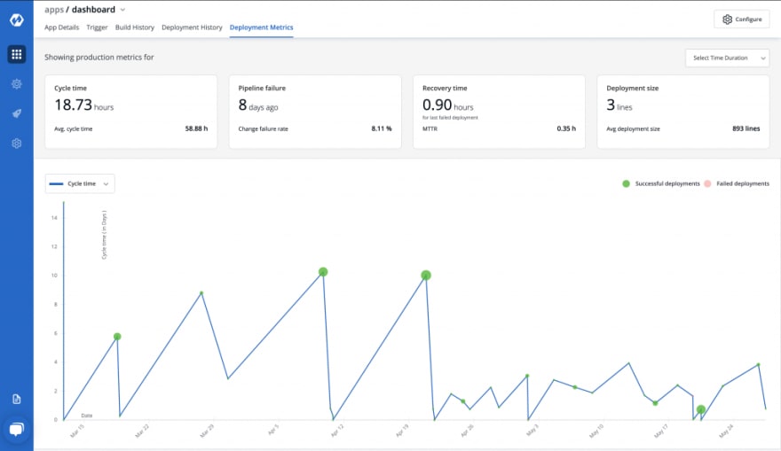
The Redesign
We redesigned the page from scratch in the pursuit of answering the above questions and some more. Take a look at it yourself.
In this design as you would see, we made fundamental changes to the previous design.
Use easy to consume metrics
Cycle time and deployments per day are related metrics, they are inversely related to be precise. Multiple deployments can happen in a day and each one of them will have a different cycle time. With dates as x-axis cycle times of different releases on the same date overlap with each other making them indiscernible.
Therefore, instead of cycle time, we are now charting the number of deployments per day as it is easier to understand trends over time.
Chart is to see trends not for RCA
In the previous approach, all data points were juxtaposed in one chart so that users could find the root cause of the behaviour. But we realised that it was creating cognitive overload.
Therefore in the newer version we decided to use charts only for anomaly detection and delegated RCA responsibilities to tabular data format. Instead of all data points juxtaposed in one chart, we placed all three metrics next to each other to highlight any anomalies.
Eg. In case of higher deployment frequency, you can find out if it is because of bug fixes or old pending features were deployed (higher deployment with increasing lead time).
Whats obvious to you may not be obvious to the user
Each metric is now supported by additional information to make the metric easily understandable and usable.
Example, for Deployment Frequency we have:
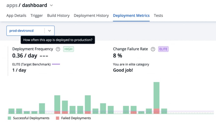
- Meaning: A tooltip explaining what the metric means aimed to familiarise users with various metrics.
- Visualisation: depicting trends of the metric over a given period.
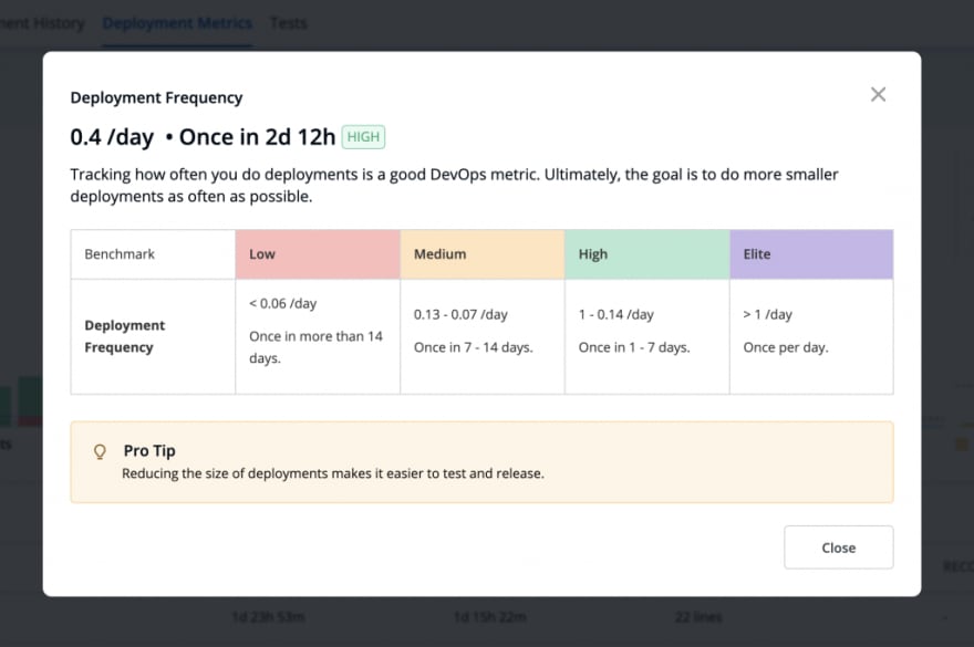
- Benchmarking: This was an important addition aimed to give a quick understanding of where the metric performance stands in comparison to the standard industry benchmark. Each benchmark was divided into four categories Elite, High, Medium, Low.
On clicking the benchmark, it opens a modal which further explains the metrics and the various benchmark categories for the metric.
We also realised that, though the number of deployments is the right metrics, deployment frequency is difficult to understand and hence we added cycle time information along with it for better understanding and correlation.
Hovering over the graph further shows details for each bar.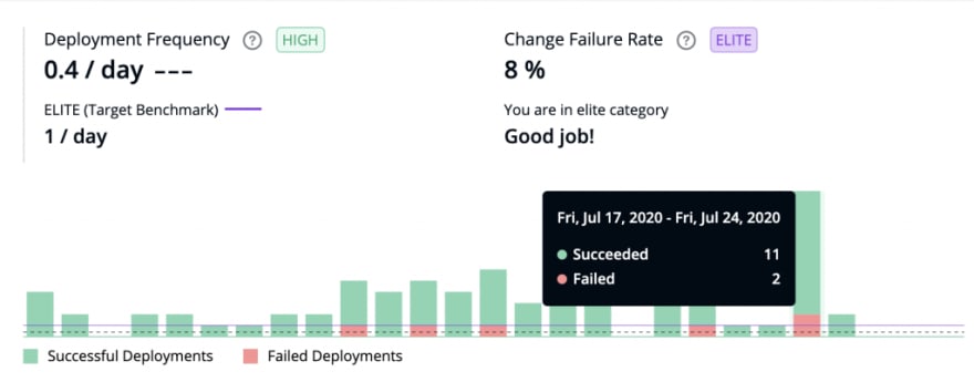
For example, hovering over the above bar shows 13 deployments (11 successful, 2 Failed) in the week of July 17 Jul 24.
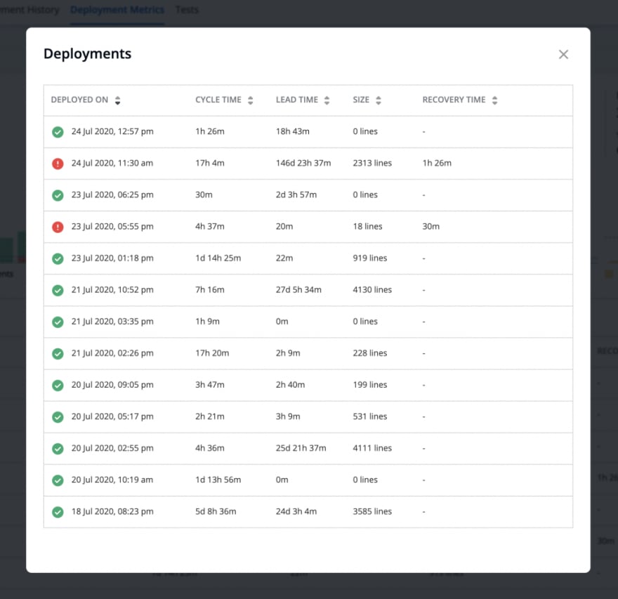
Clicking on each bar further opens a modal (to drill down) showing the deployments related to this particular bar. The modal additionally shows other data points (Cycle time, Lead time, Deployment size, and Recovery time if the deployment had failed) for easier correlation between various data points.
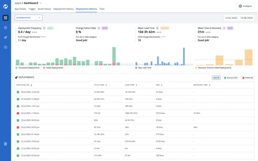
Tabular data better for RCA
Below the graphs, we added a deployments table showing all deployments of the application for the selected environment in the specified time period. The deployments lists can be filtered by successful and failed deployments based on the focus area of the user.
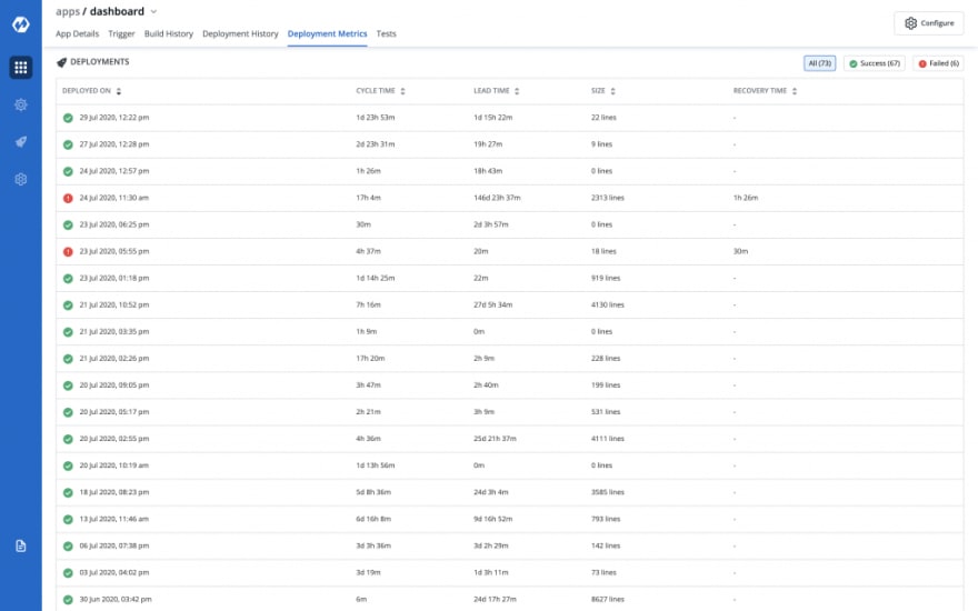
This solves the problem we had with hover, wherein you had to remember previous data points to compare. Now data is visible in tabular format and therefore its easier to compare changes across multiple releases.
Also, we went back to to using cycle time instead of number of deployments per day as this is a non aggregated view of data.
Sorting is provided on every column so that it becomes easier for you to find anomalies for e.g. largest deployments, highest recovery time, highest lead time or cycle time, etc.
You can also see the details of a deployment by clicking on the deployment date.

We believe that through this initial step that we have taken, teams who want to keep challenging themselves will be able to take data backed decisions and will be able to iterate quickly and confidently.
Let us know what you think about the design and our redesign process in the comments below. Also, if you have suggestions related to this feature do reach out to us and you can contribute as well.
Conclusion
- Do not design data visualisations just for the sake of it, make sure they answer the users questions
- Charts are best suited for trend analysis and anomaly detections
- Identifying a relevant graphical representation(bar graph, line/area chart among others) is a key starting point while working with data visualisation
If you would like to know more about UX design and Devtron, I made a walkthrough with Saiyam Pathak, Director at Civo. He is a well reputed YouTube influencer and has a great following in the commnity. You can check it out here:
Original Link: https://dev.to/pghildiyal/a-journey-of-making-our-dashboard-close-to-perfect-39fh
Dev To
More About this Source Visit Dev To