
An Interest In:
Web News this Week
- May 1, 2024
- April 30, 2024
- April 29, 2024
- April 28, 2024
- April 27, 2024
- April 26, 2024
- April 25, 2024
Some of Our Sources
- Engadget
- Technology Review
- Web Designer Wall
- Team Treehouse
- Smashing Magazine
- Smashing Apps
- You The Designer
- Inspiredology
- Reencoded
- Specky Boy
Help Webnuz
Referal links:
Making a popsicle with CSS only!
Getting creative with CSS illustrations
Even though CSS illustrations might not be ideal for production (let's face it, a simple SVG is a lot less painful), they are a great way to improve your CSS skills and let your creative spirit fly!
The project
In this project we'll make a refreshing popsicle with a small animation on hover.
Setting up the HTML
We start with setting up the HTML. In this case, the structure is simple:
<div class="container"> <div class="popsicle-container"> <div class="popsicle-top"></div> <div class="popsicle-base"></div> <div class="stick"></div> </div></div>We have one general container which we'll use to center the popsicle. The popsicle itself is composed of the .popsicle-container which contains three div elements:
.popsicle-top.popsicle-base.stick
These are the only HTML elements we'll need for this project.
Moving on to the CSS
The container is a flex box which takes the whole width of the viewport and both centers and aligns our popsicle in the middle of the screen:
.container { display: flex; justify-content: center; align-items: center; height: 100vh;}The .popsicle-container is very similar, except there we'll set the flex-direction to column so our elements will stack below one another. We'll also set the height and width of the popsicle.
.popsicle-container { display: flex; flex-direction: column; justify-content: center; align-items: center; height: 30rem; width: 12rem;}Now our wrappers are ready and we can move on to the fun stuff!
How do we capture the depth?
We want our popsicle to have proper dimensions. In order to achieve this, we'll be using two pseudo-elements: ::before and ::after.
What are pseudo-elements?
Pseudo-elements are hidden elements (think of them like ghosts that hang around your element). Like the names suggest,::beforeappears before the element and::aftergoes after it. Pseudo-elements are very useful for decorative purposes (like in our popsicle). However they are not always picked up by screenreaders so avoid putting any crucial information in them.
Let's start with the .popsicle-base.
We will put most of the properties in the ::before and ::after elements so the .popsicle-base itself will contain the width and the height. We will also need to be able to link the position of the ::before and ::after elements to the .popsicle-base, so we'll give it a position: relative;.
.popsicle-base { position: relative; height: 20%; width: 100%;}The .popsicle-base::before element will be the shaded part of the popsicle.
.popsicle-base::before { content: ''; position: absolute; width: 100%; height: 100%; background-color: #ffbdce; border-bottom-right-radius: 10%; border-bottom-left-radius: 10%; transform: skewY(-5deg);}All before and after elements need the content property. Without it they won't be displayed. So, all we need to do is to set it to an empty string. We'll set the radius on the bottom borders to make it a bit rounded and add a nice pink background colour. We set postion: absolute; so it'll be relative to the .popsicle-base (we will fix the exact positioning once we have the after element). We'll also slightly skew the Y axis to create the angle needed on the shadow.
This is what we have so far: 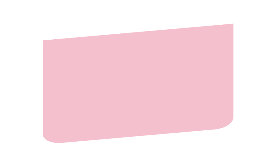
Now for the .popsicle-base::after
We'll give it a bit of depth by putting an ellipse shaped gradient at the top of the element. Besides the background colour and the gradient, the ::after element has all the same properties as the ::before. So we can simplify the code above to this:
.popsicle-base::before, .popsicle-base::after { content: ''; position: absolute; width: 100%; height: 100%; border-bottom-right-radius: 10%; border-bottom-left-radius: 10%; transform: skewY(-5deg);}.popsicle-base::before { background-color: #ffbdce;}.popsicle::after { background: radial-gradient(ellipse at top, rgba(241, 240, 240, 0.74), #ffcbd8 60%); background-color: #f3f3f3;}And here's what we have now. 
You might think, wait, where's the first rectangle?
It's there! It's just hidden behind the ::after element. In order to make it visible we'll need to shift the ::before element a bit to the right. We'll also push it a tiny bit upwards.
.popsicle-base::before { background-color: #ffbdce; right: -1.5rem; top: -0.1rem;}The result is a nicely shaded and slightly skewed rectangle: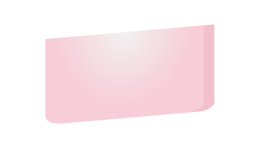
Doing the same for the .popsicle-top and .stick
The .popsicle-top follows the same logic except we put the gradient at the bottom of the element so that it blends with the other gradient:
.popsicle-top { position: relative; height: 60%; width: 100%; border-top-left-radius: 35%; border-top-right-radius: 35%;}.popsicle-top::before, .popsicle-top::after { content: ''; position: absolute; width: 100%; height: 100%; border-top-left-radius: 35%; border-top-right-radius: 35%; transform: skewY(-5deg)}.popsicle-top::before { right: -1.5rem; background: #86c8e4;}.popsicle-top::after { background: radial-gradient(ellipse at bottom, rgba(241, 240, 240, 0.74), rgba(152, 208, 241, 0.877) 80%); background-color: #97DFFC;}What we have so far:
The stick is also the same but there we also add a bit of shading on the top of the stick to make it's placement with the popsicle more realistic:
stick::before, .stick::after { content: ''; position: absolute; width: 100%; height: 100%; border-bottom-left-radius: 10%; border-bottom-right-radius: 10%; box-shadow: inset 0 0 1rem rgb(236, 187, 113), inset 0 0.5rem 0.7rem -0.3rem rgba(0,0,0,0.4); transform: skewY(-5deg)}.stick::after { background-color: #F3D4A5;}.stick::before { right: -0.5rem; background-color: rgb(219, 183, 128);}With that we have our lovely popsicle: 
Adding animation
We'll add a small pulsating animation where we slightly decrease the size and then increase it again.
@keyframes pulse { 0% { transform: scale(1); } 60% { transform: scale(0.95); } 100% { transform: scale(1); }}We'll then apply it on the .popsicle-container on hover with a 2 second duration and on an infinite loop (as long as the element is in the hover state):
.popsicle-container:hover { animation: pulse 2s ease-in infinite;}That's it!
I hope you've enjoyed making this colourful popsicle :)
Original Link: https://dev.to/evathora/making-a-popsicle-with-css-only-29gi
Dev To
 An online community for sharing and discovering great ideas, having debates, and making friends
More About this Source Visit Dev To