
An Interest In:
Web News this Week
- April 1, 2024
- March 31, 2024
- March 30, 2024
- March 29, 2024
- March 28, 2024
- March 27, 2024
- March 26, 2024
Some of Our Sources
- Mashable
- Techcrunch
- Just Creative
- Spoon Graphics
- Six Revisions
- Web Designer Depot
- Crazy Leaf Design
- Android Dissected
- Android Headlines
- Dev To
Help Webnuz
Referal links:
Styling concepts every Frontend guy must know about
// Always remember.your-projects { custom-styles: 'neat';}Hello fellow developers,
Hope you all are doing well! This post is going to be about some intermediary styling concepts/resources that you need to know about, especially if you are looking for jobs concerning frontend development.
I have found these concepts on every frontend job interview I've ever taken and stumbling over these (unless it's for an internship) is a big red flag for recruiters. That is because it sets you apart from people who use readymade components or use UI libraries. Now there's no problem in using those libraries in a personal project, but when you are developing in an industry, the code you write is likely to be licensed as an intellectual property thus making the use of external libraries questionable. Apart from that, I highly recommend for you guys to try these concepts in your personal projects and showcase them, as this highlights your skills and understanding of styling to a fundamental level, and would also rid you of depending on any styling framework.
Alright then, let's dive right into it...
1. Flexbox (or Flex)
Flexbox, according to MDN Web Docs, is
The Flexible Box Module, usually referred to as flexbox, was designed as a one-dimensional layout model, and as a method that could offer space distribution between items in an interface and powerful alignment capabilities.
which essentially means that it's a container that rearranges itself automatically on screen resizing. Now, this is a very handful tool as modern devices vary in screen sizes, and a website needs to be responsive to adapt to these screens.
A good practice to wrap your head around the flexbox concept is to try and make a simple 3x3 checkerboard just by using vanilla CSS.
First create a parent div with 9 child divs.
<!-- create a parent --> <div class="parent"> <div class="child">1</div> <div class="child">2</div> <div class="child">3</div> <div class="child">4</div> <div class="child">5</div> <div class="child">6</div> <div class="child">7</div> <div class="child">8</div> <div class="child">9</div> </div>Add in the CSS. The parent div will be the flexbox while the children will have width 30% (30vw = 30% view width, more about vw and css lengths).
.parent { display: flex; flex-wrap: wrap; /*it's important to wrap the components. More info here https://developer.mozilla.org/en-US/docs/Web/CSS/flex-wrap*/ } .child { width: 30vw; margin: 1vw; text-align: center; border: black 1px solid; line-height: 24vh; }Results: 
So we've created a simple 3x3 checkerboard with flexbox. If you try to resize your browser window, you will notice that the boxes resize and align themselves accordingly.
2. nth selectors
Nth selectors are basically selectors that can be used to select HTML elements based on their position of occurrence in the DOM. For example, if we want to color alternate checker boxes in the checkerboard we created previously, we can add the style as follows
.child:nth-child(odd) { /* odd = 1st occurrence, 3rd occurrence and so on */ background: black; color: white; }Result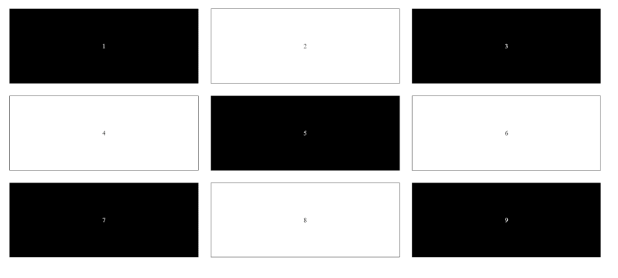
There are more such nth selectors such as
... and many more
3. :before and :after pseudo elements
If you've ever wondered how to style your paragraphs the way newspapers and magazines do, with the first alphabet of the paragraph being almost 3 times the size of rest of the text, then one of the ways to achieve that is using pseudo elements. Pseudo elements are not exactly on the DOM but are a part of the main element. They are limited in interaction and styling, but can be used to decorate and add stylistic aesthetics to your element.
We will now see how to create a magazine style paragraph. First we'll write a simple "Lorem ipsum" paragraph in a div
<!-- Don't forget to not include the "L" at the start --> <div> orem ipsum dolor sit, amet consectetur adipisicing elit. Neque velit facilis aut dolorum quasi corrupti reiciendis esse hic. Optio, quia! Quam aliquam repellendus officia hic, delectus accusantium excepturi quibusdam sequi! </div>Then add the CSS
div:before { content: 'L'; margin-right: 1%; display: block; float: left; /* so that they align in a line, and don't drop off to the next line */ font-size: 400%; }Result
We can also add a pseudo element at the end with the :after class
div:after { content: 'continued...'; display: block; float: right; font-size: 200%; color: lightgray; font-style: italic; }Result
More about pseudo elements here
Alright, that's all from me for now, hope it was of use to you all. Thank you for staying till the end, I'm still getting a hang of blogging so I'm a noob at it.
I'll add more posts to this series as time passes ;)
You can follow me on my Dev.to @vedant1202
and on my Github@Vedant1202
Peace and stay safe
Footnotes
- Image taken from Unsplash @jantined
- References from Mozilla Developer Network Web Documentation
Original Link: https://dev.to/vedant1202/styling-concepts-every-frontend-guy-must-know-about-2nmd
Dev To
 An online community for sharing and discovering great ideas, having debates, and making friends
More About this Source Visit Dev To