

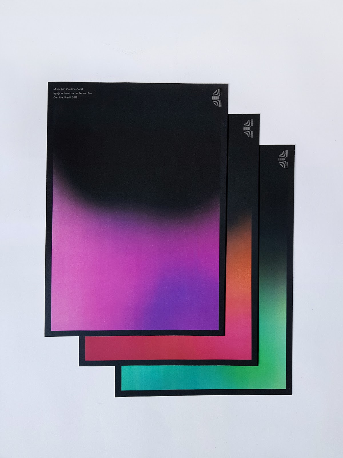
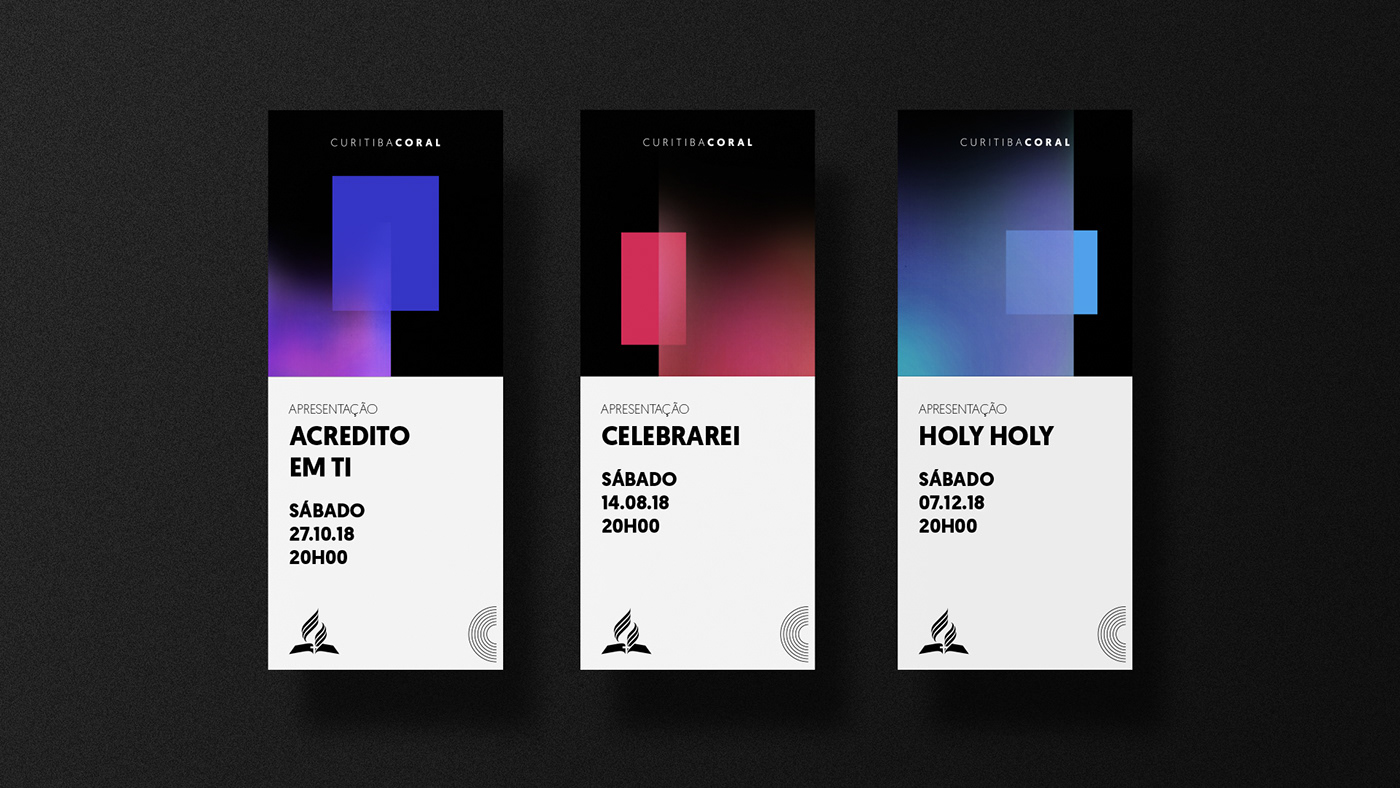
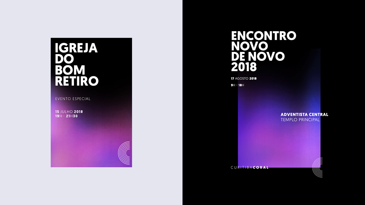
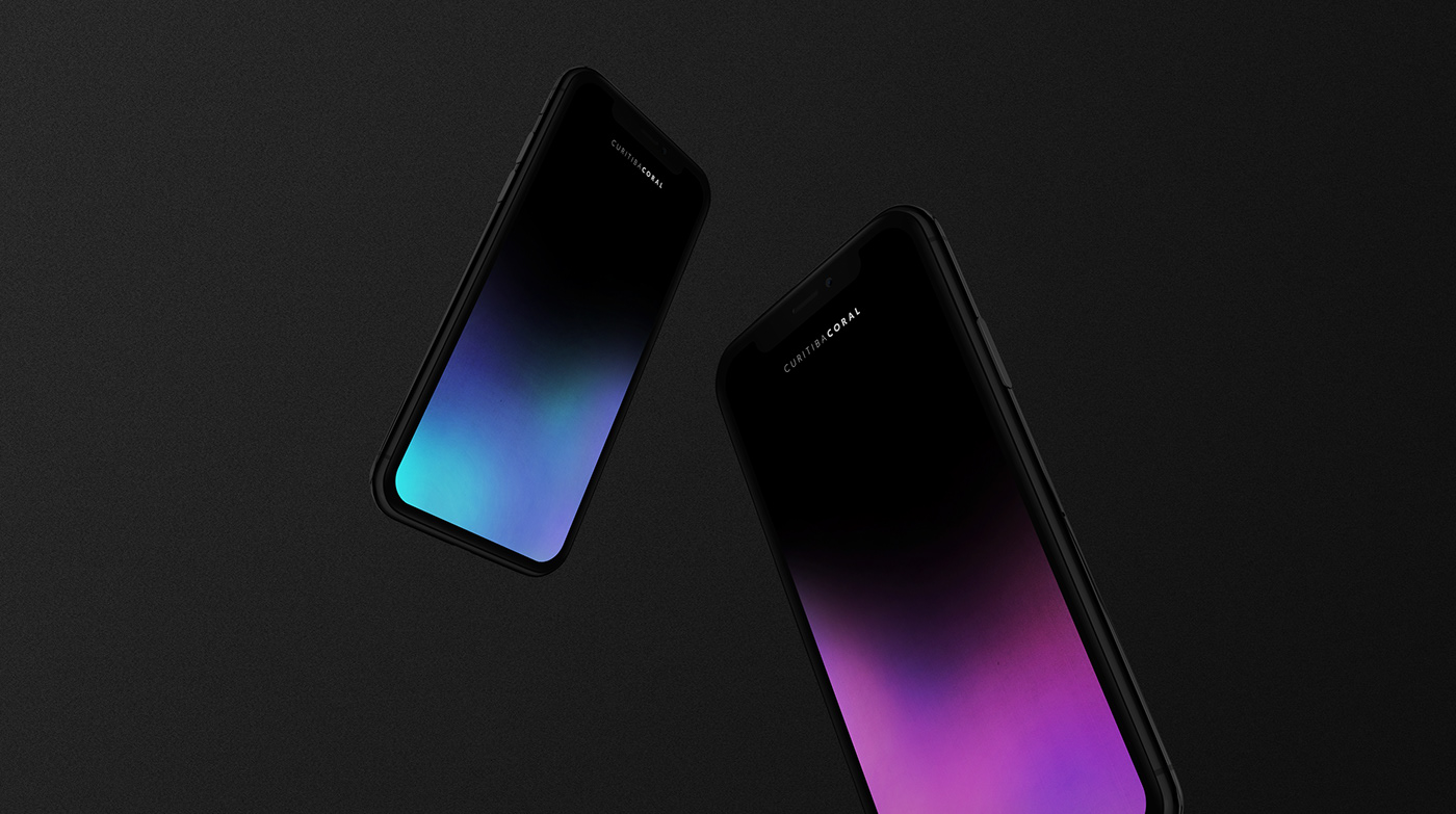
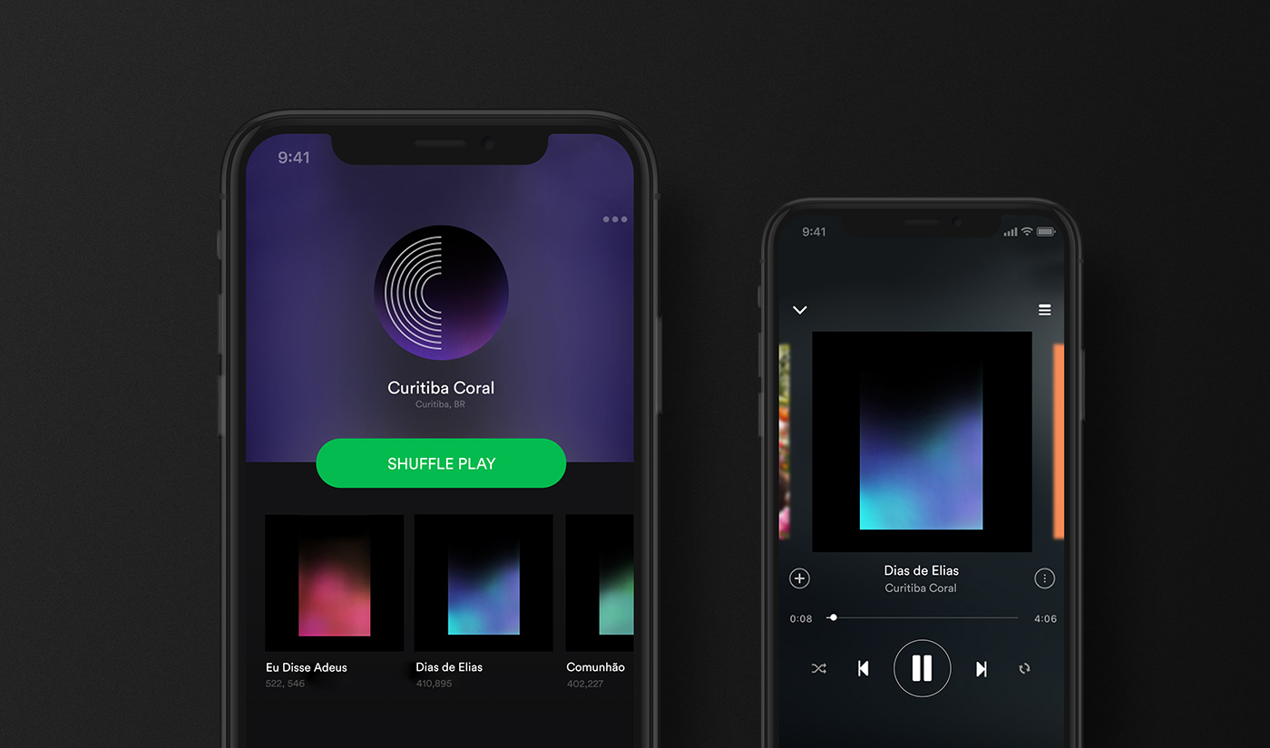
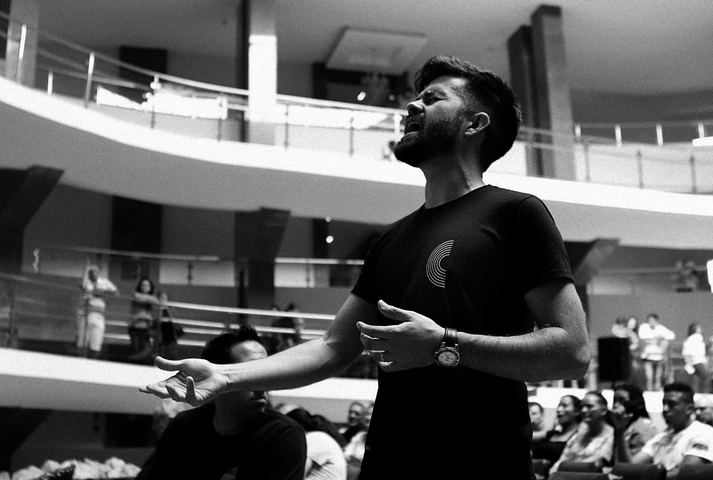
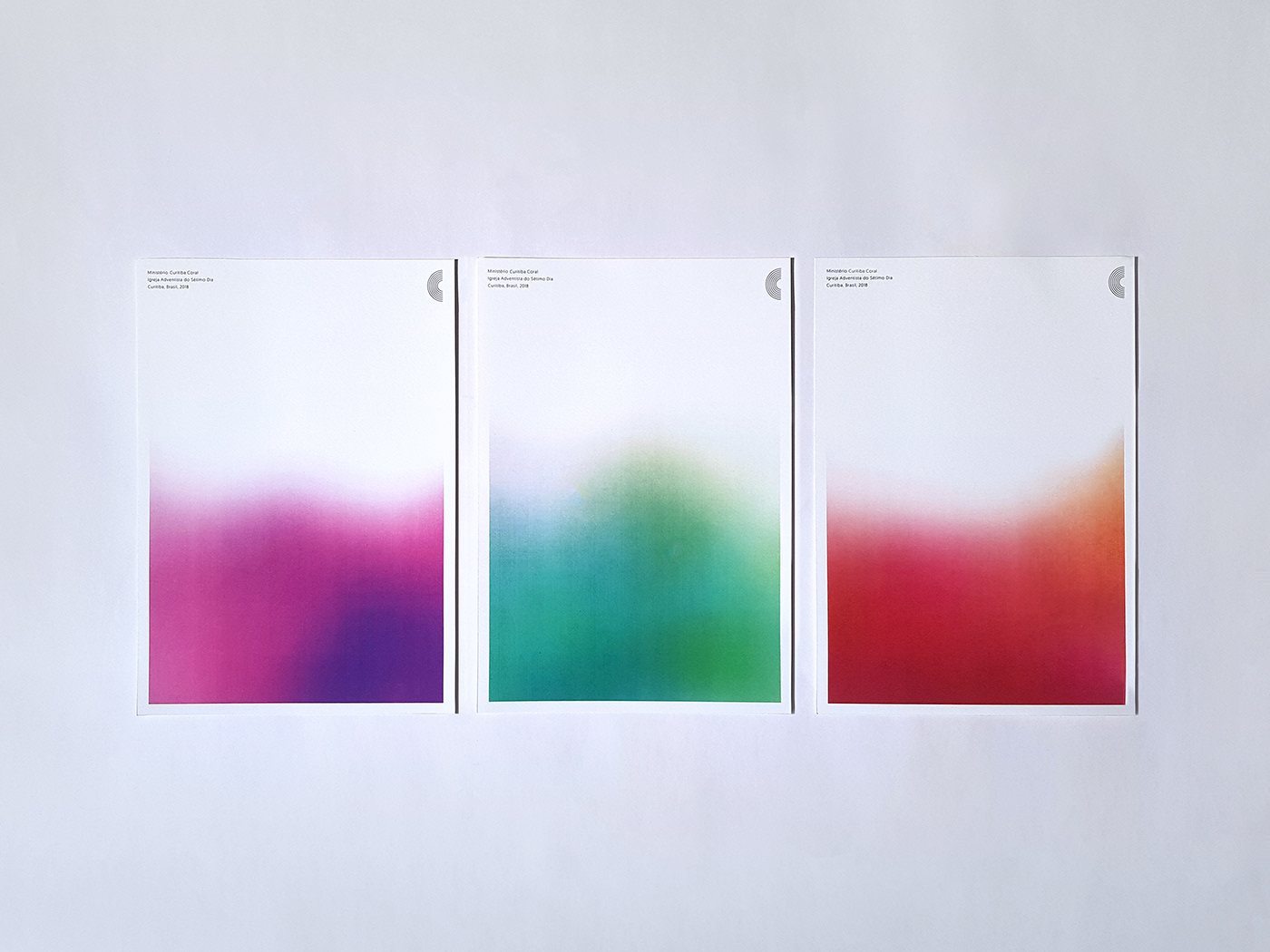
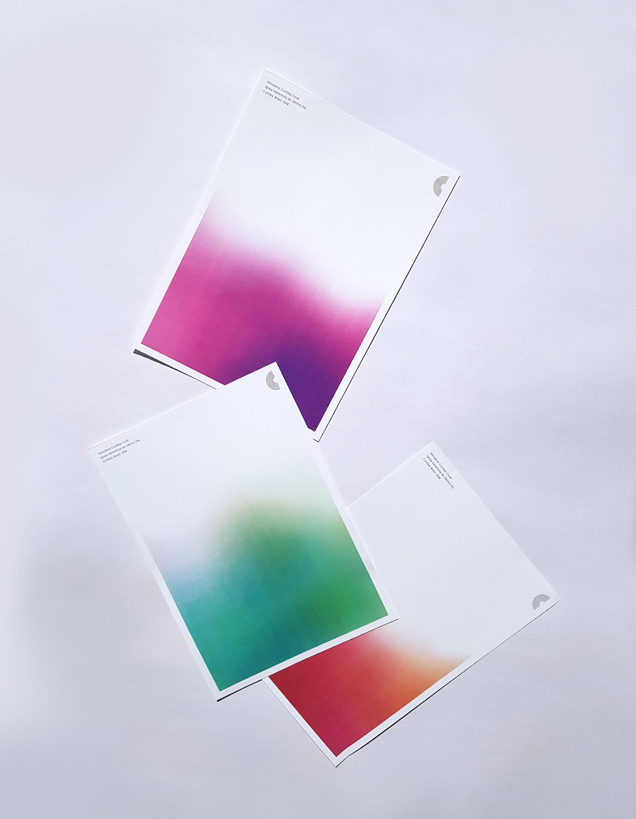
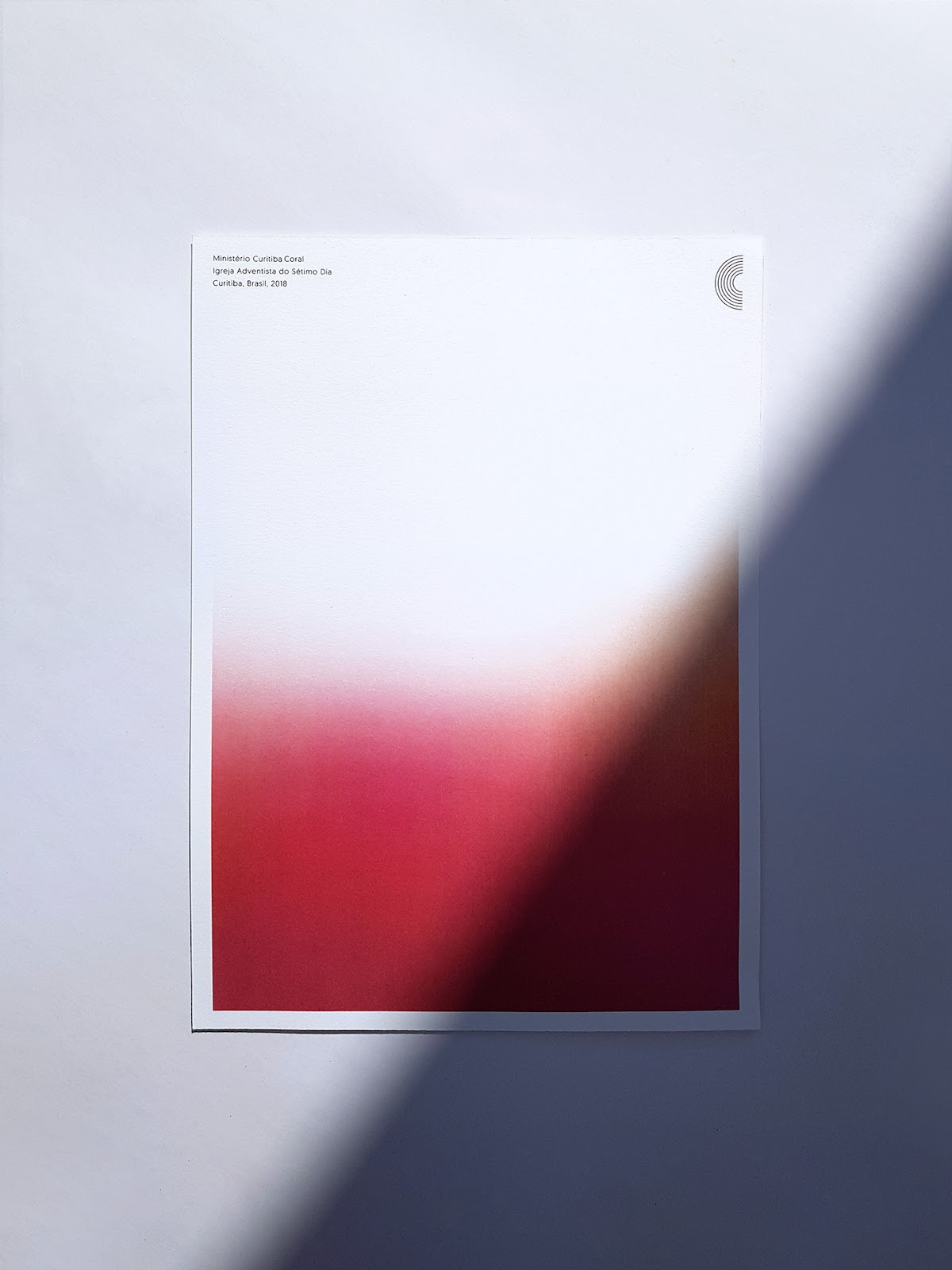
Massimo.studio shared a beautiful branding and visual identity for Curitiba Coral. In an environment where communication materials tend to be outdated and little inventive, Curitiba Choir sought a new identity designed towards a young audience (15-35) that would be bold, contemporary and relevant. With clear goals to be reached, we developed a visual system based on a concise symbol, vivid color gradients alongside a clean and direct typography.
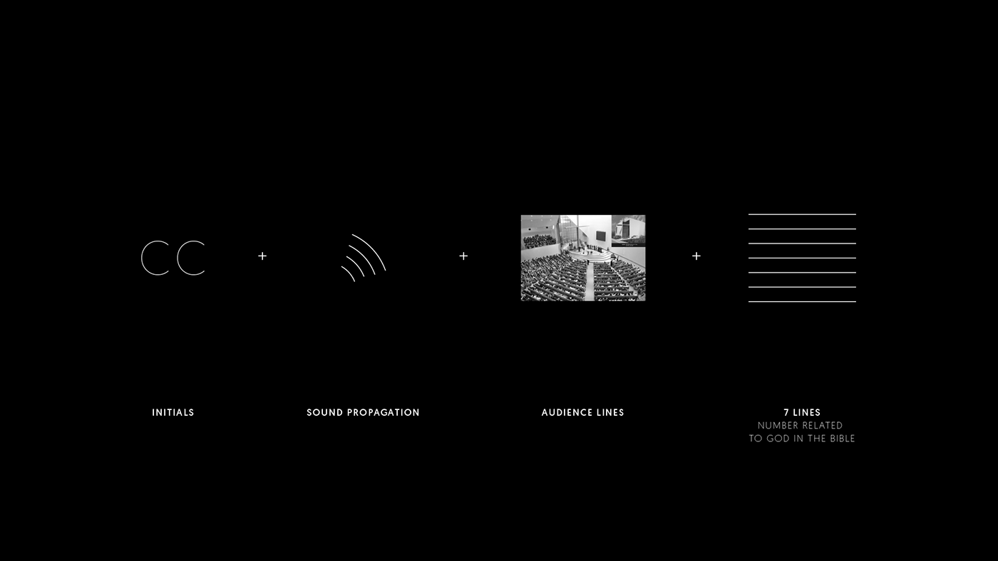
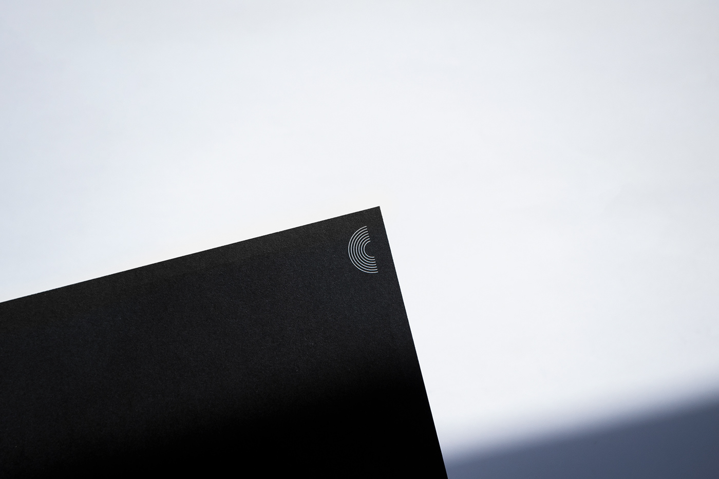
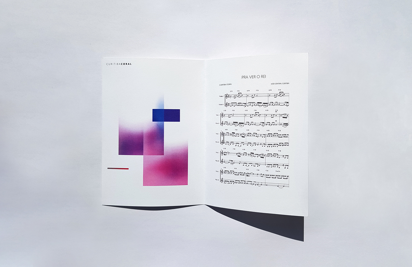
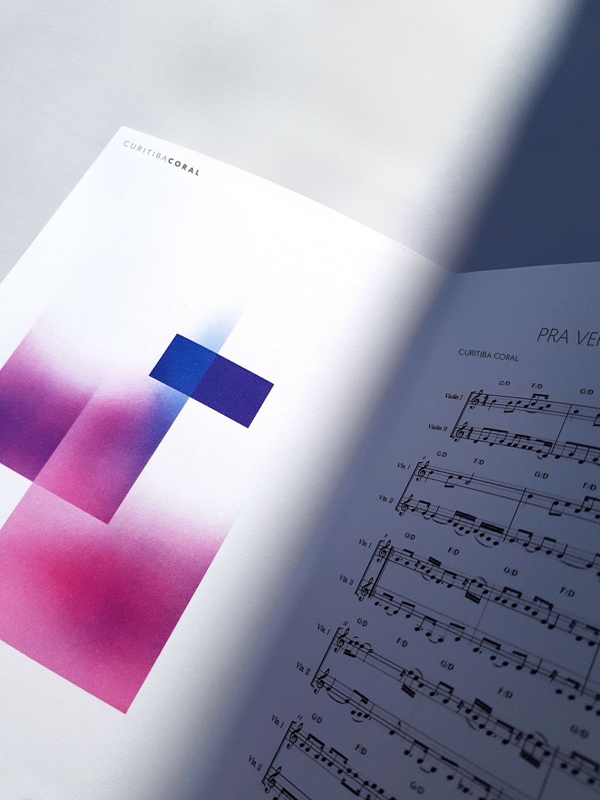
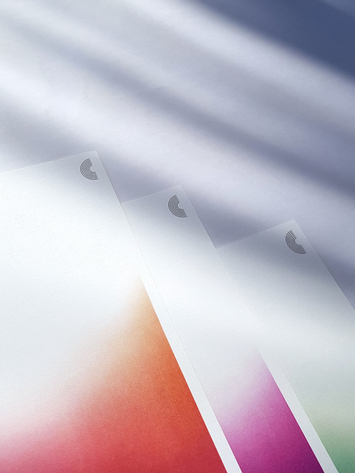
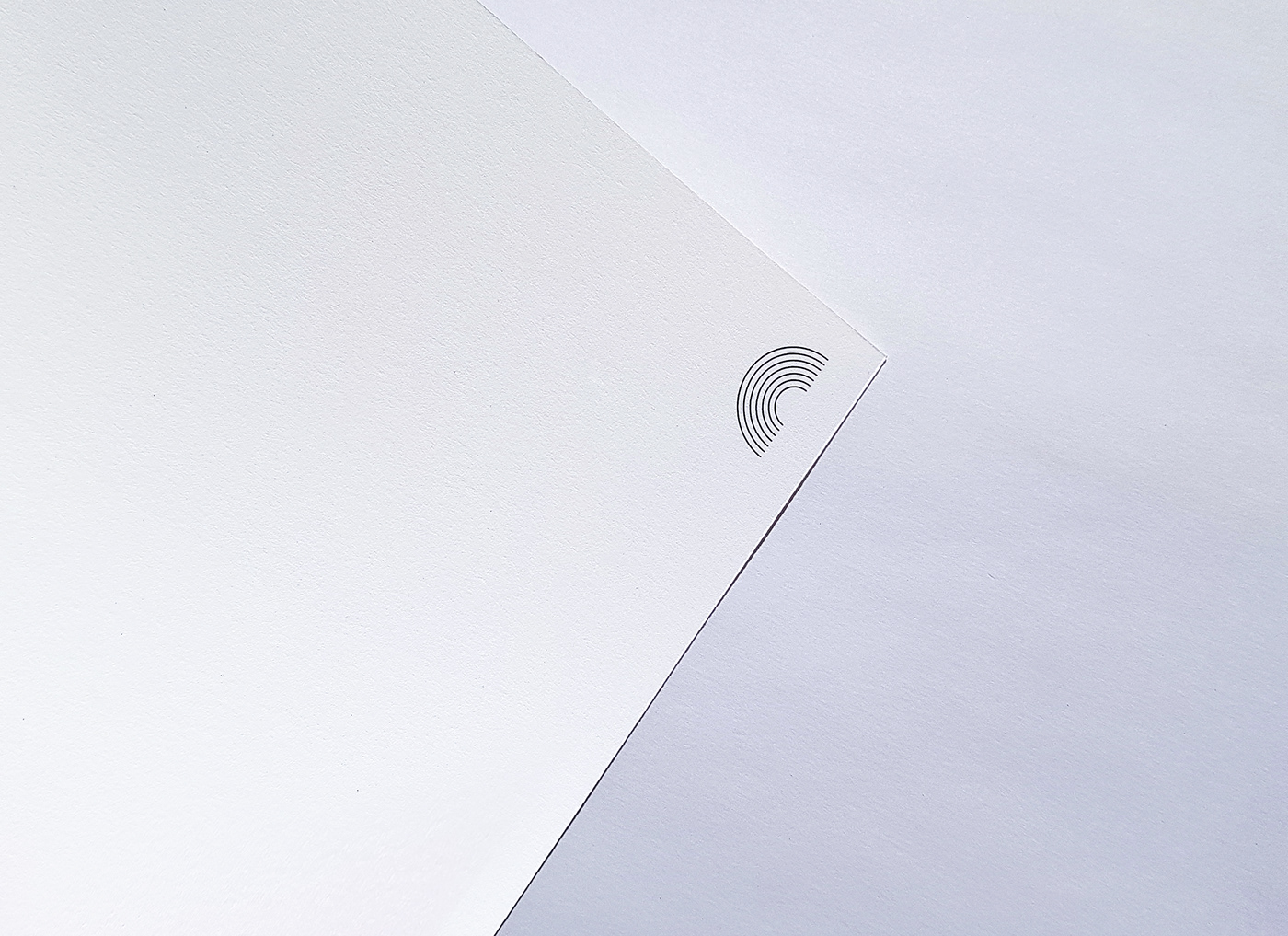
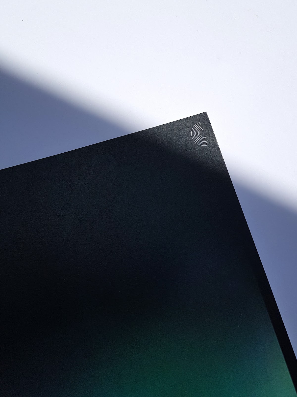
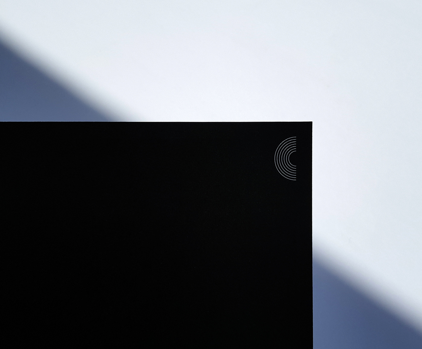
We have the initials of the name represented in the symbol, formed by seven lines referring to the number related to God in the Bible. Furthermore, there is the idea of sound waves propagation and the lines formed by the audience arrangement in the choirs church headquarters.
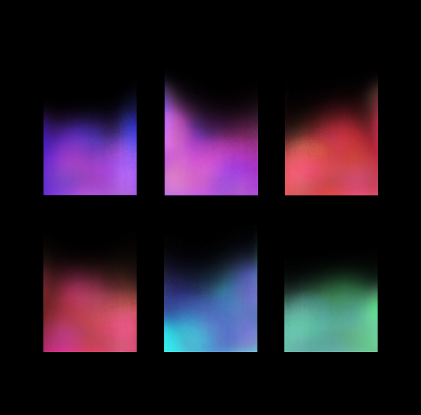
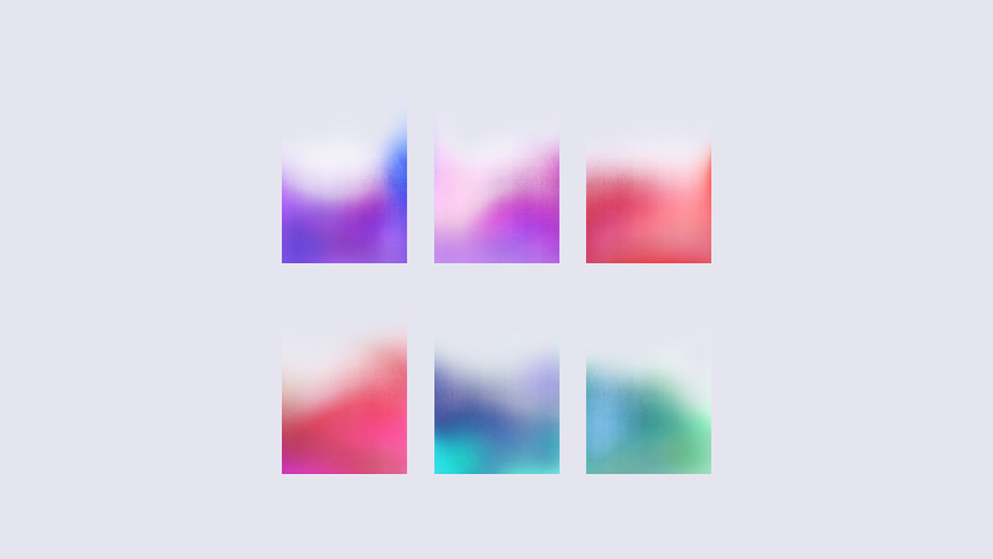
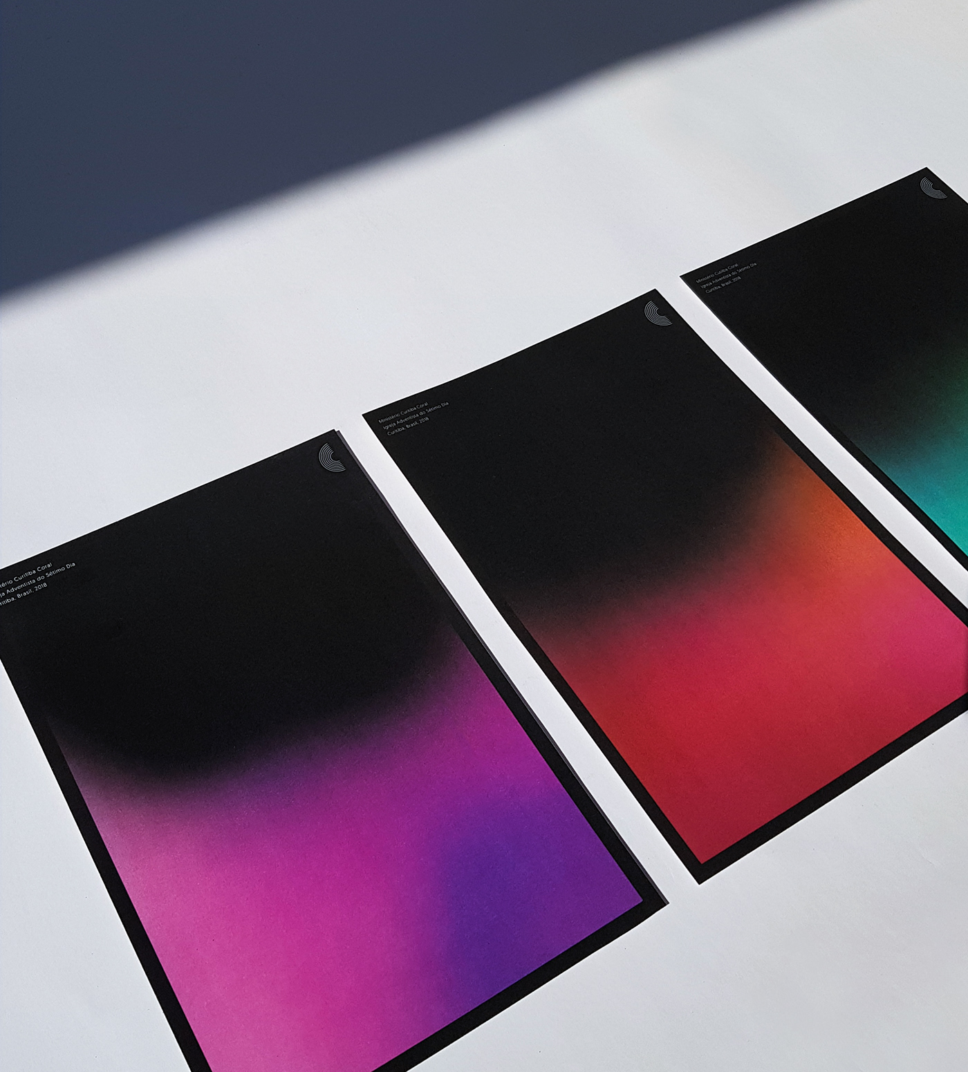
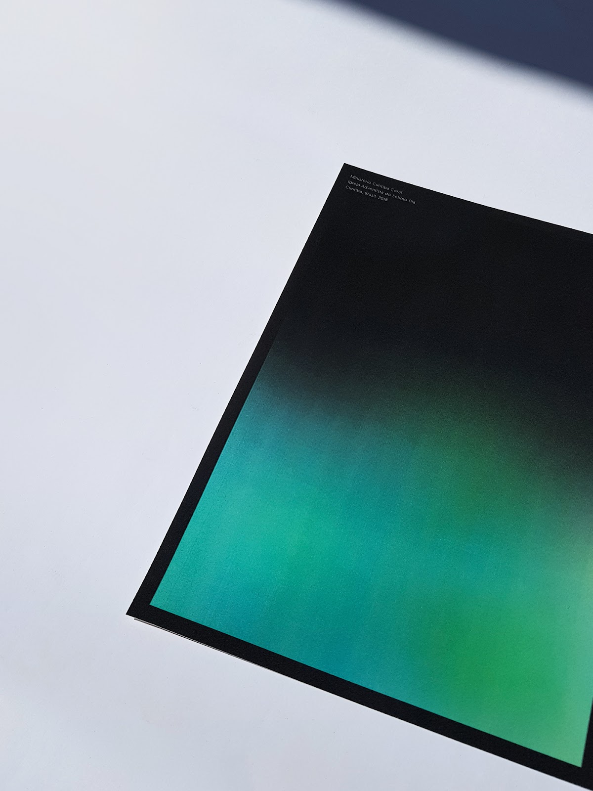
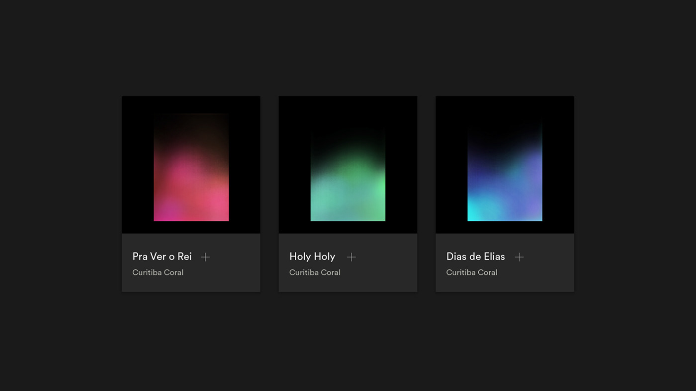
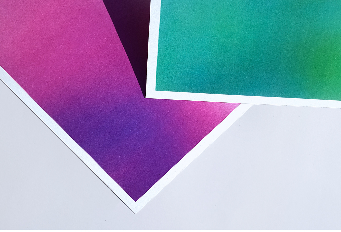
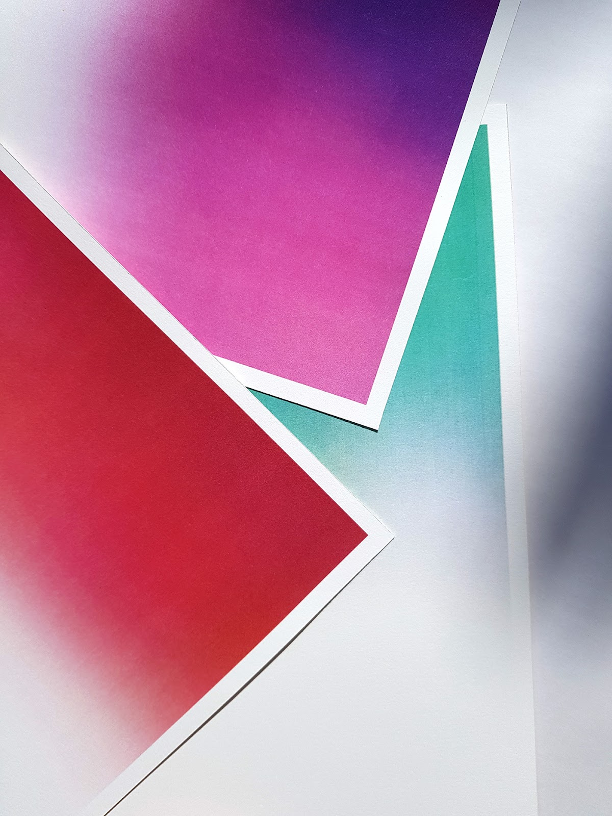
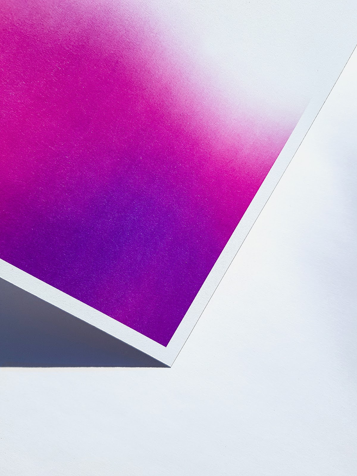
The gradients aimed upwards function as a fluid and smooth representation of voices and music rising towards heaven. In total, there are six gradients alluding to six vocal tessituras present in a choir: soprano, mezzo, contralto, tenor, baritone and bass.
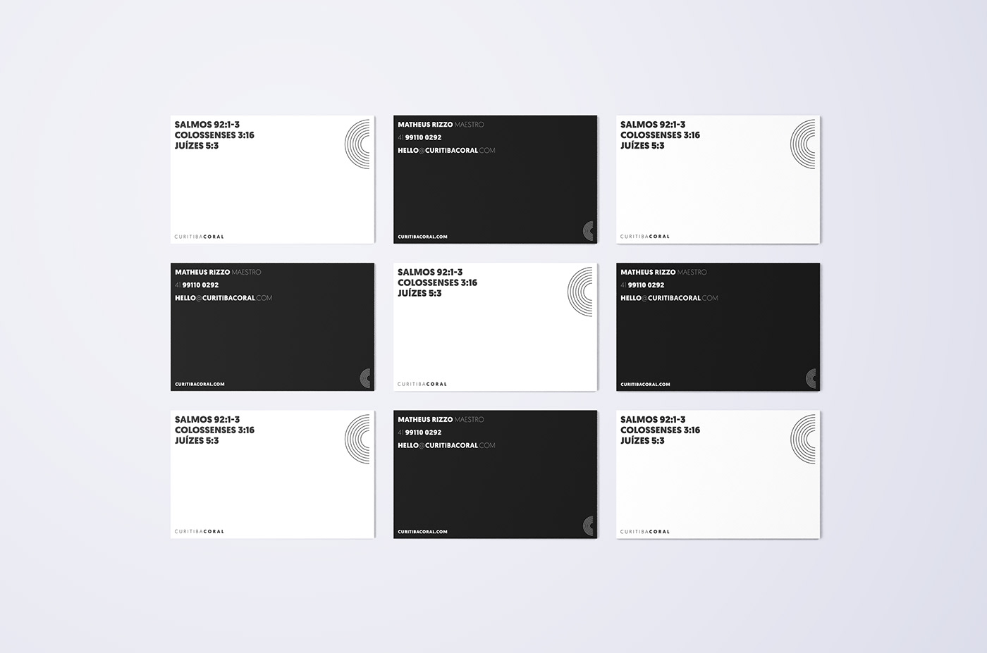
In addition, the geometric typography gives support to the visual identity, providing a harmonic composition with the gradients, generating clearness and legibility throughout the whole communication.


Credits
- Design Services: Brand Identity, Key Visuals
- Sector: Music
- Website: massimo.studio
- Social media: instagram
 Abduzeedo is a collection of visual inspiration and useful tutorials