
An Interest In:
Web News this Week
- April 3, 2024
- April 2, 2024
- April 1, 2024
- March 31, 2024
- March 30, 2024
- March 29, 2024
- March 28, 2024
Some of Our Sources
- Slashdot
- Techcrunch
- The Logo Smith
- Spoon Graphics
- Smashing Magazine
- TutsPlus - Design
- Inspiredology
- Stylized Web
- Freelance Switch
- The Verge
Help Webnuz
Referal links:
Getting Started with Storybook: How to Develop React Components Without an App
I wanted to write up some thoughts and a quick tutorial on one of my favorite development tools, Storybook. You can use Storybook which allows you to develop user interface components in isolation. It can also aid in development and documentation of design systems -- which are sets of components and design standards that companies develop to be used across their apps.
What is a Design System
Large companies normally have multiple applications -- external facing, internal facing, and cross-platform. It can be difficult to unify the design across these platforms. So, many companies are implementing design systems to help create unified design across all of their products and platforms. Here is a great example of how Airbnb implements their design system.
You may have heard of a component library before -- these are collections of components that you can import and use in your projects. A design system extends this to also include style and content guidelines and other rules for future design work. This is a great post about how design systems go beyond component libraries.
How does Storybook help?
Storybook really helps with the development process of design systems and component libraries. Here is an example of Grommet, an accessible React component library's, full Storybook. Normally, you'd have to build out a whole app in order to see your components as you create them. Storybook allows you to develop components independently so you can focus on styling and interaction. You can use it with many different frontend libraries such as React, Angular, Vue, or even just with HTML.
Tutorial
In this tutorial, we'll use React to build out a mini-component library that has a few different types of buttons to see how Storybook works! If you're new to React, check out this post to get up to speed before continuing on with this tutorial.
First, create a React app: npx create-react-app storybook-tutorial. Then, change into its directory: cd storybook-tutorial.
Now, install storybook and initialize it: npx -p @storybook/cli sb init.
This command adds a .storybook folder with configuration information about your project. It also adds a /stories folder inside your /src directory that shows a demo Storybook project. We'll go ahead and delete that folder , but you can take a peek at the code if you want!
Run: npm run storybook to get Storybook up and running -- it should pop up in your browser and give you a message about no stories being found.
Now, we'll go ahead and create a Button directory: mkdir Button and add three files inside of it, one for the component, one for the CSS, and one for the stories: touch Button.{js,css,stories.js}.
Here's a recap of all the steps from above:
$ npx create-react-app storybook-tutorial$ cd storybook-tutorial$ npx -p @storybook/cli sb init$ rm -rf /src/stories$ npm run storybook$ mkdir /src/Button$ touch /src/Button/Button.{js,css,stories.js,test.js}Now, we'll make a React component in the Button.js file -- it will just render a button and use the children prop for text. This allows us to instantiate our button component like <Button>my text</Button> and then our component would render a button element with my text on it!
// Button.jsimport React from 'react'import './Button.css'export default function Button({ children }) { return ( <button>{children}</button> )}Now we'll go ahead and create a couple stories. A story is a display of a state of a component. We'll have collections of stories for different types of elements. For example, we can have a collection of different versions of our Button component.
We'll go ahead and add our Button stories to Button.stories.js. First, we need to import React so we can use JSX in the file. Then we'll import our Button component.
Next, we'll add a default export from this file which will have metadata about our collection. In this case, I'm titling the collection Button. This will render on our Storybook UI as almost a directory name.
We'll also export two functions that instantiate our Button component with different text on it.
All together, our code will look like this!
// Button.stories.jsimport React from 'react'import Button from './Button'export default { title: 'Button'}export const DefaultButton = () => <Button>hi!</Button>export const SecondButton = () => <Button>hello!</Button>If you check back on your Storybook window, it should look like this:
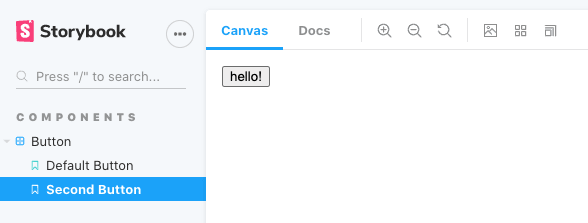
There's a Button collection label with two different buttons: Default and Second. You can click between the buttons and see each one's different text. If we were just using React, we would need to build an app to view the component -- here we can develop them independently just by creating stories.
Let's think of the different types of buttons we may have in our design system. Maybe a default outlined one, a disabled one, a primary button and then maybe different states -- hover and click for example. We may also have different sizes of buttons. What we can do is add props that differentiate these different factors and then based on those props add CSS classes to our buttons.
We'll first make it so that we have an outline button and a default button.
First, add the following CSS:
/* Button.css */button { background-color: #FF389C; color: white; font-size: 20px; padding: 10px; border: none; border-radius: 4px;}button:focus { outline: 2px solid pink;}.outline { background-color: white; color: #FF389C; border: 2px solid #FF389C;}Then, we'll tweak our storybook file to export a default button and an outline button instead of the default and second button that we have now:
export const DefaultButton = () => <Button>click me!</Button>export const OutlineButton = () => <Button outline>click me!</Button>Then, we need to conditionally add the outline class to our button if it has the outline prop:
import React from 'react'import './Button.css'export default function Button ({ children, outline }) { let classes = '' if (outline) classes += 'outline ' return ( <button className={classes}>{children}</button> )}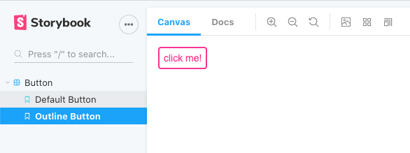
Now, if you look at Storybook the two buttons reflect our two different types of buttons!
Let's also make it so that we can have small and large buttons.
/* Button.css */.small { font-size: 10px; padding: 6px;}.large { font-size: 20px; padding: 10px;}We'll add two more button stories:
export const SmallButton = () => <Button size='small'>click me!</Button>export const LargeButton = () => <Button size='large'>click me!</Button>If you wanted, you could add small and large outline buttons too!
We'll also add the size to the classes:
import React from 'react'import './Button.css'+ export default function Button ({ children, outline, size }) { let classes = '' if (outline) classes += 'outline '+ classes += size return ( <button className={classes}>{children}</button> )}Now you should have four stories!

There are a couple things you could do now: you could use actions to test out event handling. You could use your Button in an app by importing it into a page of a React app -- you could also deploy it to npm so that you could use it in projects more easily in the future. You can also deploy your storybook so that other people can visit it by running npm run build-storybook and then using static site hosting for the folder that is produced from that command.
Storybook is such a great development tool, especially if you're a design-focused frontend developer. I hope that this was a helpful tutorial, feel free to tweet at me with what you'd like to see a tutorial on next!
Original Link: https://dev.to/aspittel/getting-started-with-storybook-how-to-develop-react-components-without-an-app-3l8c
Dev To
 An online community for sharing and discovering great ideas, having debates, and making friends
More About this Source Visit Dev To