
Some of Our Sources
- Slashdot
- Spoon Graphics
- Smashing Magazine
- Abduzeedo
- TutsPlus - Design
- Creative Curio
- CSS Globe
- Line 25
- Codrops
- Daily Now
Help Webnuz
Referal links:
A new technique for making responsive, JavaScript-free charts
There are countless libraries for generating charts on the web. Each serves a slightly different niche, but all of them have one thing in common: they require JavaScript.
That makes sense, of course often your charts will depend on data that must be fetched over the network with JS, or will be rendered to a <canvas> element. But it's not ideal. Not everyone has JS, and in any case relying on it means that you'll be left with a chart-shaped hole in the page until it loads, which you can only really get away with if all your dataviz is tucked away below the fold.
Another more subtle problem is that fluid charts those that adapt to the width of their containers must be redrawn upon resize to avoid potentially breaking. That can mean more work for the developer (particularly if the developer is using a low-level library like D3), and certainly more work for the browser.
For a recent New York Times article, I wanted to see if it was possible to create SVG charts that would work without JS.

Well, it is. I haven't seen the same combination of techniques used elsewhere, so I figured I'd write up the process. I've also created an experimental Svelte component library called Pancake to make these techniques easier to use.
The problem
Creating an SVG line chart (we'll come to other chart types later) is actually rather simple. Suppose we have a series like this...
const data = [ { x: 0, y: 0 }, { x: 1, y: 1 }, { x: 2, y: 4 }, { x: 3, y: 9 }, { x: 4, y: 16 }, { x: 5, y: 25 }, { x: 6, y: 36 }, { x: 7, y: 49 }, { x: 8, y: 64 }, { x: 9, y: 81 }, { x: 10, y: 100 }];...and a 300px by 100px chart. If we multiply the x values by 30, and subtract the y values from 100, we'll get coordinates that fill the space:
<polyline points=" 0,0 30,99 60,96 90,91 120,84 150,75 180,64 210,51 240,36 270,19 300,0"></polyline>Typically, of course, you'd use a scaling function rather than calculating the coordinates manually:
function scale(domain, range) { const m = (range[1] - range[0]) / (domain[1] - domain[0]); return num => range[0] + m * (num - domain[0]);}const x = scale([0, Math.max(...data.map(d => d.x))], [0, 300]);const y = scale([0, Math.max(...data.map(d => d.y))], [100, 0]);const points = data.map(d => `${x(d.x)},${y(d.y)}`).join(' ');const chart = `<svg width="300" height="100"> <polyline points="${points}"></polyline></svg>`;Throw in some axes and some styling, and we have a chart:

That logic could all live inside a Node.js script, meaning this chart could easily be created without any client-side JS.
But it won't adapt to the size of its container it will always be a 300px by 100px chart. On most websites, that's a problem.
The solution (part one)
SVG has an attribute called viewBox that defines a coordinate system that is independent of the size of the <svg> element itself. Ordinarily the aspect ratio of the viewBox is preserved regardless of the aspect ratio of the <svg> element, but we can disable that with preserveAspectRatio="none".
We can pick a simple coordinate system, like this...
<svg viewBox="0 0 100 100" preserveAspectRatio="none">...and project our data into it. Now, our chart adapts fluidly to its environment:
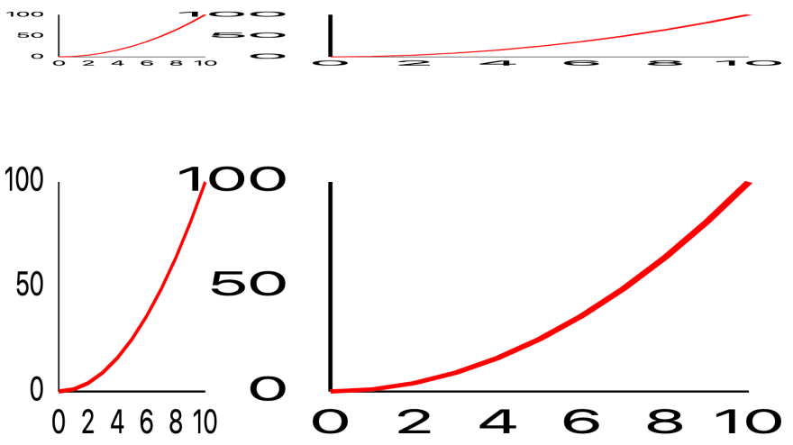
But it's obviously broken in two important ways. Firstly, the text is horribly scaled, to the point of being illegible in some cases. Secondly, the line strokes are stretched along with the lines themselves, which looks dreadful.
The second of these issues is straightforward enough to solve with a little-known CSS property vector-effect: non-scaling-stroke applied to every element:
But the first issue can't, to my knowledge, be solved within SVG.
The solution (part two)
Instead of using SVG elements for the axes, we can use HTML elements and position them with CSS. Because we're using a percentage-based coordinate system, it's very easy to keep the HTML layer and the SVG layer glued together.
Recreating the axes above with HTML is as simple as this:
<!-- x axis --><div class="x axis" style="top: 100%; width: 100%; border-top: 1px solid black;"> <span style="left: 0">0</span> <span style="left: 20%">2</span> <span style="left: 40%">4</span> <span style="left: 60%">6</span> <span style="left: 80%">8</span> <span style="left: 100%">10</span></div><!-- y axis --><div class="y axis" style="height: 100%; border-left: 1px solid black;"> <span style="top: 100%">0</span> <span style="top: 50%">50</span> <span style="top: 0%">100</span></div><style> .axis { position: absolute; } .axis span { position: absolute; line-height: 1; } .x.axis span { top: 0.5em; transform: translate(-50%,0); } .y.axis span { left: -0.5em; transform: translate(-100%,-50%); }</style>Our charts are no longer borked:

Another benefit of using HTML elements is that they automatically snap to the nearest pixel, meaning you don't get the 'fuzzy' effect that tends to happen with SVG elements.
Packaging it up
This solves the problem, but there's a lot of manual busywork involved, hence Pancake. With Pancake, the chart above would look something like this:
<script> import * as Pancake from '@sveltejs/pancake'; const points = [ { x: 0, y: 0 }, { x: 1, y: 1 }, { x: 2, y: 4 }, { x: 3, y: 9 }, { x: 4, y: 16 }, { x: 5, y: 25 }, { x: 6, y: 36 }, { x: 7, y: 49 }, { x: 8, y: 64 }, { x: 9, y: 81 }, { x: 10, y: 100 } ];</script><div class="chart"> <Pancake.Chart x1={0} x2={10} y1={0} y2={100}> <Pancake.Box x2={10} y2={100}> <div class="axes"></div> </Pancake.Box> <Pancake.Grid vertical count={5} let:value> <span class="x label">{value}</span> </Pancake.Grid> <Pancake.Grid horizontal count={3} let:value> <span class="y label">{value}</span> </Pancake.Grid> <Pancake.Svg> <Pancake.SvgLine data={points} let:d> <path class="data" {d}/> </Pancake.SvgLine> </Pancake.Svg> </Pancake.Chart></div><style> .chart { height: 100%; padding: 3em 2em 2em 3em; box-sizing: border-box; } .axes { width: 100%; height: 100%; border-left: 1px solid black; border-bottom: 1px solid black; } .y.label { position: absolute; left: -2.5em; width: 2em; text-align: right; bottom: -0.5em; } .x.label { position: absolute; width: 4em; left: -2em; bottom: -22px; font-family: sans-serif; text-align: center; } path.data { stroke: red; stroke-linejoin: round; stroke-linecap: round; stroke-width: 2px; fill: none; }</style>Because we're using Svelte, this chart can easily be rendered at build time with Node.js, or be injected into the DOM using client-side JS. For charts that have some interactivity (such as the big example chart on the Pancake homepage), you might want to do both serve the basic chart with your HTML, then progressively enhance it with interactivity by hydrating the initial DOM. This is something that's rather difficult to do without a component framework like Svelte.
Notice that Pancake isn't actually creating the <span> and <path> nodes that comprise the chart. Rather, the components are primarily logical you bring the markup, meaning you have fine-grained control over the appearance of chart elements.
Taking it further
We can do much more than simple line charts:
Scatterplots are particularly interesting. Because we can't use <circle> elements they would stretch, like the line and text elements earlier we have to get slightly creative. The <Pancake.Scatterplot> component generates a path of disconnected arcs with a radius of zero. By rendering that path with a stroke width, we can make it look as though we're plotting circles.
Because we're in a Svelte component, we can easily introduce motion into our charts, as in this small multiples example. We can also add things like declarative transitions with a minimum of fuss.
Interactivity can also be handled declaratively within a Pancake chart. For example, we can create a quadtree (borrowing heavily from D3) that lets you find the nearest point to the mouse:
<Pancake.SvgScatterplot data={points} let:d> <path class="data" {d}/></Pancake.SvgScatterplot><Pancake.Quadtree data={points} let:closest> {#if closest} <Pancake.SvgPoint x={closest.x} y={closest.y} let:d> <path class="highlight" {d}/> </Pancake.SvgPoint> {/if}</Pancake.Quadtree>At the New York Times we're using a very similar technique to create JS-less maps tracking the coronavirus outbreak. There's a bit more to do, but it's likely that this work will be folded into Pancake eventually.
In future, the library will likely add support for rendering to a canvas layer (both 2D and WebGL). Charts that use <canvas> will have a hard dependency on JS, but it's necessary in cases where you have more data than can be rendered with SVG in a performant way.
Caveats
This is still somewhat experimental; it hasn't been battle-tested to anything like the degree that existing charting libraries have.
Its focus is on managing the coordinate system for two dimensional charts. That's enough for line charts and bar charts and scatterplots and stacked area charts and what-have-you, but if you need to make pie charts you will have to look elsewhere.
For now, there's no documentation, but the homepage has examples you can crib from. It's possible that APIs will change as we encounter more real world problems.
Acknowledgments
The name 'Pancake' comes from the fact that charts are built by stacking layers on top of each other. I'm deeply indebted to Michael Keller for creating Layer Cake, which Pancake draws a lot of inspiration from, and from where I ripped off some of the example charts linked above. Michael also reported the story linked above, giving me a reason to create Pancake in the first place.
I'm also indebted to Mike Bostock, of D3 and Observable fame, for sharing the insights, examples and code that make projects like this one possible. The handful of examples on the Pancake homepage are shamelessly copied from the D3 examples page, which is a goldmine for anyone looking to test out a new charting library.
Original Link: https://dev.to/richharris/a-new-technique-for-making-responsive-javascript-free-charts-gmp
Dev To
More About this Source Visit Dev To