
An Interest In:
Web News this Week
- April 2, 2024
- April 1, 2024
- March 31, 2024
- March 30, 2024
- March 29, 2024
- March 28, 2024
- March 27, 2024
Some of Our Sources
- Team Treehouse
- Smashing Apps
- Six Revisions
- TutsPlus - Design
- Inspiredology
- Crazy Leaf Design
- Wal You
- Freelance Switch
- Android Headlines
- Willems Lab
Help Webnuz
Referal links:
10 Best (Trendy) PowerPoint Color Scheme Combinations (2019 PPT Guide)
Great designs aren't an accident. Talented designers make conscious decisions about color and the message that it sends to an audience.
As you prepare to speak, you're probably building a PowerPoint presentation to support your points. Choosing the best colors for your presentation requires careful thought. You need to match to the content and mood of your speech.

In this tutorial, you'll see the best PowerPoint color themes that you can use for an impactful message. Then, we'll look at PowerPoint color scheme ideas that are ready to use from Envato Elements.
The Importance of Color in Every Presentation
Remember that PowerPoint helps you build supporting slides for a speaking engagement. Every slide should tie into the message that you're delivering. The colors that you choose will play a part in supporting the message.
Let's look at how color impacts your presentation. We'll also discuss how to choose the right colors.
1. Color Sets the Mood
Above all, color sets a mood for a presentation. Think about the difference between a slide that starts with bright fluorescent color and a slide that starts with a grey opening slide. They're sure to set different tones before you even begin to speak.
As soon as your audience sees the first slide, they'll begin to form expectations for the content. And matching the color palette to your message ensures a successful presentation.

As you work to match your presentation visuals to your presentation message, keep a few basic color moods in mind:
Red is a color that invokes passion and intensity. Think of a bright red bullseye, for example.
Light blues and greens are cool and calming. Bodies of water and foliage come to mind and using these colors can help your audience connect with the outdoors.
Yellow feels optimistic and energizing. Reminiscent of spring and flowers in bloom.
Purple has a history of feeling regal and royal. There's a sense of luxury and exclusivity.
Maybe there isn't a single "best color for PowerPoint presentations." Instead, it's about using colors that complement your message.
2. Color Palettes
While choosing a single color is an important choice, an even more important decision is how you combine them. Few presentations will feature a single color, so it's the color palette or combination of colors that are important to consider as well.
Monochromatic color schemes all key on one central color but use various shades, like the example below:

Complementary color schemes cross the color wheel for visual appeal. Think of the reds and greens you see around the holidays or the purple and gold uniforms of the Los Angeles Lakers.

Another option is a triad or three samplings of colors across the color wheel. It's great to use a color wheel tool to sample colors across a range. Keeping the arrangement of the triad in mind ensures the colors complement instead of clashing.

To learn more about color schemes and how you can use multiple colors, make sure to check out the tutorial below:

3. Top Color Trends for 2019 (and How to Explore Them)
If you're starting to think about color as a conscious choice when building a presentation, it helps to explore the best PowerPoint color scheme ideas. The best tool for the job is Adobe Color.
Not only can you explore color options, but you can also create cohesive palettes using the tool. Using the palette options and selecting your key colors helps you generate a palette that's ready to use in PowerPoint.

Make sure to check out the Trends section to find fresh styles that are sure to resonate with an audience. Many top designers use this site to create on-trend colors, and you can sample from their creations.
10 Best (Trendy) PowerPoint Color Scheme Combinations (2019 PPT Guide)
So far, we've covered the principles that you can use to generate PowerPoint color scheme ideas. But if you want a head start, you can use pre-built templates with the best colors for PowerPoint presentations.
On Envato Elements, you unlock an unlimited number of PowerPoint templates that you can use to design your presentation. Each of these templates features the best PowerPoint color scheme ideas that you can use.

For a single flat rate, you'll unlock thousands of options with the best colors for PowerPoint presentations. Throughout this section, you'll see templates from Envato Elements and color schemes that help you give a bold presentation.
Let's see 10 of the best PowerPoint color schemes. You'll see selections from top PowerPoint templates in the Envato Elements with fun names I've created for winning color schemes.
1. Gradient Complements
A great way to blend multiple colors is by using a gradient, a blend between two colors. That's on display in the outstanding Analysiz PowerPoint template, where blues and reds blend seamlessly.
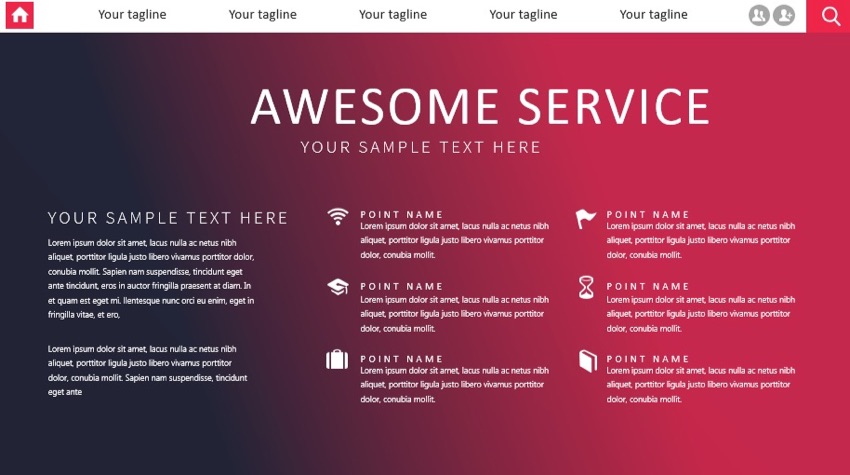
Maybe you don't think of red and blue as colors that you'd use side-by-side, but gradients are a great way to bring together two colors. Then, you can use either of the primary colors (red and blue) for critical elements. Consider a gradient if your brand has colors that aren't commonly paired together.
2. Shades of Seafoam
Remember, cool color tones like light blues and greens create a sense of calmness. That's exhibited perfectly in the PowerPoint template, The X Note. It's one of the most popular templates on Envato Elements thanks to its flexibility.

Above all, The X Note features those calming and cooling effects that use shades of blue and seafoam green. You can use this for a calming presentation that's got a casual but professional feel to it.
3. Monochrome Color Shades
Pezia is another template you'll unlock with a subscription to Envato Elements. This template has a light and dark color schemes.
No matter which version of Pezia you start with, you'll find that the color scheme is monochromatic. A single color is used in various shades to lead the viewer's eye between key points naturally.

Shades of the same color are an engaging color scheme. You can use deeper shades for essential points and lighter shades for less common elements.
4. Approach With Seriousness
Yellow and black color shades are typically used for caution type, but they can also be used in combination as an engaging color scheme. These two colors in conjunction are sure to grab an audience's attention for your presentation in a template titled Company Profile.

Historically, these colors have been used in classic examples like caution tape. But just as those colors are used to grab before crossing a threshold, it's also a way to show serious content with the best presentation color schemes.
When you use yellow and black together, you're sure to show the audience a sense of seriousness. No matter the message, this is one of those color palettes that immediately commands attention.
5. Shades of Pink
Remember, choosing a color palette is about setting the tone. The best PowerPoint color schemes align a color selection to the content and concept in your presentation.
What if your presentation focuses on softer, more classic elements? Consider the shades of pink in the STYLE Multipurpose PowerPoint theme.

A template like this is perfect for brands like fashion, cosmetics, and more. It creates a sense of elegance thanks not only to the color selection, but also the white space between elements.
6. Earth Tones
If you're building an outdoor business or advocating for the environment, earth tones might be the perfect choice for you. And those tones are captured perfectly in the Mandalika PowerPoint template.

Earth tones capture a wide variety of the best colors for PowerPoint presentations. Combining the perfect colors that harken back to clay, shrubbery, and more, they bring the outdoors indoors. This template provides an example of mixing and matching seemingly unique colors into the perfect palette.
7. Highlighting Success
The color scheme in this section is an excellent reminder that only a single hue is enough to create an engaging presentation. The best colors for PowerPoint presentations seek to complement the content, and this is the best example.
I like to call this color scheme, "highlighting success." A single bright color like the green shade in this color scheme is enough to accentuate your content. In the Blendu PowerPoint template, the best highlight color comes to life to emphasize your content.

When you use a single, eye-catching color, you draw a viewer's attention quickly. Use a color palette like this fluorescent green to stand out.
8. Pastels Plus
Everyone's familiar with the pastel shades that seem to come out every Spring. And the color palette in Color Fun captures those pastels perfectly with a bit more contrast.
While classic pastel templates focus on light, desaturated versions of colors, this template embodies "pastels plus." It samples the same primary hues but uses more contrast for a fun presentation.

The best color schemes for PowerPoint presentations are eye-catching. I love the Color Fun template for its unique "pastel plus" colors. It blends a wide variety of colors into a cohesive palette.
9. The Color of the Year Palette
If there's a single most powerful company for setting color trends, it's Pantone. They've got a tremendous amount of knowledge and expertise in color calibration.
More notably, they also name a color of the year based upon design trends. For 2019, that color is Living Coral. This shade of pink was named as the most in-vogue color, and luckily, there's a corresponding template called Living Coral PowerPoint theme.

When you use a trendy color template like Living Coral, you're sure to align your design with the latest in presentation trends. Not only is it visually appealing, but it's also culturally relevant.
10. Spectrum of Colors
Many of the color schemes in this round-up use just a few simple colors to create attractive presentations. And while it's true that the best PowerPoint color schemes use a "less is more" mindset, sometimes you'll want to use more colors.
That's where a template like Spectrum comes into play. It's got a tasteful and balanced selection of colors from across the rainbow. Yet, it doesn't feel overly bright and overwhelming to the audience.

You've seen 10 of the best colors for PowerPoint presentations. But that's not all—there's even more included in the tutorial round-up below. Check it out for even more ideas for PowerPoint color scheme ideas.
.jpg)
As another option, you can also source excellent PowerPoint color scheme ideas with templates from GraphicRiver. There are more excellent PowerPoint color schemes on GraphicRiver, but you'll pay only for individual templates you choose.
Design a Presentation With Trendy Color Schemes Today
There are as many PowerPoint color schemes as there are hues in the rainbow. Choosing the best colors for a PowerPoint presentation is an essential step in the design process. With the help of the ideas in this tutorial, you're on your way to punchy presentations with the best color choices.
Don't forget: using a pre-built template with the best PowerPoint color schemes is sure to jumpstart your design work with the best colors for PowerPoint presentations. That's the value of using Envato Elements, the all-you-can-download library for creatives.
Use the best presentation color schemes to complement your message. When you do, you're sure to reach your audience with an impact.
Original Link: https://business.tutsplus.com/tutorials/best-powerpoint-color-scheme-combinations--cms-33851
Freelance Switch
More About this Source Visit Freelance Switch