
Some of Our Sources
- Web Designer Wall
- Just Creative
- Smashing Magazine
- Smashing Apps
- Web Design Ledger
- Line 25
- Stylized Web
- CSS Tricks
- Android Dissected
- Android Headlines
Help Webnuz
Referal links:
August 6, 2019 03:34 pm GMT
Original Link: https://webdesignledger.com/grey-goose-vodka-logo-redesign/
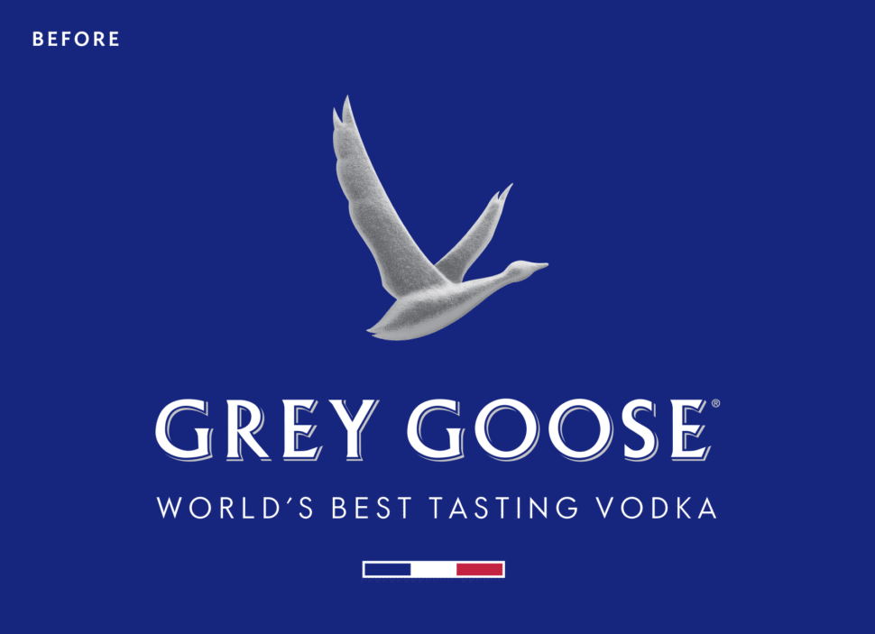
Grey Goose Redesign: 50ml of Minimalism and 1tsp of Flat Graphics
Grey Goose has revamped their visual identity and we love it. The redesign was done by London, UK-based Ragged Edge. “We needed a bold statement. So we started by redrawing the logotype from scratch – the biggest change to the brands identity since its launch in 1997. [The] bespoke type is more contemporary, with just...
Read More at Grey Goose Redesign: 50ml of Minimalism and 1tsp of Flat Graphics
Original Link: https://webdesignledger.com/grey-goose-vodka-logo-redesign/
Share this article:
Tweet

View Full Article
Web Design Ledger
More About this Source Visit Web Design Ledger