
An Interest In:
Web News this Week
- April 27, 2024
- April 26, 2024
- April 25, 2024
- April 24, 2024
- April 23, 2024
- April 22, 2024
- April 21, 2024
Some of Our Sources
- Slashdot
- Vandelay Design
- You The Designer
- Crazy Leaf Design
- My Ink Blog
- CSS Globe
- Line 25
- Wal You
- CSS Tricks
- Willems Lab
Help Webnuz
Referal links:
How to recreate Mediums article layout with CSS Grid
When people think of CSS Grid they normally envision image grid layouts and full web pages. However, CSS Grid is actually a superb technology for laying out articles as well, as it allows you to do things which previously was tricky to achieve.
In this tutorial, Ill explain how to recreate the famous Medium article layout using CSS Grid.
Note: Ive also been part of creating a free 13-part CSS Grid course at Scrimba. Get access to the course here.
 Click the image to get to the full CSS Gridcourse.
In the course, my colleague Magnus Holm will go through how to create an article layout using CSS Grid. So if you prefer watching instead of reading, be sure to check out his screencast.
The content
Were going to start off with a basic HTML file, which contains the type of content youll typically find in a Medium article. For example title, paragraphs, subtitles, images, quotes and so forth. Heres an outtake:
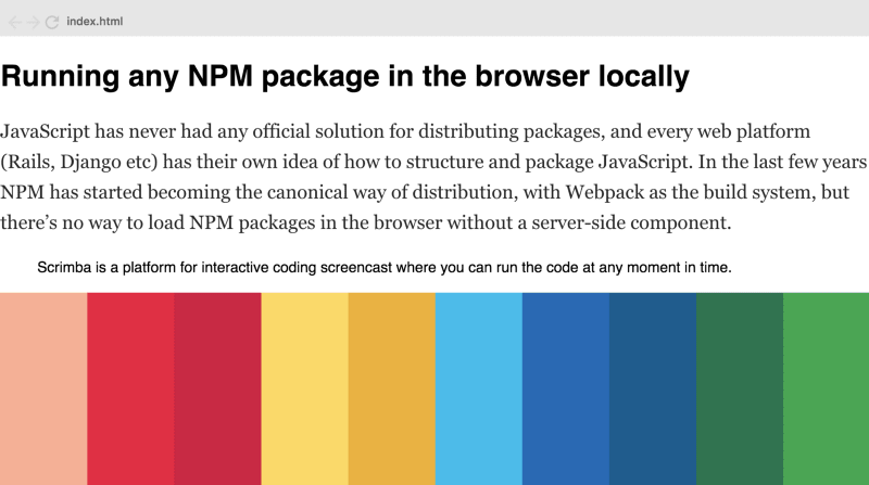
<article><h1>Running any NPM package in the browser locally</h1><p>JavaScript has never had any official solution for distributing packages, and every web platform (Rails, Django etc) has their own idea of how to structure and package JavaScript. In the last few years, NPM has started becoming the canonical way of distribution, with Webpack as the build system, but theres no way to load NPM packages in the browser without a server-side component.</p><blockquote><p>Scrimba is a platform for interactive coding screencast where you can run the code at any moment in time.</p></blockquote><figure><img src="https://mave.me/img/projects/full\_placeholder.png"></figure>If you open this file in a website without adjusting any layout itll look like this:
Not particularly elegant. So lets fix it with CSS Grid. Well do it step by step so that itll be easy for you to follow.
Basic setup formargins
The first thing we need to do is turn the whole article tag into a grid and give it at least three columns.
article { display: grid; grid-template-columns: 1fr 740px 1fr; }The first and last columns are responsive and act as margins. Theyll contain white space in most cases. The middle column is fixed at 740 pixels and will hold the content of the article.
Notice that were not defining the rows as theyll simply be as tall as they need to be in order to fit their content. Each content block in the article (paragraph, image, title) will get its own row.
The next step is to make sure all the content in the grid starts at the second column line by default.
article > \* { grid-column: 2; }We now have the following result:

We can instantly see that this looks better, as the white space on each side makes the text easier to read.
However, this effect could have been achieved just as easily using by setting the left and right margin property to auto. So why use CSS Grid?
Well, the problem arises when we want to mimic Mediums image features. For example creating full-width images, like this one:

If we had used margin: 0 auto this would have forced us to apply negative margins to the images to make them take up the entire website width, which is hacky.
With CSS Grid though, this becomes a piece of cake, as well simply use columns to set the width. To make our image take up the entire width well just tell it to span from the first to the last column line.
article > figure { grid-column: 1 / -1; margin: 20px 0; }Weve also set some margin on the top and bottom. And then we have a nice full-width image:

Expanding with morecolumns
However, this doesnt get us all the way, as Medium has a few other layouts which we need to account for. Lets look at a couple of them:
Mid-sized images
This is the image option in between the normal one and the full width one, which well call a mid-sized one. It looks like this:

NOTE: If youre watching on mobile, this image is identical to the full width one. In this article, we focus on the desktop layoutonly.
This will require at least two new columns to our layout.
Quotes
In addition, Medium also places a vertical line on the left-hand side of the article if you add a quote:
Notice the vertical line. Well need to add an extra column to our grid because of it.
This requires a tiny column on the left-hand side of the grid. To make things symmetric, well also add a similar column on the right-hand side.
So to support both quotes and mid-sized images well need to split the entire width into seven columns instead of three, like this:
article { display: grid; **grid-template-columns: 1fr 1fr 10px 740px 10px 1fr 1fr;** }If we use the Chrome inspector we can actually see the underlying grid lines (see image below). Plus, Ive added pointers to make it easier to recognise the different columns.
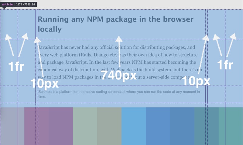
Ive added pointers to make it easier to recognise the different columns.
The first thing we need to do it to make all default items to start at the fourth column line instead of the second one.
article > \* { grid-column: 4; }Then we can create the mid-sized image by doing:
article > figure { grid-column: 2 / -2; margin: 20px 0; }Heres how that looks with the Chrome inspector activated:

The quotes are easily created by doing the following:
article > blockquote { grid-column: 3 / 5; padding-left: 10px; color: #666; border-left: 3px solid black; }We make it span from the third to the third to the fifth column line. Were also adding padding-left: 10px; so that the text will seem to start at the fourth column line (the third column is 10 pixels wide as well). Heres how it looks on the grid.

Sidemarks
Now theres one last thing we need to support. Medium has a pretty nice way of signalling which content in the article is most highlighted. The text turns into green, and it gets a Top highlight on the right hand side.

The Top highlight text element would be a nightmare to create if wed used margin: 0 auto; instead if CSS Grid. This is because the element acts different from all the other elements in the article. Instead of appearing on a new line, its suppose to appear on the right hand side of the previous element. If we didnt use CSS Grid wed probably have to start messing with position: absolute; to make this work.
But with CSS Grid its super simple. Well just make that kind of element start on the fourth column line.
.aside { grid-column: 5; }Thatll automatically make it place itself to the right of the article:

Note: I havent highlighted the text in green, as thats got nothing to do with CSSGrid.
And thats it! Weve now recreated most of Mediums article layout using CSS Grid. And it was actually pretty easy. Note however that weve not touched responsiveness, as that requires a whole new article in itself.
Check out this Scrimba playground to look at all the code.
Thanks for reading! My name is Per, Im the co-founder of Scrimba, and I love helping people learn new skills. Follow me on Twitter if youd like to be notified about new articles and resources.
Original Link: https://dev.to/perborgen/how-to-recreate-medium-s-article-layout-with-css-grid-17ce
Dev To
 An online community for sharing and discovering great ideas, having debates, and making friends
More About this Source Visit Dev To