
Some of Our Sources
- Simplebits
- The Logo Smith
- TutsPlus - Design
- Fudge Graphics
- Web Design Ledger
- Reencoded
- Android Dissected
- Hashedout
- The Verge
- TechPowerUp
Help Webnuz
Referal links:
How to Create Halftone Effects in Adobe Illustrator

Halftones are dots of varying sizes and spacing, put together to simluate a tone or gradient. Though it is a method connected to print, the aesthetics of it have made it popular to use even for digital content.
Having read a lot of comics where halftones are used, I have a special love for it that I hope to share with you in this tutorial. You will find that it is not so hard to create this effect in Adobe Illustrator, and by using halftones instead of regular black and white, or grayscale gradients, you can give your comics and artwork a certain unique appeal.
Looking for halftone resources for Adobe Illustrator? Check out this Halftone graphic style patterns to use in Illustrator as well as many others over on Envato Market.

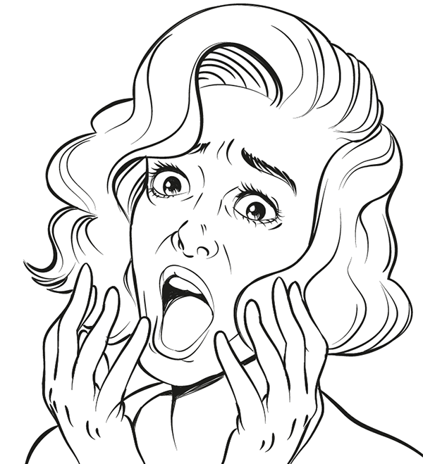
1.How to Create the Line Art
Step 1
We first need to create the artwork which the halftones will be applied to. I've made a sketch of a shocked woman, as a reference to pop art, which many associate halftones with.
I open a new document in Adobe Illustrator and import the sketch by going to File > Place...
From there I double-click the current layer the sketch is placed on, check the Template box and press OK. I won't be working with many of them for this one, but naming your layers is always a good practice.

Step 2
Now I start inking the loose sketch with the Brush Tool. As usual, I like to use my comic style custom brush from a previous tutorial, but go with your own preference on what brush you use. You can find tips and tricks on creating various brush types here at Envato Tuts+, or you can check out some of the vectorbrush packsavailable on Envato Market.

Step 3
I like to make pretty loose sketches and do the real defining during the inking process. I find that a lot of the energy from the sketch can
get lost when inking it, so my method is to not put too much effort into
the sketch, and use it asmore ofa rough guide than a precise map to
follow.
I have differed from the sketch in a lot of places, but now I feel it has the energy behind the expression just right, and it is ready for the next step.
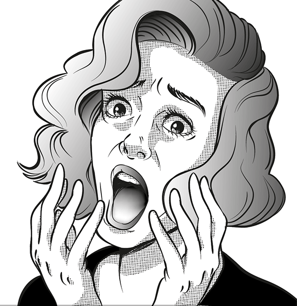
2. Adding Shades of Gray
Use the Pen Tool to create the shapes of the hair. Make two shapes, one for each of the sides the hair is parted into. To get a gradient in black and white, simply press the Period Key on your keyboard.

Once the hair is done, I add the shapes for the lips and irises as well. Since her hair is covering part of her face, I add a large shadow underneath the big lock of hair.

When shading the skin, I try to keep in mind where the light source is coming from in the picture—from the left in this case—and try to break the shapes down that way. To add to the shock of the expression, I add extra shadow underneath the eyes, which can have a scary effect.
When shading the tongue, I make a dark to medium gray object with the Pen Tool, and then I add points of lighter gray with the Mesh Tool.

A good way to keep control over the overall look of your image is to make a grayscale palette from which you pick your colors. By limiting yourself to just a few shades, you minimize the risk of having it look chaotic and overworked.

3. Time to Make Halftones!
Now we have a pretty decent grayscale image, but we want to have it in halftones. This part is easy, but a little demanding as well. While turning an object into grayscale is simply a push of a button, getting the desired look requires the right settings.
Which settings are best to use depends on what type of image you're after and what size and resolution you are working in. In other words, it requires some trial and error.
Skin
I start by selecting all the objects making up the skin shading. Having these selected, I go to theEffect menu and choose Pixelate, then Color Halftone. Even though it says "Color Halftone" I recommend starting out creating these in black and white, simply because it's easier to just keep track of how those two colors behave. Making halftones in color involves several colors blending, and the results can be trickier to manipulate.

My image is not very big, so the settings I decide to use have pretty low values, which creates a nice dense pattern for the skin.
Hair
For the hair I want something a bit bolder, and I turn the values up a bit.

Here you can really see how the dots work, becoming smaller the lighter the gradient becomes.
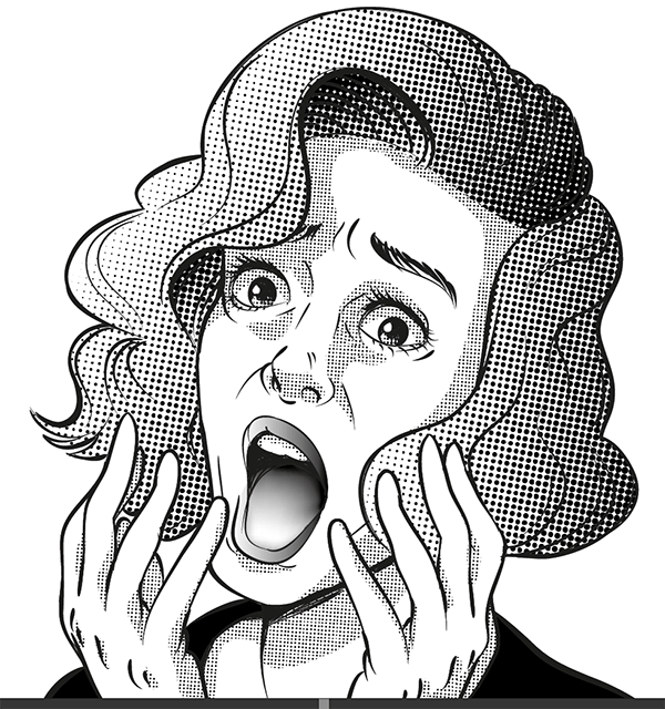
Mouth
Finally for the mouth I decide to experiment a bit more with the values, and have Channel 1 and 4 much higher than the other two.


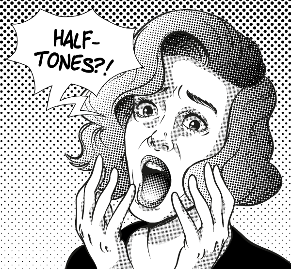
4.Use Dot Swatches for the Background
Besides creating the halftone effect yourself, Illustrator also offers some ready swatches to use. You can find them by going to Windows > Open Swatch Library > Patterns > Basic Graphics > Basic Graphics_Dots.
This will provide you with a selection of plain grays and gradients in halftone. While they may not be as flexible as making your own, they are quick and easy to use, and will make a good background for our image.

Awesome Work, You're Done!
Creating halftones is not very hard in Illustrator, but they can be a bit fickle still. For example, you might notice their appearance can change unsatisfactorily when scaling. The best approach is to apply halftones to an image that is already in its final size. That way you won't have unpleasant surprises when you export the image.
You might spend some extra time tweaking the settings to get the perfect density of dots, but adding halftones can be a good way to shake up your grayscale artwork. Especially with all the resources available, there are several ways to approach this type of style as well. For example, you might feel more comfortable creating halftones with brushes. If so, then this Halftone Brush packfrom Envato Marketmight be of interest to you.
Original Link: https://design.tutsplus.com/tutorials/how-to-create-halftone-effects-in-adobe-illustrator--cms-25121
TutsPlus - Design
More About this Source Visit TutsPlus - Design