
Some of Our Sources
- Slashdot
- Mashable
- Techcrunch
- TutsPlus - Code
- Joshua Blankenship
- Pearsonified
- You The Designer
- Crazy Leaf Design
- Android Dissected
- Android Headlines
Help Webnuz
Referal links:
Brand Identity: Smart Use of Striking Colors and Patterns
Brand Identity: Smart Use of Striking Colors and Patterns
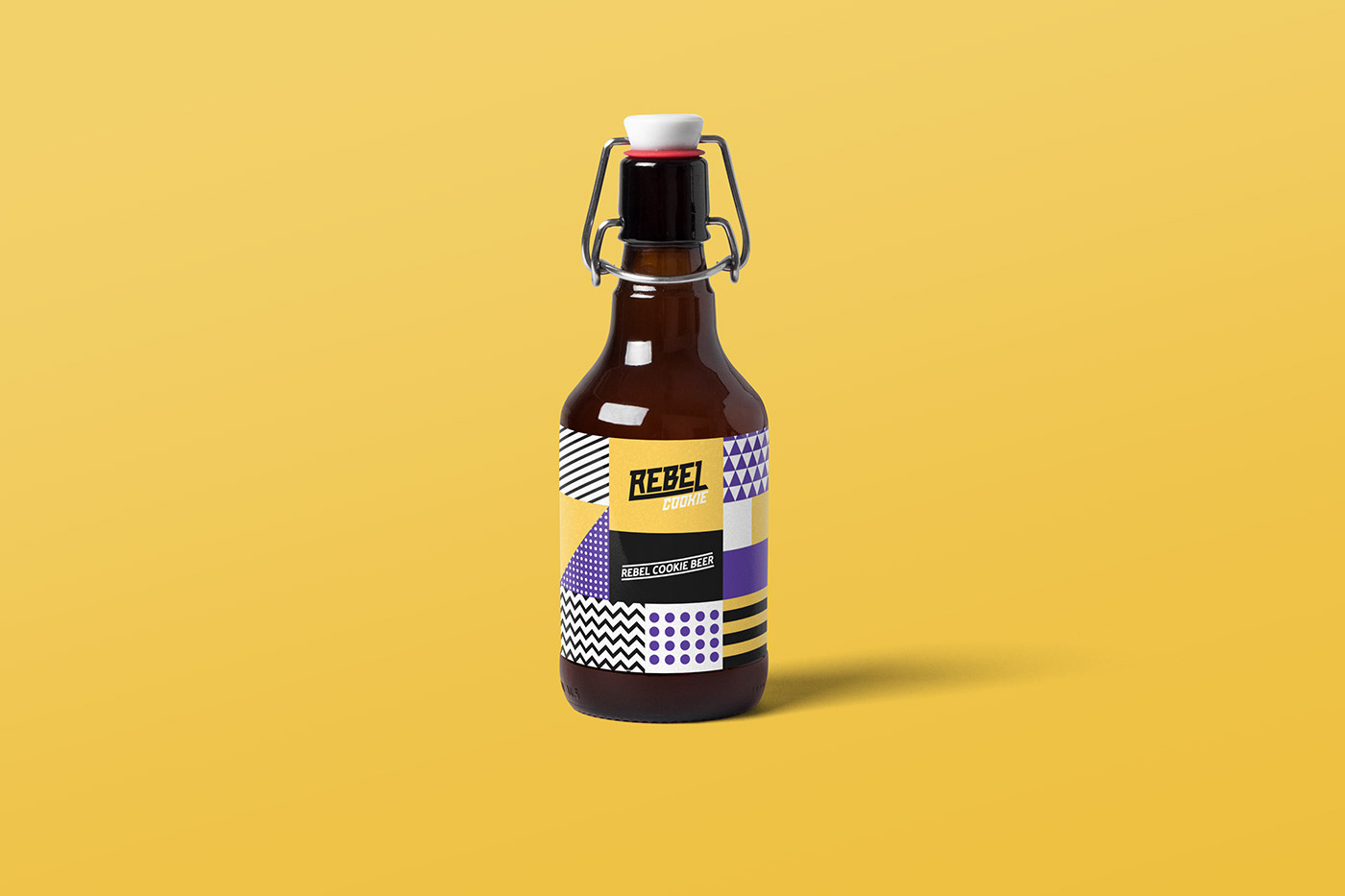
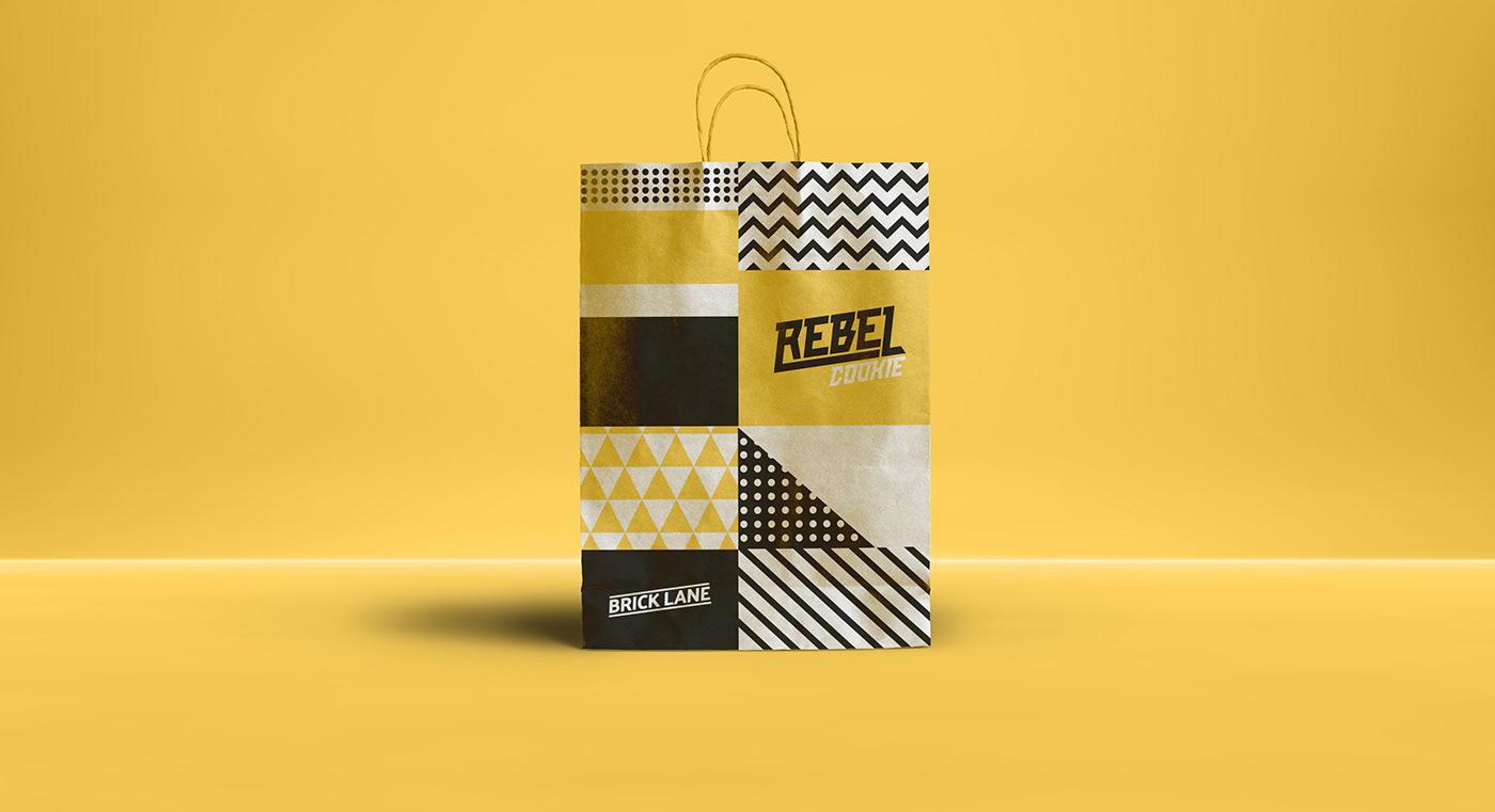
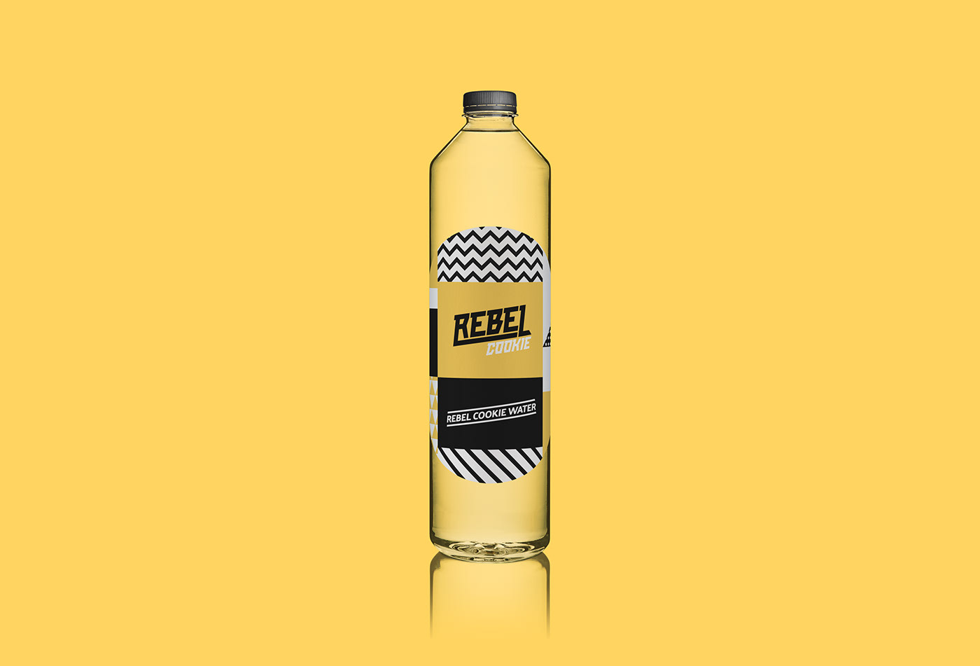
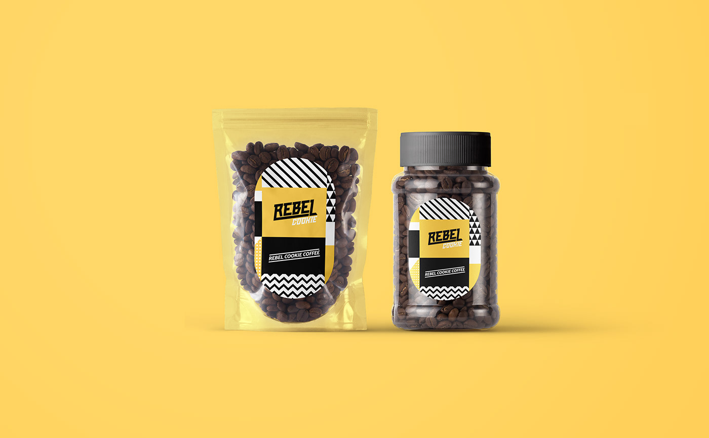
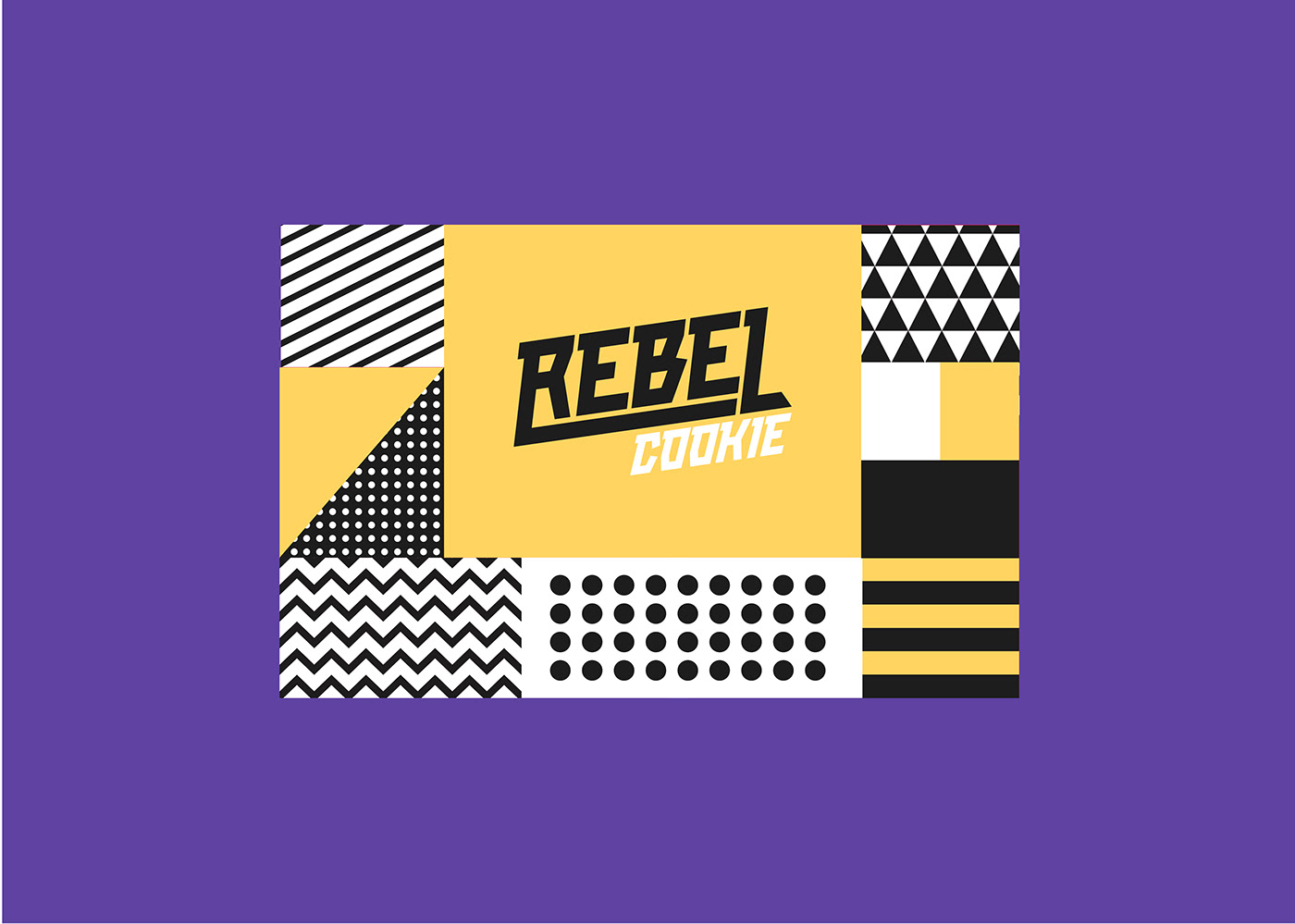
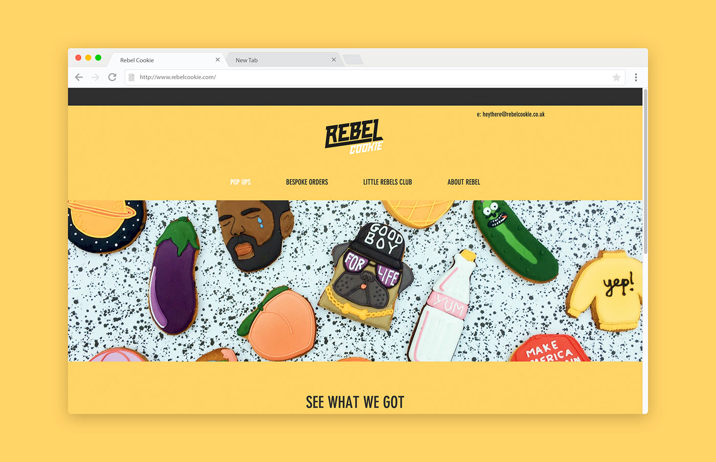
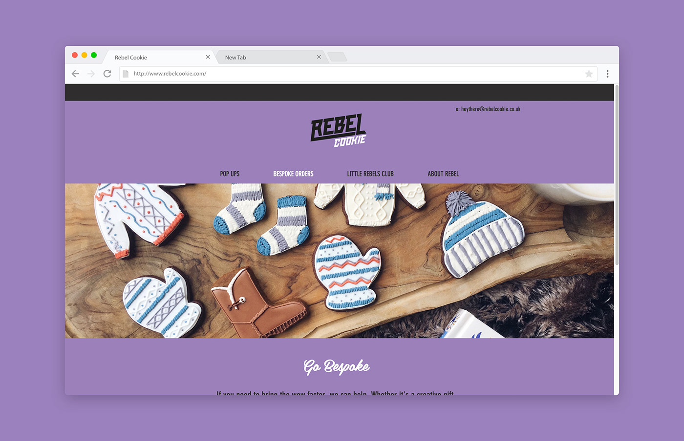
Gordon Reid was commissioned by two ex-advertising folks who had this great idea to create a reactive bakery to whatever social media frenzy was happening in the world.It was an opportunity for Gordon not to miss as he knew he had two people there who really wanted to create an exciting brand and fun design. So thankfully they had the trust to let him really go a bit wild with the brand identity.
The brand was build around the strong wordmark and striking colours. From there I created a large brand illustration with core elements that can be pulled out and used for other sections of the brand. Once the brand and core illustration was created, we got down to the website, social, packaging, stand design, outdoor advertising and loads of merch.
Brand Identity


Original Link: http://feedproxy.google.com/~r/abduzeedo/~3/vfyxlMpmRWg/brand-identity-smart-use-striking-colors-and-patterns
Abduzeedo
 Abduzeedo is a collection of visual inspiration and useful tutorials
More About this Source Visit Abduzeedo