
Some of Our Sources
- Slashdot
- Techcrunch
- Simplebits
- Pearsonified
- Smashing Magazine
- Naldz Graphics
- Android Dissected
- Codrops
- The Verge
- TechPowerUp
Help Webnuz
Referal links:
Brand Identity for New York City Architecture Firm Dash Marshall
Brand Identity for New York City Architecture Firm Dash Marshall
TwoPoints.Netshared a beautiful brand identity project for the New York City architecture firmDash Marshall. When designing the corporate identity they realized thatarchitecture acts in the intersection of the old and the new, the static and the flexible, the properties of matter and the lives of people. Within these constraints, Dash Marshall creates spaces which tell the stories of their habitants and invites them to create new ones.
Just as Michel de Certeau argued that spatial stories are what actuate the notion of place, our physical environments can give rise to new characters and events by organizing, proffering and collectivizing human sensibilities. They may even allow certain transgressions to occur, as the Independent Group aspired to do. For this reason, an architecture that upholds its commitment to its users holds tremendous power: its narratives of the past and present are the framework from which to imagine the future scripts of tomorrow.writes Esther Choi(estherchoi.net) in the preface of the book Matter Battle, 45 Lessons Learned byDash Marshal
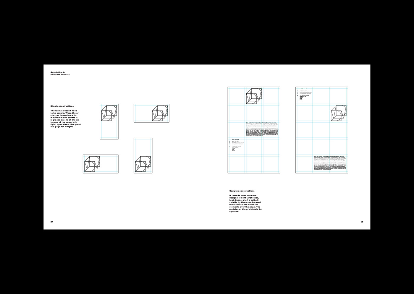
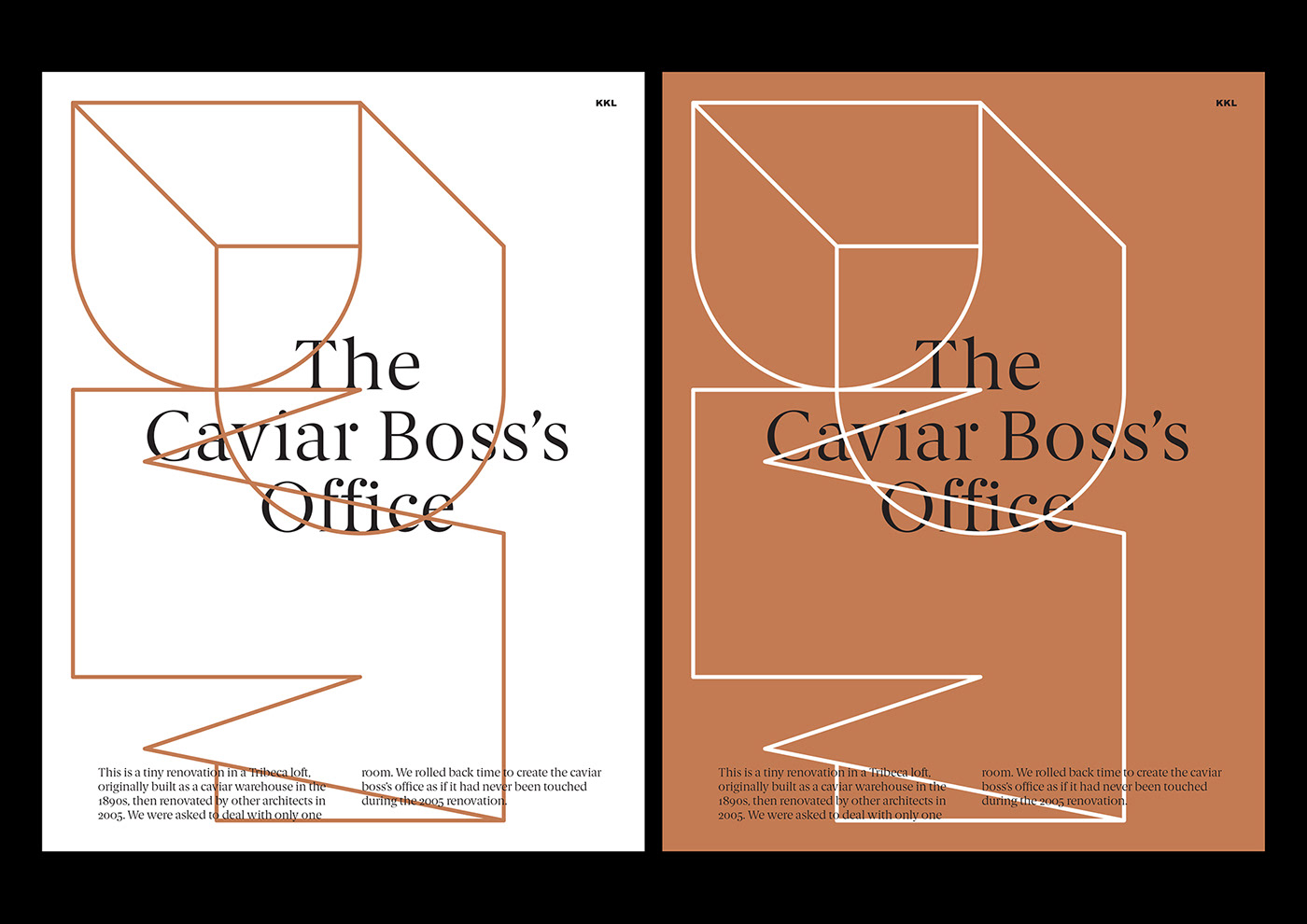
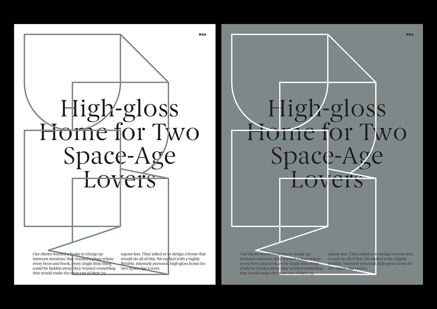
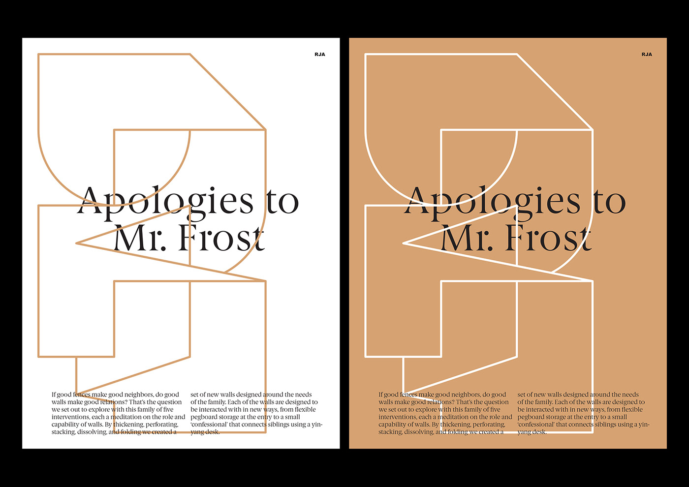
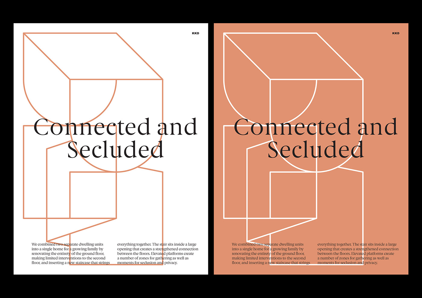
The obvious eventually came to us as a surprise. Todays corporate communication has become almost exclusively digital. It is context-responsive, morphological and semiological, and almost unaware of physical constraints. To design a consistent visual language for an architecture office, acting in the material, but communicating in the immaterial world, was the challenge. Our solution is a flexible visual identity which works within a confined space of the letters D and M. Like outer walls of an apartment or the plot of a house, the letters DM create a confined space, but within this framework nearly anything is possible.
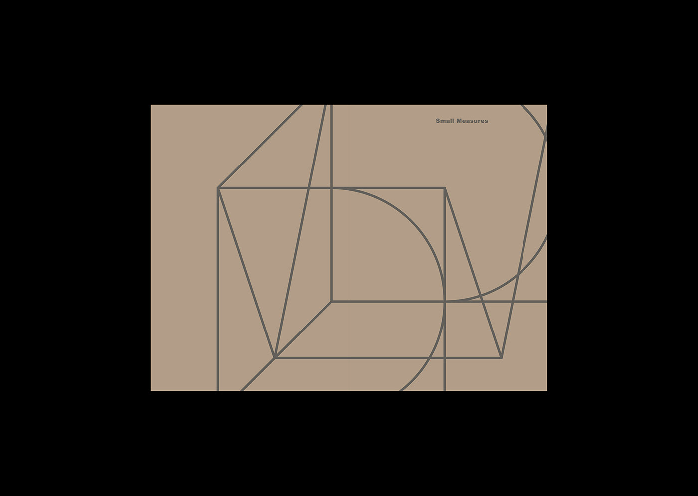
To tell the stories ofDash Marshallwe have not just designed their Visual Identity, but also their website, the book Matter Battles: 45 Lessons Learned and the booklet Small Measures.
Client:Dash Marshall
Year: 20152018
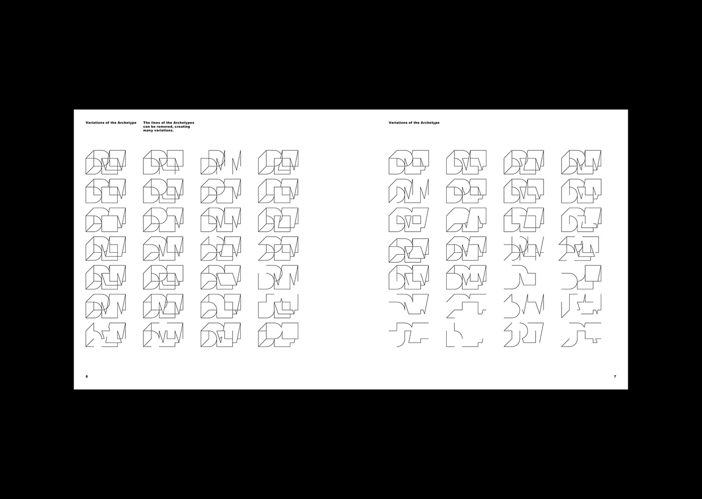
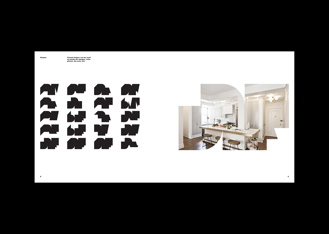
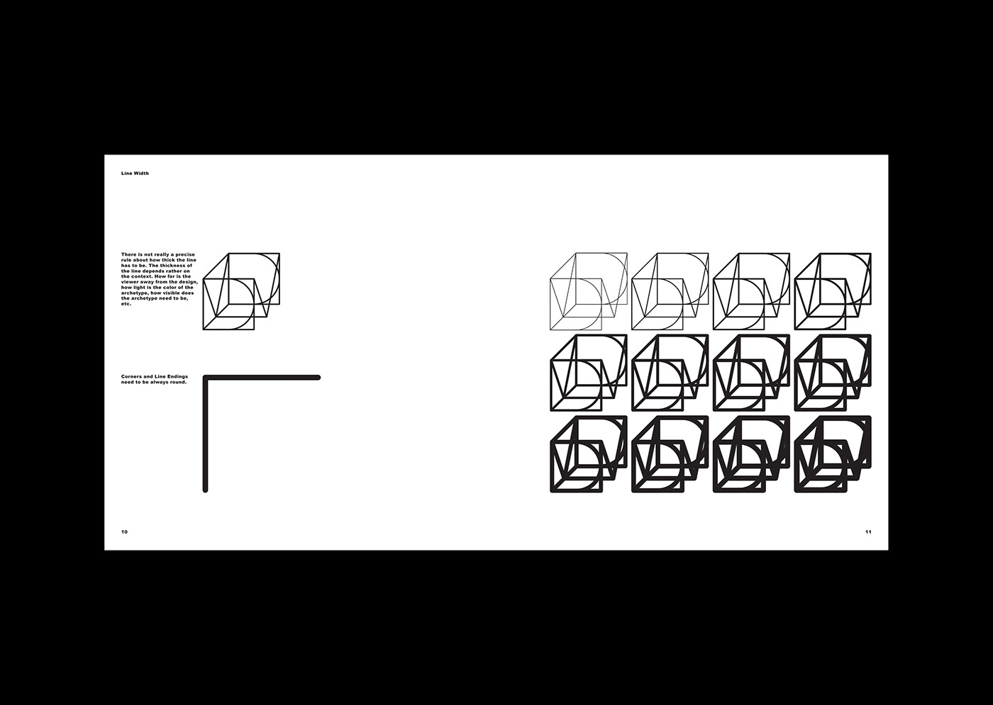
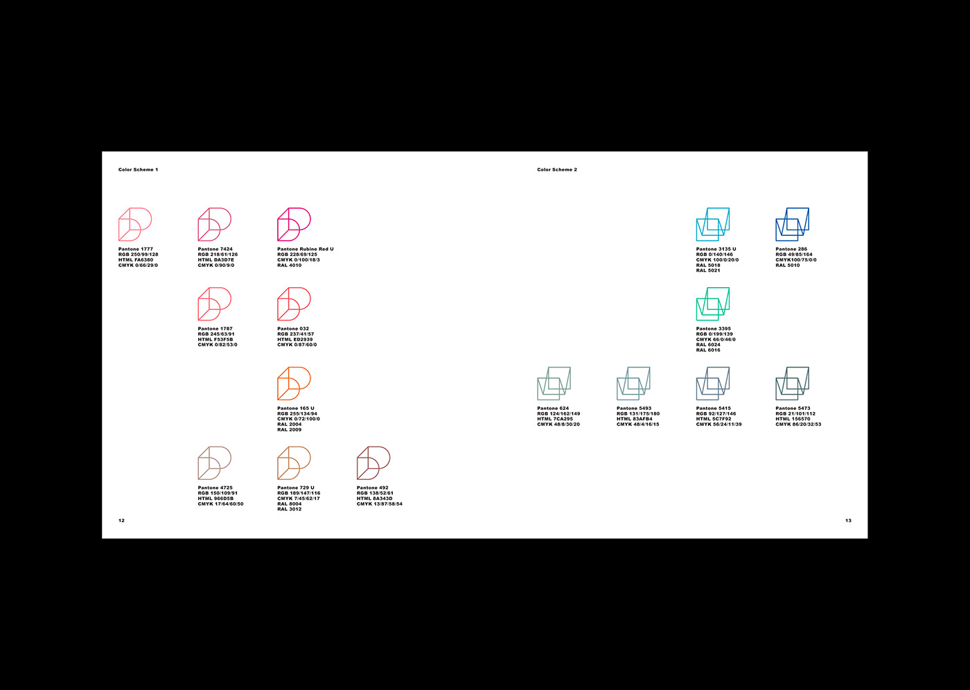
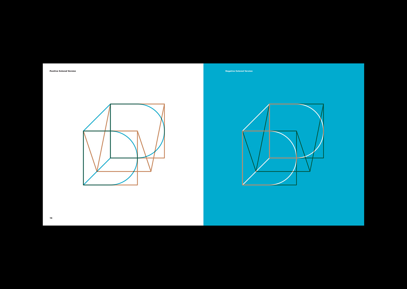
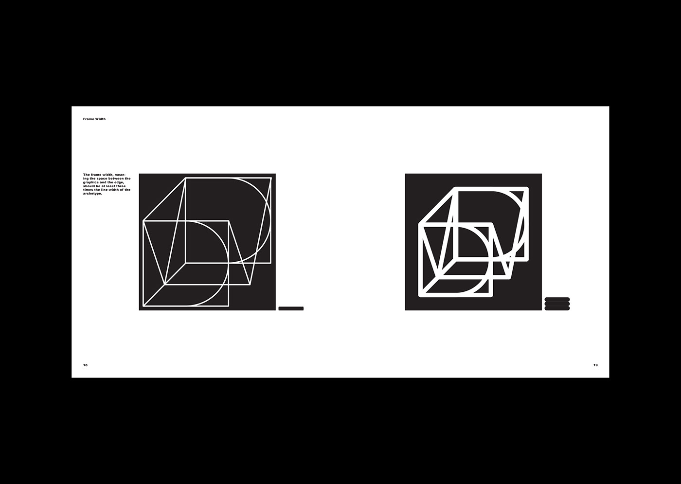
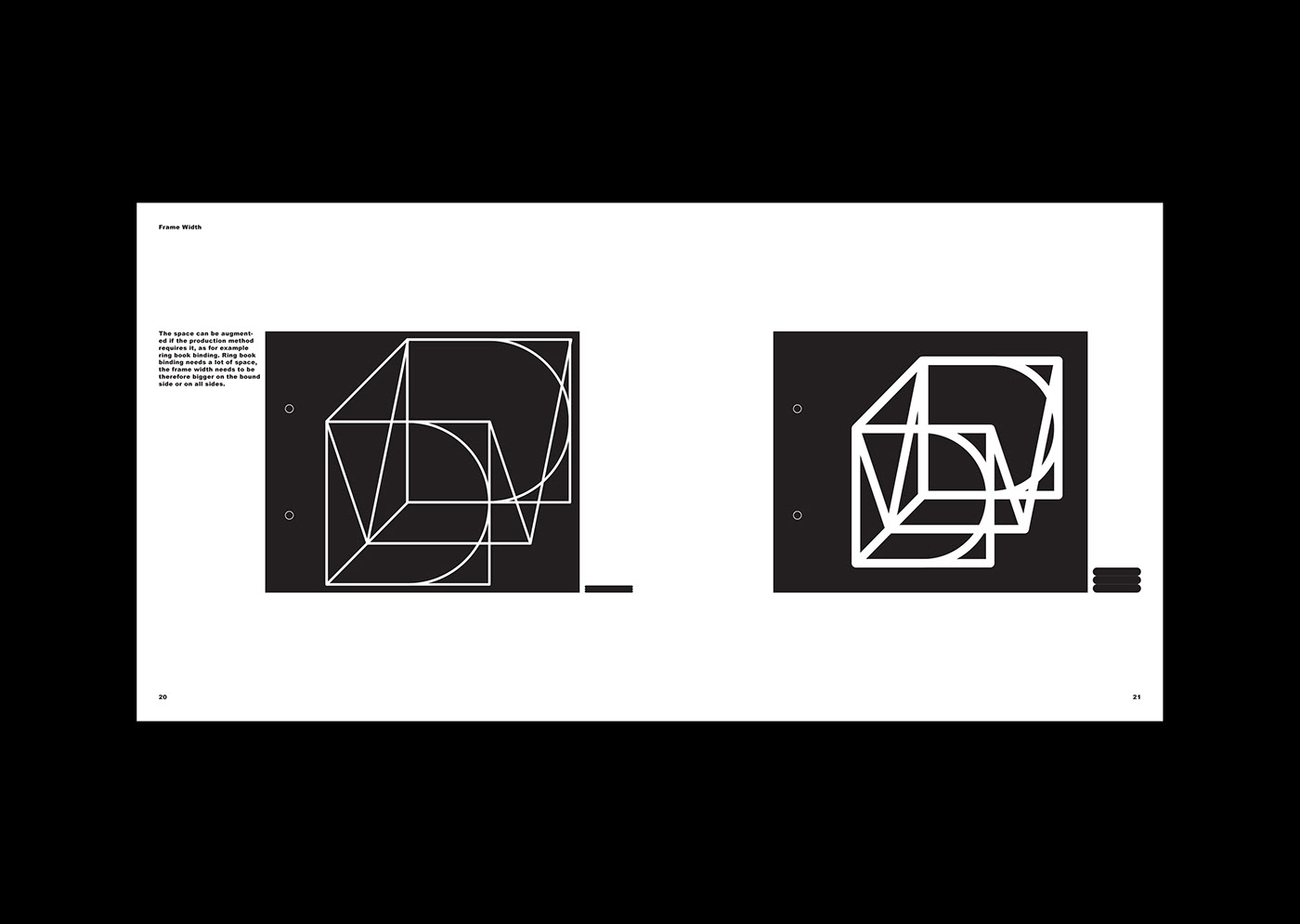
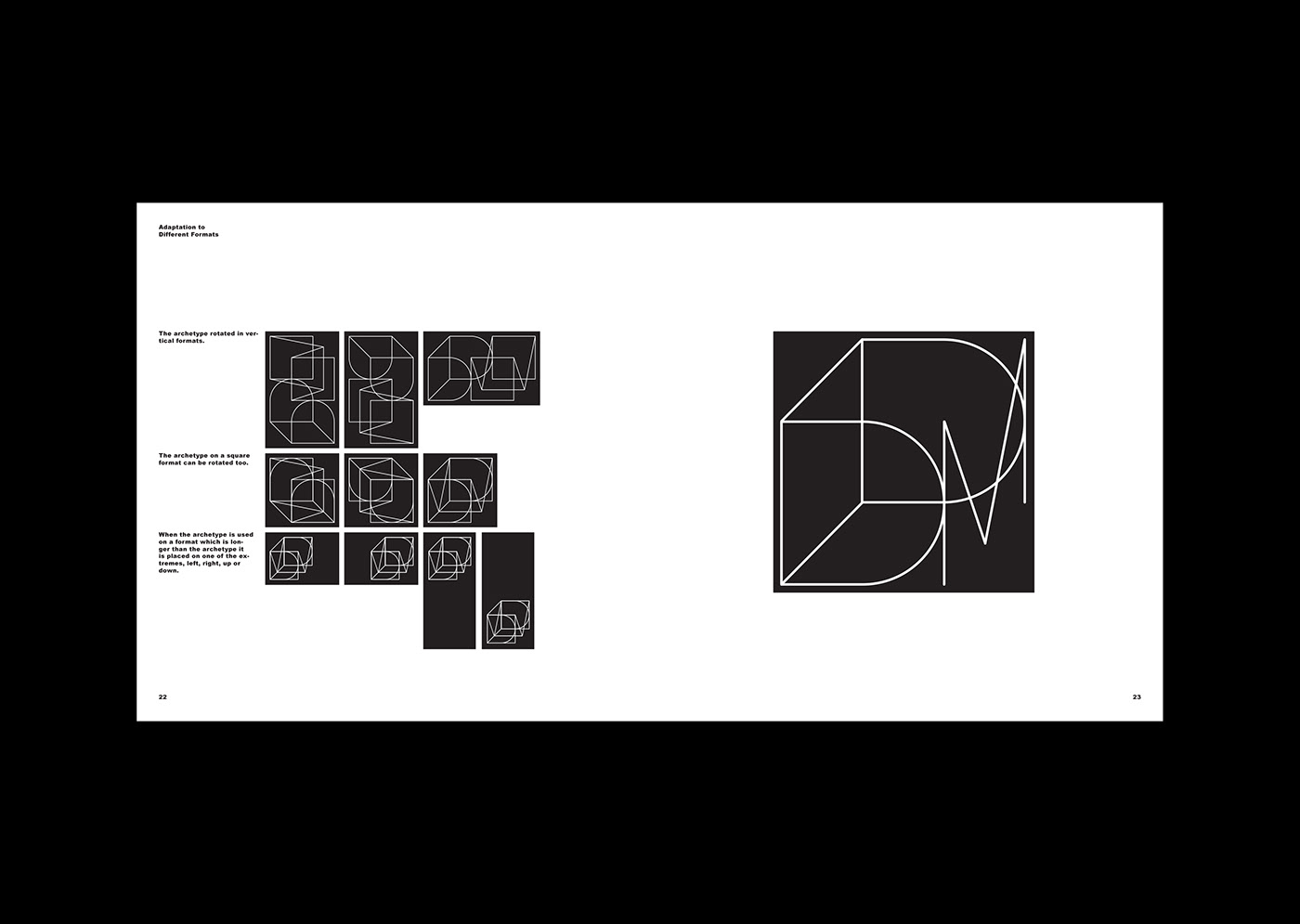
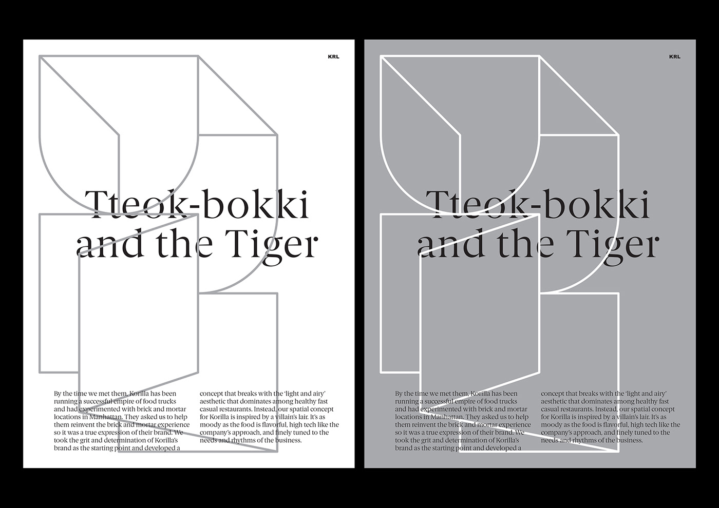
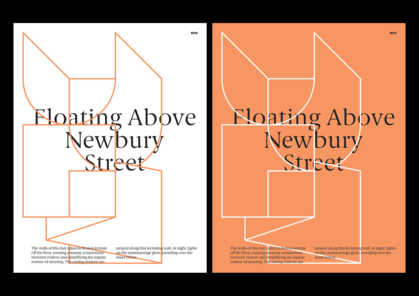
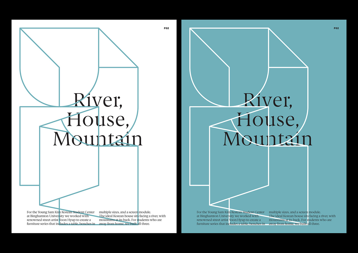
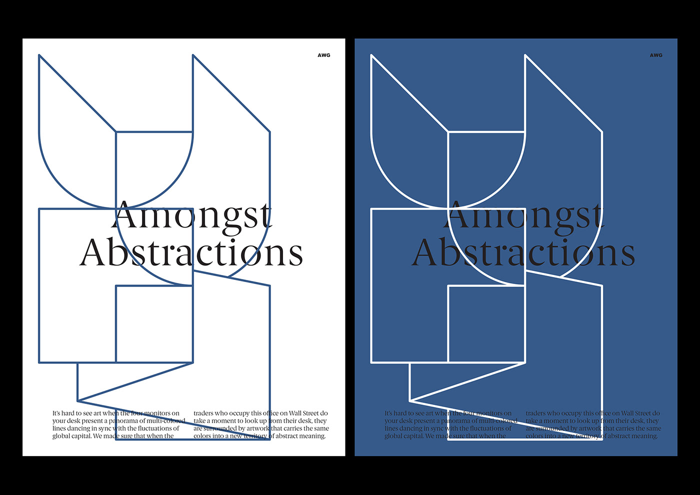
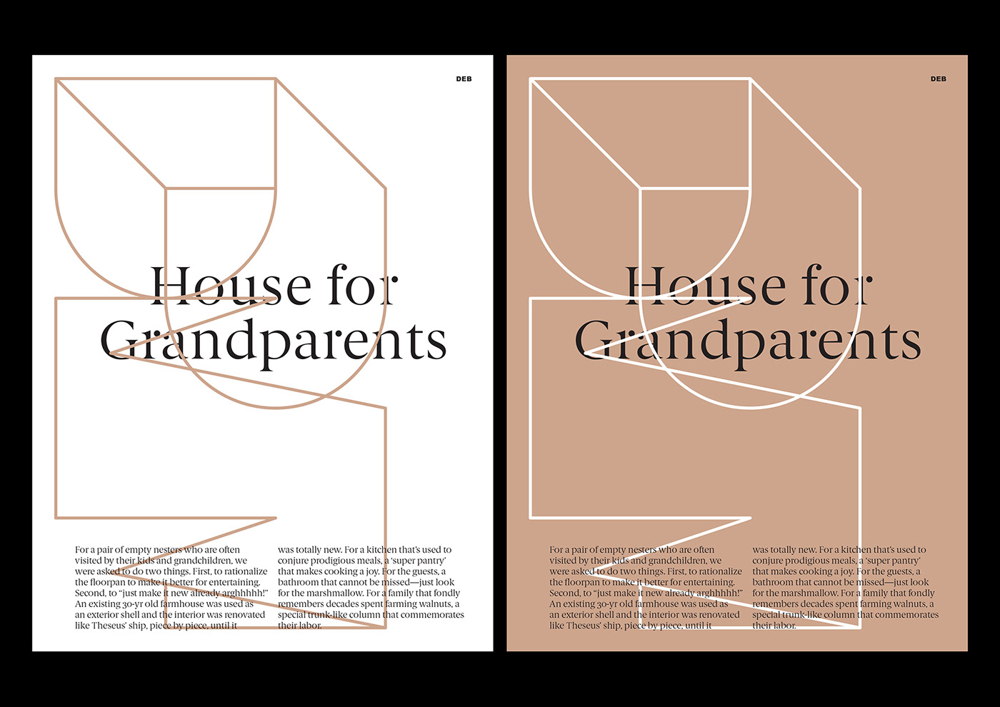
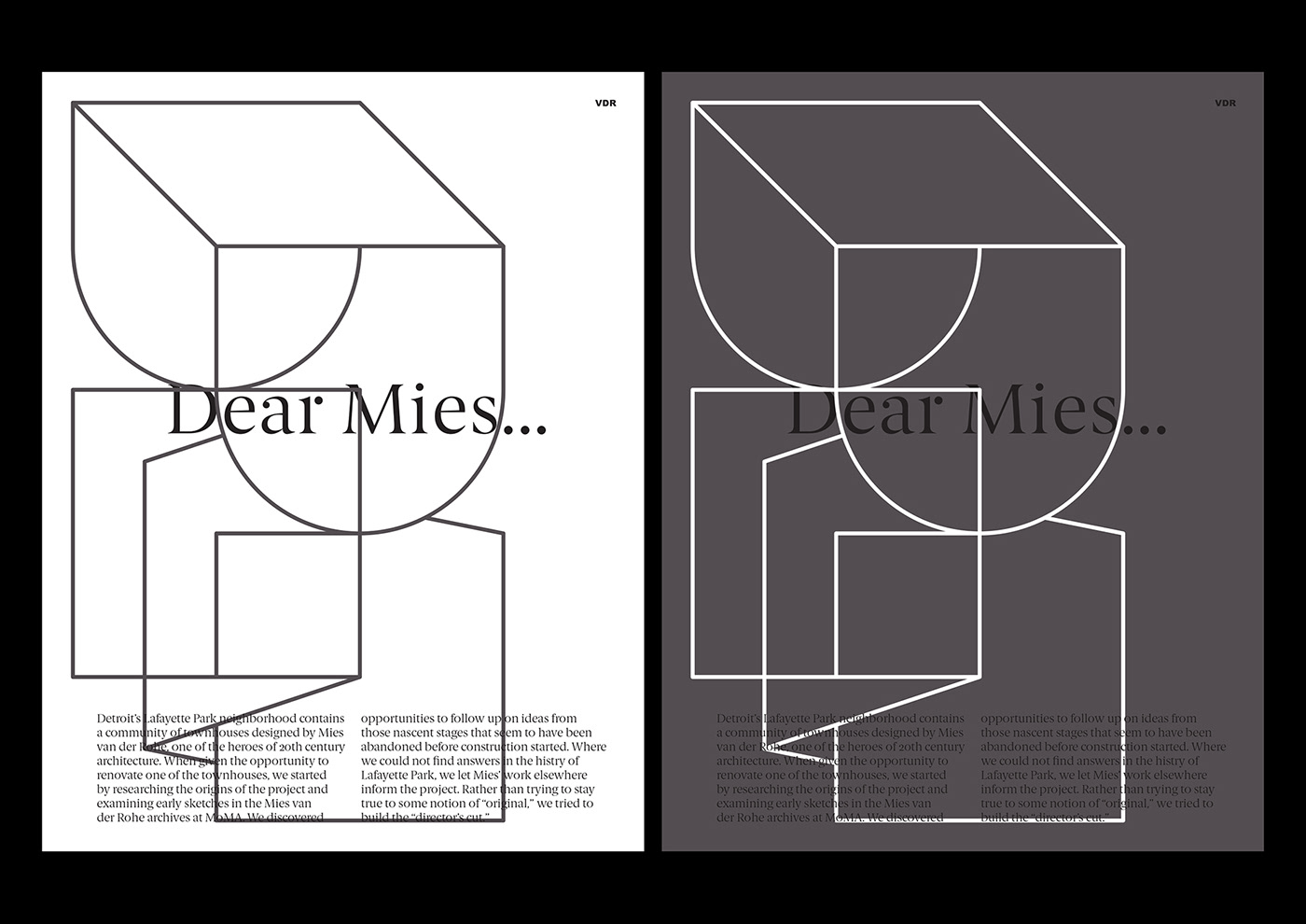
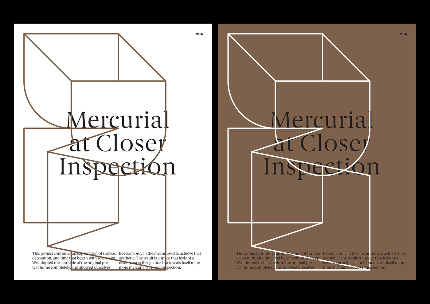
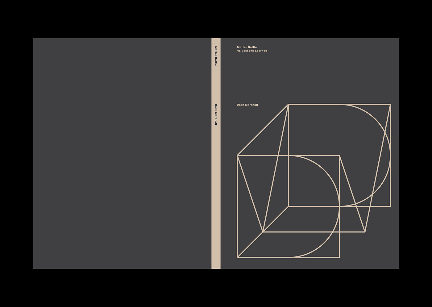
The letters DM, drawn in the isometric perspective, are the archetype of the visual identity. The lines of the letters may be removedandcolored, creating a multitude of variations of the icon.
Brand Identity


Dash Marshalls architecture plays with contradictions as old and new, classic and modern, emotional and rational. To visualize these contrasts we added thedrawnBerlingske to the constructed graphic system.

Matter Battle, 45 Lessons Learned by Dash Marshall.
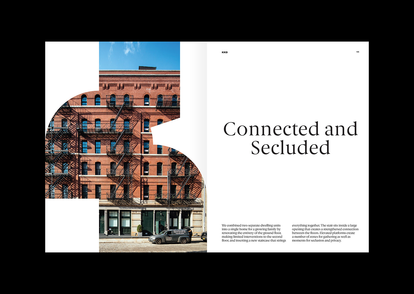
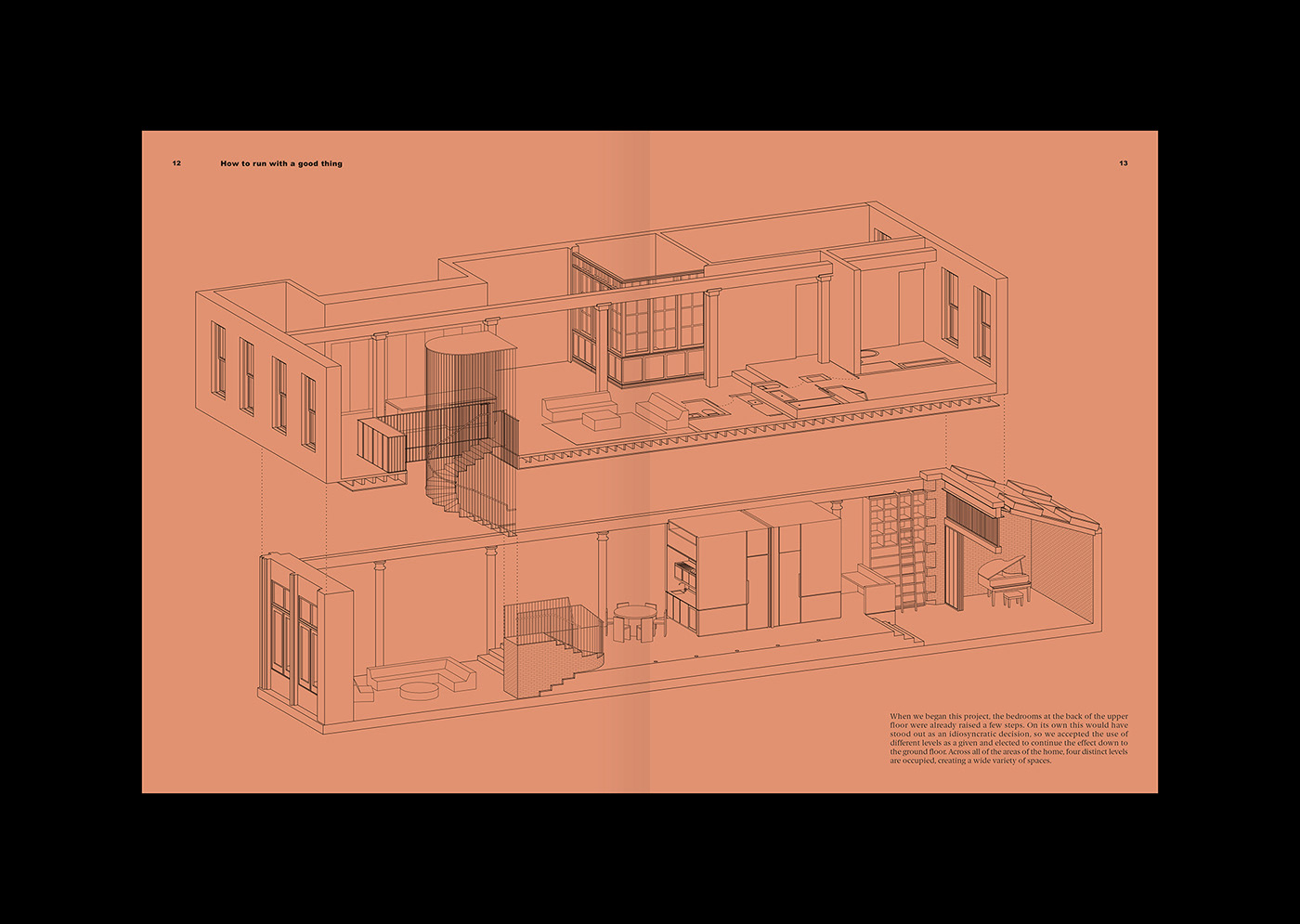
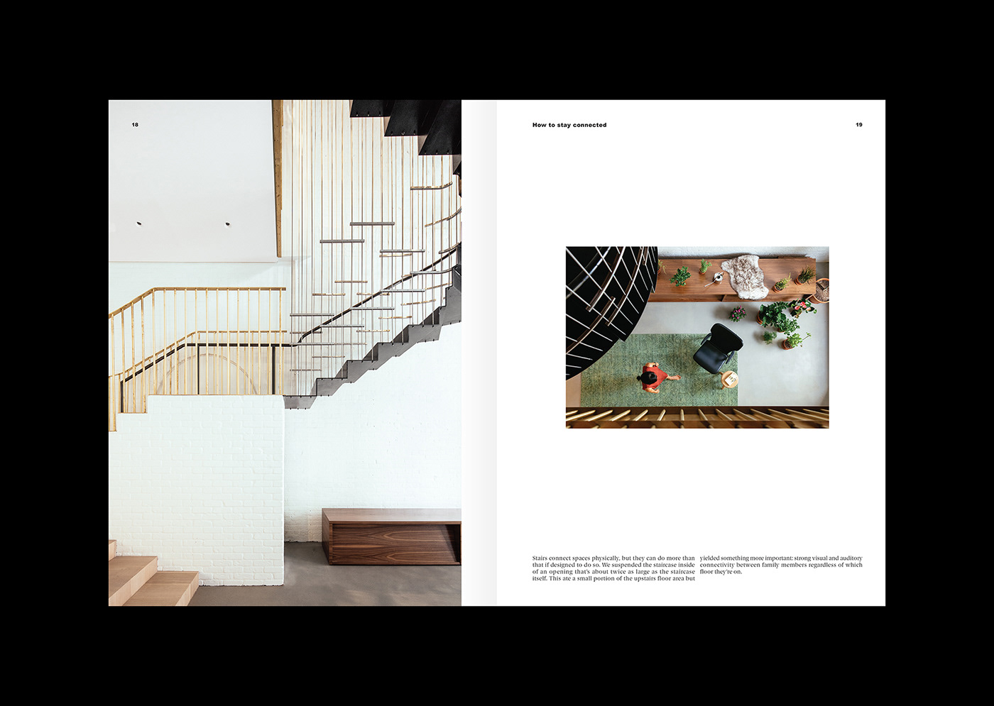
Producing a beautifulbook has to be considered today a statement in itself. The time, work and money going into aphysical object, which will be given away to only 200 select individuals, shows the appreciation of the constraints of the physical world.


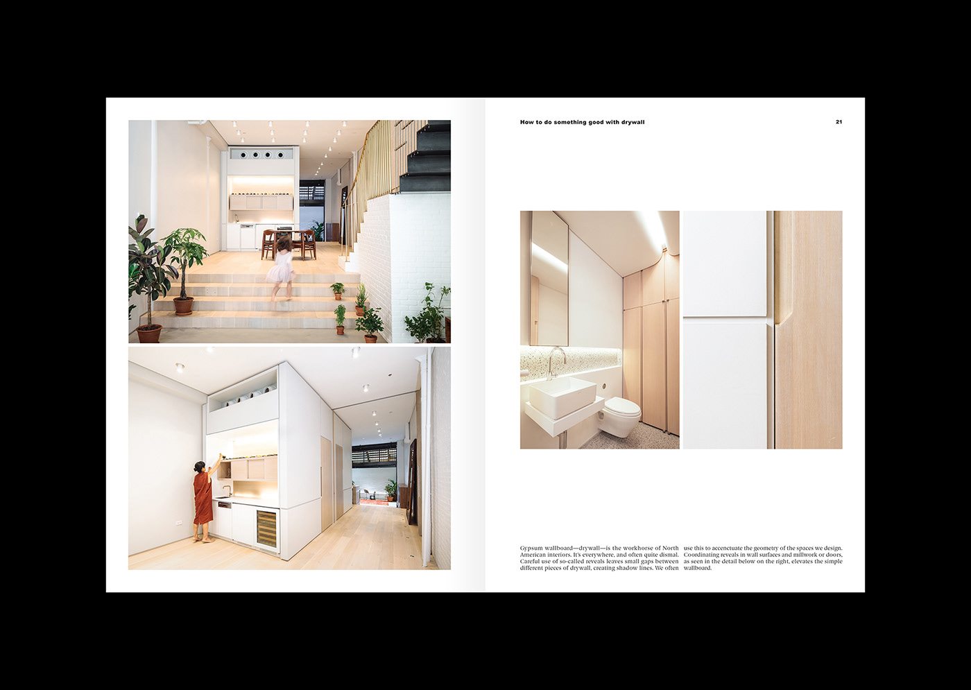
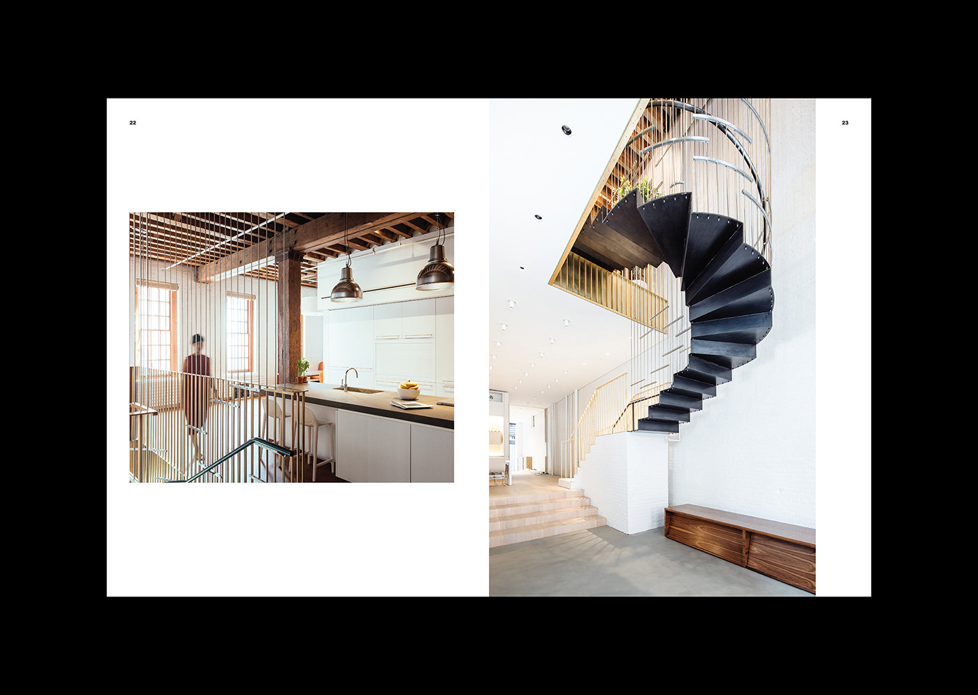
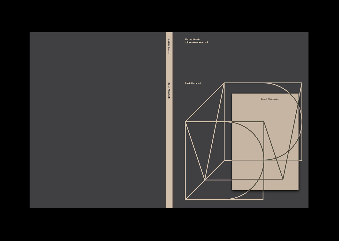
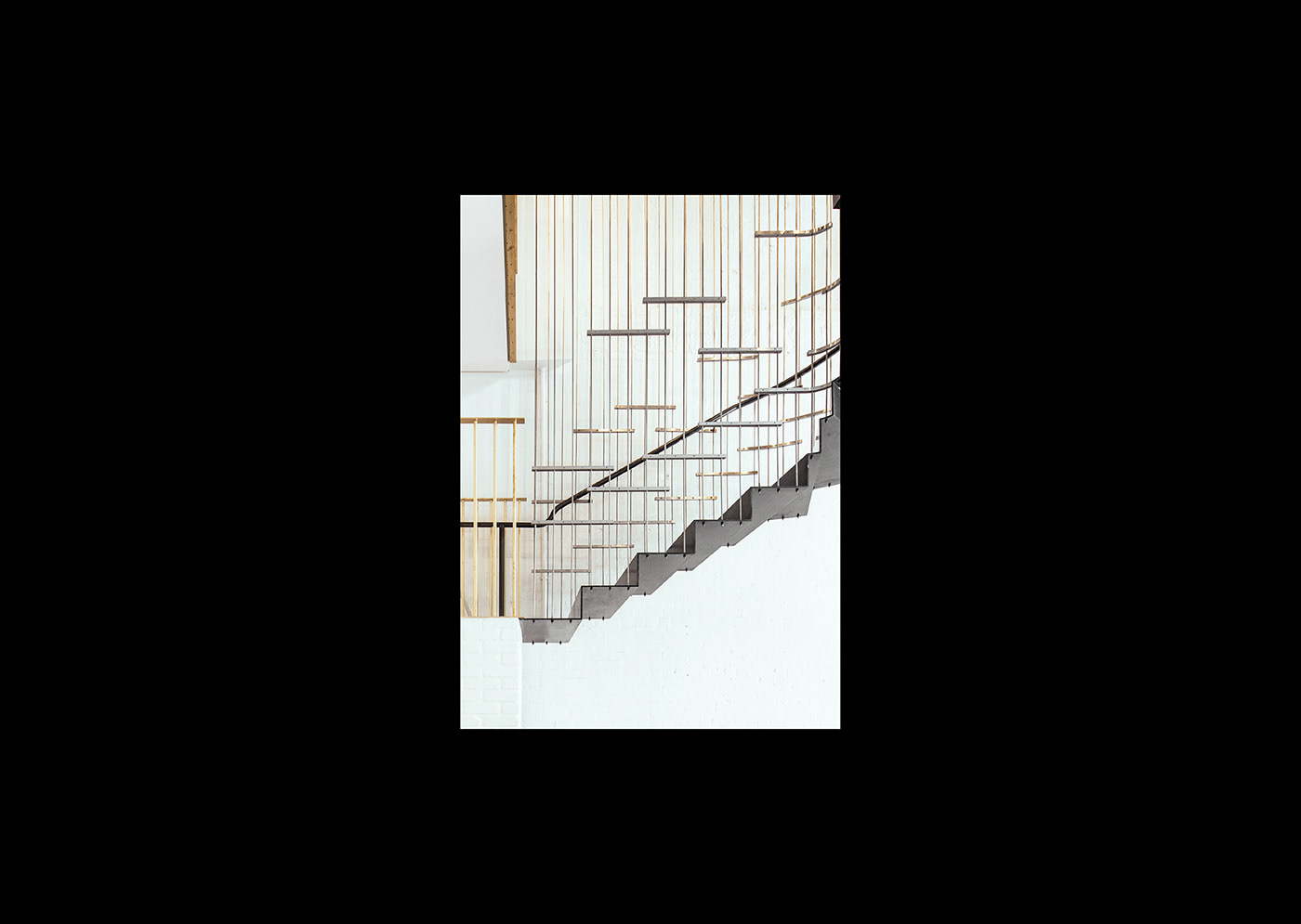
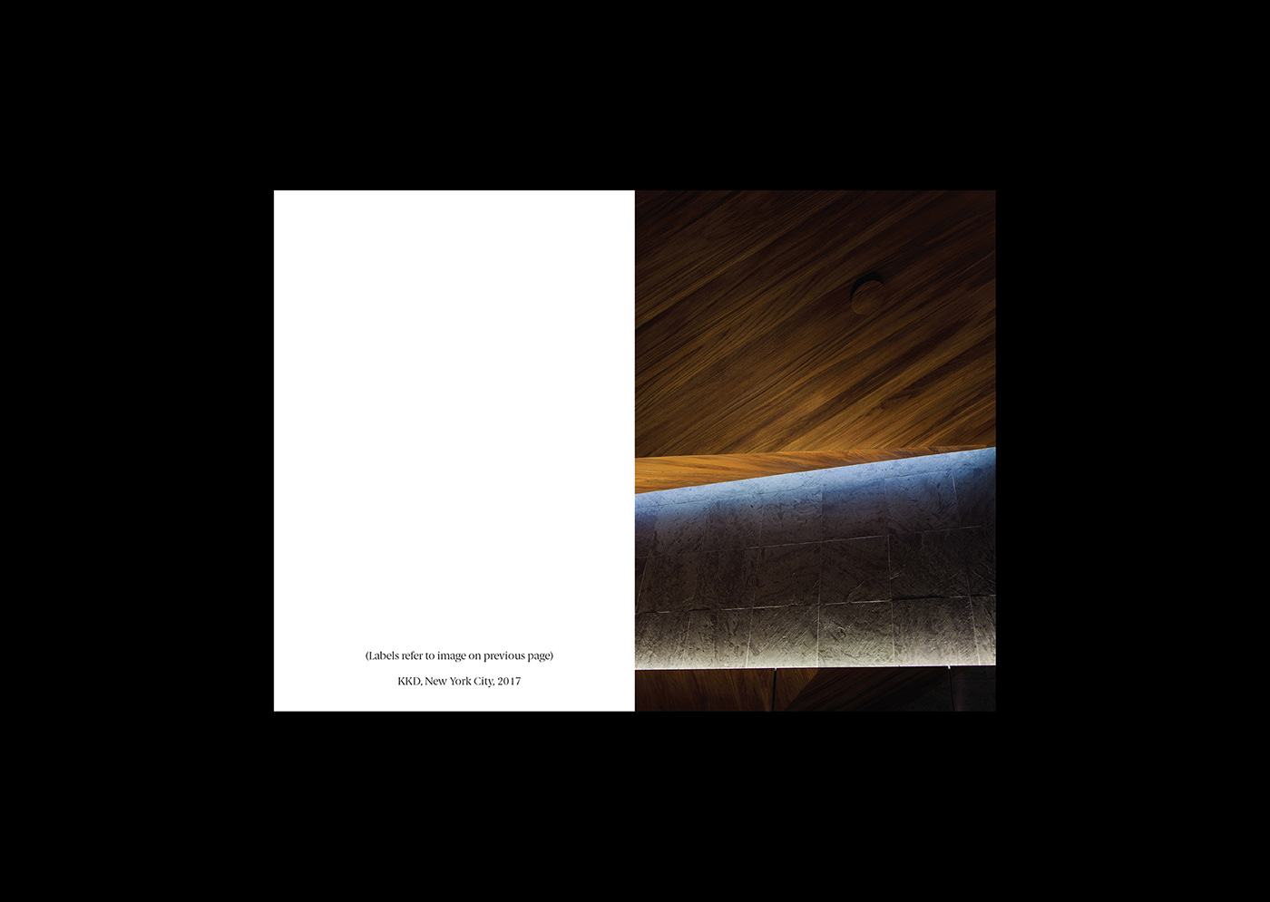
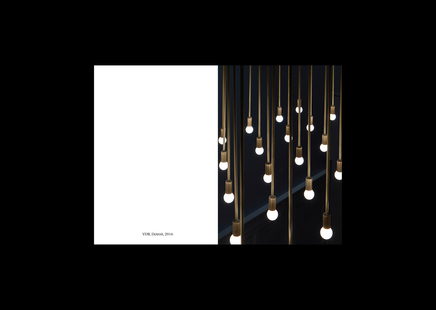
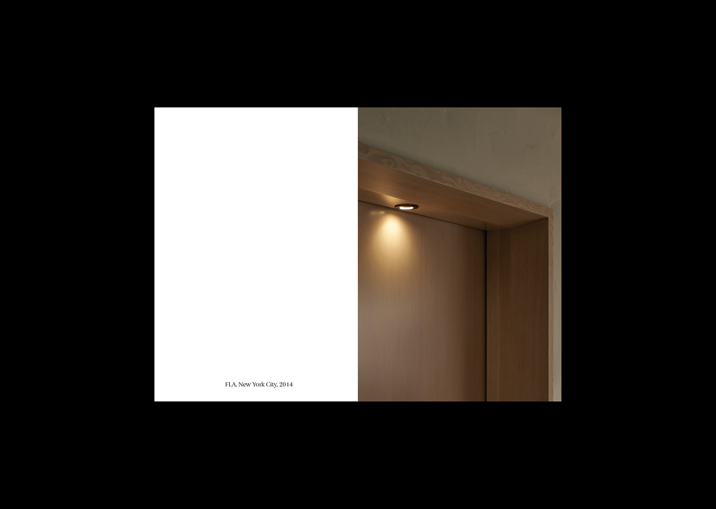
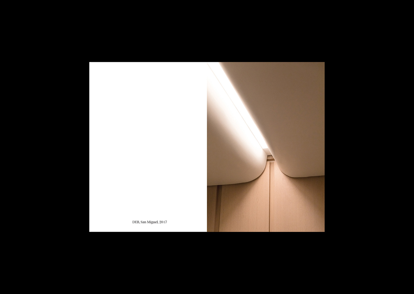
Along with the big book, comes a smaller, shorter book called Small Measures, focusing on the details of the projects and presenting them only in cropped images. The combination of a large and small book give Dash Marshall the flexibility to convey their work in different ways based on the needs of a given situation. A small book for small meetings, A big book for more substantial introductions, or both for moments of special gratitude.


Original Link: http://feedproxy.google.com/~r/abduzeedo/~3/Cll8SUM5pwk/brand-identity-new-york-city-architecture-firm-dash-marshall
Abduzeedo
 Abduzeedo is a collection of visual inspiration and useful tutorials
More About this Source Visit Abduzeedo