
An Interest In:
Web News this Week
- April 17, 2024
- April 16, 2024
- April 15, 2024
- April 14, 2024
- April 13, 2024
- April 12, 2024
- April 11, 2024
Some of Our Sources
- Technology Review
- Web Designer Wall
- Smashing Magazine
- Inspiredology
- Naldz Graphics
- Fudge Graphics
- Design Modo
- Willems Lab
- Daily Now
- Hashedout
Help Webnuz
Referal links:
How to Use Pivot Tables in Google Sheets (Ultimate Guide)
Pivot tables are a favorite feature of Excel power users. Sure, Excel is the heavyweight champ of spreadsheets. But Google Sheets is a free, web-based tool that's perfect for collaboration and has plenty of strength of its own.
A spreadsheet is really just a set of rows and columns. When rows and columns meet, cells are formed. That's where you can log data using formulas. As a spreadsheet grows and has more and more records, you'll need tools to understand the data inside it.

That includes the option to create pivot tables, which help you take your spreadsheets and find meaning in them. With a pivot table, you can build reports that help you understand your original data better.
Building a pivot table in Google Sheets is easier than you think. In this tutorial, I'll teach you how to use Google Sheets to create powerful pivot tables that slice and dice your data, right inside your web browser.
How to Quickly Use Pivot Tables in Google Sheets (Watch & Learn)
In the screencast below, I'll help you get started with using Google Sheets for analyzing your data. By the end of the video, you'll learn how to use the Sheets version of pivot tables to review a large set of data and understand it thoroughly.
Keep reading for an illustrated, step-by-step guide to using pivot tables in Google Sheets. Read on to walk through:
Why Pivot Tables?
The problem isn't usually that we lack data. The issue is that we all have so much data that we have to find meaningful ways to look at the dataset.
Pivot tables are just a tool that we can use to analyze our data. They help us take a large set of data and build reports to answer questions about it.

Review the screenshot below to see the power of pivot tables. All of these are linked to the same set of data but have different views on summarizing the data. I've summarized my freelance work by showing my client billings, top types of projects, and client billings by year.

Pivot tables take your original data and help you understand it better by grouping and summarizing your data. Let's learn how to use Pivot tables in Google Sheets.
1. Load the Sample Data
As part of this tutorial, I've included a sample set of data to use as you follow along. I've created fake data of "client billings", or the amounts we've billed our clients for a fictitious freelancing business.
This data is a CSV (comma separated value) file of raw data that you'll import into Sheets. Download and extract this file, and find the "sample-data.csv" file.
Here's how to import it into Google Sheets:
Step 1. Start a New Sheet
Go to Google Drive, and start off by setting up a new Sheet file. It's easiest to start with a blank slate to import data into.
Step 2. Import the Data into Google Sheets
Find the Data > Import menu option. Point Sheets to the sample-data.csv file to import it.

Step 3. Choose the Settings
I leave the settings on the default options. I prefer to Create new spreadsheet to launch a separate file to pivot, and automatically detect separators. Click Import to wrap up.
When you've finished the import, you'll see the data loaded inside of your Google Sheet. We can start pivoting our data now.
2. Insert a Pivot Table in Google Sheets
Now, we've prepared our sheet with raw data. Go ahead and highlight the columns where the data is stored, and go to the Data > Pivot Table option to insert your Pivot table.

Learn the Report Editor
Now, we're ready to start pivoting our data. This means that we'll use the Google Sheets Report Editor to build out different views of our data to understand it better.
Pivot tables are all about taking big sets of original data and putting it into a report you can understand. The Report Editor is Sheets' tool to build your pivot table out and understand your data in more detail.
Let's get familiar with the Report Editor. Google Sheets has four options on the left side to put data into a pivot table: Rows, Columns, Values, and Filter.
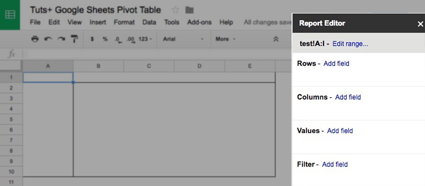
When we click Add field for any of the options, you'll see the columns from your original data. Click on one of the column names to add the data in the given format.

This is the magic of a pivot table. You can take any of the columns in your original data and build a report, placing the fields in your original data in the pivot table.
For example, if I click Add field next to Rows, and then click Client, this is the view that you'll see:

The pivot table shows each of my clients on their own row. The pivot table is taking the original data and showing it in a report. We could go on to add our billings for each client to the report builder.
Here's what each of the four options in the report builder does when you add a field to it:
Rows - Add a column as a row to see each of the values on the left side of your pivot table.
Columns - When you add a field as a column, each of the items will be shown in a column of their own.
Values - Pull numerical amounts into the values section to show
Filter - You can pull a field into the filter box to let you filter your data down, such as filtering the data for a specific year of data.
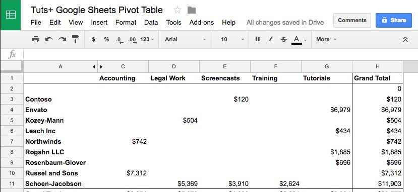
Check out the screenshot below to see a full report I've built with Google Sheets. I've put my clients in as a row, and the project types in as columns. I've also dragged the billings into the values box to see the amounts for those combinations.
Spend a few minutes playing with the report editor, trying out different columns of data in different areas of the report builder.
3. Data Analysis With Pivot Tables
Everything is setup, and it's now time to use the Pivot Table to find out more about our data set. Let's have another look at a single row in our original spreadsheet:

Each row has several key pieces of data about a project we did for a client:
- The client we did the work for.
- The type of project that we did each time.
- The date that the project was completed.
- The hours spent, amount billed, and a calculated "hourly rate."
Because each line is a client-project combination of its own, it's hard to make generalizations about our data.
A pivot table can help us answer questions with this data quickly:
- Which client did we bill for the most services?
- What project type had the highest hourly rate?
- How much did we bill in 2016, versus 2017?
Let's take a look at how to build those pivot tables below:
Which Client Did We Bill the Most?
The whole idea of pivot tables is that we can use them to understand our spreadsheets. We certainly don't have the time to manually calculate things, so pivot tables are the answer.
For our first example of this, let's try to find how much we billed each client. We need to start by pulling in the client, and then show the amounts for each client.
Let's put each client on its own row, and the amount billed into the values box:
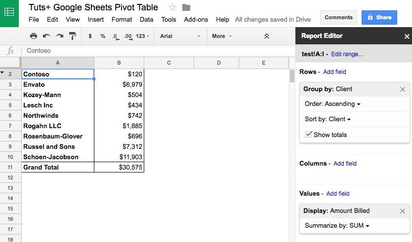
This is a simple example, but it's just what the doctor ordered. The original data would've made it difficult to subtotal by client, but pivot tables make it a breeze.
What Project Type Had the Highest Hourly Rate?
This time, let's trade out the clients for the project types. Since want to see the hourly rate per project type, let's remove the fields we added in the first example. You can do this by clicking the X in the report editor for each of the fields.
Now, let's add project type as our rows, and then put the hourly rate in the values section of the report:

However, we don't want to see the sum of the hourly rates. We'd rather see the averages of our hourly rates.
Click on the dropdown arrow next to Summarize by, and choose AVERAGE. This transforms the way that the amounts are shown; now, we're seeing the client average per hour.
This example is a great illustration that you can view amounts in different ways. Try out other values in that dropdown like count, max, min, and more.
Billings by Year
Now, let's break down our data and split it by years.
This time, it's your choice: you can put either the client or the project type as the rows in the pivot table. Either way, drop Year into the columns section. This splits the billings for each client by year, and puts each client on its own row.

All of these pivot tables are hooked to the same source of data. Building out these reports doesn't change or alter the original data at all. It just gives us a way to analyze and review our data better.
Recap and Keep Learning More About Google Sheets
Google Sheets is a staple in my freelance practice. I use it to organize my creative work, plan projects, and check on the income I expect to bill clients for.
The best thing about Sheets is that it's a special hybrid between a traditional spreadsheet app, and a connected web tool. You have the power of a spreadsheet app to log your data and use formulas. But, you also have a tool that connects to web services and can grab data easily.
Here are other tutorials to help you see the incredible potential that Sheets offers. Check at least one of them out to find out more:
 Google SheetsHow to Track Stock Data in Google Sheets - With GOOGLEFINANCE Function
 Google SheetsHow to Use IFTTT With Google Sheets
 Google SheetsHow to Create Web Input Forms With Google Sheets
How are you using pivot tables in Google Sheets? Or, are there other tools you use to do analysis on your spreadsheet data? Let me know in the comments below.
Original Link:
Freelance Switch
More About this Source Visit Freelance Switch