
Some of Our Sources
- Mashable
- Technology Review
- Team Treehouse
- The Logo Smith
- Spoon Graphics
- Smashing Magazine
- Crazy Leaf Design
- Stylized Web
- Freelance Switch
- Hashedout
Help Webnuz
Referal links:
How to Create a Vintage Music Festival Flyer in Adobe InDesign

Summer is here, and festival season is in full swing. If you’re promoting a festival event this year, you can give your publicity a vintage twist with this groovy flyer design. It’s simple to create and will make a fantastic summery statement.
We’ll be putting together the flyer layout in Adobe InDesign, and using Photoshop and Illustrator to do some colorful image editing. If you’re a relative beginner to Adobe software, this is a great all-round introduction to creating layouts for print or circulating online.
Need a festival flyer quickly? You'll find an awesome selection ofeasy-to-customize flyer templatesonGraphicRiver.
OK, are you ready for the best summer ever? Great! Let’s get started...
What You’ll Need to Create Your Flyer
To put together the flyer, you’ll need access to the classic trio of Adobe applications: InDesign, Photoshop and Illustrator. If you're not quite ready to commit to a software purchase, you can get a free 30-day trial of all these apps over at adobe.com.
You’ll also need to download the following images and font files:
Make sure the font is installed on your system before starting the tutorial. When you’re ready, we can dive right in to setting up our layout.
1. How to Set Up Your Layout in InDesign
Step 1
Open up InDesign and go to File > New > Document.
In the window that opens, keep the Intent set to Print and Number of Pages to 1, and uncheck Facing Pages.
From the Page Size drop-down menu, choose Flyer 8.5x11 or manually type in a Width of 8.5 in and a Height of 11 in.

Add a Margin of 0.2756 in (7 mm) and a Bleed of 0.25 in around all the edges of the page. When you’ve done that, go ahead and click OK.


Step 2
Expand the Layers panel (Window > Layers) and double-click on the Layer 1 name. Rename it Paper and click OK.
Take the Rectangle Frame Tool (F) from the Tools panel and drag onto the page, creating a frame that extends up to the edge of the bleed on all sides. Go to File > Place, choose your paper texture image, and click Open.

Allow the image to fill the whole frame by scaling it, holding Shift while you do, and rotating (Right-Click > Transform > Rotate) if necessary.

3. How to Add a Sunset Background to Your Flyer
Step 1
Return to the Layers panel and click on the Create New Layer button at the bottom. Double-click the layer to open Layer Options. Rename the layer Background Color.
Lock the Paper layer below, activating the Background Color layer.

Step 2
Expand the Swatches panel (Window > Color > Swatches) and click on the New Swatch button at the bottom.
Double-click the swatch to open the Swatch Options window. Name the swatch Sunset, set the Type to Process and Mode to CMYK, and adjust the percentage levels to C=0 M=53 Y=55 K=0. Click OK.

Step 3
Select the Rectangle Tool (M) and create a shape that covers the bottom half of the page. Set the Fill to Sunset and Stroke to [None].

With the shape selected, head up to Object on the top menu and Effects > Gradient Feather.
Give the shape a 90 degree gradient, pulling the dark slider along to the right.

Step 4
Create a second New Swatch, naming it Sunrise. Set the levels to C=2 M=19 Y=83 K=0.
Use the Rectangle Tool (M) to create a new shape, extending it across the whole of the page, and pulling it down past the bottom edge of the page by about a quarter-page.

Go to Object > Effects > Gradient Feather, and apply a -90 degree Gradient. This will create a subtle sunset effect.

4. How to Create a Collage Effect for Your Design
Step 1
File > Save your InDesign document, and minimize the window for now. We’ll be coming back to it a bit later.
Open up your camper van imagein Photoshop, and Duplicate and then Lock the background layer to keep a copy of the original image. We want to separate the van in the foreground from its background, but we can do this in a rough way which will add to the cut-out collage effect.
Use the Polygonal Lasso Tool (L) to trace around the edges of the van, looping off sections and clicking on the Refine Edge button at the top of the workspace.

Use the Shift Edge slider to make the selection as tight as possible, before hitting OK once you’re happy. Then Delete the selection.

Work your way around the whole van, including the shadow below, until you have isolated it. Then head up to File > Save As, and Save your image as a Photoshop (PSD) file.


Step 2
Minimize the Photoshop window and head back into InDesign.
Create a New Layer and name it Camper Van. Lock the two layers sitting below.
Use the Rectangle Frame Tool (F) to create a frame in the center of the page and File > Place, choosing your camper van Photoshop image. Center it nicely within the frame.

Step 3
Create a New Layer and name it Pen Tool. Drag this down to sit below the Camper Van layer and above Background Color.

Take the Pen Tool (P) and click around the edge of the van, leaving a little gap between the edge of the photo and the line.
Continue to trace your way around, joining the shape up at the first anchor point.

From the Swatches panel, change the Fill of the shape to [Paper] (white) and the Stroke to [None].

This creates a great little cut-out collage effect.

Step 4
Create a New Swatch, name it Cherry, and set the levels to C=0 M=130 Y=94 K=0.

Create a New Layer at the top of the layer sequence and name it Color. Lock the other layers below.
Use the Pen Tool (P) to pull out a part of the van in your Cherry swatch. Here, I’ve traced the central door, but you could try a window if you like.

Step 5
Minimize the InDesign window for a minute. You can also create playful colored elements for your collage using Illustrator.
Open up Illustrator, and File > Place your camper van image. Lock this onto its own layer, creating a New Layer above to work on.
Select the Paintbrush Tool (B) and click on the Brush Definition drop-down menu at the top of the workspace. Click on the Brush Libraries Menu and choose Artistic > Artistic_ChalkCharcoalPencil.
Select Chalk - Blunt from the brush window that opens. Draw around the VW logo, tracing the outside edge.

Then trace the inside details too.

Step 6
You can trace other elements too, like the nice V-shaped swoop across the front of the van...

... and the wheels as well.

Don’t worry about perfecting color here—I’ve just used a bright yellow to show you the shapes clearly. For now, select the VW shape only and Edit > Copy, before minimizing the Illustrator window.
Step 7
Head back to your InDesign document and create a New CMYK Swatch. Name it Turquoise, and set it as C=79 M=11 Y=48 K=1.

Edit > Paste your VW vector shape onto the page, and scale using Shift to match the proportions of the image below. Adjust the Fill to Turquoise.

Return to Illustrator, select the V swoop, and Edit > Copy; head backto InDesign and Edit > Paste. Set the Fill to Sunset.

Finally, Copy and Paste over your wheel shapes. Set the Fill of these to Sunrise.

Great work so far—your camper van’s looking groovy!

5. How to Create Letterpress-Style Typography
Step 1
Create a New Layer. Name it Typography and sit it above the Background Color layer and below Pen Tool.

Use the Type Tool (T) to create a text frame at the top of the page. Type in ‘SUMMER’ and from either the top Controls panel or the Character panel (Window > Type & Tables > Character) set the Font to Charlevoix Pro SemiBold, Size 110 pt, Tracking 160. Set the text to Align Center from the Controls panel, and adjust the Font Color to [Paper].

Edit > Copy, Edit > Paste the text frame, moving the copy below the first. Adjust the text to read ‘FESTIVAL’ and adjust the Tracking to line up the far edges of the text with the text above.

Step 2
Select both text frames, and Copy and Paste below, adjusting the Font Color to Sunset.

Repeat the paste, this time creating a New Swatch, called Sky Blue, C=49 M=0 Y=2 K=0, and move below.

Step 3
Use the Type Tool (T) to create a series of text frames at the bottom of the page. Here you can put details like the date, location and what’s on at your event. Set all the text in Charlevoix Pro SemiBold and a [Paper] Font Color.
You can use the Glyphs panel (Window > Type & Tables > Glyphs) to insert bullets between acts.

Step 4
Make sure that you’re happy with the final layout and content of the text. We’ll be duplicating all the text to create a shadow effect, so it needs to be kept the same to look right. This is the time to do a spell check!
Head over to the Layers panel and right-click on the Typography layer. Select Duplicate Layer “Typography”.

Then drag the duplicate layer down to sit below Typography. Rename this layer Type Shadows. Lock the Typography layer above.

Step 5
Drag your mouse across the whole page to select all the text frames on the Type Shadows layer, and press the arrow keys to move the text a little to the right and down.
Select each pair of ‘SUMMER FESTIVAL’ text frames and adjust the Font Color to a contrasting shade, creating a cool letterpress-style shadow effect.

Work your way down the page, adding a [Paper] color to some text, or your custom swatch colors to others.
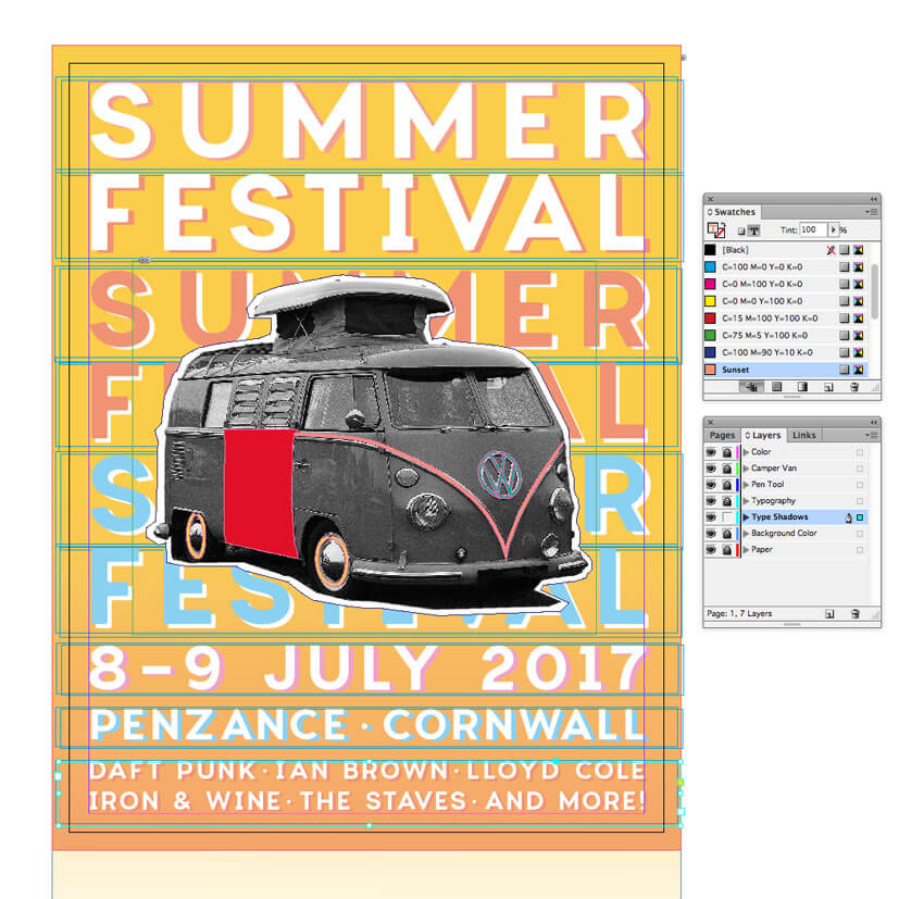
Eventually you’ll end up with a very nice letterpress effect, which looks great paired with your camper van collage.

6. How to Export Your Flyer for Circulation
Exporting Your Flyer for Online Circulation
If you want to circulate your flyer as an email attachment or get it ready for web upload, you’ve got a couple of options.
Head up to File > Export. Choose Adobe PDF (Interactive) from the Format menu if you want to attach the flyer to an email.

Alternatively, choose JPEG or PNG if you’d like to prep an image for uploading online.
Exporting Your Flyer for Printing
If you’re planning to get your flyer printed professionally at a print shop, you’ll need to make sure to include your bleed in the final export.
Go to File > Export, and choose Adobe PDF (Print) from the Format menu. Click Save.
In the window that opens, choose [Press Quality] from the Preset menu at the top.

Click on the Marks and Bleeds option in the left-hand menu, and check All Printer’s Marks and Use Document Bleed Settings. Then hit Export to create your print-ready PDF—you can send this straight off to the printers!

Conclusion: You’ve Created One Groovy Flyer
Congratulations, your festival flyer is finished! Now all you need to do is sit back and watch the ticket sales roll in.
Before you chill out with some awesome live music, let’s take a quick recap of some of the key skills you’ve picked up in this tutorial, which you can apply to other flyer design projects. You now know how to:
- Set up a standard flyer layout in Adobe InDesign.
- Create a professional backdrop of color and texture to your layout.
- Edit collage-style images in Photoshop and add vector details using Illustrator.
- Format letterpress-style typography to a high standard, adding an on-trend look to your design.
- Export your flyer for circulating online or in print format.
That’s a lot of work—great job! If you want to explore even more festival flyer ideas, you can find a range of easy-to-customize flyer templates over on GraphicRiver. Check it out!
Original Link:
TutsPlus - Design
More About this Source Visit TutsPlus - Design