
An Interest In:
Web News this Week
- April 29, 2024
- April 28, 2024
- April 27, 2024
- April 26, 2024
- April 25, 2024
- April 24, 2024
- April 23, 2024
Some of Our Sources
- Technology Review
- Joshua Blankenship
- The Logo Smith
- Web Design Ledger
- CSS Globe
- 24 Ways
- CSS Tricks
- Spyre Studios
- Design Modo
- The Verge
Help Webnuz
Referal links:
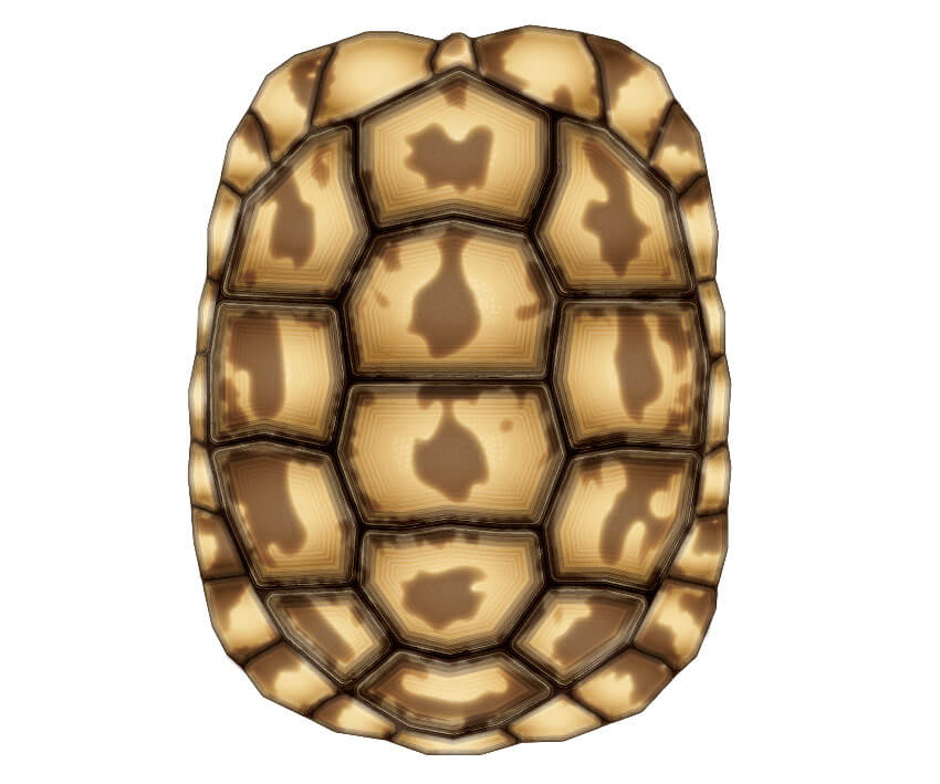
How to Create a Tortoise Shell Using the Appearance Panel in Adobe Illustrator

Whilst the Envato Tuts+ team may have a weakness for furry animal folk, there is a new kid on the block who is making us gush... and that's Tom the tortoise! He lives with our Web Design editor, Ian Yates.
I'd like you to meet him so you can understand the awesomeness of Tom.

Inspired by his cuteness,I've decided to create a tutorial on how to create a tortoise shell using the Appearance panel. If you've not used the Appearance panel before, this is the perfect tutorial for you, and it's also bezier curve/Pen Tool free, so it makes it super easy to try out.
The Appearance panel allows you to add multiple fills, strokes and effects to a single shape, without the need of duplicating points and shapes. You save the settings from the Appearance panel by creating a Graphic Style. Graphic Styles can be applied to further shapes. By knowing this process, you're able to duplicate settings from one shape to multiple without adding extra shapes and points to your document, making it less heavy and more efficient.
So let's jump into this exercise.
Tutorial Assets
In order to complete this tutorial, you'll need to download the attachment from the top right of this page. This is the reference image for this exercise, and it's an aerial photo of Tom's shell. You can use your own photography if you wish, or alternatively you can try out many of the stock images from Envato Market.
1.Create the Basic Plate Shapes
Step 1
I'm going to start by creating a New Document in Adobe Illustrator.
Let's add the reference image by going to File > Place, locating the image, and positioning it onto the artboard. If you're pretty confident with drawing the shell and plates of a tortoise, you can completely skip this step.
I'm going to keep the reference image on its own layer and add shapes in additional layers for convenience.

Step 2
I did say this tutorial is Pen Tool (P) free, but when I say this, I mean that we're not creating curves with the Pen Tool, which is what most beginners have problems with. I'm going to be using the Pen Tool to create point-to-point shapes with straight lines... so no curves required!
I start by first enabling Smart Guides (Control-U). This makes it easier when drawing the plates which are connected to each other.
Draw the first shape, and then when you come to draw the connecting shape, make sure you hit the same anchor points and same straight lines. This is important further down the road.

Step 3
I'm going to draw plates for the central section of the shell and then a series of plates for around the shell, which I'm going to call the skirt.
Keep everything organised, with the plates in their respective layers.

Step 4
I'm going to duplicate the shapes for each of the layers and then combine the shapes using Pathfinder > Unite.
I create a sublayer in each of the Skirt and Plate layers which contain the individual plates... and then underneath I have the combined shapes.
Essentially what I'm doing is creating a base underneath each section. The reason for this will be apparent later on.

2.Before I Dive Into the Appearance Panel
Step 1
Before I dive into the Appearance panel, I'm going to prepare my document.
First, in the Reference layer, I'm going to duplicate the reference image and align it alongside the original. This is so that, while I'm creating our Graphic Style, I can clearly see our reference image. Of course, this only applies if you're using a reference image!
I then add a New Layer and put a duplicate of one of the plates. This is so I can work on this single plate and use the settings from this on the rest of the plates of Tom's shell.

Step 2
The next thing I want to do is create a selection of colours and add them to my Swatch panel.
Using a technique I picked up from Beto Garza from his self portrait tutorial, I'm going to use the Eyedropper Tool (I) to fill a selection of Rectangles (M). I'm then going to Blend (Control-Alt-B) them together to create additional colours.
I then Object > Expand the blend and add them to my Swatch panel. I may not use all of the colours, but at least they'll be there ready for me should I need them.

3.Create a Detailed Graphic Style
Step 1
I'm going to open the Appearance panel. If you don't have it visible, click on Window > Appearance.
There are three main elements to point out here. You have the Stroke (and its Opacity), the Fill (and its Opacity) and the overall Opacity of the entire shape. All elements moving forward, apart from the overall Opacity, can be duplicated by going into the drop-down menu and selecting Duplicate Item.
So let's start on the fills. I'm going to use the darkest brown for the first fill.

Step 2
I'm going to duplicate the fill many times in the first stages of this exercise. You do this by clicking on the fill, so it's highlighted, and going into the drop-down menu in the top right-hand corner and going to Duplicate Item.
Visually, you won't see anything different, but in the Appearance panel, you'll see two Fills of the same colour and the same Opacity settings.
Step 3
Change the fill colour to the second darkest brown, and this will hide the bottom fill.
Here's where some magic happens. I'm going to shrink the lighter fill so it reveals some of the bottom fill. Click on the FX button along the bottom of the panel and go to Path > Offset Path.
Offset Path can increase the size of the shape by a specific unit. However, to decrease the shape's size, you just need to use a minus figure. In this case, I'm using -1mm and clicking on OK. You'll then see the bottom fill creeping around the outside of the shape.

Step 4
I'm going to duplicate this process three more times, decreasing the fill by another -1mm for each fill. So the third fill will have an Offset Path of -2mm and so on. The fills will also get gradually lighter.

Step 5
I'm going to duplicate the most recent fill again and this time fill it with an inverted transparent radial gradient.
Using the Gradient Tool (G), I'm going to modify the shape of the gradient. I'm then going to click on the Opacity link for the fill. This opens the Transparency panel settings for that specific fill. Then I change the Blending Mode to Multiply.

Step 6
I'm going to work on the Strokes now. Just as I did with the fills, I'm going to use Offset Path to contract each duplicate of the stroke.
These strokes are set to Blending Mode Screen Opacity 30% with the exception of the last two strokes, which haveOpacity of 20% and 10%.
In addition, I've applied Art Brushes to the strokes, which are available from Adobe Illustrator's default Brush libraries. You can access them by going into the drill-down menu of the Brushes panel and choosingOpen Brush Library > Artistic > Artistic_ChalkCharcoalPencil.

Step 7
Let's add some texture by adding two new fills. They will both be filled with a textured pattern which can be found by going into the Swatches panel > Open Swatch Library > Patterns > Basic Graphics > Basic Graphics_Textures.
You can drag the new fills on top of the Strokes. This makes them easier to arrange.
The first textured fill I'm going to have cover the entire shape and set to Blending Mode Overlay Opacity 10%. Using Object > Transform > Scale, I reduce the size of the pattern only for that fill to about 50%.
Then, for the second fill, I'm using Offset Path to contract it so it creates a sort of highlight of texture. This is then set to Blending Mode Overlay Opacity 20%.

Step 8
I'm going to finish off by adding a new fill with a transparent radial gradient using the lightest colour from our Blend swatch, and setting it to Blending Mode Screen Opacity 40%.

4.Apply the Graphic Style
Step 1
In order for this collection of settings in the Appearance panel to become a Graphic Style, you'll need to go into the Graphic Styles panel. With the shape selected and with all of these fancy settings you have in the Appearance panel, click on New Graphic Style. This will "save" your Appearance panel settings as a Graphic Style.
You can then apply this Graphic Style to the rest of the shapes on the central plates.

Step 2
For the skirt plates, I'm going to hide some of the outlines in the centre of the plates as they don't need to have the same level of detailing. Remember that once you've modified the settings to what you want, add them as a New Graphic Style so it's easier to apply them to further shapes.
When applying the Graphic Style to the skirt plates, you may find that some of the shapes don't look like the others. This is purely because some of the Offset Path fills and strokes are contracted so much that it only focuses on the central fills and strokes, therefore pushing the fills around the outside out of view. Let's go on to fix this.

Step 3
You get around the issue by decreasing the scale of the Graphic Style.
Apply the new style from the skirt to a test shape. Then, while selected, go to Object > Transform > Scale and reduce the scale by 55%.
Once done, create a New Graphic Style and apply it to the skirt. If you're still experiencing problems, try reducing the scale further until you get the effect you need.

5.Use Live Corners to Round the Plates
Step 1
From the earlier steps, you may have questioned the straight edges and sharp corners of the plates. Well, it's time to fix this!
With the Direct Selection Tool (A) and your first collection of plates selected, you'll notice little circles in every corner. By pulling them inwards, you round out the corners of the shapes.
This is the same workaround method I've written about in a quick tip tutorial for those who find the Pen Tool difficult.

Step 2
Apply this to all shapes apart from the base shapes for the entire skirt and centre of the shell.

Step 3
To fill in the gaps between the plates, I'm going to fill the base shapes for the centre and skirt shapes with the same colour as the fill of the very first fill.

6.Customise the Shell Patterns
Step 1
Right now, this tortoise shell could belong to anyone. And Tom isn't anyone. I mean, have you seen his cuteness?
So to make sure the shell I'm creating looks like Tom, it's time to customise it. I'm going to start by increasing the Opacity of one of the outer strokes of the central plates. I've picked the second stroke from the bottom and increased the Opacity to 50%.

Step 2
Using the Pencil Tool (N), I'm going to add new shapes in a New Layer, tracing from the reference image. I'm creating the main blob shapes on the centres of the plates.
I've created a Graphic Style of three fills with different Blending Modes and Opacities, but all using the same fill colours. You may also see I've added a feather, which you can find in the FX menu. I'm going to use this Graphic Style for all of the shapes I'm adding to the shell.

Step 3
Double-click on the Blob Brush Tool (Shift-B) to access the options window. Change the Size to 5 pt and make it influenced by Pressure from your graphics tablet.
Then with the tool, draw zig-zag shapes around the edges of the plates to create texture. These shapes use the same Graphic Style from the previous step.

Step 4
Continue to add this to the skirt of the shell using the same methods.
7.Create Depth With Gradients
Step 1
We're heading towards the end of this exercise, so let's add some further depth to the shell by using gradients.
Create a transparent radial gradient using one of the lightest colours in your Swatches panel. Use the Pencil Tool (N) to add shapes to each shell to create the shine. I've smoothed out the edges of the shine by applying a Feather effect.

Step 2
Duplicate the base shapes for the central and skirt shapes and use Pathfinder > Unite to create a shape which covers the entire shell.
Drag this shape above all of your previous shapes and fill it with an inverted transparent radial gradient with the 0% Opacity point towards the front of the shell. This will give the shell the impression of the light coming from the front and the darkness appearing at the back of the shell.

8.Bonus: Colour-Changing Tortoise!
What I always find interesting and fun to do is to use Recolor Artwork on all of my shapes once I'm done. So select all of your shapes and click on Recolor Artwork, which will be along the top of your screen.
Click on the Edit tab, and then click Link Colors.
By moving the colour points around and having Recolor Art ticked, you'll see the changes in colour live. Click on OK when you have a combination you're happy with.

Everyone Loves Tom
It's true, everyone loves Tom, and I hope this tutorial has shown you the level of dedication the Envato Tuts+ team has for their new cute Overlord!

Original Link:
TutsPlus - Design
More About this Source Visit TutsPlus - Design