
An Interest In:
Web News this Week
- April 29, 2024
- April 28, 2024
- April 27, 2024
- April 26, 2024
- April 25, 2024
- April 24, 2024
- April 23, 2024
Some of Our Sources
- TutsPlus - Code
- Team Treehouse
- Just Creative
- Pearsonified
- The Logo Smith
- Naldz Graphics
- Spyre Studios
- Android Dissected
- Codrops
- The Verge
Help Webnuz
Referal links:
How to Create a Pixel Art Portrait in Adobe Photoshop
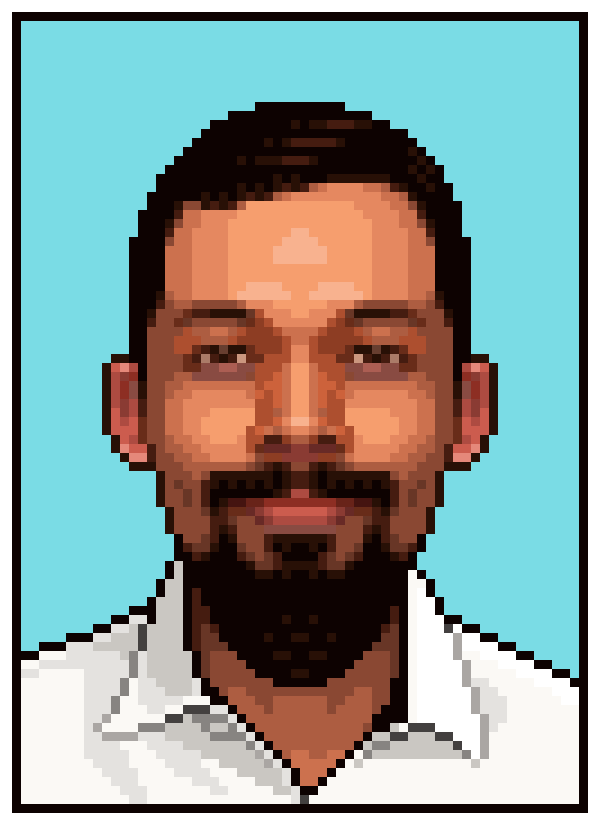
Do you want to give yourself or someone you know a very retro look?
Let's check out how to turn a photo into a cool pixel art portrait. We'll do some pixel-by-pixel work to achieve a retro, arcade game kind of look.
If you're looking for other retro pixel art graphics without having to do the work, you can always head over to Envato Market.
1. Take and Adapt a Portrait Photo
You'll need a very symmetrical photo of the person you'll pixelate.
Step 1
Get (or take) the photo! The subject should be looking straight at the camera—this way we need only do half of the face (and flip horizontal for the other half), and also the end result is kind of stiff, in a good way.
A selfie may work, but if you can get a picture with a bit more distance, it would probably work better for the portrait.
Step 2
Draw a crosshair that will help align the photo.

Step 3
Paste the portrait in a layer under the crosshairs.

Step 4
Transform (Edit > Free Transform) and align the eyes with the horizontal line, and the nose with the vertical.

Step 5
Copy the aligned face, paste it in a New Layer, flip it horizontally and lower the layer opacity to 50%. This will sort of average out the face, make both halves identical, and we won't need to worry about the light from the photo not matching the one on the pixel portrait.

Step 6
And now shrink the portrait (Edit > Free Transform). You canapply the change to both layers at the same time… don't merge them. The face could be anywhere from 50 to 75px. I drew a pair of beady eyes in a New Layer that I could use as a reference; I wanted to be able to leave a pixel for the pupil and a pair of pixels on the side for the iris. If I had shrunk the photo more, I might not have had enough resolution to achieve that.
You won't need the crosshairs anymore.

Apologies if this keeps you up at night.
2. Create a Limited Color Palette
We're going to be tracing the picture, and we want to get an artificial and deliberate kind of look to the portrait that we can't get using filters.
To get a "blockier", retro look, we'll limit the number of colors.
Step 1
You can start by picking a skin color, possibly from the forehead or the cheeks, and making this the first color in your palette, which will sit right next to the photo (in a New Layer).

Step 2
Look at the color in the color panel. If you don't have the panel set to HSB, I would recommend you do that.
We'll be making more colors by moving on these three bars.

If you're a bit persnickety, you might want to move all these measures to rounder numbers (multiples of 5 or 10).
Step 3
You'll want to make more versions of the same color, with the only difference being that saturation goes up and down by at least 10%.

Step 4
Then you make more versions of those colors with the variations being in brightness, 10% or more up and down. You'll want to get to 100%, but you might not need to go to 0%.

Step 5
And finally make a few versions with different hues, about 10˚ cooler (redder) and 10˚ warmer (yellower.)

And that's most of the palette work we'll need.
3. Trace Over the Photo
Time to do the actual work!
Step 1
In between your pixel art layer and your reference layers, you may want to put a black (or white) semi-transparent rectangle so you can quickly check on your progress. Otherwise the colors may be too close to the originals to know what you've drawn.
Turn off visibility for that square to make progress. And progress will be areas of colors that closely match the photo's.
Start drawing using the Pencil Tool.

You may want to work while zoomed in by 600% to 800%… you can then open a new window for the same file so you can check on your progress zoomed out.
Step 2
Basically, you'llbe drawing right over the photos with the skin color closest to the original that you can find on your palette.

Step 3
Continue in this fashion, covering more and more of the face. The good thing about the symmetrical style is that we only need to work on one half of the face.

For illustrative purposes, I'm leaving the black rectangle layer visible on most of the screenshots.
Step 4
Trace more and more!

Step 5
Not sure what color to use on an area? Select the color with the Eye Dropper anddoodle right over the palette. Which color makes your doodle disappear the most? Pick that one.

Free tip: you can select new colors on the fly when the Pencil Tool is active by holding Alt and clicking over the colors on the canvas.
Step 6
Continue tracing. The eyebrows and other elements can wait some time, as we continue to use skin colors.

Step 7
*tracing intensifies*

Step 8
We're getting to the eyes, and if it seems we could use some different shades, you'll want to add them to the palette.

Step 9
Eyes are the windows to the soul, they say. So maybe we'll want to get these right.
I changed the black rectangle to white because the colors for the eyes were too dark to be seen against dark.

Step 10
Finally, I'm using a redder hue for the skin under the eye.

Step 11
With the eye being done, it'd be a good time to mirror what we've done so far and check on progress.

Step 12
Then continue with more parts of the face…
Nose…

Step 13
Cheek…

Step 14
Improve and advance those areas.

Mirror the face again when you hit a milestone like completing the nose.

Step 15
My dimples got lost on the mirrored and shrunken picture references, but I know they're there, so I make sure to add them.

And continue working on the cheek.

Step 16
We're running out of skin areas to trace, so we can start doing some outline work, and add facial hair… if you have any.

Step 17
Finish the chin (or facial hair).
I worked in a new, darker color. I didn't add it to the palette, but if I want to use it again later, I know where to find it.

Step 18
And the lips… the main reason we got the redder hues. In this case, finishing them called for expanding the palette.

Step 19
Milestone hit. Check on mirrored progress.
Continue tracing. The ears may take a little more freedom than just tracing. We're getting to areas that don't need to be exact copies and can be treated more creatively.

Step 20
Mirror again, and we're almost done with skin colors. Get to the hairline.
For this we'll turn off visibility for the flipped photo reference—we'll want to do the hair in its original style, which probably means asymmetrical. Hairdos like a buzzcut or a center part might not need that.
I made a slightly larger forehead. It doesn't matter because I'm adding hair on top of it.

Step 21
The hair comes in, and I can give it a slightly better shape than the original, so why not?

Step 22
Now I'm improving the hairline on a separate layer.

And then merging it back down with the face.

Step 23
Finally, I make some small retouches to the hair, the forehead, and the areas where they meet.

Step 24
And then I add basic outlines for the neck and shirt, and define the edge of the pixel portrait.
I particularly enjoy adding these asymmetrical elements and giving areas outside of the face less rigidness or accuracy.

Step 25
With the neck being done here, there's no more need for the skin color palette.

Step 26
Fill in the shirt, and give it some basic details.

4.Retouch and Finish
The work on tracing is done, but there are still some improvements that could be made.
Step 1
We don't really need the picture references anymore.
Soften and finish details on the clothing if possible and add a nice, contrasting background color.

Step 2
I thought some areas in my portrait, like the cheeks and forehead, were looking too much like poorly rendered gradients, I think because of the many shades and their concentric nature, so I removed a shade here and interrupted the concentric-ness there.

Step 3
There's usually plenty of potential to add patterns or textures to hair, which is great because not only does it add detail and volume but it helps achieve this deliberate, artificial-in-a-good-way style.

Step 4
We don't much want the graphic to look normal—that's what the photo is for. Soto finally finish the portrait and make it pop and look more video-game-like, play around with image adjustments like Levels, Hue/Saturation…, Brightness/Contrast… Make it vibrant!

Enlarge to around 500% (in multiples of 100% and with anti-aliasing set to off) and you can export it and show it off!
You're Done! Awesome!
You made it to the end! I hope my instructions were easy enough to apply to your own photo.
Try options like fewer colors or smaller resolution for even more pixelated results, and happy pixelling!
Original Link:
TutsPlus - Design
More About this Source Visit TutsPlus - Design