
An Interest In:
Web News this Week
- April 26, 2024
- April 25, 2024
- April 24, 2024
- April 23, 2024
- April 22, 2024
- April 21, 2024
- April 20, 2024
Some of Our Sources
- Mashable
- Techcrunch
- TutsPlus - Code
- Team Treehouse
- FanExtra - PSD
- Fudge Graphics
- Wal You
- CSS Tricks
- Android Dissected
- TechPowerUp
Help Webnuz
Referal links:
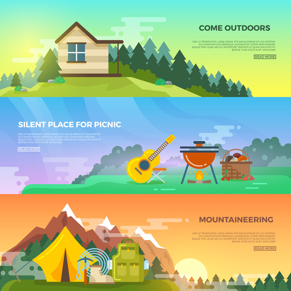
10 Top Tips on Creating Flat Design Graphics
In this article we’ll be talking about flat design. You’ve probably heard about it as it is one of the main trends in design for a few years already. Let’s take a closer look at this trend and get to know what it is, where it came from, and what you need to do to make a clean, vivid and responsive flat design!
You can find a lot of great examples of flat design web layouts, flat icons, templates and other materials on Envato Market. Check them out in order to have a clear vision of what modern flat design looks like!
1. What Is Flat Design?
Flat design is a minimalistic modern style of user interface and graphic design, which uses a minimum of elements and excludes any types of complex colors, gradients, highlights and other shiny, textured, shadowed effects.
Flat design is the direct opposite of skeuomorphism and rich design. However, I can’t but mention that flat design is not as simple as it might seem. It still can include some features of skeuomorphism, but we’ll talk about that a bit later.
All in all, flat design helps to focus more on the content, without distracting the viewers from the visual effects. It emphasizes the simplicity of elements and at the same time makes the interfaces more responsive, faster and easier to use.
2. A Bit of History
Flat design is known to have been used long before it became a huge trend in the design community. It was widespread in the 80s due to the technology which was not yet able to create and support complex effects, textures and shapes. However, even in those years, design tended to gain its first and simplest skeuomorphic features, trying to look more true to life.
Flat design, as we see it now, started gaining its popularity after Microsoft began releasing its so-called Metro design style products. Metro is a UI design language created by Microsoft and it is all about being simple, clean and modern.
In 2010, Microsoft released Windows Phone 7, which used a simple, flat-design UI with sharp edges and clear graphics, inherited from one of the earlier Microsoft’s products (Zune). Later on, inspired by the success, Microsoft released the Windows 8 OS, based on the same Metro-style flat design graphics.

Finally, flat design reached its peak of popularity in 2013, when Apple unveiled iOS 7, presenting its new design and totally changing all the previous UI elements, including icons and fonts. They created very descriptive guidelines on both UI and icon design.

Soon after that, Google also switched the style of its web pages and applications to flat design, naming it Material Design. Google has a whole section dedicated to Material Design, including its goals, its principles, and great guidelines on creating material icons, UI, layouts and so on.

Since then, flat design has become a key direction in design for the last few years, making websites, applications and design elements elegant, neat and stylish.
To sum up, there are three global examples of flat design style that should be mentioned in the modern media world:
- Microsoft’s Metro design
- Apple iOS 7 design
- Google’s Material Design
3. Keep It Simple
Flat design is obviously named for its absence of three-dimensional elements and effects, such as gradients, textures, highlights, overtones and shadows. Flat style is a two-dimensional way of object visualization. Apart from that, complex objects tend to be very simplified and stylized. Sometimes we depict only the silhouettes or the outlines that make the actual object recognizable, without minor details.

Minimalism is a global trend nowadays, and such simplicity of forms and use of sharp edges emphasize neat and visually appealing design. Simple forms are more comprehensible and easy to perceive. They really make a design piece look minimalistic and clean, avoiding a busy and cluttered look.
4. Make It Perfect
When it comes to flat icons and UI elements, it is necessary to make them look as crisp, accurate and pixel-perfect as possible. This is essential for both raster and vector graphics.
In this case, everything is clear with Adobe Photoshop, as it works with raster graphics which are apparently pixel-based.
When it comes to Adobe Illustrator, this is a vector graphics program, which deals with lines and curves, called vectors, that are drawn mathematically. Some time ago, Adobe Illustrator wasn’t really convenient for making pixel-perfect graphics. The good news is, recent versions of Adobe Illustrator have become a great tool for designers to deal with pixel-perfect graphics.
Apart from that, vector graphics basically implies working with flat, simple shapes with distinct colors and grids. Adobe Illustrator is very flexible in terms of settings and allows you to change Units, adjust Guides and Grids to your needs, align objects and use various types of Snapping. All of this makes it much easier to create pixel-perfect designs that remain crisp and clean on any display. If you’re aiming for pixel-perfect graphics, be sure to check this great guide on creating pixel-perfect artwork in Adobe Illustrator.
5. Color Accents & Trends
One of the most specific features of flat design, apart from shapes, is the use of color. Most color palettes for flat-style elements consist of a few basic colors. Bright, bold, vibrant, saturated colors are significant for flat design.
The color scheme in flat design is not limited to some particular colors. It includes various tints and shades and depends on what you are depicting, whether those are bright candy icons or retro-style objects in a subtle retro palette.

If you’re an experienced designer and you have an eye for the right color palettes, you can play around with the Color panel of Photoshop or Illustrator, picking the colors just by guesswork. However, this process requires intuition, practice, and good skills. And there are some tools that may be handy for building a proper palette.
Some of them are suitable for all kinds of design and illustrations, not only for flat design. Those are such services as Adobe Color CC, previously known as Kuler. Now you can access it through the website or directly from Adobe products. It is a very flexible tool, which allows you to make up your own palette or use a wide range of user-made palettes from the library.
Another simple and handy palette generator is Coolors. Just tap the space bar and vary the colors of your palette, which can be adjusted and exported.
There are some other similar services with custom palettes that can be helpful. However, there is one that was made specially for flat design. FlatUIColors.com by Designmodo is a series of flat color swatches with hex codes, which is very convenient to work with. It has become very popular among designers seeking colors for pixel-perfect designs. Check it out!
And you can also find a great variety of color swatches and palettes in Google's Material Design guide.
6. Long Shadows
As mentioned above, flat design tends to be simple and spacious—that is why it rejects using any kinds of effects. However, there is one effect that emerged from flat design. It became a trend and one of the significant features.
We’re talking about the long shadow effect. It has some typical characteristics which make this effect recognizable. Those are a 45-degree angle and big size (a shadow should be about twice as long as the object). As a result, long shadows really bring more depth to flat designs.
Such an effect makes an object look more three-dimensional, while still maintaining a flat look.
7. Working With Fonts
Typography plays a big role in flat design. Oftentimes, text becomes the main element of composition, while flat-style elements don’t distract the viewer.
Simple typefaces are usually used in flat design, making the whole design piece look clean and readable. You can find a lot of free fonts in Adobe Typekit if you’re using Adobe products. Otherwise, Font Squirrel is a great source of free fonts which suit any taste. Just be sure you read the licenses first, if you need to pick a font for commercial use.
Most designs in flat style tend to use uppercase lettering and contrast colors, making the text look more legible.

Pick the font carefully. It should emphasize the whole design piece and correspond with it, without looking like some alien element. It doesn’t mean that you can’t use Serif fonts or some complex handwritten fonts with swirls and additional elements. Just stick to a minimalist look and keep everything in balance. Yet most successful flat designs use Sans Serif fonts more often, as they are more straight-edged and strict, as well as all the flat-style illustration elements.
8. Pros & Cons of Flat Style
While flat design has become so popular due to its numerous advantages, it still has some drawbacks, which designers face while working with this style. Let’s sum up both the pros and cons of flat design.

Pros
Trend
Flat design has developed into a trend, attracting a lot of positive attention among designers and web designers, and it doesn’t seem to be losing its position. On the contrary, it's spreading more and more and acquiring some new forms and features, gradually transforming into something even more creative.
Simplicity
Flat design is simple, minimalist, and clean. When it comes to websites, flat designs really help you to focus more on the content, not on the distracting visual effects. This also works for mobile app interfaces: clean design with big flat buttons make it perfect to work on mobile devices.
Vividness
The use of color is another great plus of flat design. Bright and bold colors look attractive and clean, and the lack of gradients makes a design look modern. What is more, such clean colors make it look more positive and engaging, creating a proper mood.
Cons
There are a lot of other advantages of flat design, but no design is perfect, and we can’t idealize it. There are still some disadvantages that we must mention:
Unresponsive
Sometimes, the lack of additional details or visual effects makes it very hard to create a convenient and user-friendly interface, which makes the whole design not responsive. Not all users actually feel comfortable with this design, because it may be hard to find clickable elements on a web page or elements which you need to tap in a mobile application, because they are not interactive.
Typography Problems
As mentioned, not every font fits flat design. Sometimes such a design piece with bold, straight-edged fonts looks really balanced and stylish. However, choosing the wrong typography may result in completely ruining your design. You really need to feel which fonts are appropriate for flat design and which are a no-no. Weak typography skills can make it really hard to pick the proper font.
Weak Visuals
Due to the limitations in use of effects, colors and fonts, flat design may look too simple and uninviting. Its minimalism can also become its greatest disadvantage—all those designs end up looking quite the same. It is rather hard to make your icons or web pages differ from somebody else’s designs, because we’re using the same simplified shapes, limited color palettes and similar fonts. As a result, in the course of time flat design may come to look boring.
9. Flat Design Future Trends
Flat design can’t be called fully formed and developed. Maybe because of its disadvantages, described above, it tends to transform and develop, acquiring new features and visual enhancements.
If you take a closer look at the latest examples of flat design, you may notice that it actually takes a step aside from its strict tools and starts adding subtle effects, such as gradients (non-contrast), shadows, highlights, and other visual enhancements.
What happens is that these decorations actually add depth to designs, without making it look overloaded with details, as skeuomorphic designs sometimes do. These minor enhancements make flat design more responsive and convenient and also bring a fresh look, making it more versatile and diverse.
As a result, flat design doesn’t seem to lose its characteristics; on the contrary, it becomes more interesting, more flexible—it really becomes better.
10. How to Start?
So, you’re willing to dig into flat design and can’t wait to start creating some flat assets! I can’t but agree that this process is exciting and challenging, whether you’ll be creating an isolated object or a complete flat scene, including groups of elements.

If you want to try making flat illustrations, I’d recommend you start with a small set of icons, which are connected with one and the same topic. And when you feel comfortable with this technique, move on to a more complicated illustration or try another field of design, applying your new knowledge of flat graphics in creating flat web templates or banners.
Here are some tutorials that might be helpful for you.
If you're working in Adobe Illustrator, check out these flat icons tutorials:
 VectorCreate a Set of Apple Watch Icons in Adobe Illustrator
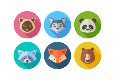 Icon DesignHow to Create a Set of Flat Animal Icons in Adobe Illustrator
Try making more details such as gradients, highlights and textures, adding depth and realism:
 VectorHow to Create a Stylised, Textured Flat Camera in Adobe Illustrator
 Icon DesignCreate a Set of Flat Precious Gems Icons in Adobe Illustrator
Try depicting more flat objects in order to create a flat scene:

Challenge yourself by making a more detailed cityscape:

Maybe you’re working in Affinity Designer? Here are some useful tutorials for you too! Start by making one simple icon:

And then create the whole set of icons:

Or go further and design a poster with flat-style elements!

As I mentioned, raster graphics are pixel-based, so are great for icon design too. If you’re more comfortable working with Adobe Photoshop, then feel free to use it for flat design as well!
Finally, if you want to improve your skills and add more complicated details and effects to your design, then try this Creating Flat Workspace Elements for Advertisements video-course with detailed descriptions and a step-by-step process for drawing every object from the very beginning up to the end.

Let's Sum Up
To sum things up, we’ve revealed some facts from the history of flat design, and talked about colors, shapes and typography. We’ve looked at flat design from different angles, discussed its advantages and disadvantages, and listed some of the main points that are essential for making good design.
I hope you’ve discovered some new information from this article or at least found it interesting and inspiring. You should really try making a flat design piece if you haven’t tried before.
All in all, what else can be mentioned when talking about flat design?
If you are really into flat design, if you like its straight-edged shapes, vivid colors, crisp fonts and its overall clean and minimalistic look, then go for it!
It is trendy, but, as with any other kind of graphic style, you should not limit your creativity to one and the same kind of techniques and visual elements. Current trends don’t mean that you can’t choose any other design style for your project. Skeuomorphism still looks intricate, and there is no reason for giving up drawing realistic objects with a bunch of tiny details and textures. Just remember that your design should match each specific project, reflecting its feel and look, preserving usability and function.
Original Link:
TutsPlus - Design
More About this Source Visit TutsPlus - Design