
An Interest In:
Web News this Week
- April 28, 2024
- April 27, 2024
- April 26, 2024
- April 25, 2024
- April 24, 2024
- April 23, 2024
- April 22, 2024
Some of Our Sources
- Web Designer Wall
- Smashing Magazine
- TutsPlus - Design
- Vandelay Design
- Inspiredology
- FanExtra - PSD
- Web Design Ledger
- CSS Globe
- Specky Boy
- CSS Tricks
Help Webnuz
Referal links:
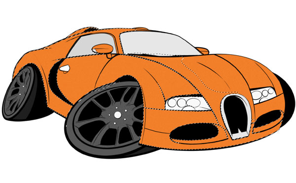
How to Draw, Ink and Colour a Cartoon Car in Adobe Photoshop

Creating cartoon versions of real-life objects can allow people to do the craziest things with perhaps the most basic designs, while exploring their creativity to no end! Cars are no exception to this way of working, and many zany ideas have been concocted over the years. In this tutorial I will show you how to create a simple cartoon car, so you too can create your own twisted rendition of your favourite auto!
1. Set Up Your Document
Firstly, in Photoshop click New,and then under the Canvas
Size option scroll down the options until you are under the International Size heading, and select size A3 canvas.
Secondly, check the resolution of your image, which you will
find displayed in the setup box. For this document I would recommend a resolution of
300 dpi or higher, as this level is a
standard print format setup. Of course, if you wish to go into greater
detail you can set the resolution higher.
Take note, if you have already
created the document by accident, you can go to the View option on the task bar, scroll down and select the Canvas Size option. In the dialog box
that should appear, you can then change the resolution of your canvas this way.Once you have these parameters set up, click on the OKbutton and we are ready
to go!

2. Warm Up
Now that we have our canvas set up, we shall begin with a few
simple sketches to get an idea of where we want to go. To begin our sketches, take a simple Round Brush at a size
between 10 and 15 and then move
across to your canvas.
In this tutorial we are going to be drawing a sports car, which
can be constructed using simple rectangles and long, sweeping lines. If you are
not accustomed to drawing sweeping lines, practice in a separate document using
your graphics tablet and pen, making long strokes on the canvas and experimenting with different types of pen pressure.

3. Establish Perspective
Step 1
We should now be warmed up and ready to get on with our
sketch. At this point we need to plan our sketch and work out our perspectives.
We begin constructing our vehicle by drawing a simple square and then building
this up into a box that will form a base for the body of our car. To draw our
square in the proper perspective, you first take the Line Tool (U)and then draw a basic horizontal line across the canvas
about two thirds of the way up the page, which will act as our horizon.

Step 2
For this drawing we will be using a three-point perspective setup which, as the name suggests, is
basically three so-called vanishing points just off the canvas that will help
us with our perspective and which our relevant guidelines will be drawn toward.
To begin with, we shall focus on the point just off to the left of the image. As
with the horizon line, take the Line
Tool and draw a straight line across the page from where your vanishing
point is.

Step 3
Now we move to the other vanishing points. As above, take
the Line Tool and draw a line from
the vanishing point on the right side. We should now have a basic idea of where
the rest of our lines are going to go.

Step 4
We now need to draw additional lines that will form our box.
At this point too it may be worth your while drawing in additional lines that
might help with the perspective of other car components, e.g. wheels, grille and
windows. We now look at the third vanishing point, which is a distance above the
image and, as with the last two steps, draw a third line that goes from this
third point and down through the canvas. If you wish to do so, you can draw in
some straight lines that establish the parameters of the box.

4. Create a Simple Sketch
Step 1
Now that the perspective is established, we can get busy with our
sketch. Begin by creating a New Layer
over the top of our perspective layer. Then reduce the Opacity of the original perspective layer to 50%. Once this is done, we now draw a simple box
that will form the lower body of the car.

Step 2
Next, draw a second box that will make up the driving area
of the vehicle. If your perspective has been set up correctly, you should not be
having any problems at thispoint.

Step 3
Now we start moving on to more complex lines and shapes and,
if you followed the warm-up steps earlier, you shouldn’t have many problems. At
this point we shall draw in the wheel arches on the car and, as mentioned previously,
sweeping lines are a must with drawing these.

Step 4
Next we move on to drawing in some lines marking out the
edges of the bonnet and doors of the car. I find drawing these in at an early
stage helps later when it comes to the finer details.

Step 5
We now add the basic shapes that will define the lights and
grille on the vehicle. Again, at this stage, being refined in your drawing is notnecessary.
It will be worth your while
flipping your canvas to check whether all of your perspectives add up. What this
entails is basically flipping your canvas through 180 degrees so that it looks as if you are looking at it through the back.
To do this, first go to the Image > Rotate
Canvas option, and then click on Flip
Canvas Horizontal. If you see any mistakes, use the Eraser Tool in the toolbar or the eraser on your tablet pen if you have
one and remove any error, and then redraw any lines correctly. To flip your canvas
back, repeat the above process.

5. Refine Your Sketch
Step 1
Now that we have a completed loose sketch on our canvas, we shall
begin to refine it and make it look more like an actual car rather than just a
mash of lines.
Now that we have our base sketch, we are going to go over it once more
to clean up any loose lines and fix any issues with perspective and proportion.
As in the previous section, our first order is to create a New Layer on top of our current sketch
and reduce the Opacity of the underlying layer to 30%.
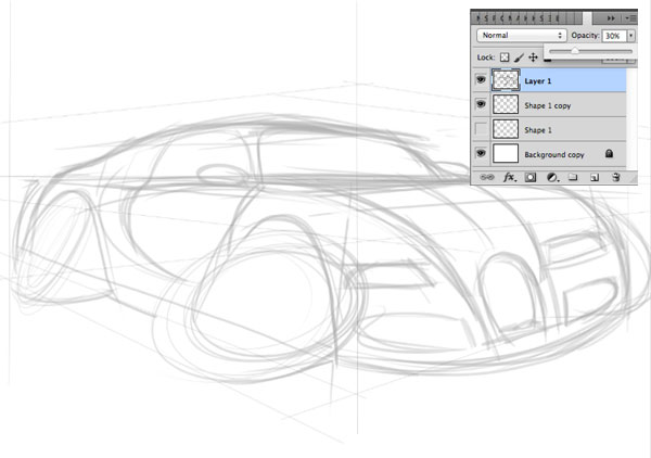
Step 2
On the new layer you have created, take your circular brush and trace over the top
of the original layer, taking a lotmore care with your brush
strokes as you go. Eventually, you should now have a clean sketch to move
forward to the inking phase.

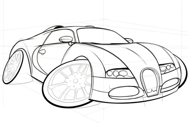
6. Ink Your Sketch
Step 1
We now move on to creating our clean line work that we will
take forward to our colouring stage. As previously, our first step is to create
a New Layer over the top of the
sketch layer and reduce the Opacity of this to 50%. Once you have done this, be
sure to Lock the sketch layer to
prevent you drawing on that layer by mistake.

Step 2
Now for the inking phase, for which we need a clean solid
brush, and the only way to get this is by making some adjustments to the
settings of the brush in the Brush Settings window. In this window are listed the Shape Dynamics, Transfer, Spacing, Airbrush and Smoothing options, and
these control the fluidity, hardness and overall look of your lines.
Personally, I prefer to take a standard circular brush and
then, when you look at its settings, you uncheck
the Transfer andAirbrush boxes. In the Shape Dynamics you want to turn the Minimum Diameter down to 0%. Leave all
other settings, including the Smoothing
box and the Spacing settings, as they
are. They do not need changing for what we are about to do.

Step 3
Now that we have our tools set up, we shall move on to the inking.
Start by zooming your image in on a measured section of the car. It doesn’t
matter if you begin on the left or right side of the canvas as this is a
digital picture and, unlike pencilled drawings, you will not smudge work when
moving across the image! Begin drawing a fine line over your refined sketch,
taking great care as you work. You will find it best to work in small sections,
working your way around the image as you go.

Step 4
As you work, keep a mental note of where your light source/s
are coming from. The reason for this is that areas of shadow are often
defined by thicker lines and in areas of highlights a thinner line is normally
used, a principle that we shall be adopting to create this image.

Step 5
Continue inking the car section by section, and for more fine
details remember to adjust your Brush Size in the setting box along the top bar. Eventually you should have a
completely inked car body.

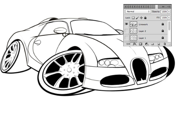
Step 6
For a quick and easy way of making the wheels of the car,
create a New Layer and select the Elliptical Marquee Tool. Simply draw an
ellipse that is roughly the same height as the ellipse we have sketched, and
then use the Fill Tool to fill the
ellipse with plain black colour. The Opacity
of the layer then needs to be reduced to 50%.

Step 7
Now, go across to the Edit> Transform > Skew option.

Step 8
From here you can pull each of the corners and distort your
ellipse to match the sketch below. When it is correct, click once and select
the Apply option in the pop-up
window.

Step 9
With the ellipse still selected, go toSelect > Modify and then across to theContract option. In the pop up box that follows this, contract the
selection by between 25 and 30 Pixels and
then clickContract.

Step 10
Finally, go toEdit > Cut, or as a shortcut hold down the Commandand X buttons. You
should now have a complete outer wheel.

Step 11
Now follow the same process for the rear wheel and the wheel on the right of thecar.
Step 12
The next step is to create the inner rims, following the
same principle as we used to create the outer rims.

Step 13
For the spokes of the car's wheels, return to the use of our
pen and careful inking technique. As with other detailed parts, spend as much
time as you can on this, as the wheels will provide a major focal point of this
image and viewers will spot any mistakes.
Finally, if there are any major black areas that do not have
any colour in them, fill these in with black colour.

7. Colour Your Image
Step 1
We should now have produced a clean inked image that is
ready to colour. To help us later along the way, double-click on this layer and you will now notice you are able to
alter the name of this layer. We are going to change this name to “line
work”.
As a result of doing this, we can now tell easily what this layer is
amongst the others. It is worthwhile Locking
this layer so that we do not make any mistakes later on. Also remember to create a New Layer for our colour work.
Step 2
At this stage, the best way to go about colouring an image
is to begin laying down a flat base colour that has no gradient in it
whatsoever. It is later we will start adding our shadows and highlights. To
start with, we shall add a base tone for the body as it is the largest area of
the car, and we are going to do this in orange.
To select this area we are going to take the Magic Wand Tool and click on areas of
the car body that we wish to fill with colour. To make multiple selections with
the Magic Wand Tool hold down the Shift key as you select areas. To
de-select areas that you do not want coloured, hold down the Alt key as you click the area. To
finalise your selection, go to the Select > Modify > Expand option and
then expand the selection by 4 pixels. This last little task will make sure the
image will be filled with colour and you will not be left with any unsightly
white highlights.
Step 3
Now fill this selection with a flat orange colour and, once
done, de-select your selection by
simply clicking off the selection using either theEllipse Toolor the Lasso Tool.

Step 4
We now move on to the wheels, which we are going to paint a gun-metal grey colour, as I think it goes well with the orange body colour scheme.
To select these, follow the same principle as outlined in step 2 and then fill
your selection with greytone.

Step 5
Moving on to the windows, we will be using a lighter grey
tone than the wheels, so fill these in using the same method as in the previous
step. For the lights, use a very light grey tone. Now we should
have a flat base for our car, and we can now begin to build up the details.

8. Add Shadows, Highlights and Effects
Step 1
Before we proceed with our highlights, here is a useful tip
for creating a convincing paint look, as many modern sports cars have
metallic paint finishes and we can create this effect in Photoshop with
relative ease.
First, Duplicate the
base layer by going across the top bar of our workspace to the Layer button and then down toDuplicate Layer. With our duplicate
layer we go across to theSelect button and
down toFilter and then across toAdd Noise. From here a pop-up box will appear, and in this
you will see Amount with a default
percentage within it, and all you need to do is adjust this to 9.51%. It does not
sound much, but this will be enough to give us the paint “fleck” we are after.

Step 2
Next, on this duplicate layer, we are going to remove the
sections of the windows, tyres and lights, as these areas do not need our metallic "fleck" effect. To do this, go back to our original layer
and select the windows and lights using the Magic Wand Tool,and then return to our Duplicate Layer and cut the areas we have
selected.

Step 3
When creating a digital picture, I find it best to work on
your shadows first. On top of our base layers (both the original and our
duplicate), create a New Layer and in
the Layer Settings box adjust this
from Normal to Multiply. It would be good practice too to name this layer "Shadows" so we can keep track of our
layer hierarchy.

Step 4
Now click on our base colour layer and select the car's
orange bodywork. Then take the Lasso Tool
and, in the Feather box across the
top bar, adjust the pixel feather to 20 px.Then hold down the Alt
key and carefully de-select the areas we do not want to have in shadow.
Step 5
Now we have our shadow area selected
and ready to be filled. To do this, we now select the Gradient Tool in the toolbar, and before you fill your selected
area make sure you have the Opacity Level across the top bar set to 50%.
Once this is done, click and drag your mouse a measured distance across the
page and then release, which should give you a nice fill of colour in your
selected area. Take note, if you do not like the way your colour fill comes out
the first time, use the Undo option
(Command-Z) to go back on what you have done.

Step 6
For harder shadows, create a New Layer,making sure this layer too
is set to Multiply, and follow the same selection method as for the other shadows above. Once
selected, take the Pen Tool, which works a little like the Lasso Tool
but gives you more control, which is exactly what you need for this step.
First click outside of the selection and you will see a point appear—this
marks the beginning of your Path, which
is basically a more controlled method of selection. To further your selection,
move your arrow across and click again to create another point of your path.

Step 7
You will notice, however, that with
this selection routine you can only create straight lines. To create a curve in
your path (and for this it is best practice to use a mouse), you need to first
click to make a starting point in your path, and then move your mouse to another
point on the canvas and click again, but this
time as you click keep the mouse button held
down. Then drag your mouse button across and around, and you will notice that
you get a curve forming instead of a straight line.
How much of a curve you
want is up to you, but ideally we want a path that has a nice fluid curve.
Continue doing this if you need to make any more selections of thistype.

Step 8
When we get to the end of our
selection, right-click and go down to Make Selection, and you will see a pop-up window appear. Click the New Selection option and you will now notice we have a selected
area. If you have made the right selections, this area should have all the
sharp lines we need for more detailed shadows.

Step 9
Now fill this area with another
orange tone. If the colour is notdark enough for you, go across
the top bar to Image > Adjustments > Hue/Saturation. From this option a pop-up box will appear and you
will be faced with three sliders: Hue, Saturation and Lightness. For shadows, I personally would leave the Hue level for now and concentrate only on the Saturation and Lightness levels. For this part of the project I would adjust the Saturationto between -20 and -40 and reduce the Lightness
to -10. Click the OK button to confirm, and then
de-select.

Step 10
We now need to Merge the layers.

Step 11
Now that we have our shade established,
we shall move on to our highlights. As with our shadows, we begin by creating
another New Layer on top of our
existing “multiply” layers. However, this time we shall change our settings to Screen rather than multiply. This basically means that any tones we now put
into our selected areas will be lighter than our standard base layer.

Step 12
As in our shadow steps previously,
select the body of the car with the Magic Wand Tool, and then take our Lasso Tool
and adjust the Feather option to
between 20 and 35 px. Then de-select
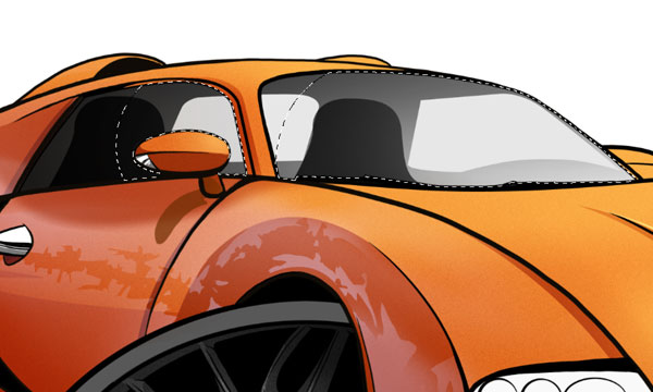
areas of the body until you have a selection area as in the screenshot below.

Step 13
Now add an orange colour that is
slightly lighter than our base colour, using the Gradient Tool. I find it best to drag our Gradient Tool from the
right to the left of the canvas.

Step 14
It might help our image if we have some reflective highlights too. I would recommend that these are in a
mid-blue colour on another New Layer and
ensure, as on other layers, this is set to “screen”. Then, as above,
use the Gradient Tool,but this time
drag your mouse from left to right. Additional highlight layers may be needed
to create the right effect, but eventually you should be left with an image
that looks like the screenshot below.

Step 15
Use your Lasso Tool
to mark out a selection on our Reflective Highlight layer that gives the impression of objects opposite the car
reflecting on the bodywork of the car. Once you've drawn it out, Cut out your selection. If you are left with a selection like in
the screenshot below, you are on the right track. Also make sure you have Merged your layers to keep the hierarchy under control.

9. Work on the Wheels, Interior and Lights
Step 1
For the wheels of the car, we are going to add a little shade
to these and not much highlight, as our main light source is coming from the
right side of the car. To start we shall go to our "Line Work"layer and using the Magic Wand Tool select the inner rim on the forward wheel.

Step 2
Next, create aNew "Multiply" Layer and fill the lower half of the wheel with a darker grey
tone. It is a good idea to set your Gradient Tool Opacity to40–50%.

Step 3
It would be worth your while using some solid dark tones in
some areas of the rims to show the sharp cut of the rims. To create these you
can use the Pen Tool to draw out
some selections demonstrated in the selection below, and then fill these with a
solid dark-grey tone using the Paint Bucket Tool.

Step 4
Now repeat steps 1 to 3 for the rear wheel also!

Step 5
The interior of the car needs to be defined a little bit so
as to not make the car look too plain. To achieve this, take the Pen Tool and draw out gaps that will
mark out both the small rear window of the car and the side window on the left
side of the vehicle.

Step 6
Now, you want to fill your interior with a black tone using
the Gradient Tool going from left to
right. Repeat the process for the seats, although you should make these a
little darker so they stand out a little more. If the look you are after is not
correct, be sure toUndo your
gradient and try again.

Step 7
To create the right look for the glass, you will need to use
your Magic Wand Tool to select the areas of the windows in the “line work”
layer, and then in a separate New Layer which
needs to be set to “screen”, use our Lasso Tool and make sure it has the Feathering
set to 25 px. Then, holding
the Alt button,de-select a small area in the left side of both the front and side
windows. This will be our area of shadow.
Step 8
Using our Gradient Tool, with a Circular Gradient
set up and with a light-grey tone, drag your cursor from right to left, filling
your selection with tone. For the side window, separate fills may be required, but remember the reflection will not be as harsh in this window, so be careful with your fills. De-select
your selection once you are finished.

Step 9
Next, using the Pen Tool, carefully cut out two curves that will be a hard reflection on our
window. Then repeat step 7 by filling in with your Gradient Tool with a pure
white tone. Make sure to de-select afterwards.

Step 10
For the lights, it is best to follow the same principles
as for the interior above, carefully utilising the Magic Wand, Pen and Lasso Tools. A piece of important advice to
take note of is that in the right light, your shadows will be few, as this cluster is
bathed more in light than its opposite on the left which is more in shadow.

10. Work on the Background
Step 1
We should now have an image that is nearing completion, and all
we need to do now is give the image a bit of atmosphere. For such a fine
car as this, a photography studio with a shiny white floor would be a great
choice, and to make this more realistic we need a reflection of the car on the
floor.
To create this, first hide your white background layer. Then select
your layer labelled “line work” and right
click on this layer inLayer Hierarchy > Merge Visible.

Step 2
Next, Duplicate this
now merged layer and place it belowour original one.

Step 3
We now have our duplicate layer and need to warp it so that it
looks as if the car is sitting on a mirrored floor in the studio. To do this we
go to the Edit button and go down to Transform and to the Skew option and, as with our sketch
layer earlier, you need to pull the corners to give the impression of a
reflection on the floor.
You may also need to select the Scale option to further warp this reflection until it meets the
image we are looking for. Lastly, you need to reduce the Opacity of this layer
to around 25–35%. Using the Move Tool,
make sure the image is positioned correctly on the canvas below the car.

Step 4
To finish our mirror effect, take the Ellipse Marquee Tool but, before drawing an ellipse, adjust the Feather setting on the top toolbar to
40 px. Once this is done, draw a large ellipse on the canvas and then go to
the Select option and click the Inverse option. Clicking this option
will flip your selection from the inside of the ellipse to the outside of it.
From here we go to Edit and
click the Cut option. Once this is
done we should have a faded effect around the edge of the reflection, creating
the finishing touch we are looking to achieve.

Step 5
Still using our Lasso Tool, carefully draw out a little area of shadow beneath the car. Then fill the area using theGradient Tool with first a mid-grey tone and then a black tone to give the impression of deep shadow.
11.Add the Finishing Touches
Step 1
At this stage, to really set off the car’s paintwork, it
would be worth your while including a few specular (bright white) highlights. You
can create these in another New Layer using
theGradient Tool set at itsCircular option.

Step 2
Your
illustration is now virtually complete apart from one very important step,
which is for you to add your signature to let everyone know that you have
created this masterpiece!

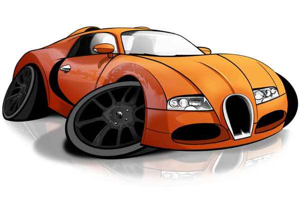
Awesome Work, You're Done!
Creating cartoons and putting your own little spin on a real-life object isalways going to take a bit of practice, and you might not get the result you are after first time. As you hopefully will have seen throughout this tutorial, however, if you plan your drawing properly, use a bit of creative eye and above all take care as you work, you will have a result that will please both those in the art world and also the occasional petrol head!
Original Link:
TutsPlus - Design
More About this Source Visit TutsPlus - Design