
An Interest In:
Web News this Week
- April 26, 2024
- April 25, 2024
- April 24, 2024
- April 23, 2024
- April 22, 2024
- April 21, 2024
- April 20, 2024
Some of Our Sources
- TutsPlus - Code
- Team Treehouse
- Inspiredology
- FanExtra - PSD
- Crazy Leaf Design
- CSS Globe
- Stylized Web
- CSS Tricks
- Spyre Studios
- Hashedout
Help Webnuz
Referal links:
CSS Refreshers: Borders
Sure, we’re all familiar with borders. Is there anything new that could possibly be introduced? Well, I bet there’s quite a few things in this article that you never knew about!
Not only can CSS3 be used to create rounded corners, but plain-ole’ CSS can also be wrestled into displaying custom shapes. That’s right; in the past, before these techniques were discovered, we might have resorted to using absolutely positioned background images to display circles or arrows. Thankfully – as we gleefully take one more step away from Photoshop – this is no longer the case.
The Basics
You’re likely familiar with the most basic use of borders.
border: 1px solid black;
The above code will apply a 1px border to an element. Plain and simple; but we can also modify the syntax a bit.
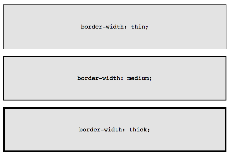
border-width: thick;border-style: solid;border-color: black;
In addition to passing a specific value to border-width, three keywords may alternatively be used: thin, medium, and thick.
While it might initially seem unnecessary to ever make use of the long-hand form, there are a handful of cases when it’s advantageous, such as when you need to update some aspect of a border when a designated event occurs.
Perhaps you need to change the color of a border when the user hovers over a specific element. Using the shorthand form would require that you repeat the pixel values.
.box { border: 1px solid red;}.box:hover { border: 1px solid green;}A more elegant and DRY approach would be to specifically update the border-color property.
.box { border: 1px solid red;}.box:hover { border-color: green;}Additionally, as you’ll find shortly, this long-hand technique is helpful when creating custom shapes with CSS.
Border-Radius
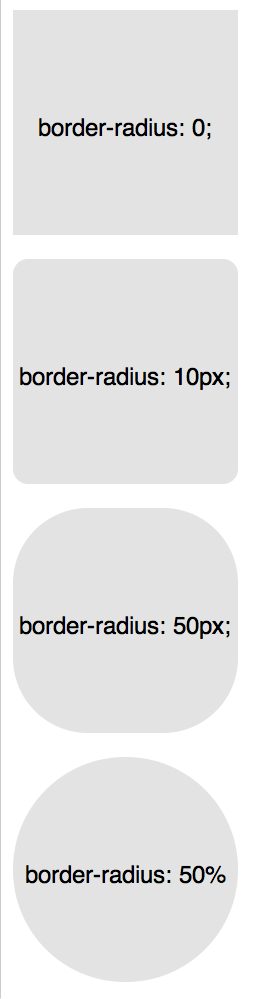
border-radius is the golden child of CSS3 – the first new property to gain widespread use in the community. What this translates to is that, excluding Internet Explorer 8 and below, all browsers can display rounded corners.
Previously, it was necessary to use vendor prefixes for both Webkit and Mozilla, in order for the styling to be correctly applied.
-webkit-border-radius: 10px;-moz-border-radius: 10px;border-radius: 10px;
These days, however, we can slice off the vendor versions without worry, and simply stick with the official form: border-radius.
As one might expect, we can also specify custom values for each side of a box.
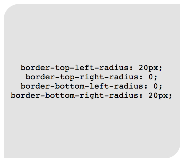
border-top-left-radius: 20px;border-top-right-radius: 0;border-bottom-right-radius: 30px;border-bottom-left-radius: 0;
In the code above, setting border-top-right-radius and border-bottom-left-radius to zero would be superfluous, unless the element is inheriting values which need to be reset.
Much like margin or padding, these settings can be condensed into a single property, if necessary.
/* top left, top right, bottom right, bottom left */border-radius: 20px 0 30px 0;
As an example (and as web designers do so often), the shape of a lemon can be reproduced with CSS and the border-radius property, like so:
.lemon { width: 200px; height: 200px; background: #F5F240; border: 1px solid #F0D900; border-radius: 10px 150px 30px 150px;}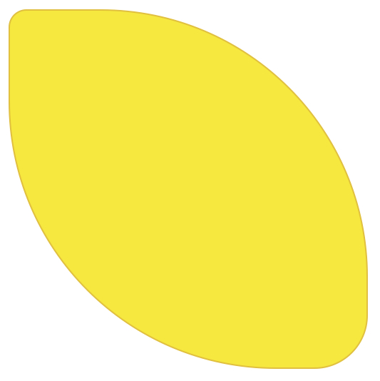
Beyond the Basics
Many designers happily stick with the knowledge outlined thus far in this chapter; however, there’s a few ways we can push it further!
Multiple Borders
There’s a variety of techniques that we can refer to, when tasked with applying multiple borders to an element.
Border-Style
While solid, dashed, and dotted are the most frequent values for the border-style property, there’s also a few others that we can make use of, including groove and ridge.
border: 20px groove #e3e3e3;
Or, with the long-hand form:
border-color: #e3e3e3;border-width: 20px;border-style: groove;
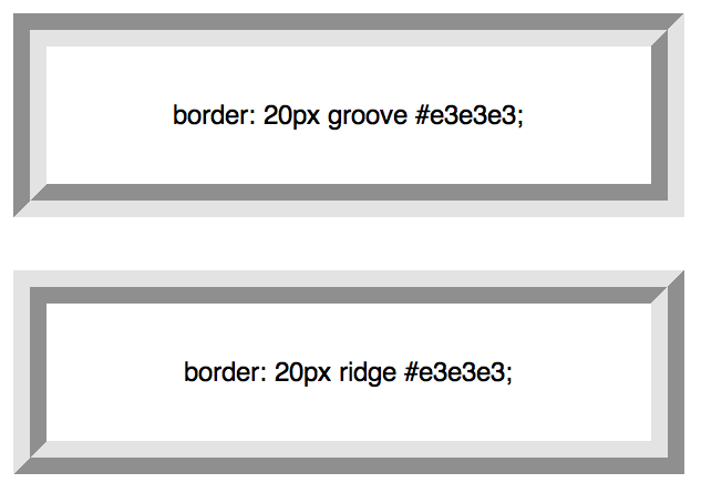
While this is certainly helpful, a ridge or groove effect isn’t really multiple borders.
Outline
The most popular technique for creating two borders is to take advantage of the outline property.
.box { border: 5px solid #292929; outline: 5px solid #e3e3e3;}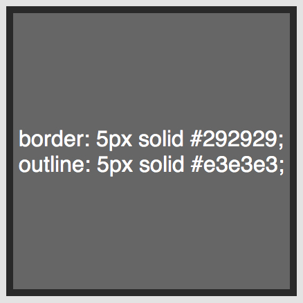
This method works wonderfully, however, it’s limited to two borders. Should you need to create a layered, gradient-esque, effect, a different approach will be necessary.
Pseudo Elements
When the outline technique doesn’t suffice, an alternate approach is to take advantage of the :before and :after pseudo elements, and apply any necessary additional borders to the generated content.
.box { width: 200px; height: 200px; background: #e3e3e3; position: relative; border: 10px solid green;}/* Create two boxes with the same width of the container */.box:after, .box:before { content: ''; position: absolute; top: 0; left: 0; bottom: 0; right: 0;}.box:after { border: 5px solid red; outline: 5px solid yellow;}.box:before { border: 10px solid blue;}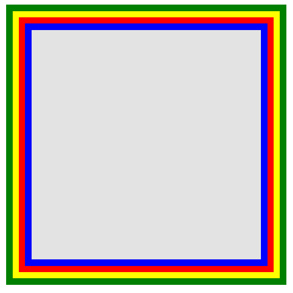
This perhaps isn’t the most elegant approach, but it certainly gets the job. One caveat is that it’s easy to confuse the order in which the border colors will be applied. A certain level of “guess and check” is often required to apply the correct sequence.
Box-Shadow
The cool kids way to create an infinite number of borders is to take advantage of the spread parameter in the box-shadow CSS3 property.
.box { border: 5px solid red; box-shadow: 0 0 0 5px green, 0 0 0 10px yellow, 0 0 0 15px orange;}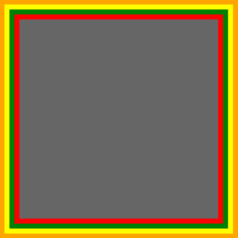
In this case, we’re being clever and are using box-shadow in a way that might not necessarily have been intended when the specification was originally written.
By setting the x, y, and blur components to 0, we can instead use the spread value to create solid borders at the desired locations. Because box-shadows can be stacked, through the use of a comma, the number of possible levels is infinite.
This technique gracefully degrades quite nicely. In older browsers, which do not recognize the box-shadow property, this will simply render the single red 5px border.
Remember: designs needn’t be identical in all browsers. Write your CSS for the most modern of browsers, and then provide suitable fallbacks, accordingly.
Modifying Angles
In addition to passing a single value to border-radius, we can alternatively provide two – separated by a / – to specify unique values for both the horizontal and vertical radii.
For example…
border-radius: 50px / 100px; /* horizontal radius, vertical radius */
…is equivalent to:
border-top-left-radius: 50px 100px;border-top-right-radius: 50px 100px;border-bottom-right-radius: 50px 100px;border-bottom-left-radius: 50px 100px;
This technique is particularly helpful when you need to mimic a subtle, lengthy curve, rather than a generic rounded corner. For instance, the following code allows us to slightly break away from a square shape, resulting in more of a curled, paper-like effect.
.box { width: 200px; height: 200px; background: #666; border-top-left-radius: 15em 1em; border-bottom-right-radius: 15em 1em;}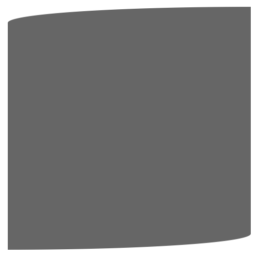
CSS Shapes
Perhaps the neatest use of borders is when they’re cleverly applied to elements, which have a zero width and height. Confusing, huh? Let’s see a demonstration.
For the next several examples, assume the following markup…
<div class="box"></div>
and the following base styling:
.box { width: 200px; height: 200px; background: black;}The most frequently referenced example, when demonstrating how CSS shapes might be used in a project, is to create the obligatory arrow.
The key to understanding how an arrow might be formed with CSS is to set a unique border-color to each side, and then reduce both the width and height values for the container to 0.
Assuming a div with a class of arrow as the container:
.arrow { width: 0; height: 0; border-top: 100px solid red; border-right: 100px solid green; border-bottom: 100px solid blue; border-left: 100px solid yellow;}As demonstrated at the beginning of this chapter, a cleaner syntax would be to not use the all-encompassing short-hand version:
.arrow { width: 0; height: 0; border: 100px solid; border-top-color: red; border-right-color: green; border-bottom-color: blue; border-left-color: yellow;}We can even reduce this further, by grouping the color values.
.arrow { width: 0; height: 0; border: 100px solid; border-color: red green blue yellow;}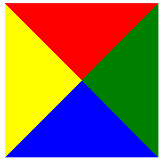
Interesting, right? It makes perfect sense, though, when we take a step back. That’s the only possible way that the colors could align, assuming a width and height of zero for the container. Now, what if we set all of the border-colors to transparent, except for the blue side?
.arrow { width: 0; height: 0; border: 100px solid; border-bottom-color: blue;}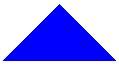
Excellent! But it doesn’t seem too semantic to create an .arrow div, all for the purpose of adding an arrow to the page. Instead, pseudo elements can be used to apply the arrow after or before the associated element.
Creating a Speech Bubble
To create a 100% CSS speech bubble, we begin with the markup.
<div class="speech-bubble">Hi there!</div>
Next, some base styling should be applied.
.speech-bubble { position: relative; background-color: #292929; width: 200px; height: 150px; line-height: 150px; /* vertically center */ color: white; text-align: center;}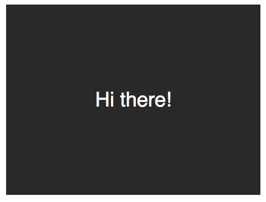
The arrow will be applied using the after psuedo-element.
.speech-bubble:after { content: '';}The
:beforeand:afterpsuedo elements can be used to insert generated content either before or after an element’s content.
At this point, it’s simply a matter of reproducing the arrow, and positioning it in the proper location. We start by absolutely positioning the content, resetting the width and height, and applying the border colors.
.speech-bubble:after { content: ''; position: absolute; width: 0; height: 0; border: 10px solid; border-color: red green blue yellow;}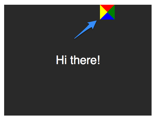
Because we know that we want the arrow to point downward, the image above demonstrates that all but the red (or top) border should either be omitted, or set to transparent.
.speech-bubble:after { content: ''; position: absolute; width: 0; height: 0; border: 10px solid; border-top-color: red;}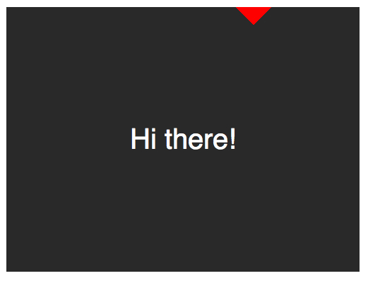
When creating CSS shapes, because we can’t use the width property to specify how wide the arrow should be, the border-width property should be used instead. In this case, the arrow should be slightly larger; so the border-width can be increased to 15px. We’ll also position the arrow at the bottom and center of the container, by using the top and left properties, respectively.
.speech-bubble:after { content: ''; position: absolute; width: 0; height: 0; border: 15px solid; border-top-color: red; top: 100%; left: 50%;}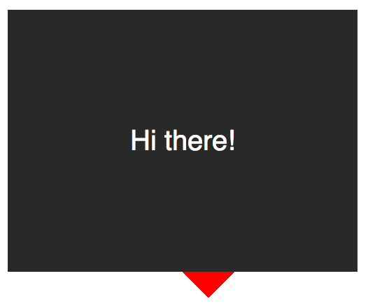
Almost there; the final step is to update the color of the arrow to be the same as the container’s background. The positioning also needs to be modified to account for the width of the borders (15px). While we’re here, we’ll also apply a subtle border-radius to make the container appear to be more bubble-like.
.speech-bubble { /* other styles */ border-radius: 10px;}.speech-bubble:after { content: ''; position: absolute; width: 0; height: 0; border: 15px solid; border-top-color: #292929; top: 100%; left: 50%; margin-left: -15px; /* adjust for border width */}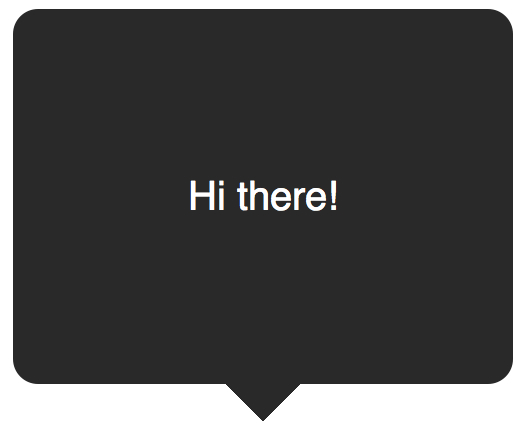
Not bad, ay? Abstract this code away to a few reusable classes, and you’re good to go for all future projects.
/* Speech Bubbles Usage: Apply a class of .speech-bubble and .speech-bubble-DIRECTION <div class="speech-bubble speech-bubble-top">Hi there</div>*/.speech-bubble { position: relative; background-color: #292929; width: 200px; height: 150px; line-height: 150px; /* vertically center */ color: white; text-align: center; border-radius: 10px; font-family: sans-serif;}.speech-bubble:after { content: ''; position: absolute; width: 0; height: 0; border: 15px solid;}/* Position the Arrow */.speech-bubble-top:after { border-bottom-color: #292929; left: 50%; bottom: 100%; margin-left: -15px;}.speech-bubble-right:after { border-left-color: #292929; left: 100%; top: 50%; margin-top: -15px;}.speech-bubble-bottom:after { border-top-color: #292929; top: 100%; left: 50%; margin-left: -15px;}.speech-bubble-left:after { border-right-color: #292929; top: 50%; right: 100%; margin-top: -15px;}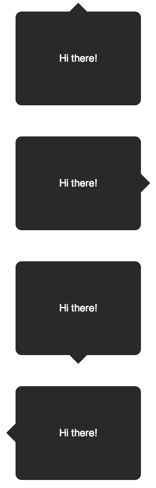
Bonus: Better Vertical Centering
One downside to using line-height to vertically center text is that you’re limited to a single line. Should the text require two or more lines, each line height will be far too large. A clever solution is to set a display of table to the speech bubble, and a display of table-cell to the paragraph that wraps the text. This then allows us to align the text to the middle, accordingly.
<div class="speech-bubble speech-bubble-top"> <p>Text goes here.</p></div>
Next, the modified CSS.
.speech-bubble { /* other styles */ display: table;}.speech-bubble p { display: table-cell; vertical-align: middle;}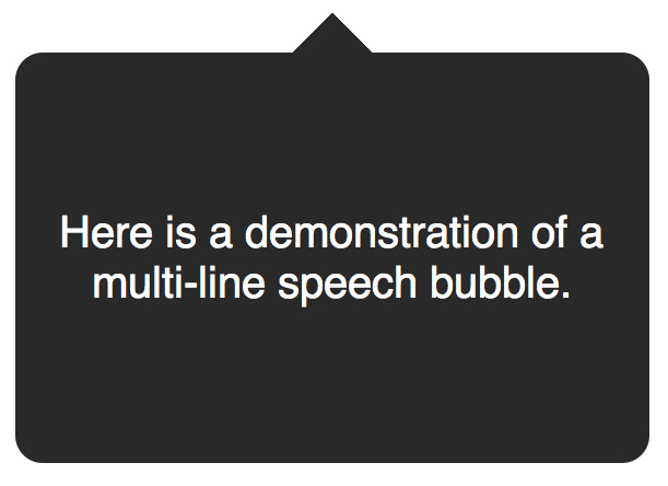
If references to
display: tablebring back terrible memories of old-fashioned, table-based layouts, don’t worry. These properties merely refer to the style in which an element should display.
We’re not limited to triangles; CSS is capable of producing all sorts of shapes – even hearts and biohazard signs!
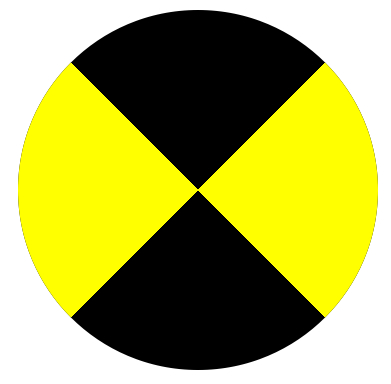
.biohazard { width: 0; height: 0; border: 60px solid; border-radius: 50%; border-top-color: black; border-bottom-color: black; border-left-color: yellow; border-right-color: yellow;}Summary
Though it’s true that the simple border: 1px solid black syntax goes a long way, if we’re clever, we can create a variety of helpful effects, icons, and shapes. Who would have thought that borders could be so powerful? The key is to remember that the styling for common shapes or speech bubbles should only be created once, and then abstracted away to utility classes for future usage.
Original Link: http://feedproxy.google.com/~r/nettuts/~3/sZgDQhxkTm4/
TutsPlus - Code
 Tuts+ is a site aimed at web developers and designers offering tutorials and articles on technologies, skills and techniques to improve how you design and build websites.
More About this Source Visit TutsPlus - Code