
My name is Marcos Torres, I'm Graphic Artist from Porto Alegre, Brasil. You can get to know more about me by acessing my Personal Website or by following me on Twitter: @marcos333. You can also see some of my last projects at my Flickr.
Some of Our Sources
- Mashable
- Techcrunch
- Spoon Graphics
- TutsPlus - Design
- FanExtra - PSD
- Noupe
- Android Dissected
- Codrops
- Android Headlines
- Hashedout
Help Webnuz
Referal links:
January 16, 2012 09:02 am GMT


Original Link: http://feedproxy.google.com/~r/abduzeedo-tutorials/~3/00BchmHLWnY/create-skateboard-illustration-mixed-medias
Create a Skateboard Illustration with Mixed Medias
As most kids born on the 90's I had my skater ( and I was really bad at that to be honest). Anyway, I always loved skateboard art and I remember to go with my friends to skate shops only to see the shapes from brands like Santa Cruz, Flip, Powell Peralta and others. So I must admit that this art had huge influence on my work and here's just a little tutorial in tribute to that.
If you're not really into skateboard art, I would suggest you to take a look at Jim Phillips artworks, he's like the father of skateboard art. Besides Jim, you should also check guy like Billy Argel, Gunsho, Pablo Etchepare and Diego Medina, whose work is intricately linked with the skateboard culture.
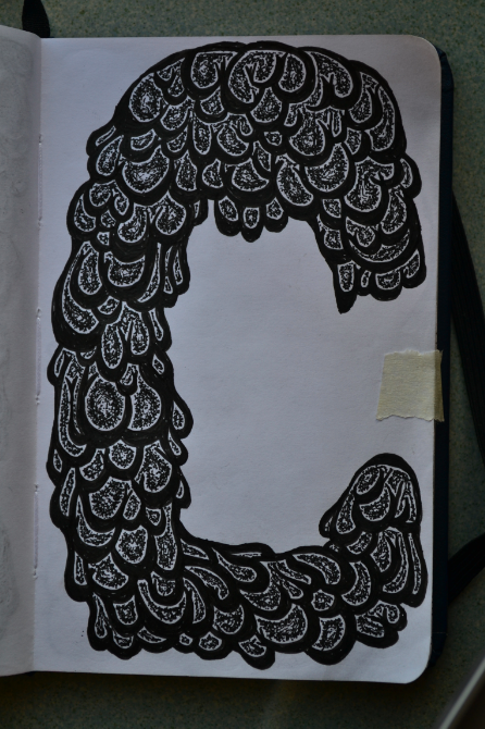
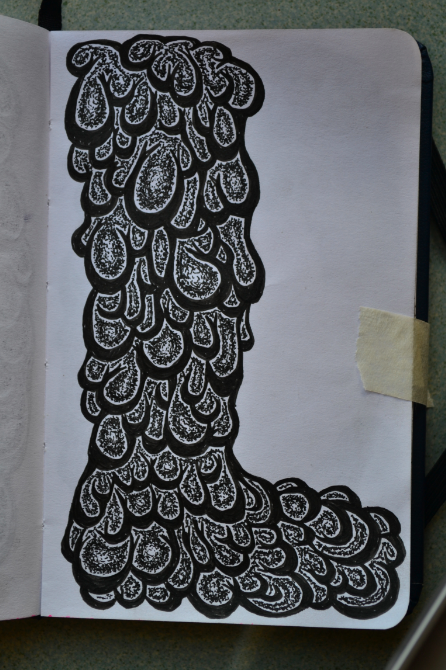
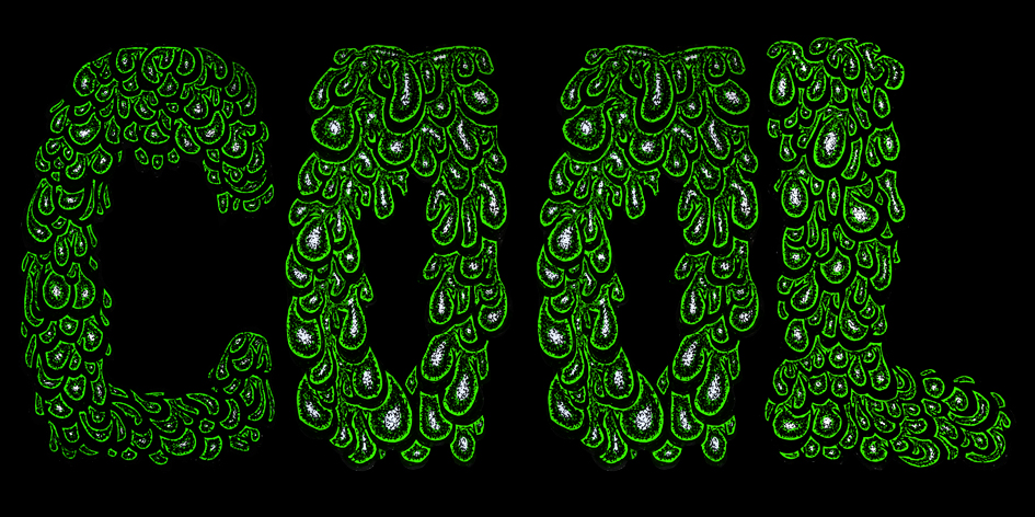
Ok, enough talking, so what are we going to do today? Quite simple: A "Cool" in melting green-ish letters, old school style.
Warm ups
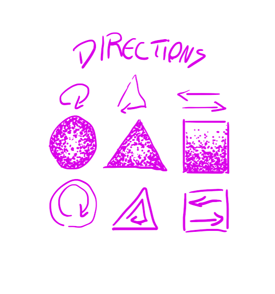
Let's begin with some warm ups, as you may already know, pointilism can be really tiresome and messy, so let's make some simple exercises. Make a circle, a triangle and a square, start filling it with dots doing the following movements: circular for the ellipse, triangular for the triangle and side to side for square. That way you will be warming up your wrist and also testing your dot control, try it at least two to three times If you never tried this technique before. Do it slowly and don't put too much pressure or you may get your wrist injured because of the repetition. This technique will be used on the following in order to give some depth on the letters.
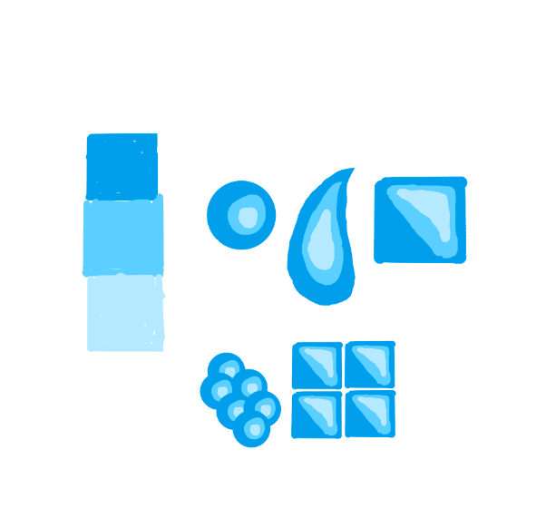
You probably already know hard gradients, nowadays they are mostly used on vector art and t-shirt art, as some printing methods require few colors. If you never used before, try this simple exercise: make a three colors gradation, like the blue one I did, then try drawing some forms with the darker color, make a reflex with the medium color and a little reflex with the brighter. As you can see, from certain distance your eye will assimilate a gradient. Try as many forms as you want, then make patterns to see the effect they have on the illustrations. This technique will help later on giving depth on the letters.
Line work
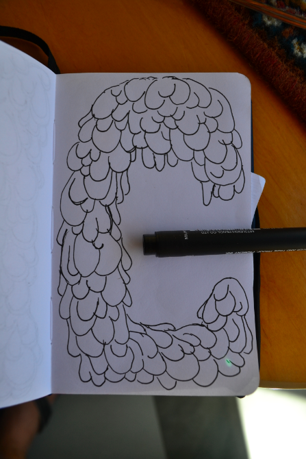
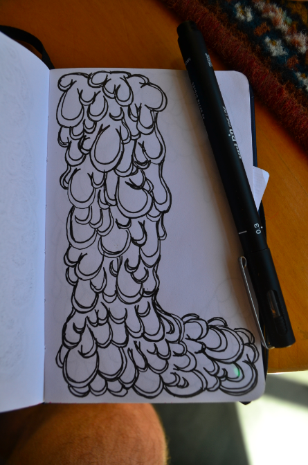
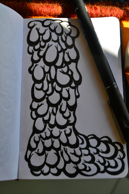
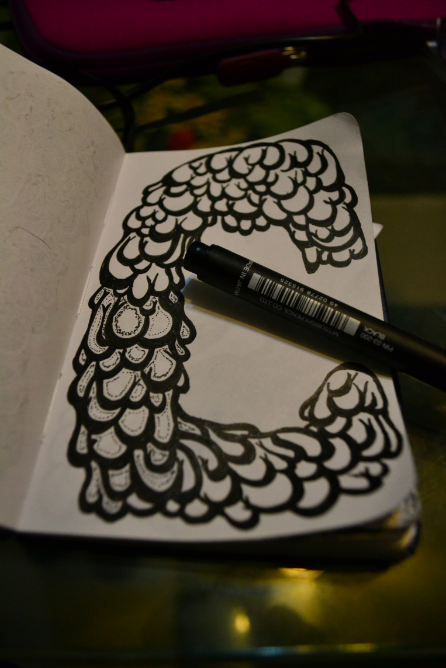
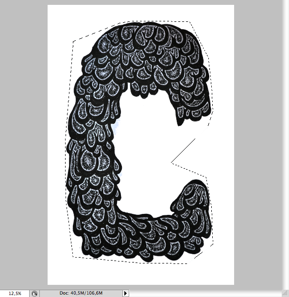
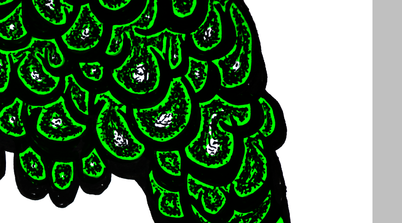
I wanted a tradicional melting effect, with drops and everything on the type formation. I haven't done sketch with graphite, but I would suggest you to try it before using a technical drawing pen. A good way to make sure the type will be legible it's to draw it first with graphite as a bubble form and then make the drops inside of it. Notice that you should vary the size of the drops or it will look flat and boring, just saying.
Stroke
To vary the size of the stroke it's a really important thing on skateboard art, maybe because it's a characteristic inherited from comic books and as it come of the early works that were mostly done using brush, not pencils and so the vary was a quite normal thing. Anyway, after I did the line work, I started tracing the paths inside each bubble to make a heavier stroke on the middle and thinner on the extremities.
Stroke Fill
Yep, here's a tiresome part: after tracing the stroke you should fill it with black ink.
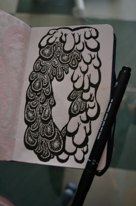
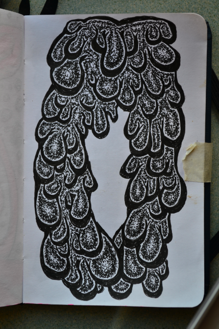
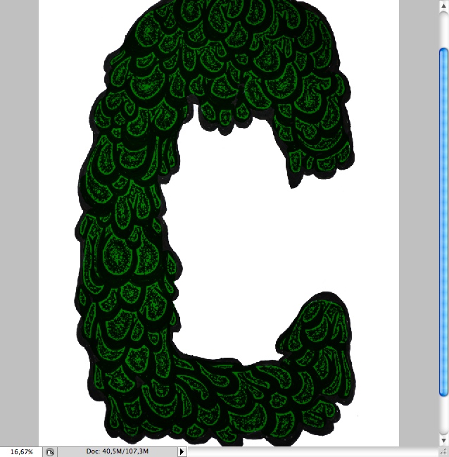
Dot shading
Ok, I hope you remember the previous exercises because we're going to apply it here. In order to make the dot shading correctly, first mke circles around the bubbles and fill them using a circular movement, just as we practiced before.
This will take some good amount of time, but the result it's quite neat.
Final Result
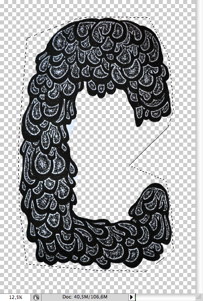
Now I have all the three letters to write "Cool". When comes to digitalizing images, most people rather use scanners, but as in this case it was only a BW artwork, I though it would be quicker and easier to just photograph them using a professional camera. But, anyway please fell free to use the method you want to.
Cleaning
Having the images on the computer the first thing I've done was to open them on photoshop and adjust their levels in order to clean the white and get a heavier black. Then, just simply cut the letter usign the lasso tool (L), the pen tool (P) or using masks, the method you feel more secure.
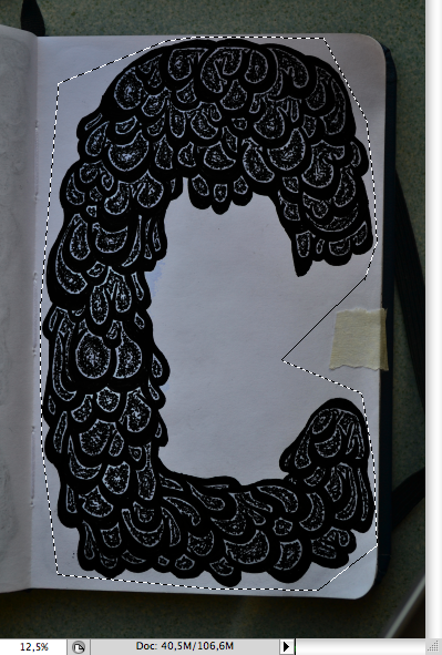
Make a new layer with only the type selection (ctrl + J / command + J), then make a white background on layer bellow.
Adding hard gradients
It's time to apply the hard gradients, first I filled the whole letter with dark green.
As a rule, the flat parts without and with less dots were filled with bright green, notice that it gave a border effect onthe bubbles.
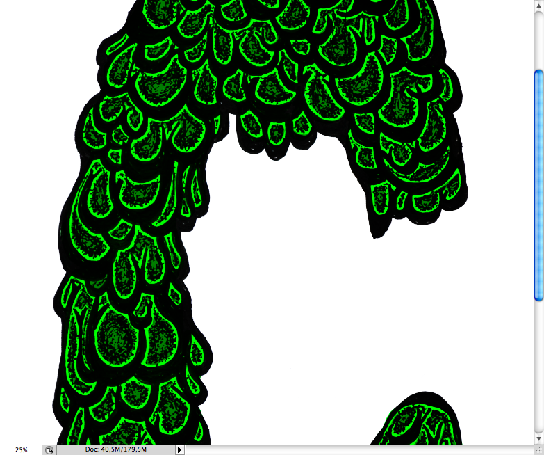
And also filled inse of them a bit, as you can see the start to pop and give depth.
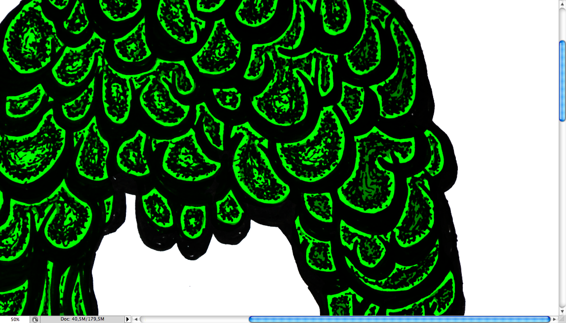
Following my previous instructions on hard gradient, I added white inside of the bright green on each bubble.
I must say doing this is less tiresome then the dot filling and the final result with a black background got really slick.
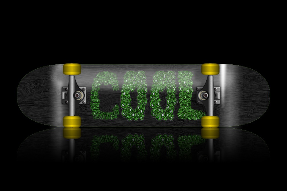
Mockup
As it was about skateboard art we can forget to make a mockup with the final illustration, so I found this really cool mockup at Freebie Pixels, you can download the PSD and replace it with the final reult. Hope you guys learned with this and had fun, see ya.
Original Link: http://feedproxy.google.com/~r/abduzeedo-tutorials/~3/00BchmHLWnY/create-skateboard-illustration-mixed-medias
Share this article:
Tweet

View Full Article
Abduzeedo
 Abduzeedo is a collection of visual inspiration and useful tutorials
More About this Source Visit Abduzeedo