My name is Marcos Torres, I'm Graphic Artist from Porto Alegre, Brasil. You can get to know more about me by acessing my Personal Website or by following me on Twitter: @marcos333. You can also see some of my last projects at my Flickr.
Create Sonic The Hedgehog Opening on Illustrator
The other day while I was cleaning up some stuff in my bedroom I've found my Sega Genesis - Mega Drive in Brazil, one of the first 16 bit consoles released in the 90s. I remember most of my friends were more into Mario Bros because they had a SuperNES. I played Mario Bros years later, but at that time my eyes were focused only on playing frenetically Sonic The Hedgehog almost everyday.
So, continuing our "nostalgic tutorials" series this one will be about this classic game opening, sure this will probably give you some really good memories so let's do it. Just a warning before we can proceed: this is an more advanced and step forward tutorial, so a previous knowledge of the software and the character will be really helpful. Also, this can all be solved with a mouse, althought using a tablet will make it way more fast.
Tunnel
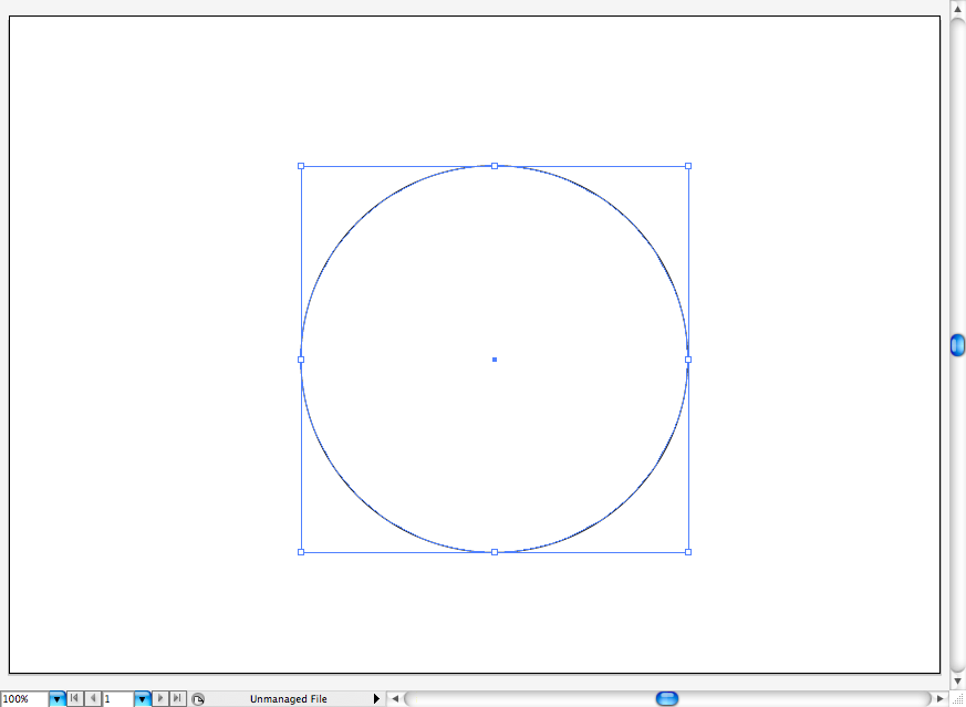
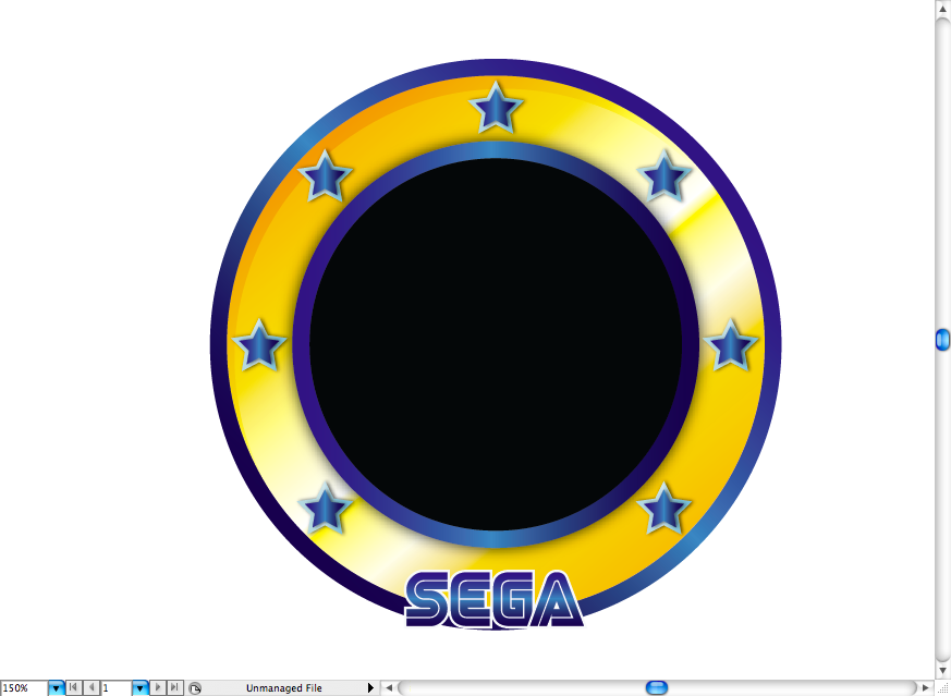
I kind of don't know If that's a tunnel or a giant ring on the opening titles, anyway the first thing you should do after creating a new document on illustrator is to create a perfect circle using the ellipse tool (L) + shift. You're actually going to create four of them, use a white fill to understand which is under and which is bellow.
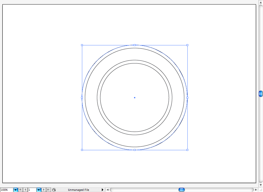
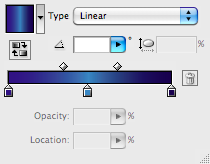
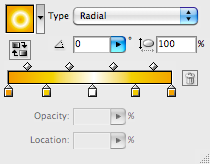
So I added a blue metallic linear gradient on two of them, a more intricate golden gradient on one of the circles and a black fill on the circle on the front in order to symbolize the hole.
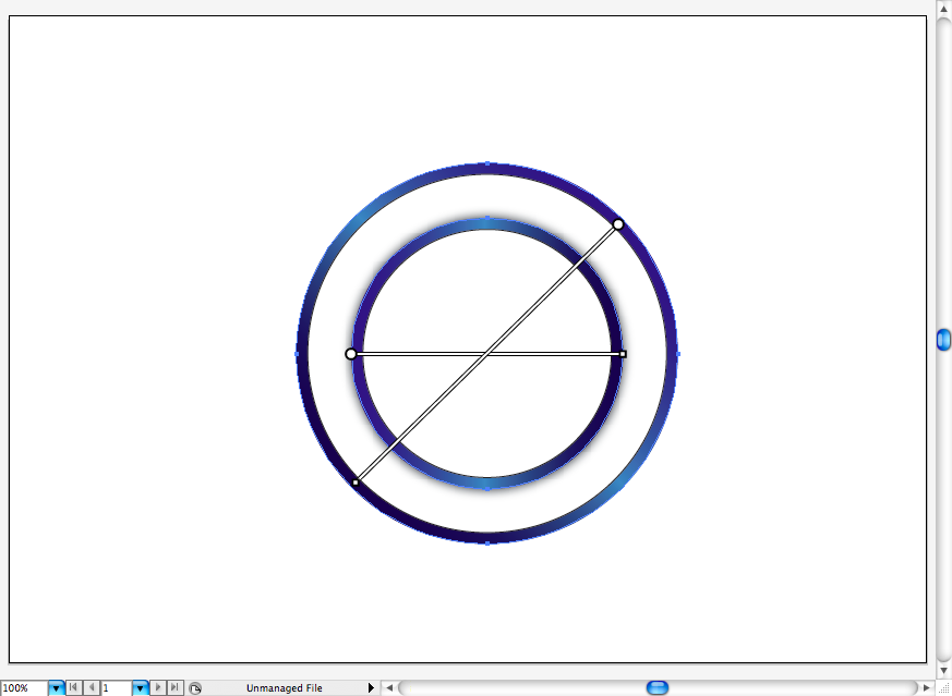
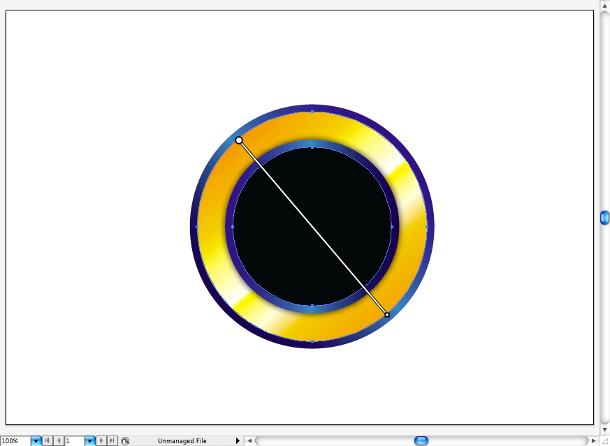
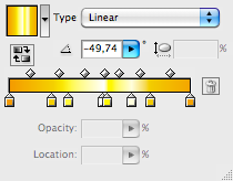
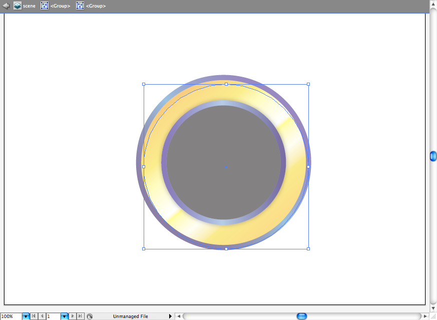
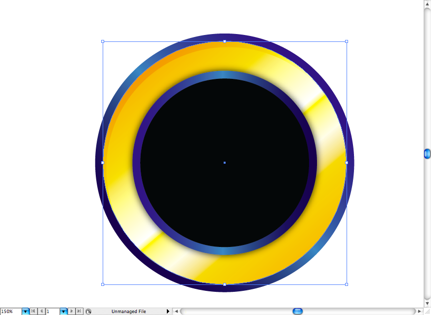
I also wanted a hard shading on the golden circle, so I just created a white circle, selected the soft light blending mode, pulled it a bit to the right downward diagonal and made a clipping mask (ctrl + 7 / command + 7) with a duplicated golden circle.

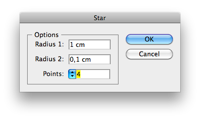
Let's add some stars, first click on the start tool to create specifi star with the parameters bellow.
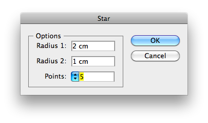
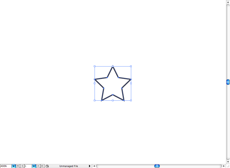
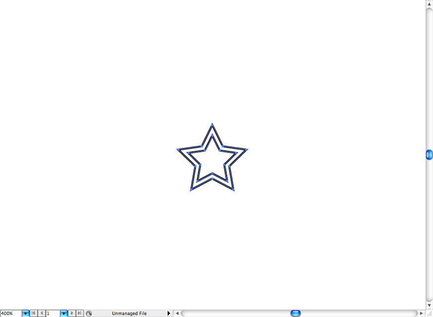
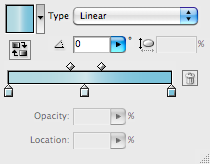
Make another one inside of it. Then add some blue gradients, use a stronger on the one inside and a softer on the outside.
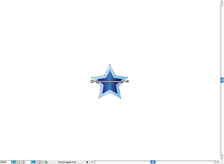

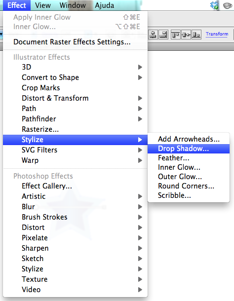
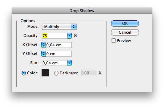
I also added a drop shadow on each of them to look more funky.
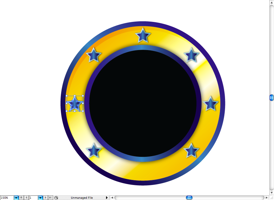
Then duplicated it and alligned like the picture bellow.
Here's the first we're going to use for the SEGA logo, you can get it here
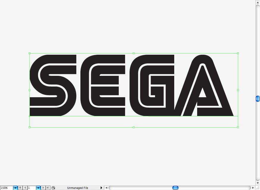
So, after I wrote SEGA I turned the font into outlines (ctrl + shift + O / command + shift + O) and added the same blue gradient used on the circles.
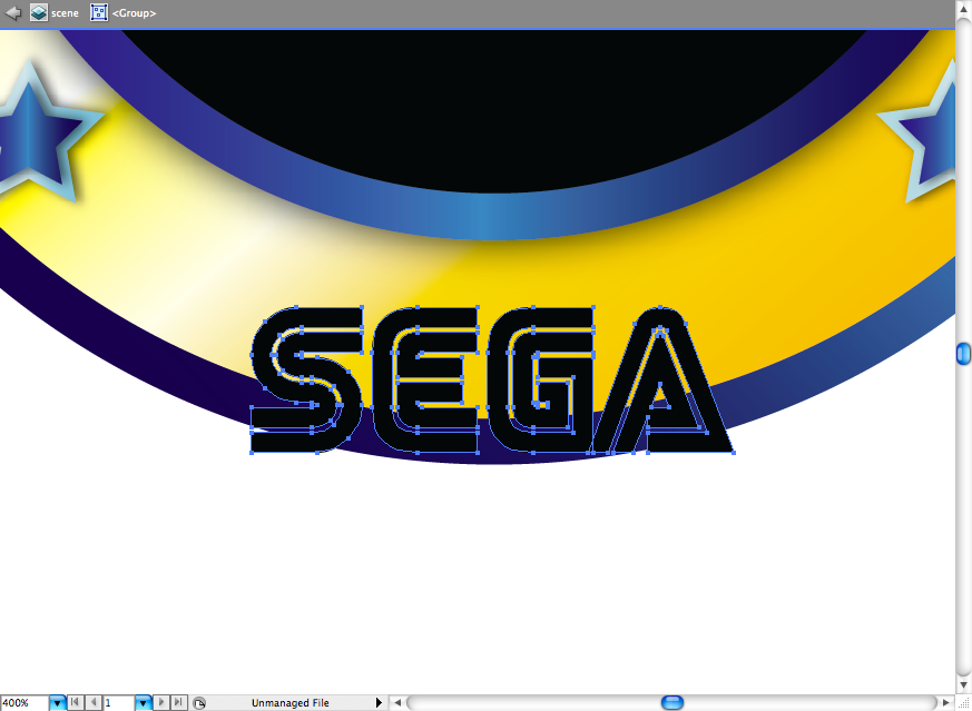
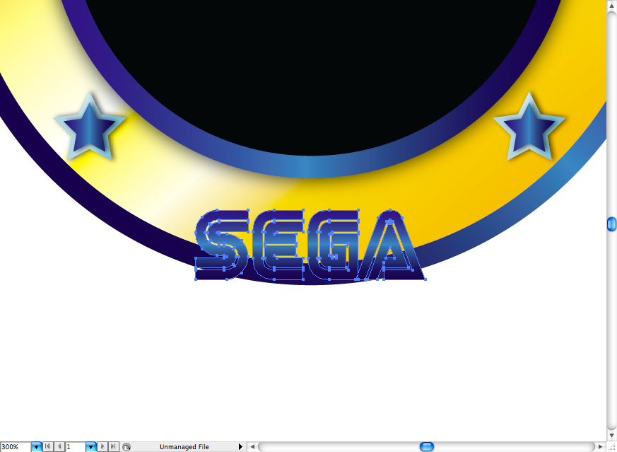
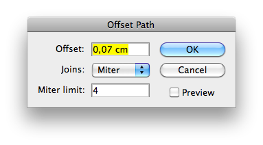
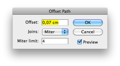
Ok, now go to Object > Path > Offset Path and set the parameters like this. Use a white fill on the new path.
Wings
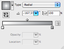
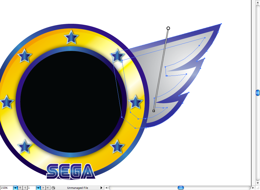
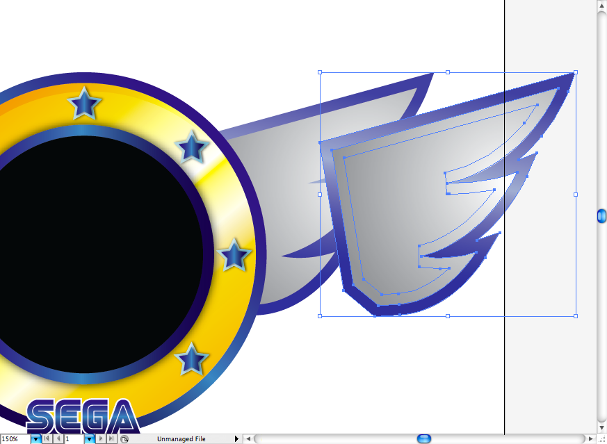
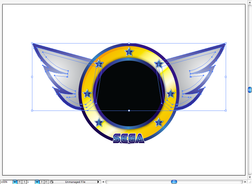
Never quite get why there's wing on theis opening, anyway I just draw then using the pen tool (P). Then add a grey radial gradient on it. I also used the same offset path here, so you can pretty much repeat the procedure.
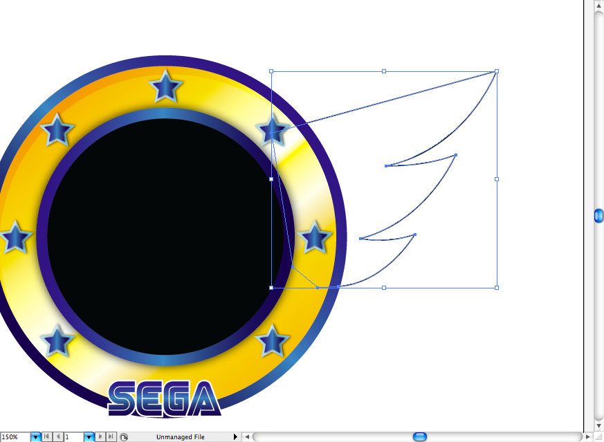
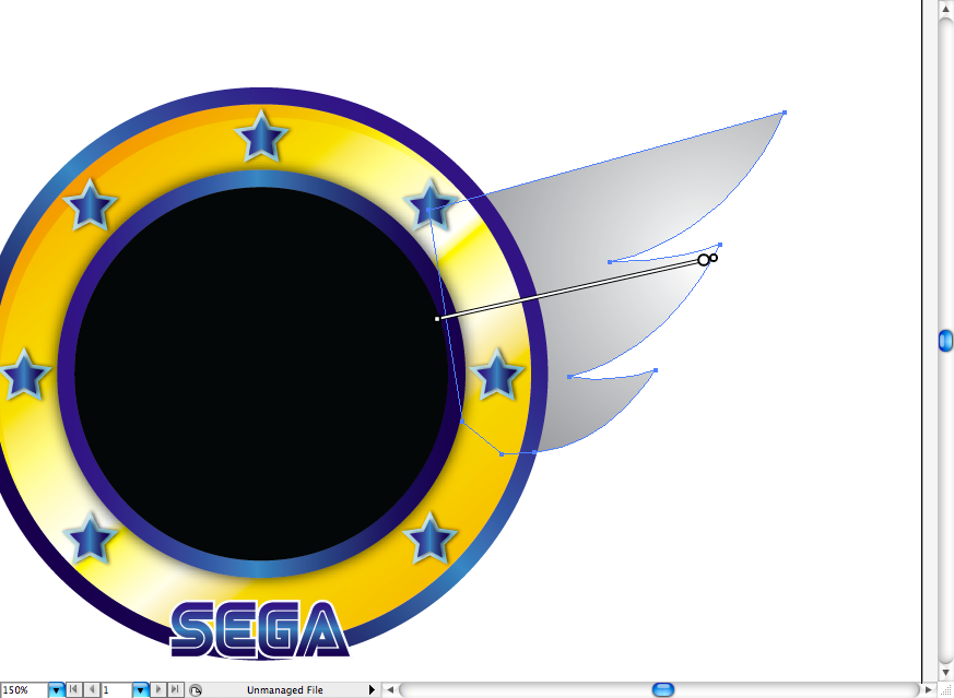
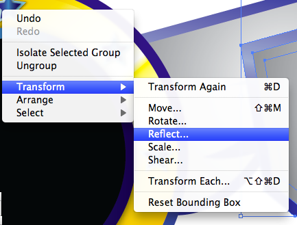
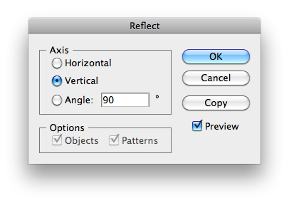
Don't forget to duplicate and flip it to the other side (just right click and go to Transform > Reflect).
Ribbon
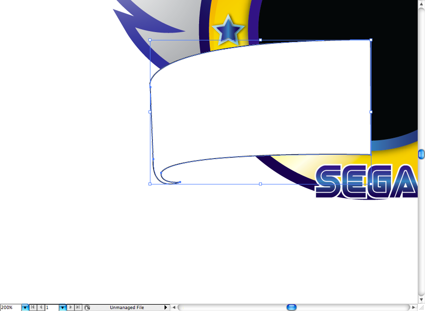
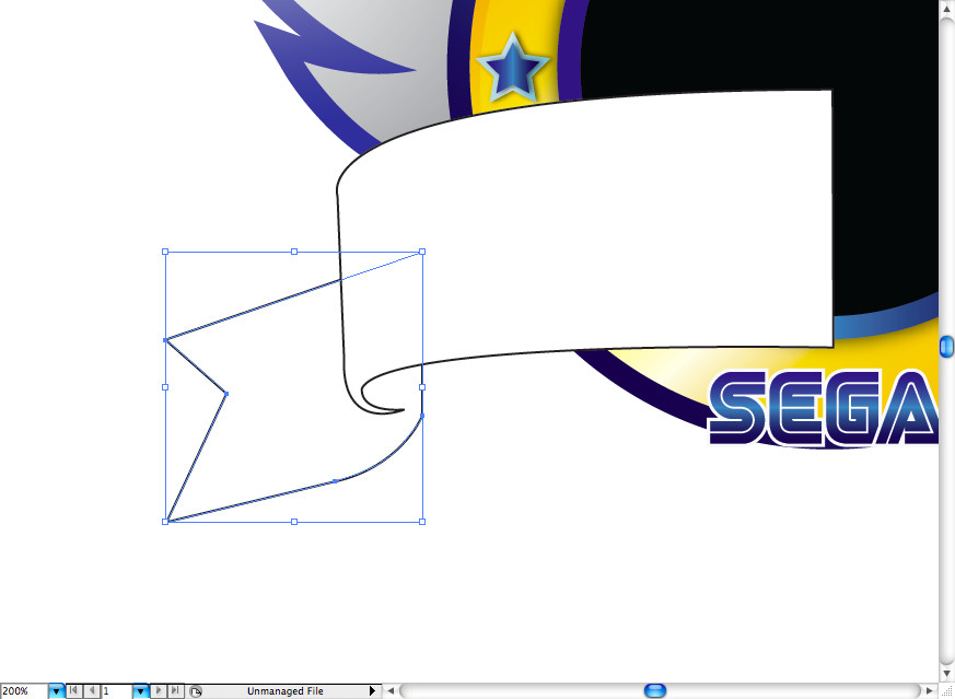
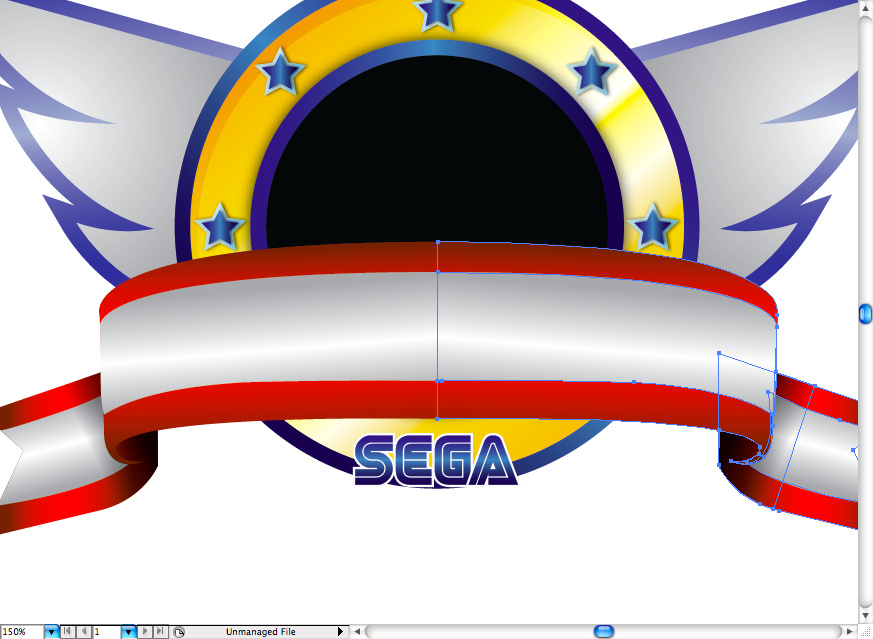
Using the pen tool (P) I made this shape with a little hook shape on the end, this will be like a folding of the ribbon. On the sequence I just made the extremity using the previous tool.
I added some red linear gradient, just watch for the gradient directions, they will help to enhance and give depth to the image.
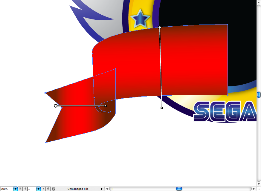
To make a the white shapes, I basically duplicated the red ones and adjusted it using the selction tool (V) and the direct selection tool (A)
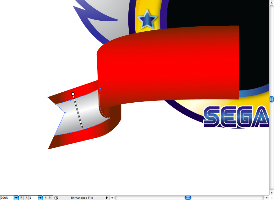
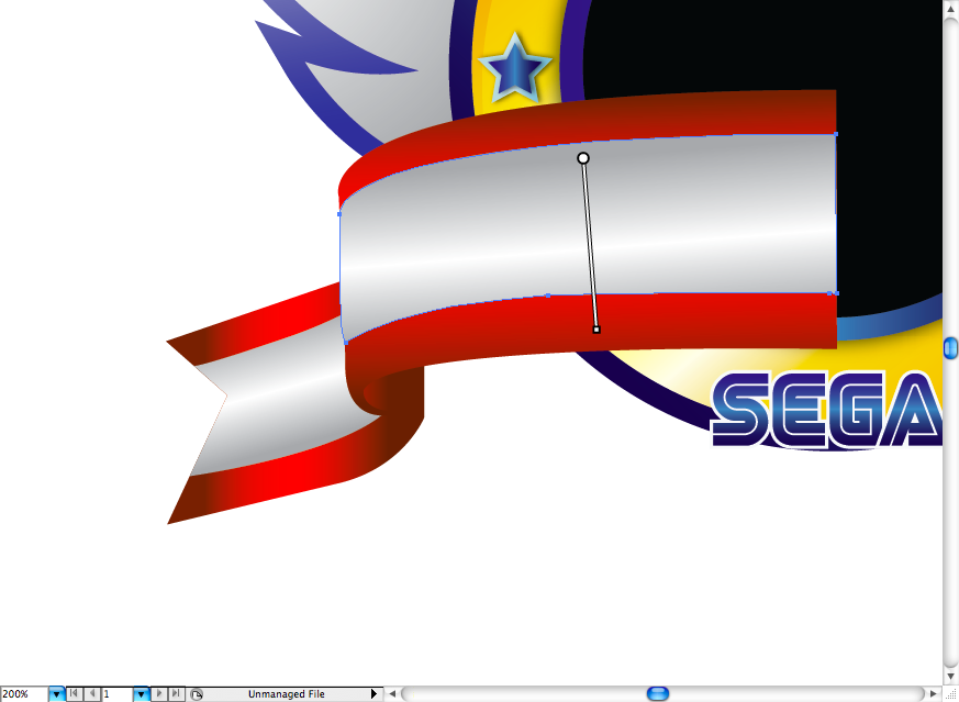
I also added a shadow by creating this shape right on the ribbon folding then selecting the blending mode called multiply.
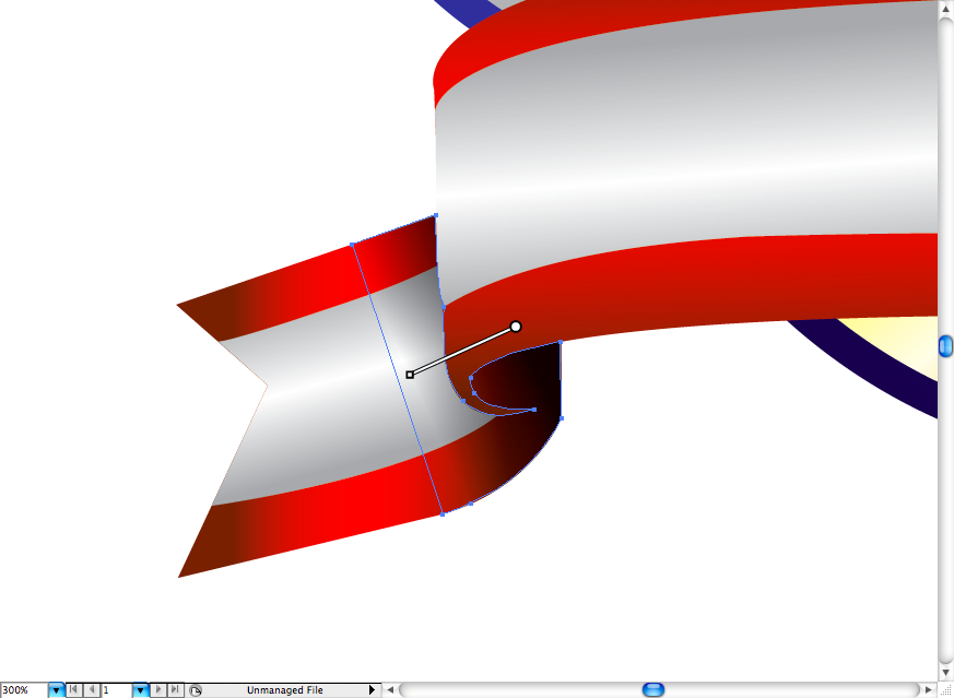

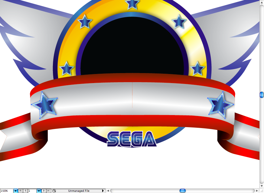
Ok, then just duplicate it and flip it to the other side. I also added the stars used on the circle, but on a larger size.
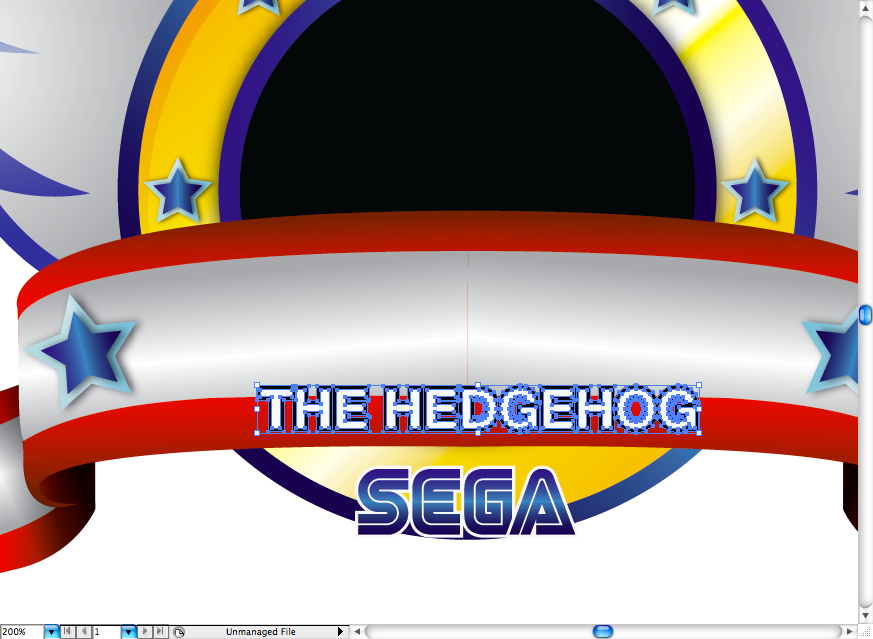
For the main title first I wrote "The Hedgehog" using Hevletica (you can use Arial with you prefer), turned it to outlines and used offset path on it.
You can get the next font that we're going to use on the Sonic type here.
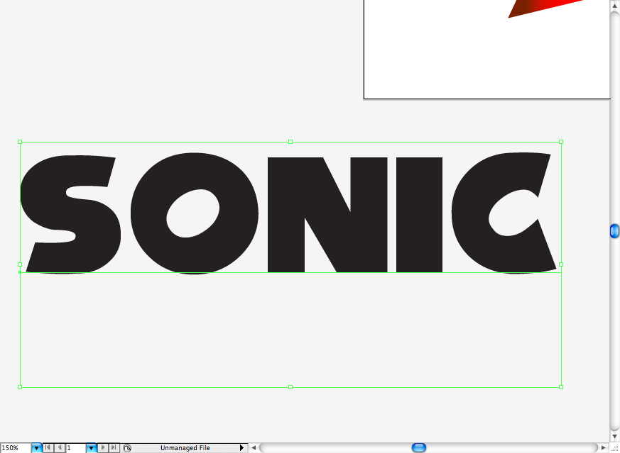
I outlined the type and added a mettalic intrincate gradient.
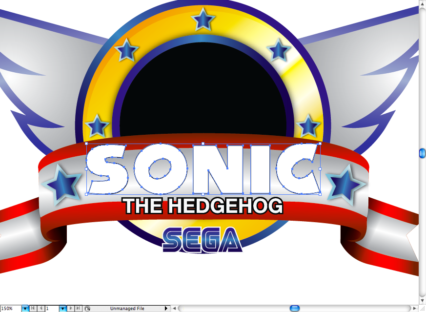
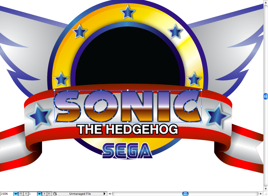
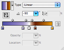
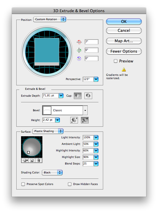
Ok, then access Effect > 3D > Extrude & Bevel, set the parameters like the ones bellow.
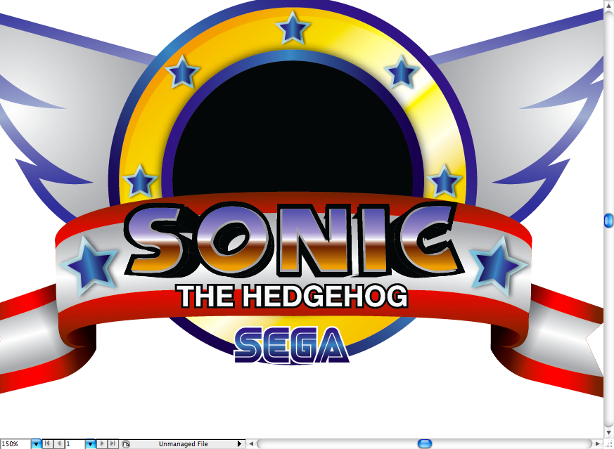
Now that we just finished this part, let's add a black background by creating a big black rectangle using the rectangle tool (M).
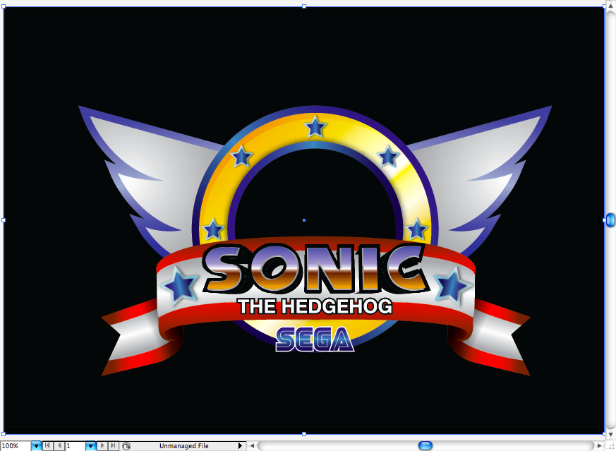
I decided to add some shiny stars so I clicked on the star tool and configurate it to make some thin 4 points stars. I also added some golden gradient on them.
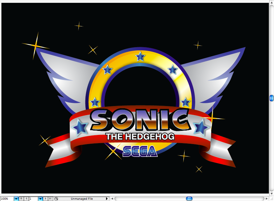
Sonic
Ok, here's the most anticipated and also the toughiest part of the tutorial: drawing Sonic. Before trying to draw this character on the final pose, I made some several studies of it and it's body structure and movements, Sonic is one of these classic big-head cartoon characters, the hardest part to understand it's how you will place the eyes. So, I would suggest you guys to try some sketching looking to some original images, it's good to understand the logic behind some characters, that's enhance you graphic repertory.
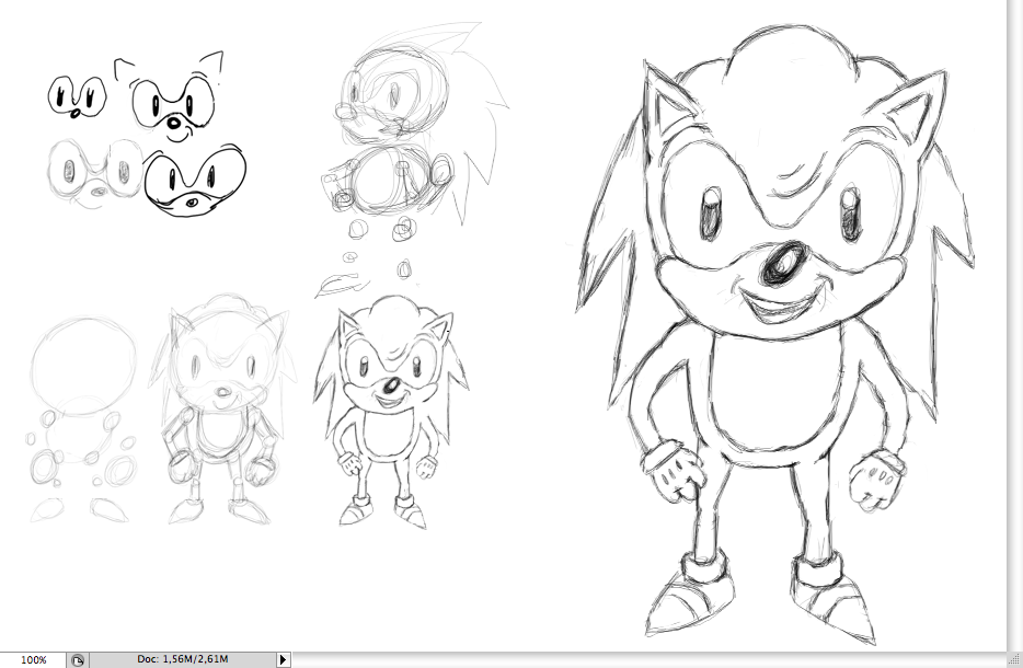
So, after a lot tests adn studies, I tried to make the classic Sonic pose and laced it on the Ai file on the bottom to help you guys. As you can see I divided the character in a lot o ellipses, this is way of showing the body struture, where are the main parts and the joints.
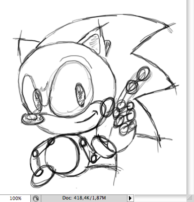
After putting it on illustrator, I started tracing over the most simple shapes, mostly ellipses,like the ones in the eye, head and body.
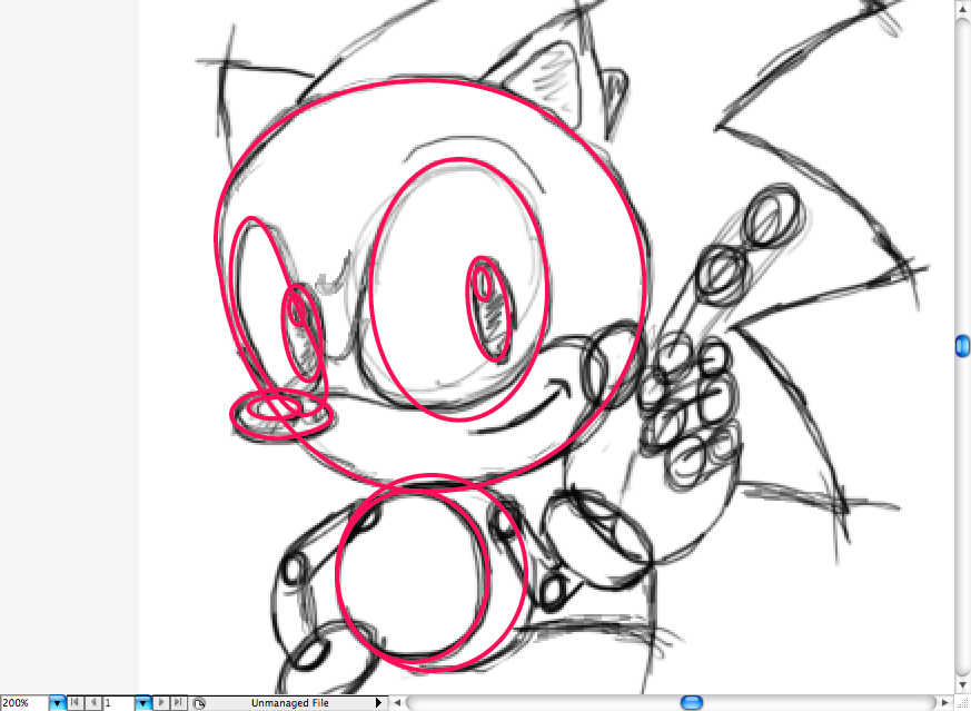
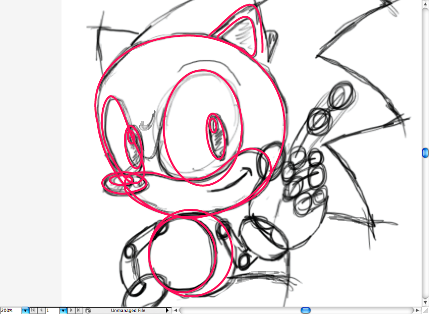
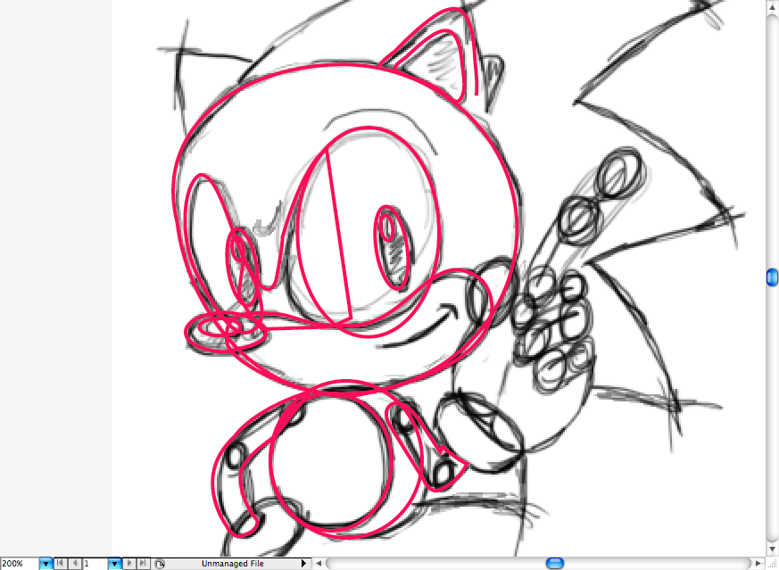
With some help of the pen tool (P) I traced the rest of the body, I know this may not make much sense right now, but this is the best way to vectorize a character with less effort.
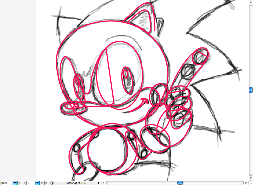
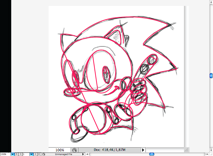
Ok guys so right now here's a great test for you, as I know our readers are really good this should be piece of cake: using the pathfinder tool called Unite, you should wisely unite some of the traced part in order to get this vector Sonic. Don't worry, this is just a test, If you don't feel confortable on trying, there's a ready vector version on the downloadable file.
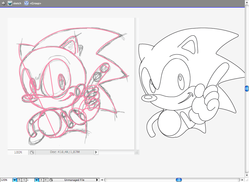

After we got it all vectorized, let's add some flat colors, I like to do that before adding gradients and shadows as it's better to preview how we should add light and shadow on the image.
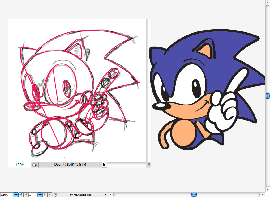
I started with the eye, adding some grey radial gradient, then added some grey gradient on the nose and on the eyes.
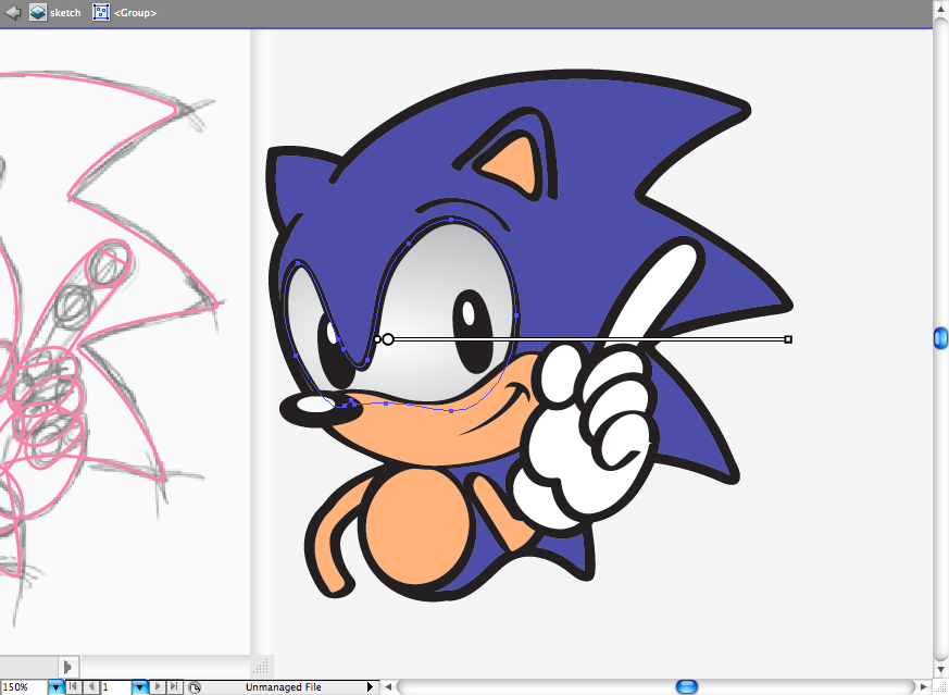
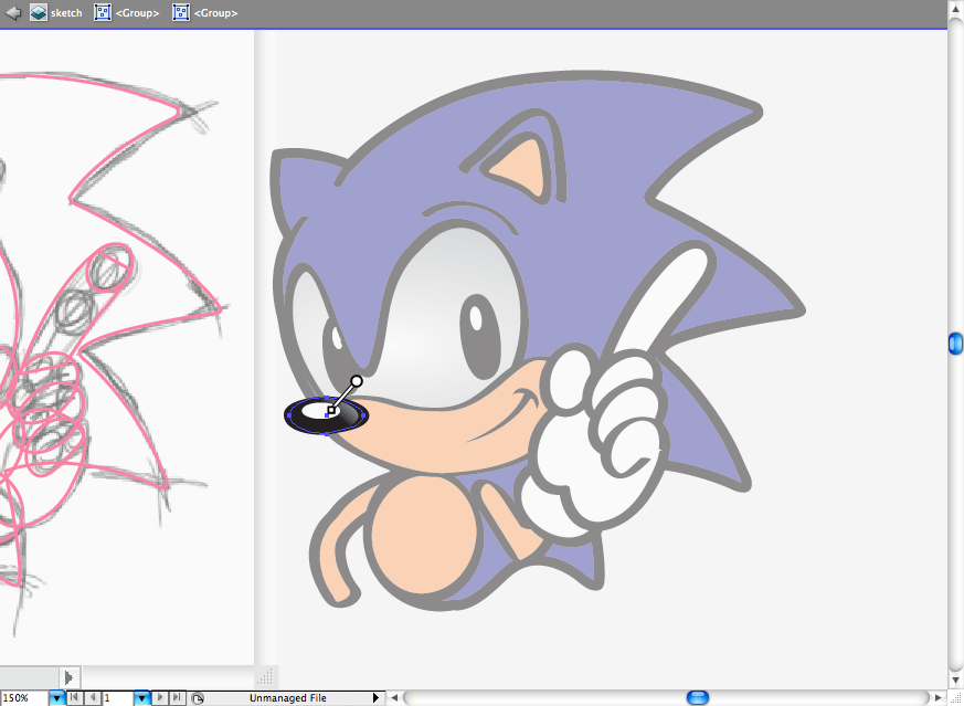
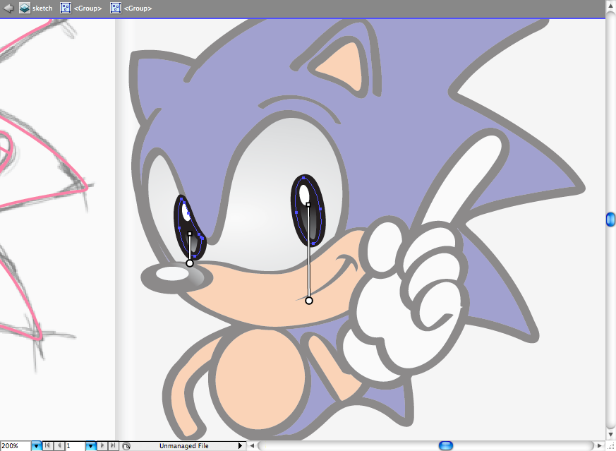
I decided to substiture the beige for a hotter color as a orange gradient, just watch for the gradient directions and formats (linear and radial).
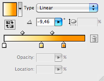
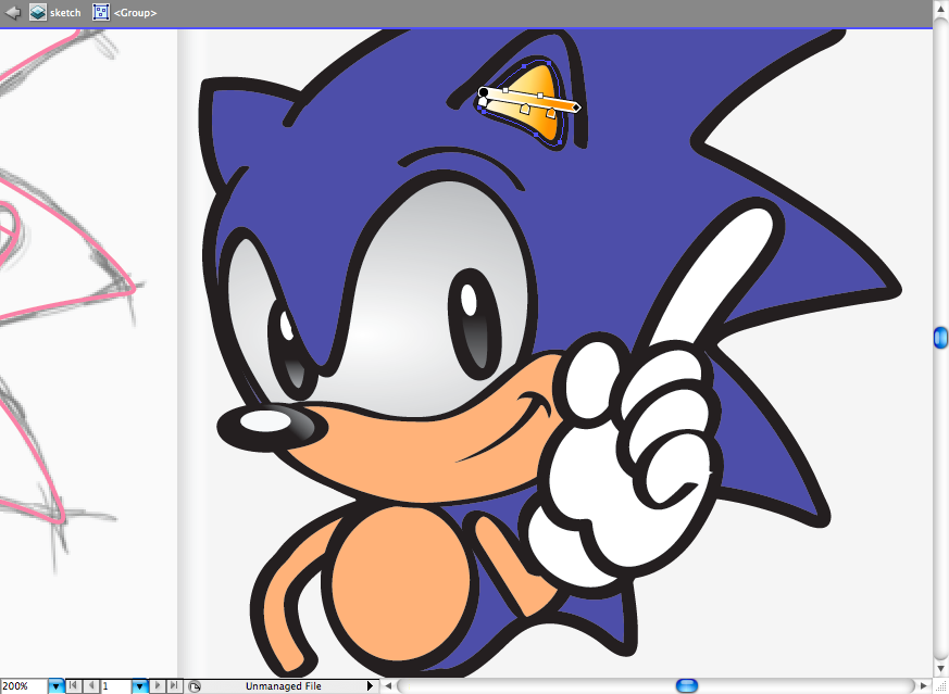
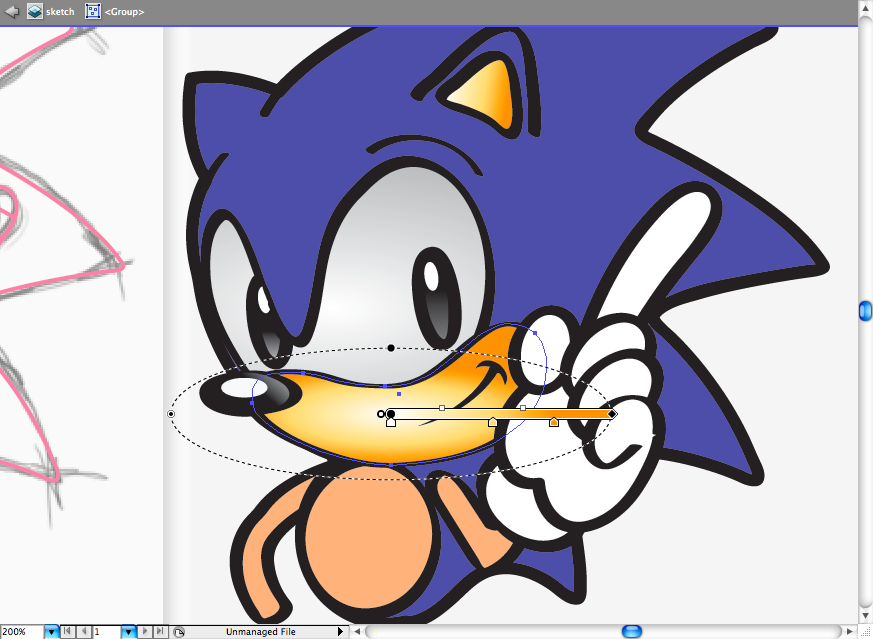
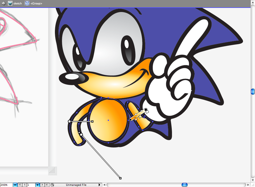
The glove it's a bit intricate, so here's a tep by step on the gradient directions, watch it carefully.
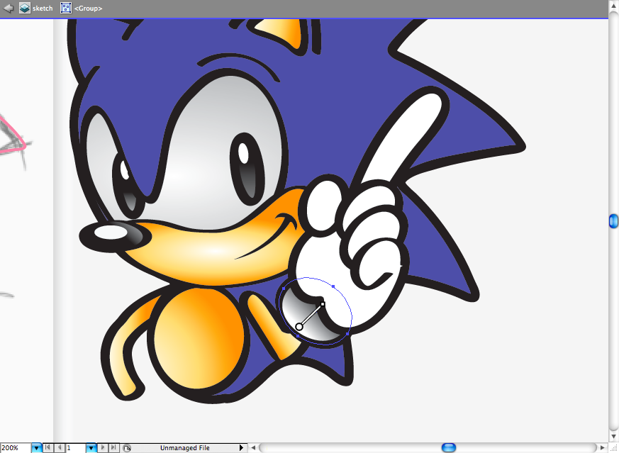
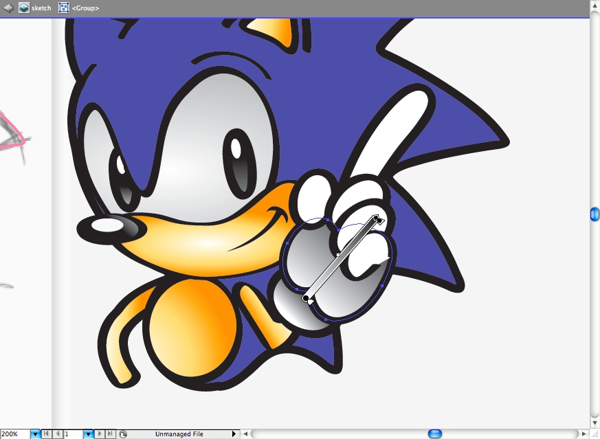
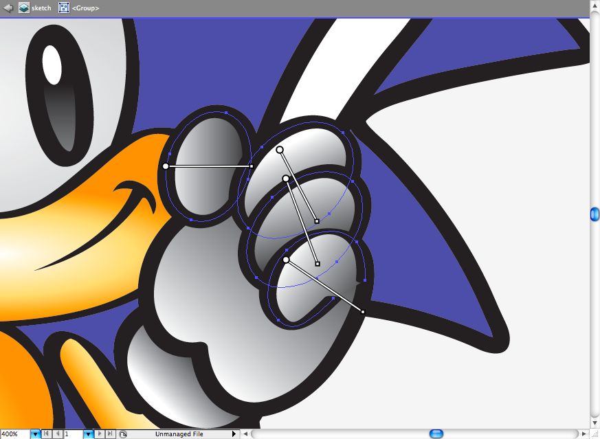
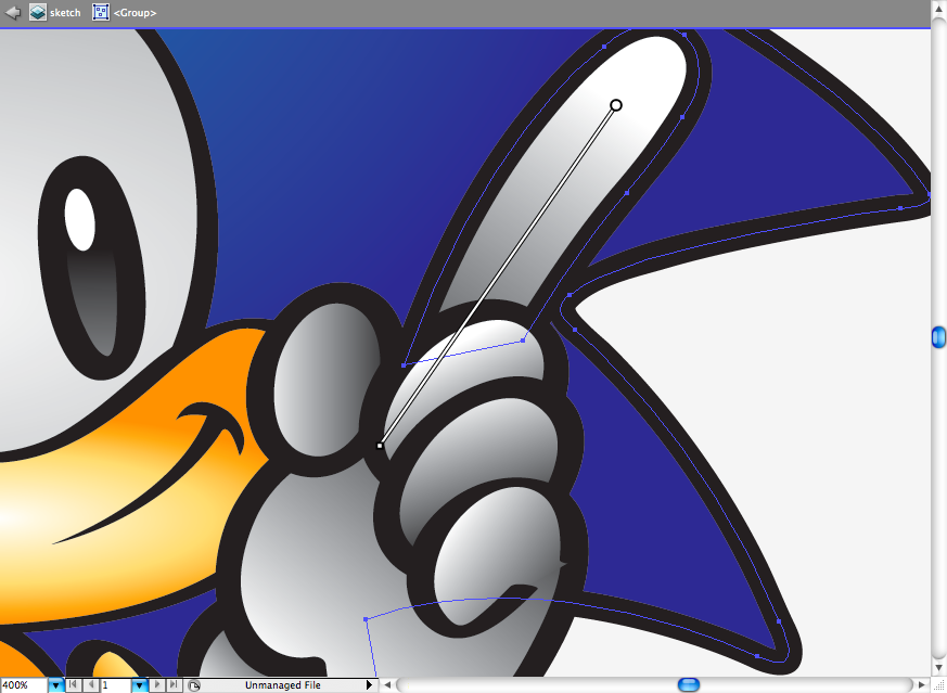
Finally I added some blue radial gradient on the top of him and posicionate him on the scenario, right behing the ribbon.
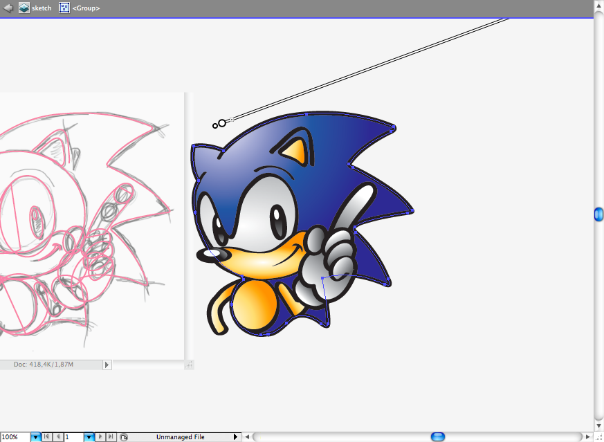
Final Result
Although the tutorial was really step forward, I hope you guys got a better understanding on character design, as this will always be a really tough part when doing a illustration. Studying movements, faces, gestures it's wuite important for any illustrator. Hope you guys enjoyed this lesson.
Download the Illustrator File
Click here to download the Illustrator file used for this tutorial.

Original Link: http://feedproxy.google.com/~r/abduzeedo-tutorials/~3/_shJxo_seaU/create-sonic-hedgehog-opening-illustrator
Abduzeedo
 Abduzeedo is a collection of visual inspiration and useful tutorials
More About this Source Visit Abduzeedo


