
An Interest In:
Web News this Week
- May 1, 2024
- April 30, 2024
- April 29, 2024
- April 28, 2024
- April 27, 2024
- April 26, 2024
- April 25, 2024
Some of Our Sources
- Mashable
- Techcrunch
- Technology Review
- Simplebits
- Six Revisions
- Inspiredology
- CSS Globe
- Web Resource Source
- Willems Lab
- The Verge
Help Webnuz
Referal links:
How to Animate a Demo of an iPad App with Photoshop
Have you ever tried to explain the behavior of your interface designs to your clients? Many times words are not enough to show what the designer has in mind when delivering a piece to their customer. In mobile applications, with both horizontal and vertical scrolls combined and animation or transition effects, this problem is even larger. This tutorial will show you how to design an interface of a mobile application from scratch in Photoshop and, most importantly, will show you how to present an animation describing the behavior of the application for submission to the final customer. Are you ready? Let’s get started!
Tutorial Assets
The following assets were used during the production of this tutorial.
- iPad 2 Template by Max di Capua
- Retina Display Icon Set thanks to Alex Shutin.
- Pointing Hand thanks to rvila
- Walkway Typeface thanks to Font Squirrel
Before Getting Started
This tutorial aims to be a guide to present a more dynamic sample of your interface designs, showing the behavior that the app will have when it’s implemented.
There are several advantages of creating an animated version before implement it into a programming language, here are some:
- Time. It’s obvious that the time to implement any design (Web, Interface, Mobile App) into a programming language is very large, having a video sample instead will help your client to have a better idea of how the app will work on its final environment and will help you to save development time. As you will see in this tutorial, having an animated version of your Photoshop design is not complicated at all and it can be done in 1 hour or less.
- Accuracy. Not all the designers are very good programmers, and not all the programmers are good designers, sometimes we need to work with another professional on the other side of the globe. Telecommuting may cause misunderstanding of ideas, having a detailed file describing the functionality into an animated format will increase the accuracy of the final work.
- Easier, quicker and cheaper rounds of changes. We all know clients love to change the requirements on the go, to change an interface design issue when the app is already implemented may take more time and increase the development cost. Iterations on the graphic files may only affect the design costs, and will help your client to be fully satisfied with the user experience before writing a single line of code.
With that in mind, let’s move forward with today’s tutorial.
First we will design a News Reader iPad App from scratch with Photoshop, then we will animate the behavior of scrolling trough the news feeds both vertically and horizontally and finally opening an article into a popup window. Did I mention that we will only use Photoshop for the entire process?
Since this is not a basic tutorial, I will assume that you have a basic level of understanding of Photoshop’s tools and processes, like creating Clipping Masks, Vector and Layer Masks, and more importantly, Smart Objects. If you really want to go trough this tutorial and you’re still a beginner, I suggest you to read a couple of articles describing these subjects first.
- The Answer to All Your Problems: Masking "" Basix
- What is a Clipping Mask Then?
- Be Smart and Use Smart Objects "" Basix
Now, let’s get it started!
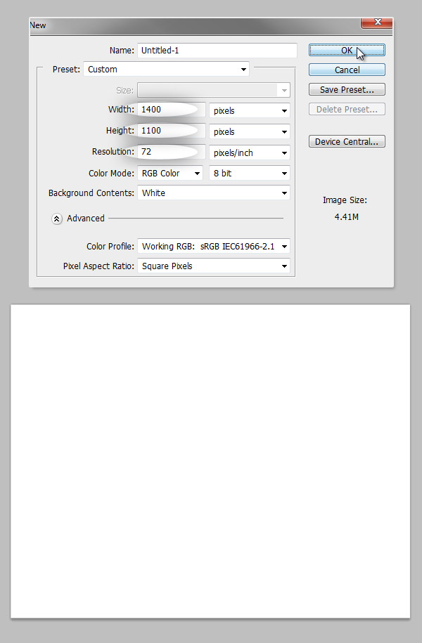
Step 1 – Blank canvas
Every great design start with a blank canvas, this time we will create a 1400 x 1100px document RGB at 72ppi.
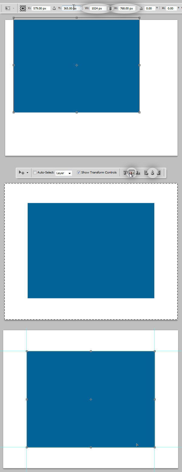
Step 2 – Work Area
Since we are creating a design for an iPad app, we will need to draw a square to delimit the working area of the iPad screen (1024 x 768 px). You can easily do it by creating a rectangle and using the Transform Controls of the Move Tool (V) click on any corner and then on the Options Panel on top write the desired dimensions on the W and H values. Then press Command/Ctrl + A to Select All and still with the Move Tool selected align the box to the absolute middle by clicking on the alignment options.
Then, when the box is located on the absolute middle, draw four Guides around the box, this will be our working area, and the visible part of our application. From now until the end of this tutorial the space between these guides will be the "app area".
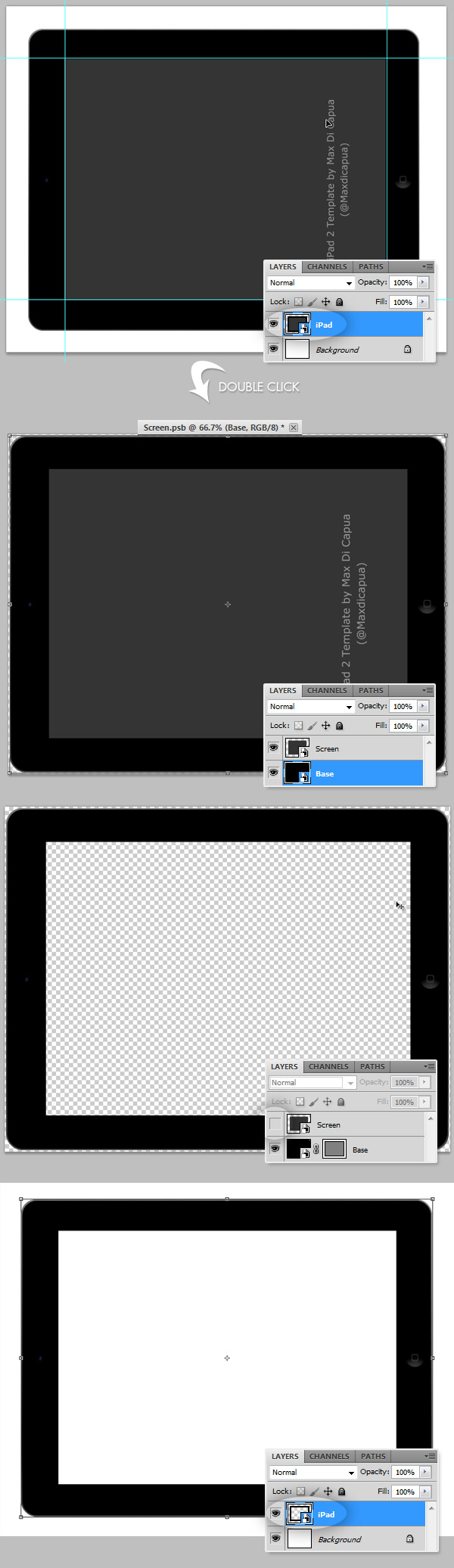
Step 3 – Adding the iPad
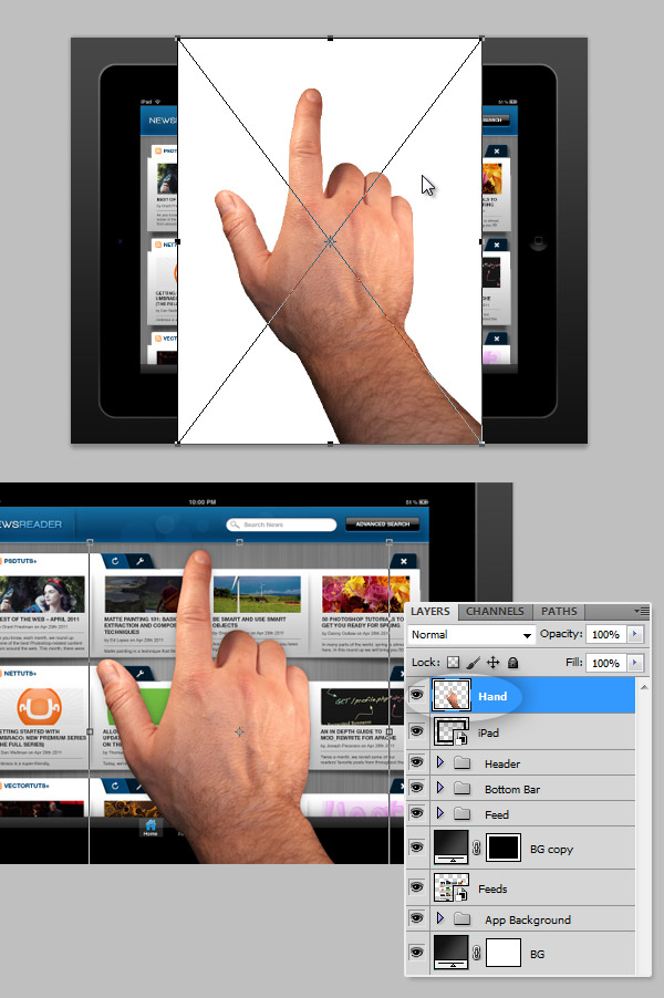
Now, open and insert the iPad Template from the assets, rotate it to place it in Landscape mode and resize it to make the active area (screen) match with our guides. Convert it into a Smart Object and name it "iPad". Then double click on the smart object miniature on the Layers Panel a new window will appear with a editable set of layers corresponding the "iPad" smart object. There delete the gray area where the interface will be located. Save the .PSB file, all the changes will be automatically updated on the main document.
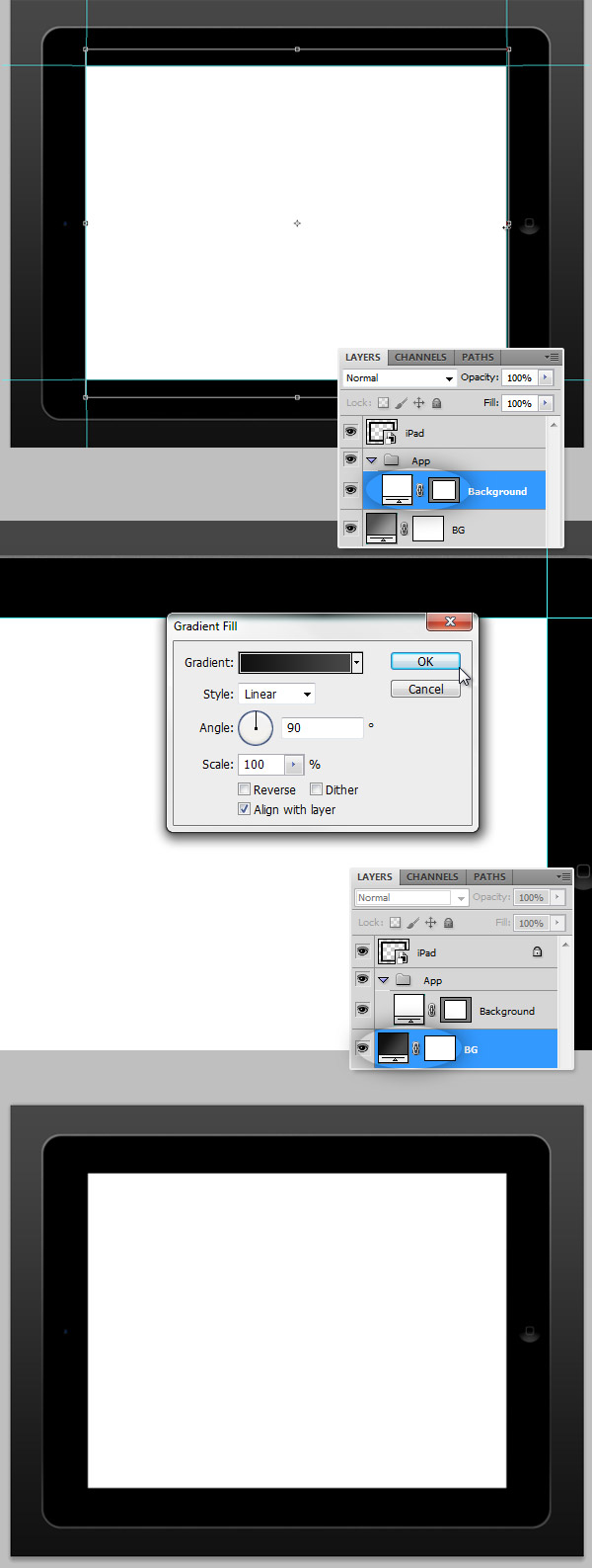
Step 4 – Backgrounds
Now, let’s add some backgrounds, first a Rectangular white background behind the "iPad" Smart Object. This background should be placed between the left and right Guides of the app area, you can call the layer "Background" and put it inside a Folder named "App" because there is where we will put the entire app design. Then a large gradient background for the entire document (#121212 – #434343).
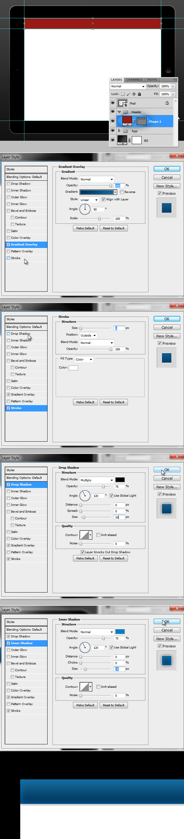
Step 5 – Header Background
Draw a Vector Rectangle between the top border of the app area down to 80px inside a new Group named "Header". Apply the following Layer Styles: a Gradient Overlay (#00345C – #146592), a White (#FFFFFF) 1px Stroke, a 10px Drop Shadow and a Light Blue Inner Shadow (#0180C7).
Step 6 – Header Background Details
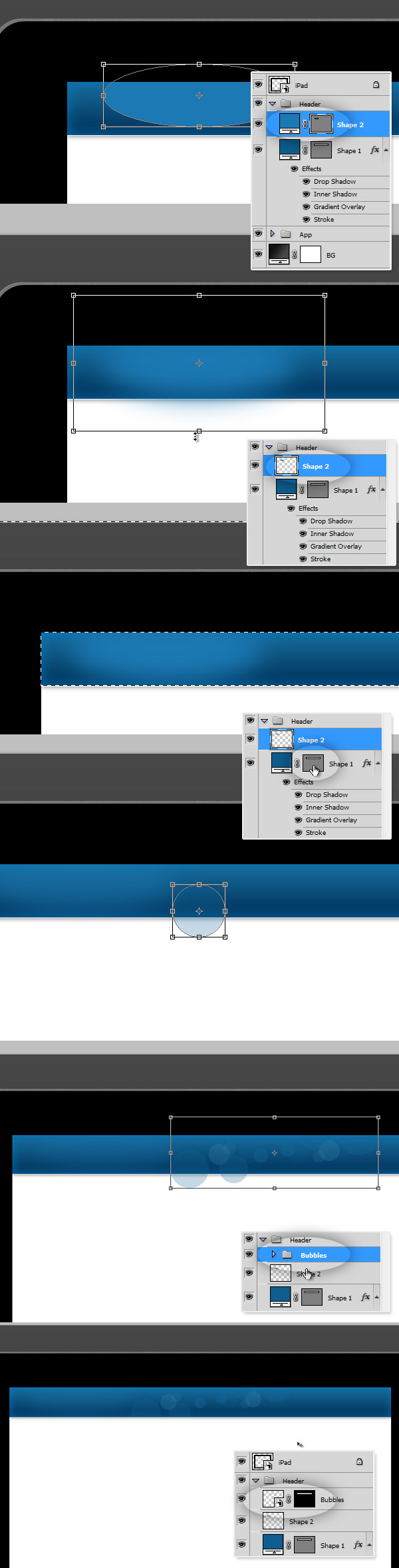
The mobile devices have now very beautiful displays, it will be a shame if we didn't add some little details to the header to make it look nicer. First, add a blue Ellipse (#1C79B4) on the left side of the header, apply a Gaussian Blur to it (it will rasterize the shape), use any radius, I’m trying with 15px. Then Command/Ctrl + Click on the Vector mask of the Header Rectangle, Command/Ctrl + Shift + I to invert the selection and press Delete to remove all the extra blue shine. The, if you want to, you can add several circles using different tones of blue and different opacities, put them on a Group named "Bubbles" and place it to the right of the header. Then you can either rasterize it and repeat the process of the blue glow on the left, or you can convert it into a Smart Object and apply a vector mask to hide the exceeding.
Step 7 – Adding the app name
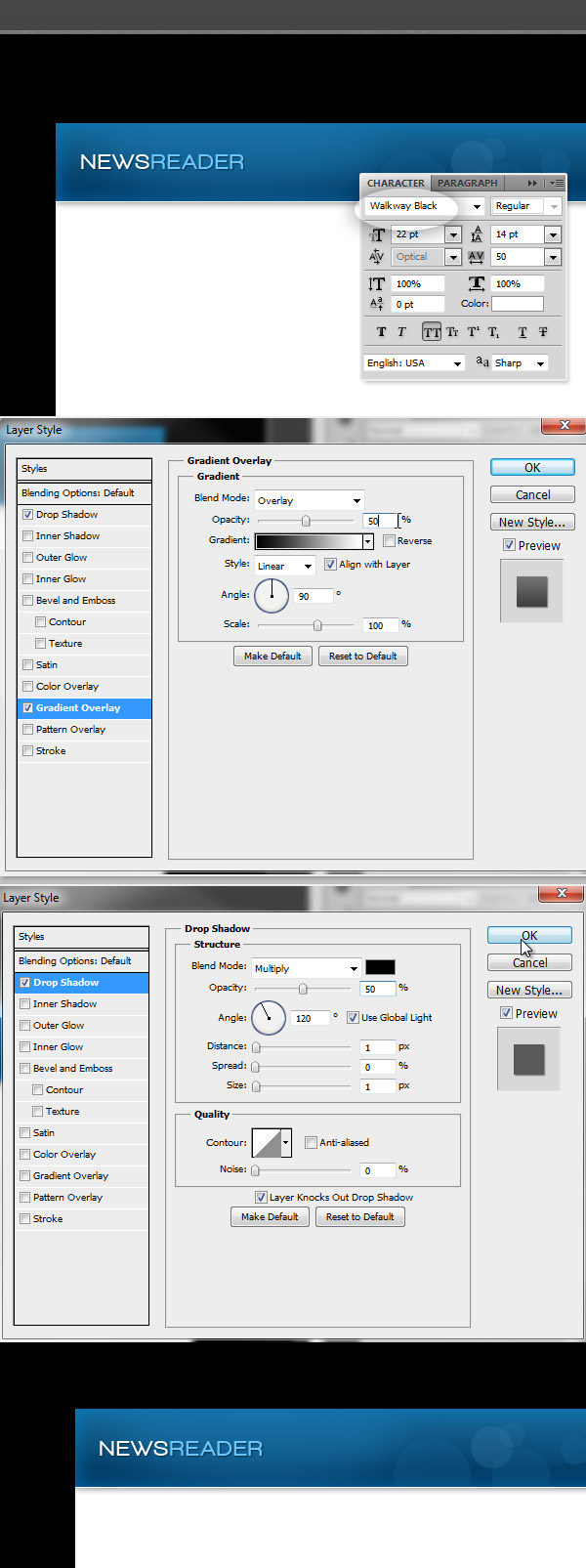
I will skip the process of creating an elaborated logo for our application, I’m just naming it "News Reader" using the beautiful font "Walkway Black" from the assets. I’m adding a subtle drop shadow and a Gradient Overlay with actual Overlay as Blending Mode. Place the logo on the left side of the header and inside a Group named "Logo" inside the "Header" folder.
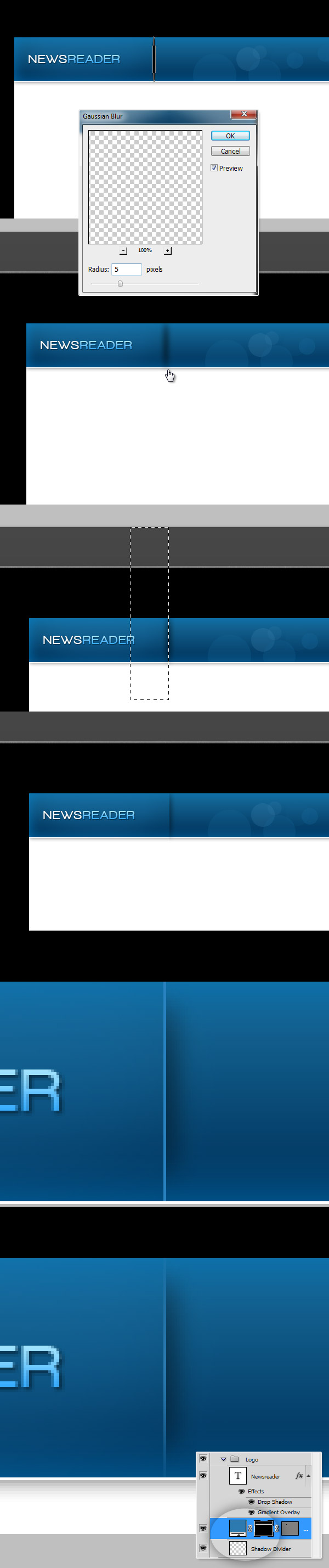
Step 8 – A divider shadow
Draw a narrow black Ellipse, then apply a 5px Radius Gaussian Blur to it. Then using the Rectangular Marquee tool, select the half of the blurred ellipse and delete it. Next, add a 1px thick Line to the left of the shadow, finally add a Layer Mask and fill it with a reflected Black – White gradient. Put everything inside the "Logo" folder.
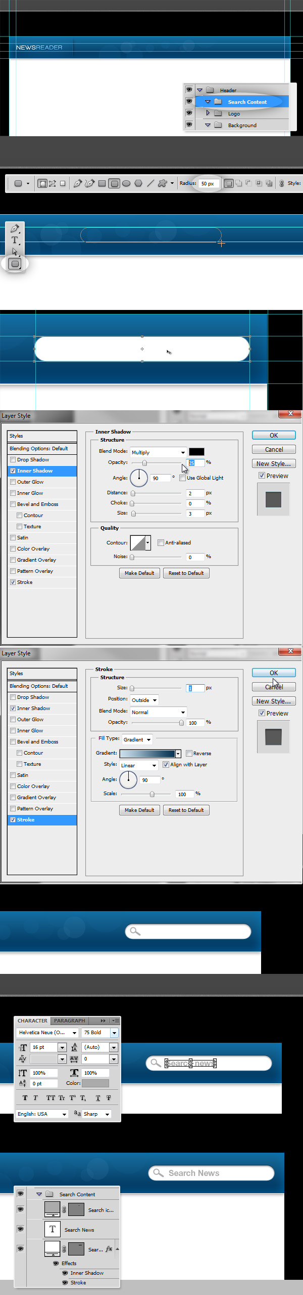
Step 9 – Add a search box
Add a folder named "Search Content" inside using the Rounded Rectangle Tool, add a white rectangle (50px border radius). Add the Styles shown on the images below (an Inner Shadow and a Gradient Stroke) to give it a subtle letterpress effect. Then add a gray (#ABABAB) Magnifier icon and a Search text, using Gray as well, "Helvetica Neue" as font face and Size: 16pt.
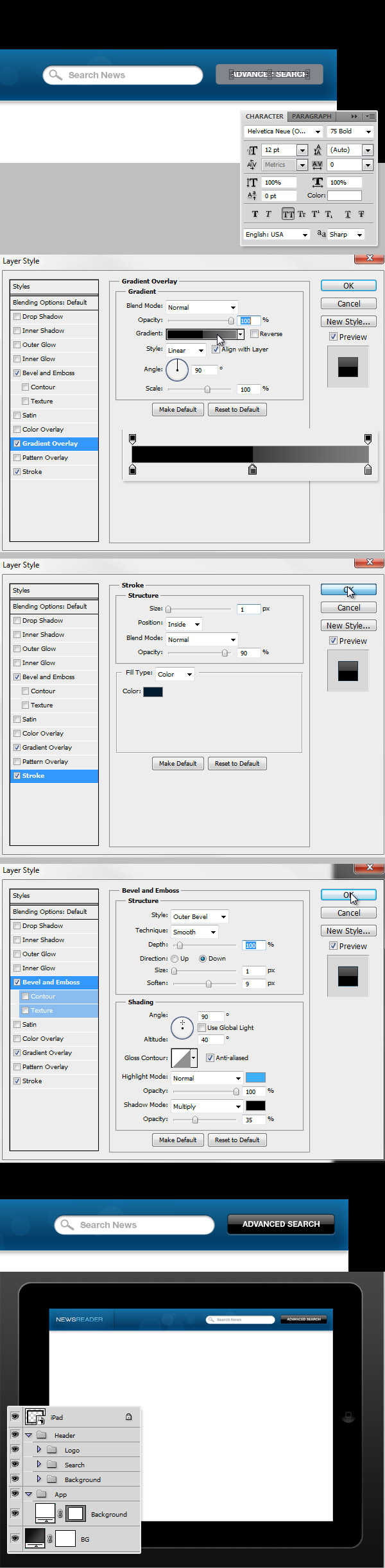
Step 10 – Search Button
Add a new rounded rectangle for the search button (5px radius) at the right of the Search box. Then add the text of the button "Advanced Search" with "Helvetica Neue 75 bold" typeface and white foreground.
Then add to the button a glossy Gradient Overlay as shows the image below, and a Gradient stroke. Then add a Bevel and Emboss style as shows the image below. Put both search box and button inside a new Group named "Search".
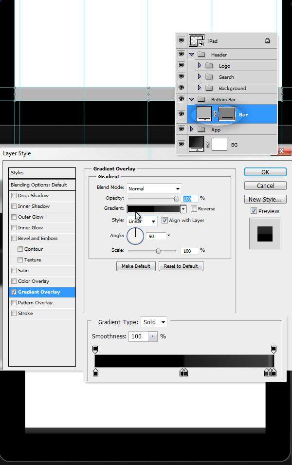
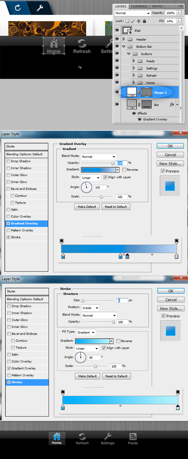
Step 11 – Bottom Bar
Let’s add the bottom menu bar. Draw at the bottom of the App area a black Rectangle (50px height). Then apply a glossy Gradient Overlay as shows the image below.
Step 12 – iPad top bar
Above the header there should be a bar with the standard iPad information (Signal, clock and battery). Even when this area is not too big, it may cause a considerable reduction into our app area, so it’s wise to add it. Down the "Header" folder a few pixels below, then double click on the "iPad" Smart Object and add a black stripe or the actual top bar from the iPad asset. Save the Smart Object and place the "Header" folder in its proper place.
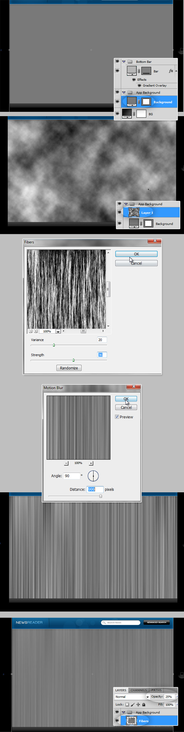
Step 13 – Fibers Background
A nice touch for any application is a clean and good looking background. for this, create a folder named "App Background". There draw a gray Rectangle (#797979) exactly inside the bounds of the app area. Then go to Filter > Render > Clouds and render some Black/White clouds into a new layer above the gray background. Next, go to Filter > Render > Fibers… and increase it’s Strength and Vibrance as you want. Then go to Filter > Blur > Motion Blur and set the Angle to 90 degrees and the Distance to 999. Finally delete all the fibers outside the app area and set its Opacity to 25%.
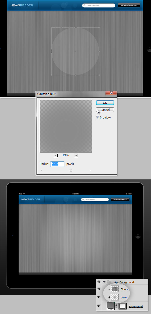
Step 14 – Background Glow
As a final touch, add a gray Circle above the fibers (Opacity 30% or less). And apply a Gaussian Blur around 45 – 50px Radius. Then delete the glow outside the app area. If you don’t want to delete or crop these layers you can convert the Gray "Background" layer into a Clipping Mask by clicking between the two layer miniatures on the Layers Panel and holding the Option / Alt click.
Now, we have the background of our app done, it’s time to move forward with the content.
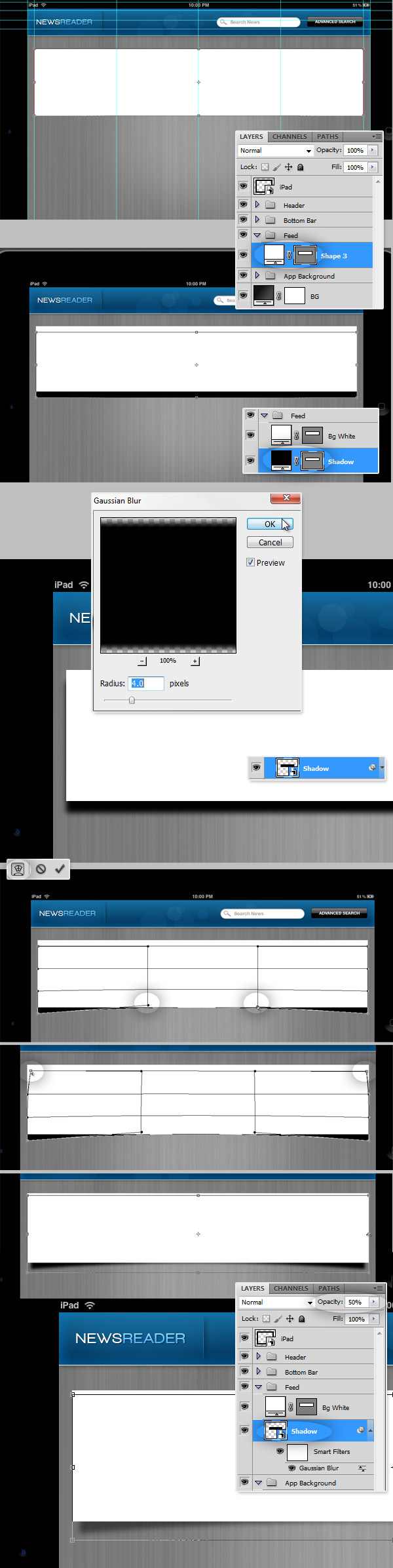
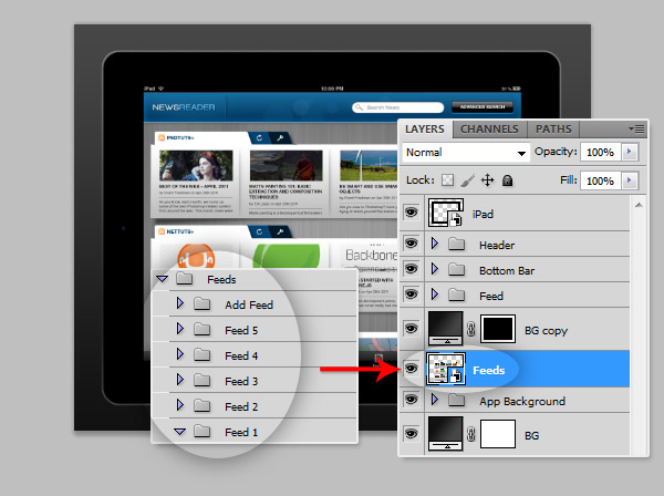
Step 15 – Feeds
Since this application will have several news feeds, we will add them in various rows. Each row will contain a set of the latest news of certain website or RSS feed. We will start adding a single row, and then duplicate it as many times as needed.
Keep your layers organized, create a Group named "Feed" and place it between the "Bottom Bar" and the "App Background" folders. The order of the folders is very important to have the final animation working properly.
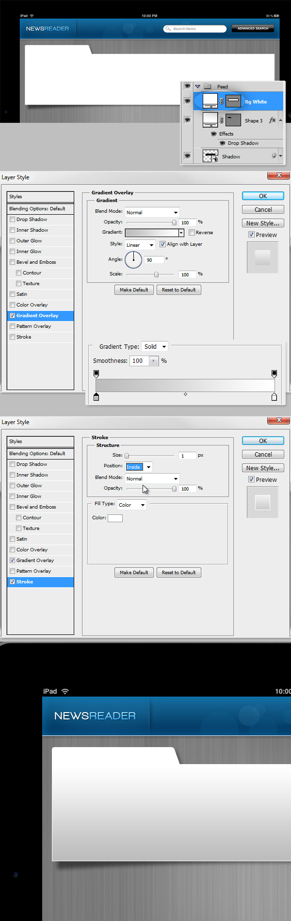
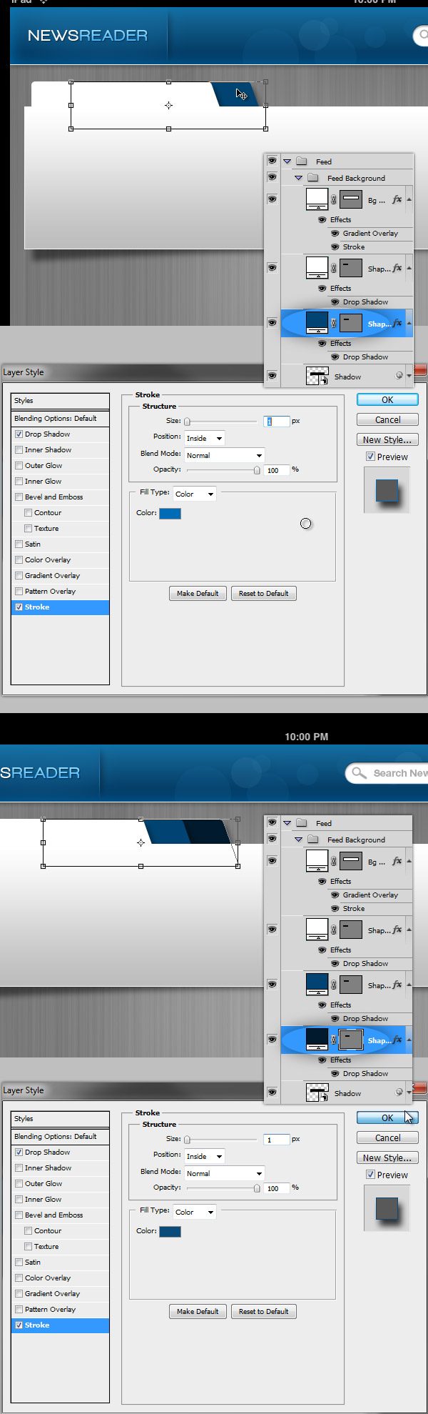
Draw a White Rectangle (200px height) and place it on top of the app area, next to the "Header". For the box shadow draw a black Rectangle behind the white one, name it "Shadow" and apply a 4px Gaussian Blur to it. Then using the Warp Tools of the Free Transform Controls, warp the black rectangle as shows the set of screenshots below. Finally, change the "Shadow" Opacity to 50%.
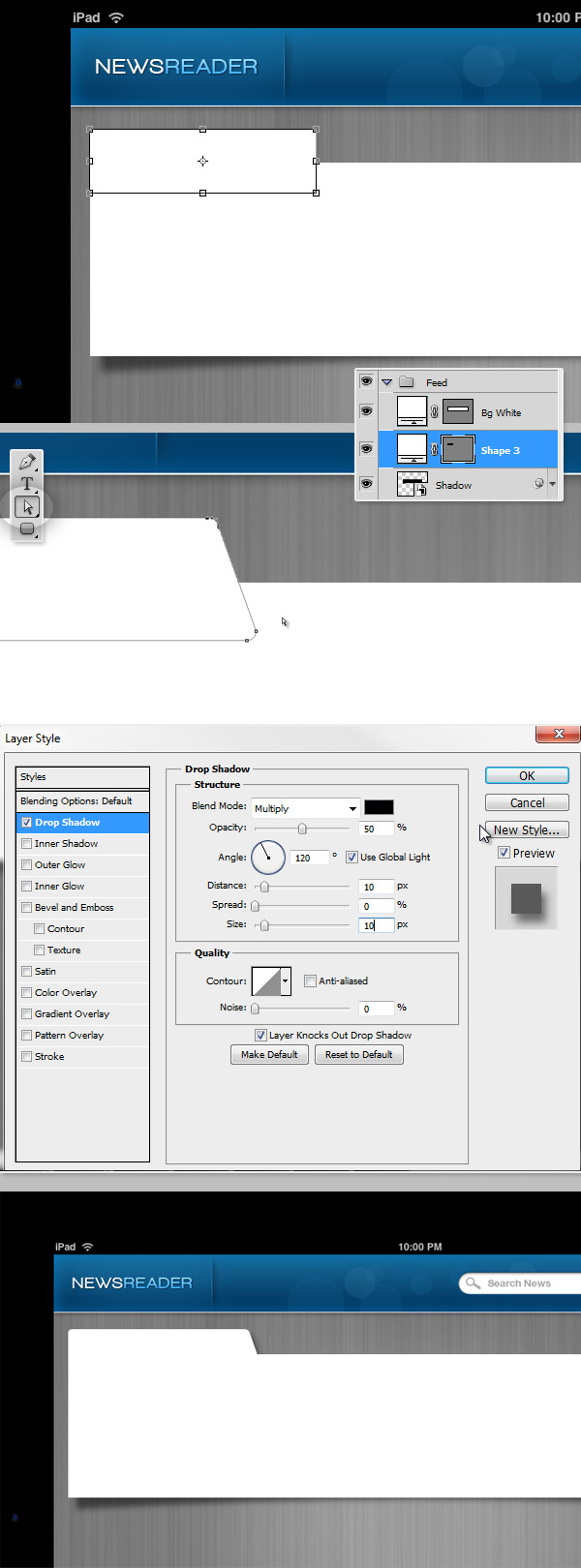
Step 16 – News Feed Name
Let’s add a tab where we will put the news feed name. Draw a 5px Corner Radius Rounded Rectangle (#FFFFFF) and using the Direct Selection Tool (A) move the bottom right points of the rectangle a few pixels right. Then apply a subtle Drop Shadow as shows the screenshot below. Place the layer behind the "Bg White" layer.
Step 17 – Feed Background
Since our background still looks a little bit lame, let’s increase it’s deep sensation adding a subtle Gradient Overlay to the "BG White" layer (#BEBEBE – #FFFFFF). A nice touch is to add a 1px White Stroke to the background layer to create a nice gap between the box and its shadow.
Step 18 – Option Tabs
Duplicate the "Tab" layer, place the copy behind the original. Change its foreground to blue (#014373) and its Stroke to (#016CB4), repeat the process but and set a darker variant of blue (#011A2E and #0B4B79 for the Stroke).
Step 19 – Feed Title
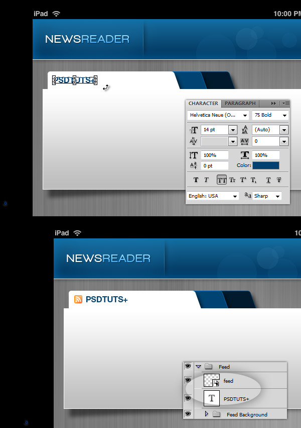
Add the title of the news feed using "Helvetica Neue 75 bold" using this foreground color: #034170. You can add a Favicon next t the title if you want to.
Step 20 – Icons
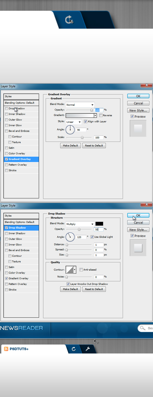
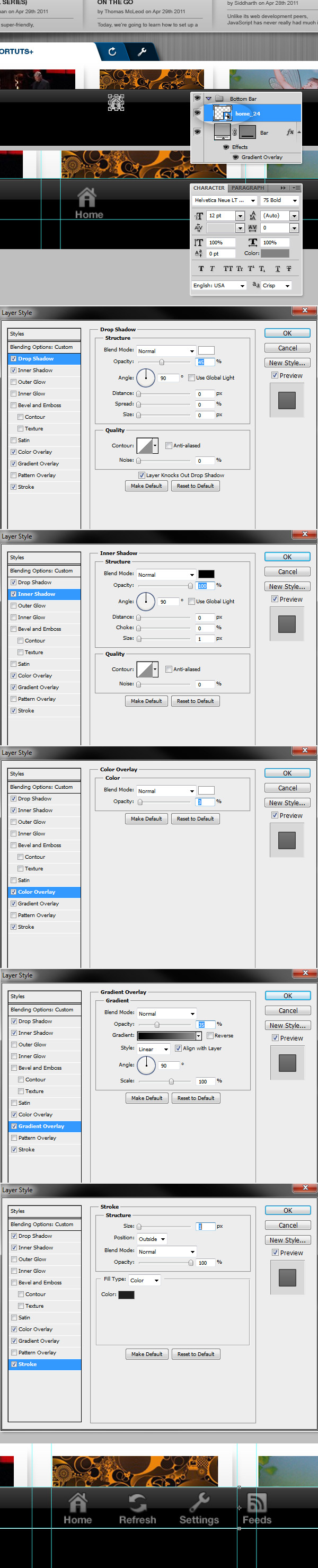
Add more icons over the tabs, "Refresh" and "Configure" (I’m using the icons set mentioned on the assets). Apply a Gradient Overlay and a Drop Shadows with the values shown on the screenshot below.
Step 21 – Close Tab
Now, add a tab for the "Close" button.
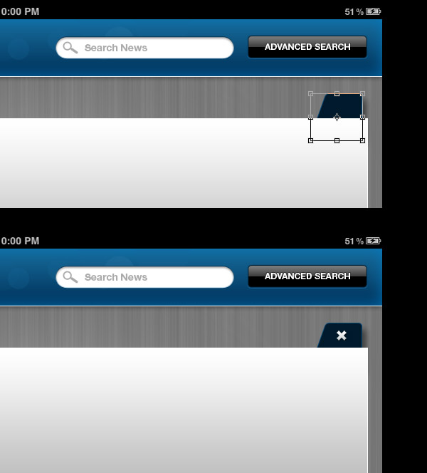
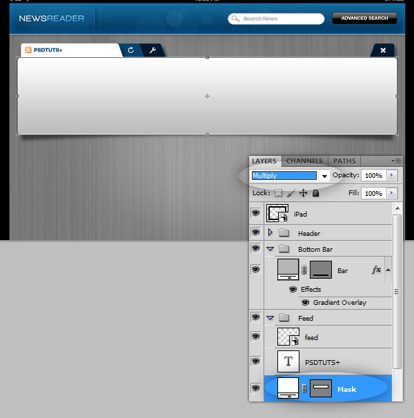
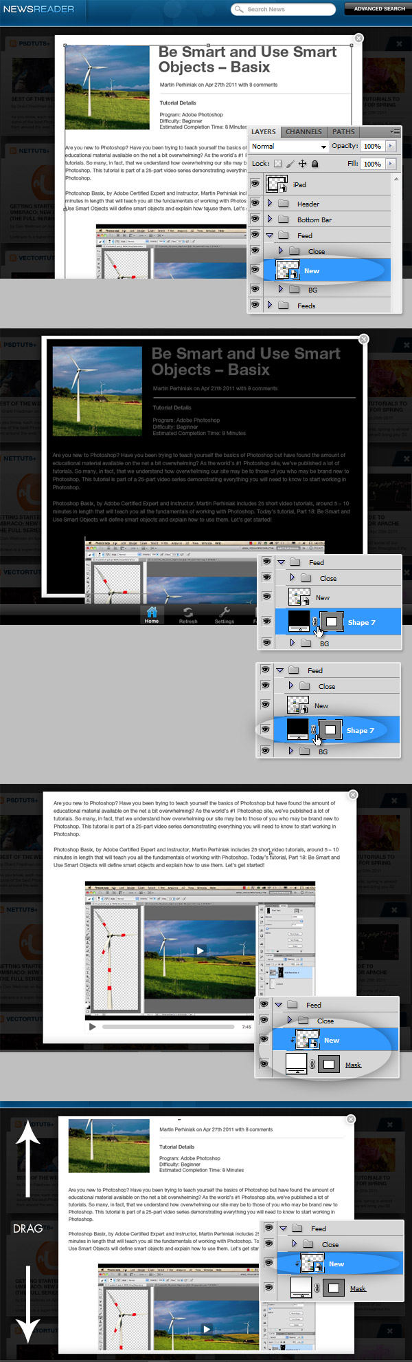
Step 22 – Start thinking on the animation, add a Mask.
Now we have all the Background layers created (inside a folder named "Feed Background"), and the title and icon outside. Now create a rectangular vector Rectangle above the "Feed Background" named "Mask". This will be a future mask to hide the visibility of the set of News that this feed will have. But don’t worry about it yet, just change it’s Blending Mode to Multiply.
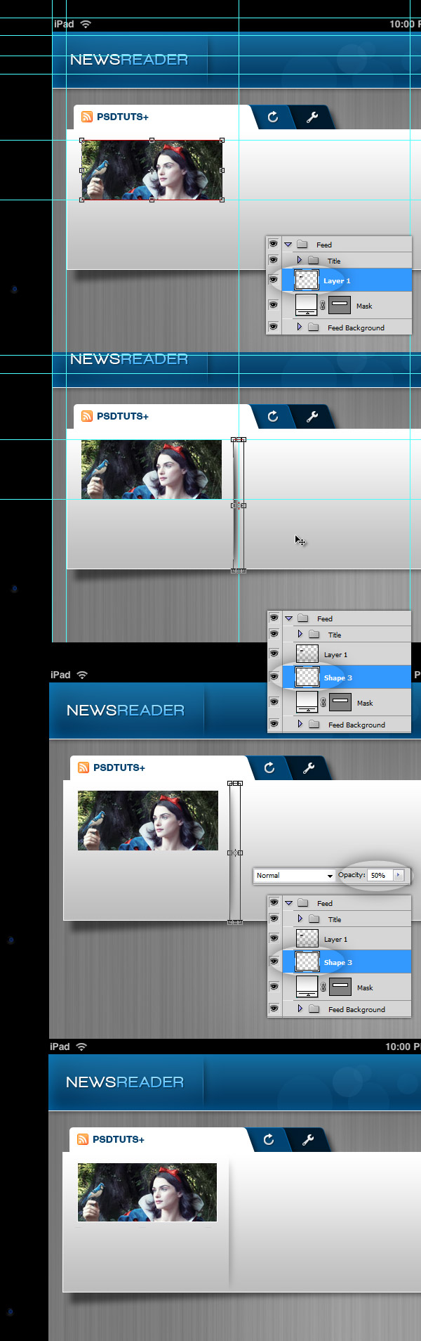
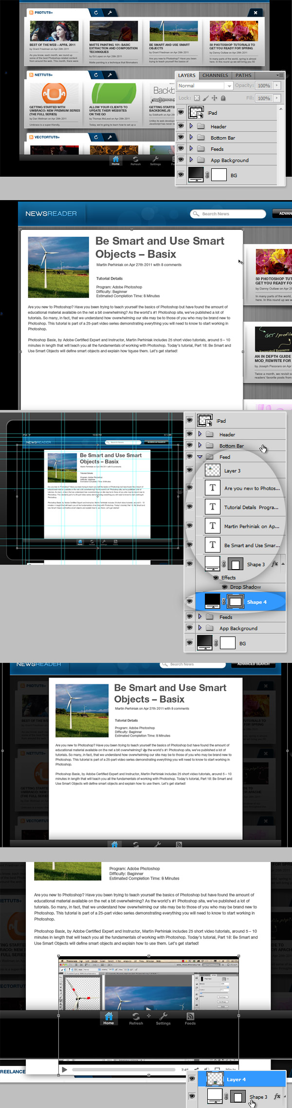
Step 23 – Add an article
Each row in our app, will contain several articles, let’s add one (I’m using several articles of tuts+ network as samples). Place a rectangular picture between the "Mask" layer and the "Title" layers – see the screenshot below. Repeat the process described on the Step 8 to create a shadow divider, and change it’s Opacity to 50%.
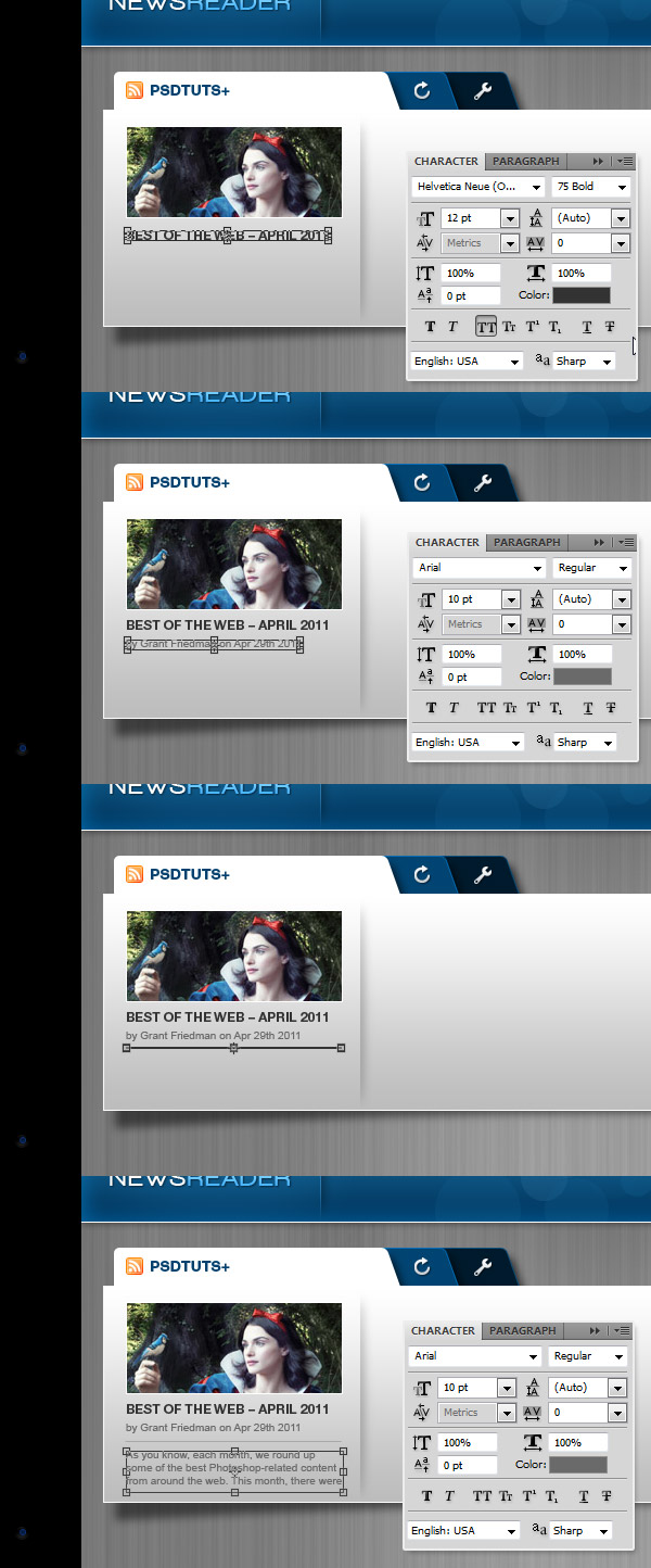
Step 24 – Article Content
Let’s add a Title for our article, a line of metadata and a brief paragraph of text. See the following screenshot to see the suggested typography and colors. Finally put all the layers related to an article into a folder named "Article".
Step 25 – Add more articles
Add more articles, until fill the entire row. Once you run out of space, select all the article folders you just created (Command/Ctrl + Shift on the Folder miniatures on the layers panel) and drag them to the left as necessary to add another article at the right. Add as many articles as you want, finally drag all the articles back to the original position (with the first article left aligned with the feed background).
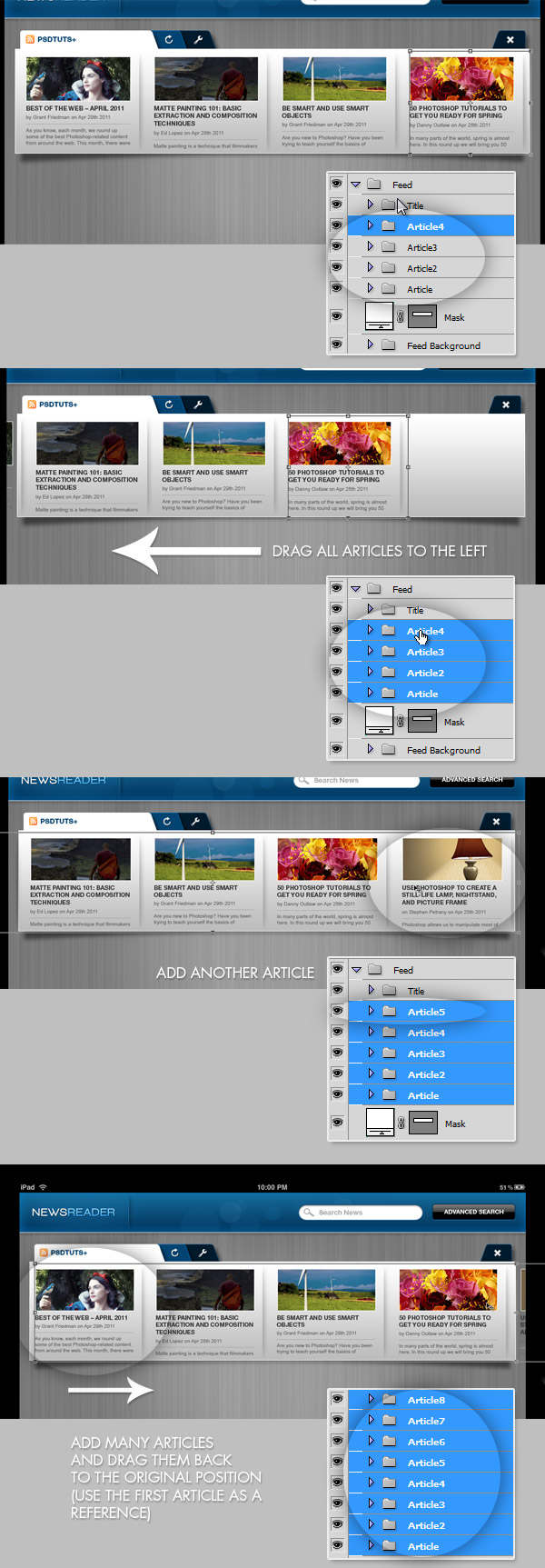
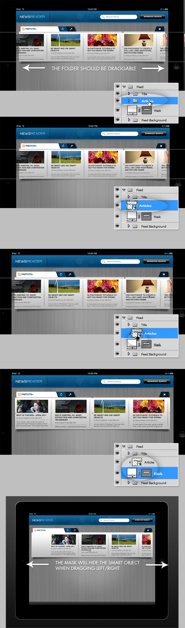
Step 26 – Convert the articles into a Smart Object
Put all the articles into a new Group named "Articles". Ensure the folder can be dragged left and right as shows the image below. Then convert the Folder into a Smart Object. Then, convert the "Mask" layer into a Clipping Mask (Option / Alt click between the "Articles" Smart Object and the "Mask" layer). Now, try to drag the "Articles" object left and right, the "Mask" layer should hide the articles outside the Mask area. At this point this news feed actually have all the layers necessary to animate its behavior.
Step 27 – Add more Feeds
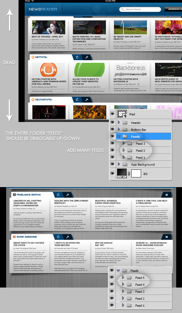
Now, add many rows of news feeds, and put each row into a Folder with its respective name: "Feed1", "Feed2", etc. Then add all the feeds into a new folder called simply "Feeds". You can duplicate the background and create different articles inside each one, but DO NOT duplicate the "Articles" smart object from the first feed, just create one from scratch. Ensure the entire "Feeds" folder is easily draggable from top to bottom and vice-versa. You can even add a couple of feeds with only text on them.
Drag all the "Feeds" from bottom to top, and leave visible only the bottom two.
Step 28 – Bottom bar
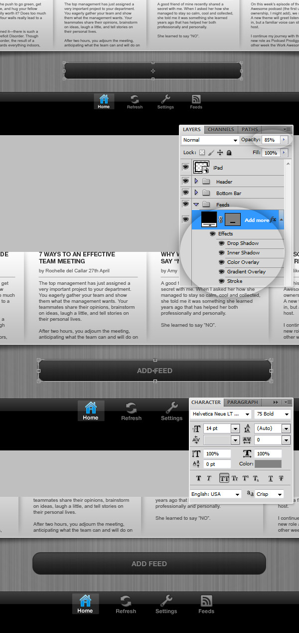
On the "Bottom Bar" folder (Step 11) add the following navigation icons: "Home", "Refresh","Settings","Feeds" from the assets. Add each icon name below its icon using "Helvetica Neue 75 Bold" (#818181). Then apply to the icon the Layer Styles shown on the screen below. Finally, create a new Style for a Selected/Active icon.
Step 29 – Selected / Active icon
Add a transparent box behind it and change the name foreground color to white. You should get something like the bottom of the screenshot below..
Step 30 – "Add Feed" button
Inside the "Feeds" folder, add a button (Rounded Rectangle 5px radius) copy and paste the layer style of the bottom bar icons if you want to save time. Then add the word "Add Feed" with "Helvetica Neue 75 Bold" (#828282) and align it to the middle of the button.
Step 31 – Add an actual Article
The structure of your layers so far, should contain an "iPad" smart Object, the "Header" the "Bottom Bar", the "Feeds" folder and the "App Background".
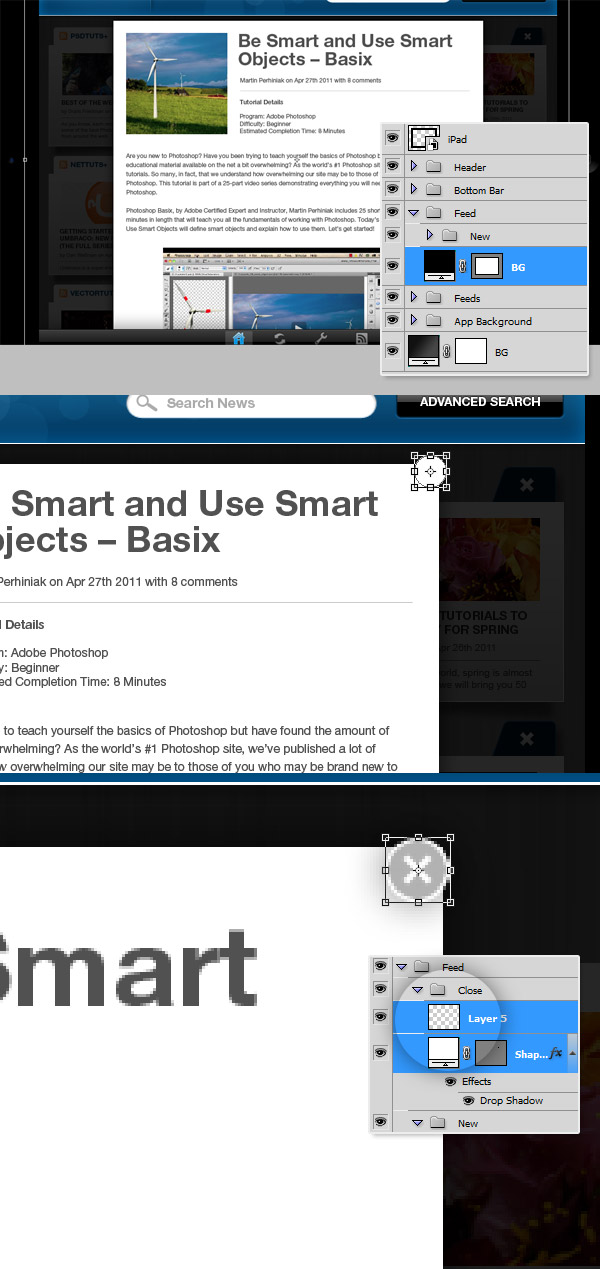
Now add a new set of Layers into a folder named just "Feed" between the "Bottom Bar" folder and the "Feeds" folder. This folder will contain an article, create a white background, and add some content (Title, Thumbnail and a brief paragraph of text) on it. Draw a big Black Rectangle just inside the bounds of the app area and down its Opacity to 75%. Then Center Align the white area. Does not matter if the content you added exceeds the app area, actually we will animate a scroll effect for this content. Let’s move forward.
Step 32 – Add the Close Button
First organize your layers, name the Black background "BG" and arrange it to the bottom. Then put all the text layers, thumbnails and images into a folder named "New" or "Article".
Using the Ellipse Tool, draw a white circle in the top right corner of the feed area and apply a subtle Drop Shadow to it. Then paste (or draw) a nice "X" as close button, put all these layers into a folder named "Close".
Step 33 – Sliding the Article
Select the "New" folder and convert it into a Smart Object, Then create another rectangle, above the white background and name it "Mask" (it is shown in black on the screenshot) and use it as a Clipping Mask for the "New" Smart Object. Then using the Move Tool (V) drag the object from top to bottom and vice-versa to be sure everything looks good. Finally put the article to its original position (left – top aligned).
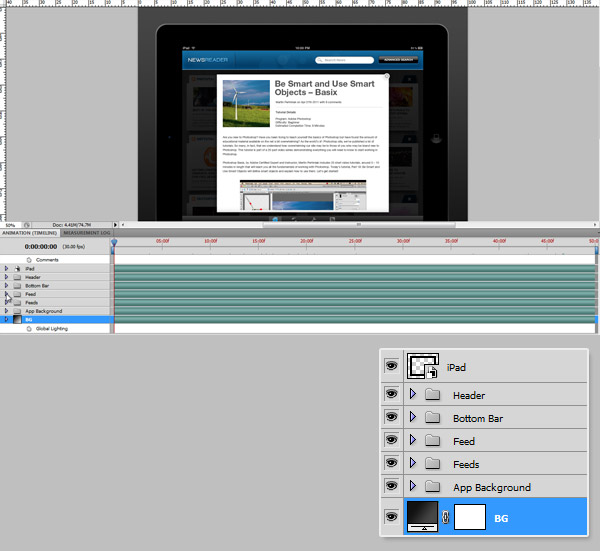
Part 2 – Animation
Before moving forward on this, is important to have all the layers organized and the smart objects properly created. The layer structure should be this, from top to bottom: "iPad" Smart Object, then "Header", "Bottom Bar", "Feed", "Feeds" and "App Background" folders, and finally the general "BG" layer.
Then it’s important you have created the "Articles" Smart Object from the first row of feeds (Step 26), because a Smart Object contains a complete timeline, and you can nest animated transitions in many levels (I know it sounds confusing but it will make sense in a couple of steps).
You will need a decent CPU and Graphic Card to render the animation, so patience is a great ingredient here.
Remember: we will animate the behavior of the app, you should always keep in mind the process from taking a look at the news feeds, scrolling through the articles and finally open an article to read it.
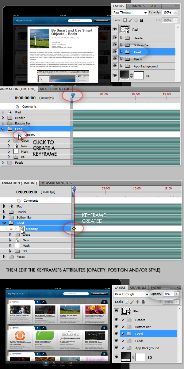
Step 34 – Show the Animation Panel
Go to Window > Animation. This panel contains a Timeline where you can put keyframes to animate transitions between Post ion, Opacity, and Layer Styles. In this tutorial we will animate Position and Opacity. This area is not too different to other video editing programs like After Effects or Premiere, if you are a newbie it is a great starting point.
Step 35 – Hide the Feed
Let’s start the fun part of this tutorial!
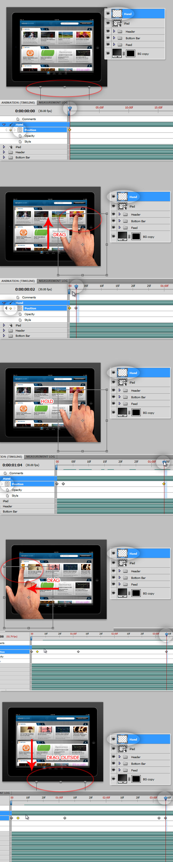
We will start hiding a Folder that should not be loaded from the beginning. The popup feed should remain hidden until an action makes it visible. For this, on the Animation Panel, look for the "Feed" folder and click over the tiny triangle next to it to expand the animation options. Then move the triangular slider on the Timeline and place it on the very beginning of the animation. Click on the little Stop Watch icon next to the Opacity option under the "Feed" folder, that how you create a Keyframe. Once you have the keyframe created, you can apply all the changes of the properties you want, in this particular case, we will reduce the "Feed" folder Opacity down to 0%. And that’s it, this folder will remain hidden until we make it visible again.
Step 36 – Animating the Articles
Browse your folders on the Animation Panel and found the "Articles" Smart Object of the "Feed 1" row and expand its options. – Drag the handler on the timeline a little bit to the right, next to 1s (one second), then click on the Stop Watch icon to create the first Keyframe. Ensure at this point that the position of the Object is left aligned with the feed row background. – Drag the handler next to the 4s on the Timeline and click on the little yellow square to the left of the Position Option (between the next/prev arrows) to create a new Keyframe. Now, using the Move Tool, drag the "Articles" Smart Object to the left, in order to have the Object, right aligned with the feed row background. – Move the handler to the 5s on the Timeline and insert a new Keyframe (remember, clicking the little yellow square) and simply hold it’s position (do not move anything). – Finally move the handler next to the 7s on the Timeline, create a new keyframe and using the Move Tool, turn back the "Articles" Object to it’s original position, left aligned to the feed background.
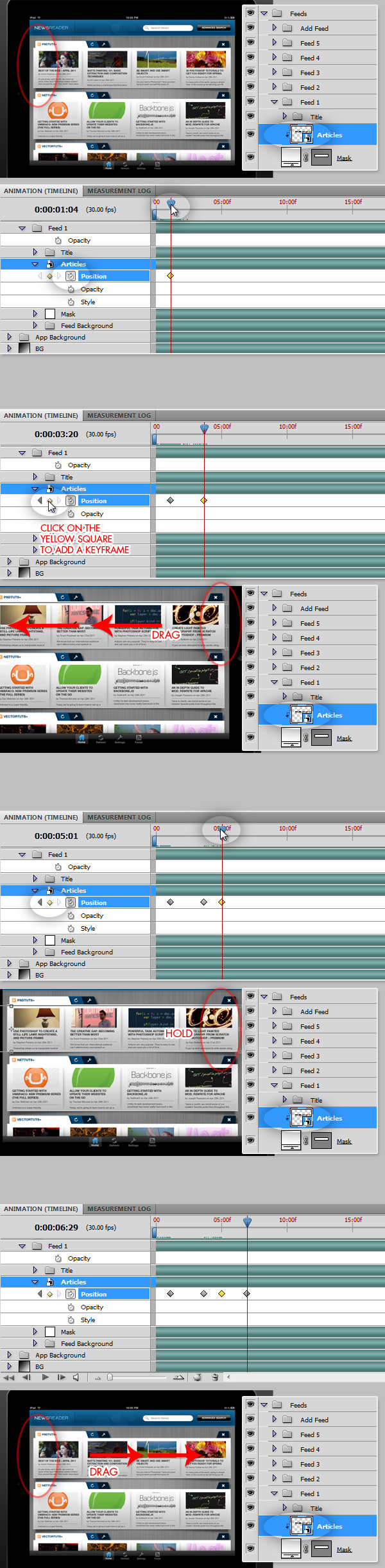
If you want to, you can preview this little part of the animation process by going to File > Export > Video Preview. There are two handlers on the left and right areas of the timeline that you can drag to reduce the work area, making the rendering process quicker.
Step 37 – Convert all the Feeds into a single Smart Object
Starting to make sense right, let’s move forward. Now we will animate the entire "Feeds" folder. Since we cannot directly animate the Position of a folder, we will need to convert it into a Smart Object, but what happens with the nice animation we just did with the articles? Once you convert the entire folder into an Smart Object all its timeline and all its keyframes keeps the same. The timeline is unique anyway, if there’s a transition effect on the third second of animation into a Smart Object, it will remain visible in all its parent files and timelines. You can test it by exporting the animation with the Smart Object instead of the folder and you will see no difference.
In order to mask it correctly (to avoid seeing a number of articles moving behind the iPad) Create a copy of the "BG" layer, place it over the "Feeds" object and apply a Vector mask, making only visible the app area (1024x768px).
Step 38 – Animate the Feeds Object
Select the "Feeds" Smart Object and open the Animation Panel. There move the Timeline handler next to the 7s, create a Position keyframe, ensure the feeds are aligned to top. Then move the handler next to the 11s and create a Position keyframe, there move the entire object until is bottom aligned. Then on the 14s on the timeline create another Position keyframe, but do not move the object, just leave it bottom aligned, this will create a Hold effect. Finally move the timeline handler next to the 15s and create a keyframe, drag the object until is top aligned again.
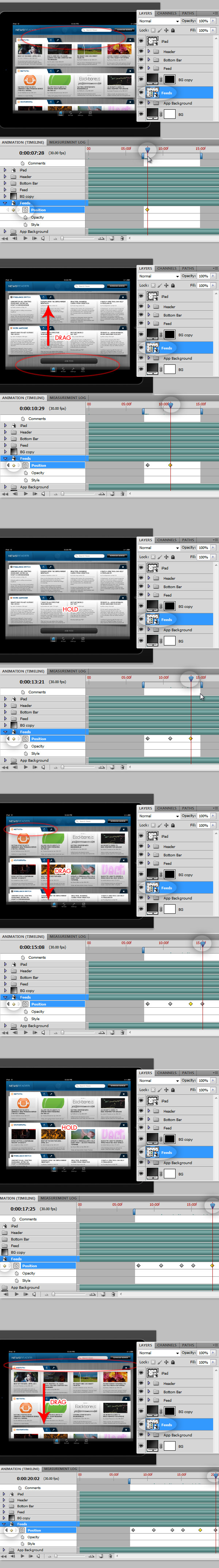
Previewing the previous animation step you should have something like this:
Step 39 – Animate the popup feed
First we will need to make the popup visible again, remember we hide it on the Step 35. Select the "Feed" folder and on the Animation Panel move the timeline handler next to the 20s and create a keyframe. Then move the handler to the 22s and create another keyframe, there change the Opacity of the folder to 100%. Next create another keyframe next the 30s and keep the Opacity in 100%. Finally, create a keyframe next to the 31s and change the Opacity of the entire folder back to 0%.
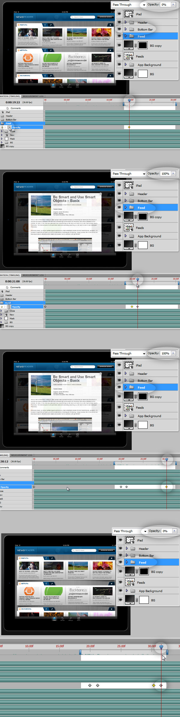
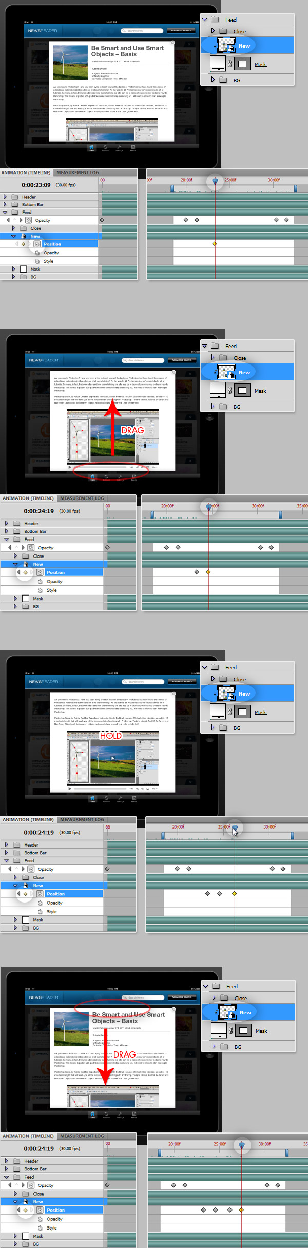
Step 40 – Animating the content of the article
Is time to animate the content of our pop up article. On the Step 33 we created a smart object inside the "Feed" folder. Select it and ensure it is properly masked with the "Mask" layer behind it. On the Animation Panel. On the 24s of the timeline, create a Position Keyframe for the "New" or "Article" Smart Object ensure the article is top aligned. Then next to the 25s create a Position keyframe and drag the smart object until the article is bottom aligned. Then on the 26s create a keyframe without changing the object position. Finally next to the 28s create a keyframe dragging the object back to its top aligned position.
Previewing the two previous steps you should have something like this:
At this point you know how to drag, hide and move layers and how they look exporting the animation. All the behavior of the app is animated, so you can stop here. but if you want to you can add some visual aids to help your client/costumer to understand better your ideas.
Step 41 – Animating the hand
Place the hand image from the assets, extract it from its background and if you want, add a Drop Shadow effect.
Step 42 – Scrolling the articles
Now everything is basically animate the position of the hand trying to match the animation. First move the hand horizontally creating the effect of scrolling through the articles of the horizontal news feed.
Step 43 – Scrolling the feeds
Then animate the hand to create the effect of scrolling through the new feeds vertically. Don’t forget: try to match the positions of the keyframes previously created when animating the app flow.
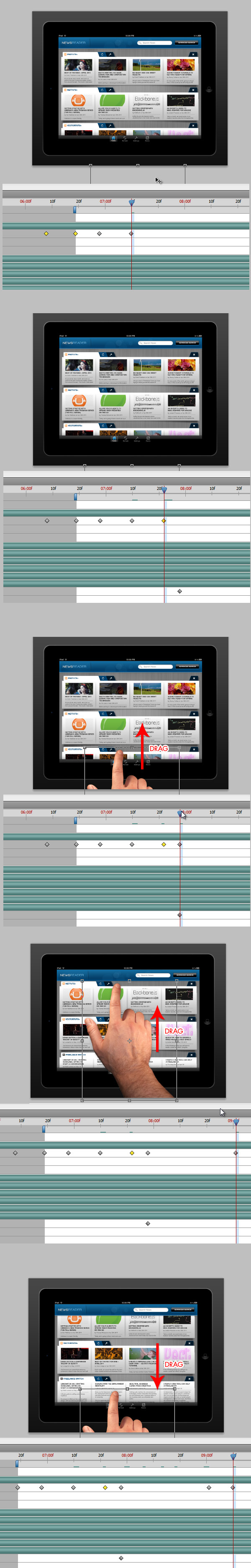
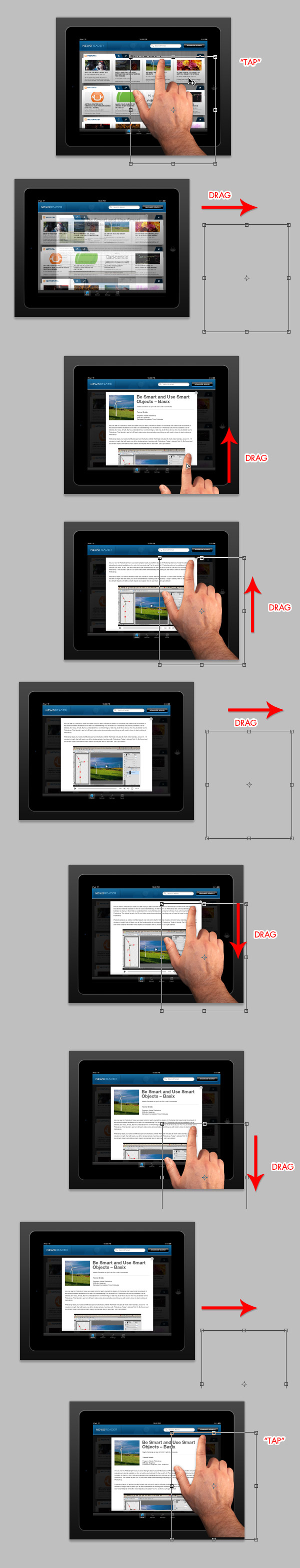
Step 44 – Scrolling the popup article
Then animate the hand to match the vertical scroll of the article content. First locate the hand over the selected article on any feed to create a "Tap" effect. Then move it as shows the screenshots below to match the vertical scroll. Finally, locate the hand over the close button (remember, always match the previously created keyframes).
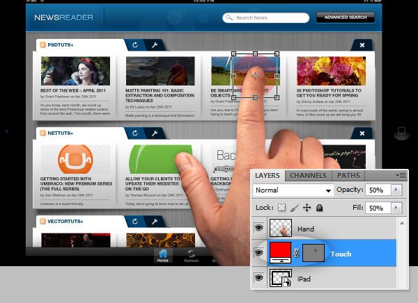
Step 45 – Optional Touch Layer
Just if you want to, you can create a circle layer named "Touch" and basically animate its Opacity when the hand is tapping the article.
Conclusion
After several keyframes, tons of layers and no less Smart Objects, you should have something like the video below. Now, this is ready to be shown to any client or costumer. Good luck!
Original Link: http://feedproxy.google.com/~r/psdtuts/~3/pWScTxAw91s/
TutsPlus - Design
More About this Source Visit TutsPlus - Design