

Barcelona-based design studio Prctica has unveiled a new label design for 9+ wines, a natural wine producer based in Catalonia, Spain. The new labels feature a bold, graphic design that is both eye-catching and informative creating a beautiful packaging design.
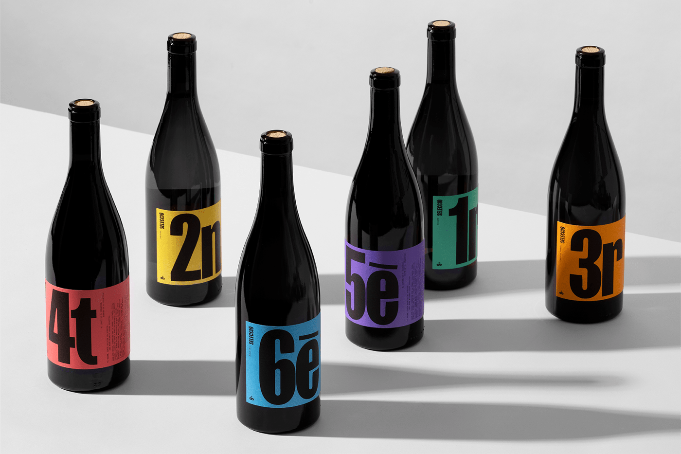
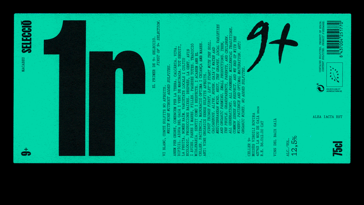
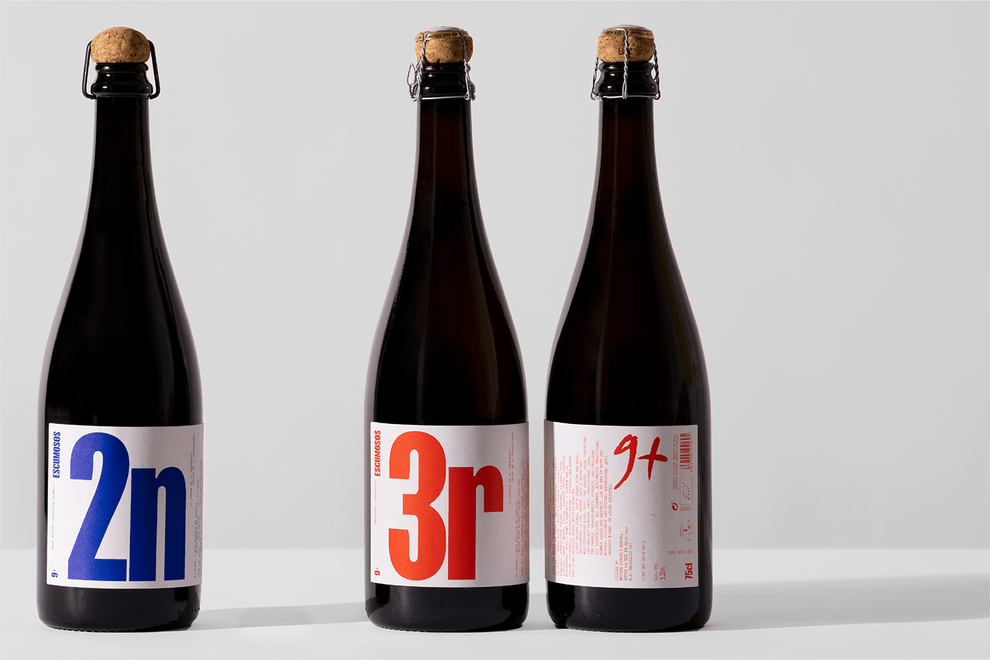
The 9+ winery is unique in that it is the only winery in Catalonia, and perhaps in the world, whose name is a number, not a word. This presented a challenge for Prctica, as they needed to create a label design that would be both memorable and easy to understand.
The solution was to use a simple, yet effective, naming and graphic system. Each label features the number 9+, followed by the name of the wine and the grape variety. The background of each label is a different color, which helps to visually differentiate the different wines.
This project presented the challenge of designing 15 labels, all under a global image but with different families: Base, Selection, and Sparkling. This need led us to create a naming and graphic system that orders and enumerates the wine bottles, not only to rationalize the wide range of products, but to strengthen the winerys identity as well as to make it stand out from the natural wine sector.
Here are some of the key features of the new 9+ labels and packaging design:
- Bold, graphic design that is both eye-catching and informative
- Simple, yet effective, naming and graphic system
- Different background colors for each wine to help visually differentiate the different wines
- Clean, modern website design that is easy to navigate
- Information about the winery, the wines, and the winemaking process
The new 9+ labels are a significant improvement over the previous designs. They have helped to make 9+ wines more visible and accessible to consumers, and they have helped to strengthen the winery's identity.
Packaging design artifacts


Credits
- Printed atChalaguier
- Photographed byEnric Badrinas
- Fonts in use: FK Screamer byFlorian Karsten& GT Alpina byGrilli Type
For more information make sure to check outPrcticawebsite.
 Abduzeedo is a collection of visual inspiration and useful tutorials