
Some of Our Sources
- Mashable
- Techcrunch
- Technology Review
- Smashing Apps
- Creative Curio
- Inspiredology
- My Ink Blog
- Stylized Web
- Codrops
- Willems Lab
Help Webnuz
Referal links:
React Toastify : The complete guide.
This article was originally published on the React Toastify : The complete guide.
In this guide we will start with the basics for creating toast notification and step by step move on to creating complex notifications and exploring the full capabilities of the React Toastify library
Here is the run up on what we are going to learn in this article
- What are Toast Notifications?
- What is react Toastify?
- Installing react Toastify
- Creating a basic toast notification
- Types of Toast Messages
- Setting the Toast Message Position
- Custom Styling with HTML and CSS of Toast Messages
- Using transition and animations
- Promise based Toast Messages
- Handling autoClose
- Render String, number and Component
- Setting custom icons, using built-in icons and disable icons
- Pause toast when window loses focus
- Delay toast notification
- Implementing a controlled progress bar
- Updating a toast when an event happens
- Custom close button or Remove the close button
- Changing to different transitions
- Defining custom enter and exit animation
- Drag to remove
If you are looking for JavaScript chat API and SDK, DeadSimpleChat is the solution for you.
What are Toast Notifications?
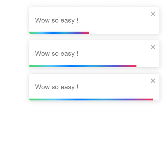
Toast or Toastify notifications are pop-up messages that come up with some information generally on the side bar. This could be information like sucess, loading, error or caution.
There could also be a progress bar or not. there are a variety of Toast Notifications available. Refer to below images for an example:
What is react toastify?
React toastify is one of the most popular libraries out there for creating toast notification in react.
With react toastify you can easily create toast notifications and alerts in your react application
Installing React Toastify
To install the react toastify, first you need a react application. You can easily add to your react application or if you learning you can create a new react application with create-react-app
Then, in your react applicaiton you can install react toastify by:
npm install --save react-toastifywith yarn
yarn add react-toastifyCreating a basic toast notification
Creating a basic toast notification is easy. In your App.Js file import react toastify and the react-toastify CSS like:
import { ToastContainer, toast } from 'react-toastify';import 'react-toastify/dist/ReactToastify.css';Creating a basic toast notification
Creating a basic toast notification is easy. In your App.Js file import react toastify and the react-toastify CSS like:
import { ToastContainer, toast } from 'react-toastify';import 'react-toastify/dist/ReactToastify.css';then in your App() function just create a notification
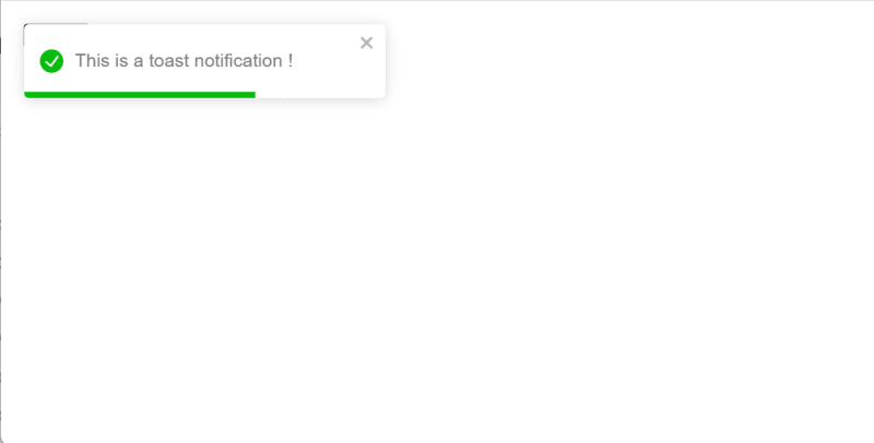
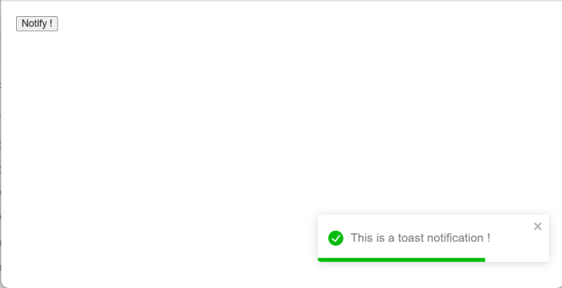
function App(){ const notify = () => toast("This is a toast notification !"); return ( <div> <button onClick={notify}>Notify !</button> <ToastContainer /> </div> )}Now we have learnt how to create basic toast notifications. Let us now learn about some of the properties of toast notifications, styling characterstics and the types of toast notifications available
Types of toast notifications
There are 5 pre-defined types of toast notifications available in the react toastify
these are:
- Default
- info
- success
- warning
- error
This is how these four types look like and how you can implement each of the type below:
Just call the Toast Emitter with the type you want to implement
Default

const notify = () => toast("This is a toast notification !");This is the default, so no need to call anything here. The complete function looks like this:
function Toastify(){ const notify = () => toast.error("This is a toast notification !"); return ( <div> <button onClick={notify}>Notify !</button> <ToastContainer /> </div> )Info
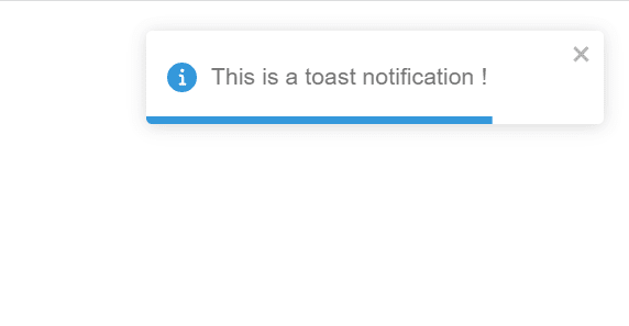
const notify = () => toast.info("This is a toast notification !");The complete function looks like
function Toastify(){ const notify = () => toast.info("This is a toast notification !"); return ( <div> <button onClick={notify}>Notify !</button> <ToastContainer /> </div> )}Success

const notify = () => toast.success("This is a toast notification !");the complete function looks
function Toastify(){ const notify = () => toast.success("This is a toast notification !"); return ( <div> <button onClick={notify}>Notify !</button> <ToastContainer /> </div> )}Warning
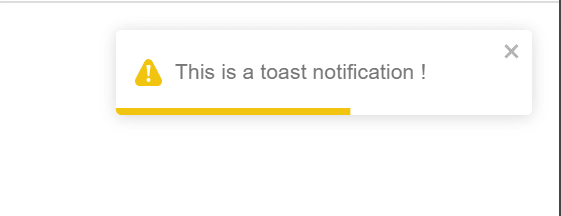
const notify = () => toast.warning("This is a toast notification !");function Toastify(){ const notify = () => toast.warning("This is a toast notification !"); return ( <div> <button onClick={notify}>Notify !</button> <ToastContainer /> </div> )}Error
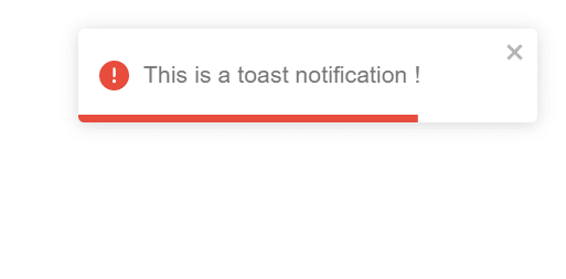
const notify = () => toast.error("This is a toast notification !");function Toastify(){ const notify = () => toast.error("This is a toast notification !"); return ( <div> <button onClick={notify}>Notify !</button> <ToastContainer /> </div> )}Setting the Toast Notification position
You can set the Toast notification position from a variety of pre set positions available in the react toastify library
the available positions are:
- top-left
- top-right
- top-center
- bottom-left
- bottom-right
- bottom-center
Here is how the positional notification looks like in each of the position and the code to implement the position
To add the position setting you need to edit the ToastContainer and set the position property like
<ToastContainerposition="top-right" />In our example you can set it like
function Toastify(){ const notify = () => toast.error("This is a toast notification !"); return ( <div> <button onClick={notify}>Notify !</button> <ToastContainer position="top-right" /> </div> )}you can set other settings like so:
<ToastContainerposition="top-left"/><ToastContainerposition="top-right"/><ToastContainerposition="top-center"/><ToastContainerposition="bottom=left"/><ToastContainerposition="bottom-right"/><ToastContainerposition="bottom-center"/>The different positions look like this
top-left
top-right

top-center

bottom left

bottom right
bottom center

Custom Styling the notification with HTML and CSS
You can custom style the toast notification with HTML and CSS, here is how you can customize the notification
There are bunch of CSS variables that are exposed by the react toastify library. You can override them and do customization that most will work for most people.
Here are the variables that you can override:
:root { --toastify-color-light: #fff; --toastify-color-dark: #121212; --toastify-color-info: #3498db; --toastify-color-success: #07bc0c; --toastify-color-warning: #f1c40f; --toastify-color-error: #e74c3c; --toastify-color-transparent: rgba(255, 255, 255, 0.7); --toastify-icon-color-info: var(--toastify-color-info); --toastify-icon-color-success: var(--toastify-color-success); --toastify-icon-color-warning: var(--toastify-color-warning); --toastify-icon-color-error: var(--toastify-color-error); --toastify-toast-width: 320px; --toastify-toast-background: #fff; --toastify-toast-min-height: 64px; --toastify-toast-max-height: 800px; --toastify-font-family: sans-serif; --toastify-z-index: 9999; --toastify-text-color-light: #757575; --toastify-text-color-dark: #fff; //Used only for colored theme --toastify-text-color-info: #fff; --toastify-text-color-success: #fff; --toastify-text-color-warning: #fff; --toastify-text-color-error: #fff; --toastify-spinner-color: #616161; --toastify-spinner-color-empty-area: #e0e0e0; // Used when no type is provided // toast("**hello**") --toastify-color-progress-light: linear-gradient( to right, #4cd964, #5ac8fa, #007aff, #34aadc, #5856d6, #ff2d55 ); // Used when no type is provided --toastify-color-progress-dark: #bb86fc; --toastify-color-progress-info: var(--toastify-color-info); --toastify-color-progress-success: var(--toastify-color-success); --toastify-color-progress-warning: var(--toastify-color-warning); --toastify-color-progress-error: var(--toastify-color-error);}If changing variables is not enough for you. You can override existing class. Here are the classes that you can easily override
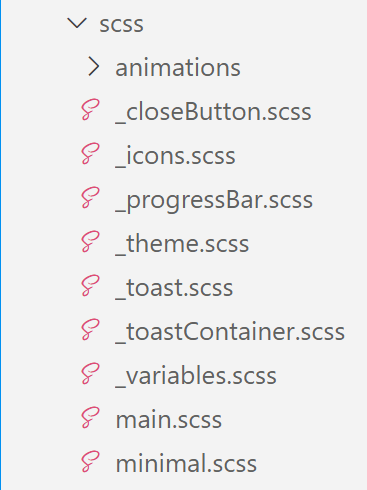
/** Used to define container behavior: width, position: fixed etc... **/.Toastify__toast-container {}/** Used to define the position of the ToastContainer **/.Toastify__toast-container--top-left {}.Toastify__toast-container--top-center {}.Toastify__toast-container--top-right {}.Toastify__toast-container--bottom-left {}.Toastify__toast-container--bottom-center {}.Toastify__toast-container--bottom-right {}/** Classes for the displayed toast **/.Toastify__toast {}.Toastify__toast--rtl {}.Toastify__toast-body {}/** Used to position the icon **/.Toastify__toast-icon {}/** handle the notification color and the text color based on the theme **/.Toastify__toast-theme--dark {}.Toastify__toast-theme--light {}.Toastify__toast-theme--colored.Toastify__toast--default {}.Toastify__toast-theme--colored.Toastify__toast--info {}.Toastify__toast-theme--colored.Toastify__toast--success {}.Toastify__toast-theme--colored.Toastify__toast--warning {}.Toastify__toast-theme--colored.Toastify__toast--error {}.Toastify__progress-bar {}.Toastify__progress-bar--rtl {}.Toastify__progress-bar-theme--light {}.Toastify__progress-bar-theme--dark {}.Toastify__progress-bar--info {}.Toastify__progress-bar--success {}.Toastify__progress-bar--warning {}.Toastify__progress-bar--error {}/** colored notifications share the same progress bar color **/.Toastify__progress-bar-theme--colored.Toastify__progress-bar--info,.Toastify__progress-bar-theme--colored.Toastify__progress-bar--success,.Toastify__progress-bar-theme--colored.Toastify__progress-bar--warning,.Toastify__progress-bar-theme--colored.Toastify__progress-bar--error {}/** Classes for the close button. Better use your own closeButton **/.Toastify__close-button {}.Toastify__close-button--default {}.Toastify__close-button > svg {}.Toastify__close-button:hover,.Toastify__close-button:focus {}you can also build your own style using the scss file. Just edit the scss directory and build your own stylesheet.
If you just want to change some colors and stuff like that you can easily do that by changing some variables
variables are defined in the __variables.scss file
Passing CSS classes to components
The ToastContainer will accept the following props for styling
- className
- toastClassName
- bodyClassName
- progressClassName
- style
toast("Custom style", { className: "black-background", bodyClassName: "grow-font-size", progressClassName: "fancy-progress-bar",});This is how you can customize the toast notification
Using transitions and animation
When it comes to animation there are millions of ways you can animate the toast notification.
m and of course you can create your custom animations as well
The four available transitions are:
- bounce
- slide
- zoom
- flip
You can use one of the default transitions like
to add a default transition import the transitions from react-toastify and then in the ToastContainer add the transition like shown above.
You can also implement the transition per toast as well, so you can have different transition for different toasts
Instead of the ToastContainer add the transition setting in the toast function
import { Bounce, Slide, Zoom, ToastContainer, toast } from 'react-toastify'; const notify = () => toast.success("This is a toast notification !");<ToastContainer transition={Zoom} /> </div>function Toastify(){ const notify = () => toast.success("This is a toast notification !",{ transition: Slide }); return ( <div> <button onClick={notify}>Notify !</button> <ToastContainer /> </div> )}For custom transition, create the custom transition and import it in your App.js file then in the ToastContainer or the toast function use it as you use the default transition. like
import { Bounce, Slide, Zoom, ToastContainer, toast } from 'react-toastify'; const notify = () => toast.success("This is a toast notification !");<ToastContainer transition={yourCustomTransition} /> </div>Promise based Toast Messages
The react toasitfy exposes a toast.promise function. You can add a promise or a function that returns a promise.
When that promise is resolved or fails the notification will be updated accordingly.
When the promise is pending a notification spinner is also displayed
function Toastify(){ const resolveAfter2Seconds = new Promise(resolve => setTimeout(resolve, 2000)) const notify = () => toast.promise(resolveAfter2Seconds, { pending: "waiting for the promise to resolve", success: "promise resolved successfully", error: "promise failed to resolve" }); return ( <div> <button onClick={notify}>Notify !</button> <ToastContainer /> </div> )}This is how you can create a promise based toast message.
Displaying a simple message is useful in most of the cases. For added interactivity you can display a message according to the promise response.
You can show some message if the promise resolves successfully or show some other message if the promise fails to resolve and even show a message when the promise is pending.
Here is how you can implement this:
function Toastify(){ const notify = new Promise(resolve => setTimeout(() => resolve("this is soo cool"), 2000));toast.promise( notify, { pending: { render(){ return "Promise Pending" }, icon: false, }, success: { render({data}){ return `Great, ${data}` }, // other options icon: "", }, error: { render({data}){ // When the promise reject, data will contains the error return <MyErrorComponent message={data.message} /> } } }) return ( <div> <button onClick={notify}>Notify !</button> <ToastContainer /> </div> )}Handling Auto Close
The autoClose property of the toast accepts a duration in milliseconds or false
import { ToastContainer, toast } from 'react-toastify';//Close the toast after 2 seconds <ToastContainer autoClose={2000} />You can also individually close each toast at different points in time
function Toastify(){ const notify = () => toast("closeAfter10Seconds", { autoClose: 10000 }); const notify2 = () => toast("closeAfter2Seconds", { autoClose: 2000 }); return ( <div> <button onClick={notify} >Notify !</button> <button onClick={notify2} >Notify2 !</button> <ToastContainer autoClose={2000} /> </div> )}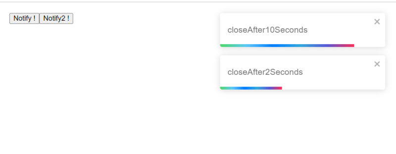
You can also prevent the toast notification from closing by default using the false statement instead of the seconds like
toast("hi", { autoClose: false });Render String, number and Component
You can render any react node including a String, number or even a component. This is how you can do it
import React from "react";import { ToastContainer, toast } from 'react-toastify';const Data = ({closeToast, toastProps})=>{ <div> Hi how are you? {toastProps.position} <button>Retry</button> <button onClick={closeToast}>close</button></div>}function Toastify(){ const notify = () => toast( <Data /> ); return ( <div> <button onClick={notify} >Notify !</button> <ToastContainer /> </div> )}Setting custom icons, using built-in icons and disable
There are built in icons available with the toastify library that are useful for most cases, you can include customize icons for your application and lastly you can delete the icons from the toast notification itself as well.
The toast types all display their associated icons, so you can specify a toast type and display the corresponding icon
Custom Icon
to display a custom icon simply supply the toast type with an icon like so
//you can use a stringtoast.success("custom toast icons". { icon: ""});//or a componenttoast.success("custom toast icons". { icon: CustomIcon});// or a functiontoast.success("custom toast icons". { icon: ({theme,type}) => <img src="url"/>});Pause taost when window loses focus
The default behavior of the toast is to pause whenever the window loses focus. But you can set it to not pause by setting the pauseOnFocusLoss property to false like
//All all toasts<ToastContainer pauseOnFocusLoss={false} />// for individual toaststoast('cool', { pauseOnFocusLoss: false})Delay toast notification
To delay notification display you can use setTimeout or use the delay prop that uses setTimeout under the hood
toast('cool')toast('how are you?', {delay: 1000});Limit the number of toast displayed
Notification can be handy, but there can be multiple number of notification displayed.
You can limit the number of notifications displayed using the limit prop
import React from 'react';import { toast, ToastContainer } from 'react-toastify';import 'react-toastify/dist/ReactToastify.css';// Display a maximum of 3 notifications at the same timefunction App(){ const notify = () => { toast("lorem ipsum"); } return ( <div> <button onClick={notify}>Click on me a lot!</button> <ToastContainer limit={3}> </div> )}When the number of toasts displayed hits the limit the remaining toasts are added to a queue and then displayed whenever a slot is available
You can clear the queue as well, to clear the queue so that no more toasts are displayed use the clearWaitingQueue() method
toast.clearWaitingQueue();Implementing a controlled progress bar
If you are programming a file upload or something else where you need to indicate the progress of the program then a controlled progress bar that indicates that process might come useful
Lets see an example where we upload file to the server and the progress bar will load as the file is being uploaded
import React from 'react';import axios from 'axios';import { toast } from 'react-toastify';function demoOfProgressBar(){ // Keeping a reference of the toast id const toastId = React.useRef(null); function uploadFiles(){ axios.request({ method: "post", url: "/cool", data: informationToBeUploaded, onUploadProgress: p => { const progress = p.loaded / p.total; // see if the toast is being displayed if (toastId.current === null) { toastId.current = toast('Uploading', { progress }); } else { toast.update(toastId.current, { progress }); } } }).then(data => { //When the upload is done the progress bar will close and the transition will end toast.done(toastId.current); }) } return ( <div> <button onClick={uploadFiles}>Upload files to server</button> </div> )}Updating a toast when an event happens
You can update a toast when an event happens, For example if you are uploading a file to the server, you can update the toast when the upload is completed
Things you can update
- Change the Type of toast or change colors or theme
- Change the content of the toast
- Apply a transition when the change happens
Lets see these with examples in action
1. Change the Type of toast or change colors or theme
import React from 'react';import { toast } from 'react-toastify';function changeToast() { const toastId = React.useRef(null); const notify = () => toastId.current = toast("this is soo cool", { autoClose: false }); const updateToast = () => toast.update(toastId.current, { type: toast.TYPE.INFO, autoClose: 2000 }); return ( <div> <button onClick={notify}>Notify</button> <button onClick={updateToast}>Update</button> </div> );}2. Change the content of the toast
Changing the content of the toast is easy as well. Just pass any valid element or even a react component.
In the below examples I will show how to render a string as well as component to change the toast in action
// With a string toast.update(toastId, { render: "New content", type: toast.TYPE.INFO, autoClose: 5000 });// Or with a componenttoast.update(toastId, { render: MyComponent type: toast.TYPE.INFO, autoClose: 5000});toast.update(toastId, { render: () => <div>New content</div> type: toast.TYPE.INFO, autoClose: 5000});3. Apply a transition when the change happens
If you want to apply a transition when a change happens thenyou can use the className or the transition property to achieve this
toast.update(toastId, { render: "stuff", type: toast.TYPE.INFO, transition: Zoom})Custom close button or Remove the close button
You can pass the a custom close button to the toast container and override the default button
Here is how you can do this.
import React from 'react'; import { toast, ToastContainer } from 'react-toastify'; const CloseButton = ({ closeToast }) => ( <i className="fastly-buttons" onClick={closeToast} > delete </i> );function App() { const notify = () => { toast("this is a toast notification"); }; return ( <div> <button onClick={notify}>Notify</button>; <ToastContainer closeButton={CloseButton} /> </div> );}Here is how you can define it per toast
toast("this is a toast notification", { closeButton: CloseButton})You can also remove it globally and show it per toast or show it globally and hide it per toast like:
toast("this is a toast notification", { closeButton: true})//hide it per toast and show globallytoast("this is a toast notification", { closeButton: false})Adding Undo action to toast messages
You can add a undo button to the toast messages. For example if some one did a action that they want to undo they can easily undo the action by clicking on the undo button
Drag to remove
you can drag the toast to remove it. You need to define the width percentage to remove the toast. You can also disable drag to remove.
set the percentage of drag when the toast is removed
pass the draggablepercent props with the percentage of screen that needs to be dragged to remove the toast as follow
<toastContainer draggablePercent={50} />toast('Cool',{ draggablePercent: 90})To disable the ability to drag to dismiss pass the false to draggable property
<ToastContainer draggable={false} />You can disable per toast notification as follows
toast('Cool',{ draggable: false})Here is how you can enable drag to remove in react Toastify notification.
Original Link: https://dev.to/alakkadshaw/react-toastify-the-complete-guide-164j
Dev To
 An online community for sharing and discovering great ideas, having debates, and making friends
More About this Source Visit Dev To