Your Web News in One Place

Help Webnuz

Referal links:

Sign up for GreenGeeks web hosting
December 6, 2022 02:43 pm GMT

Camang:gam branding inspired by geometric shape of Korean alphabet

Camang:gam branding inspired by geometric shape of Korean alphabet
abduzeedo120622

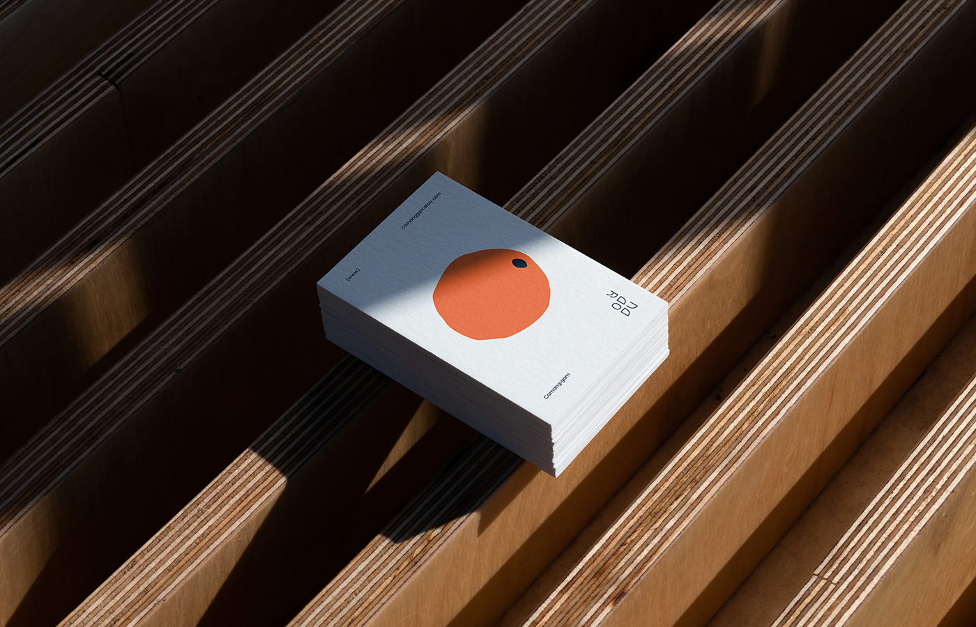
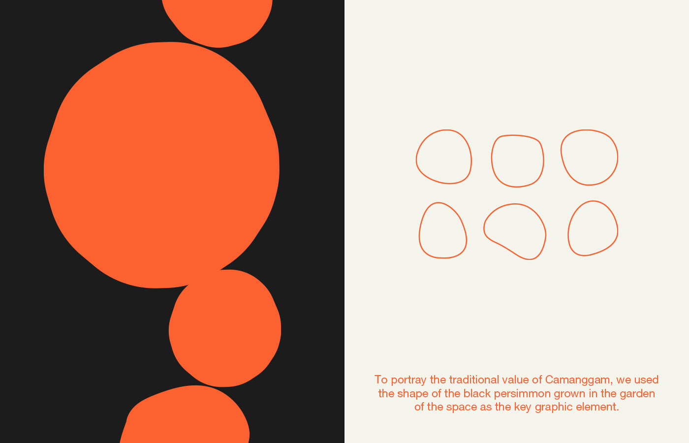
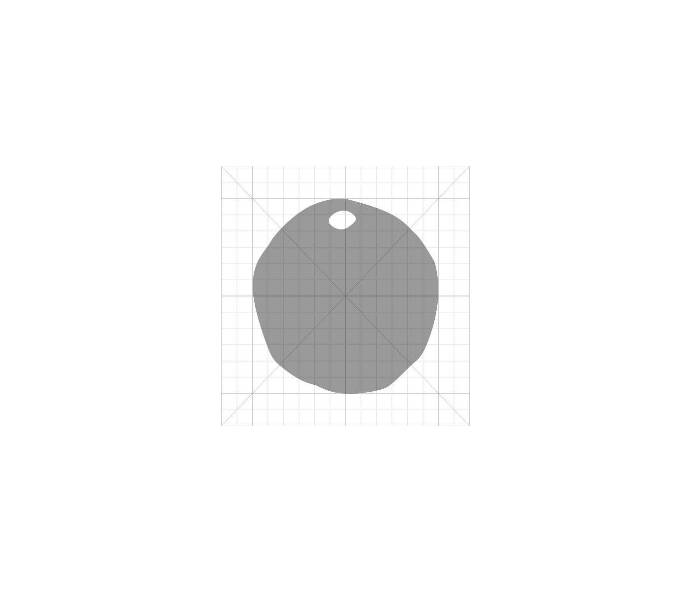
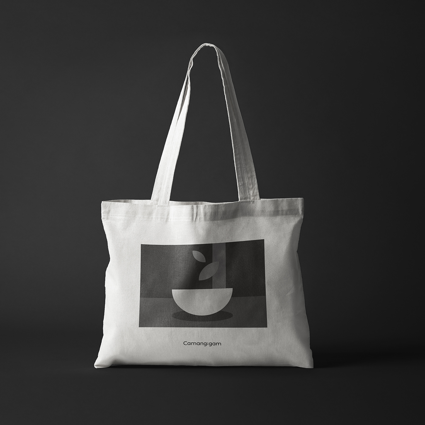
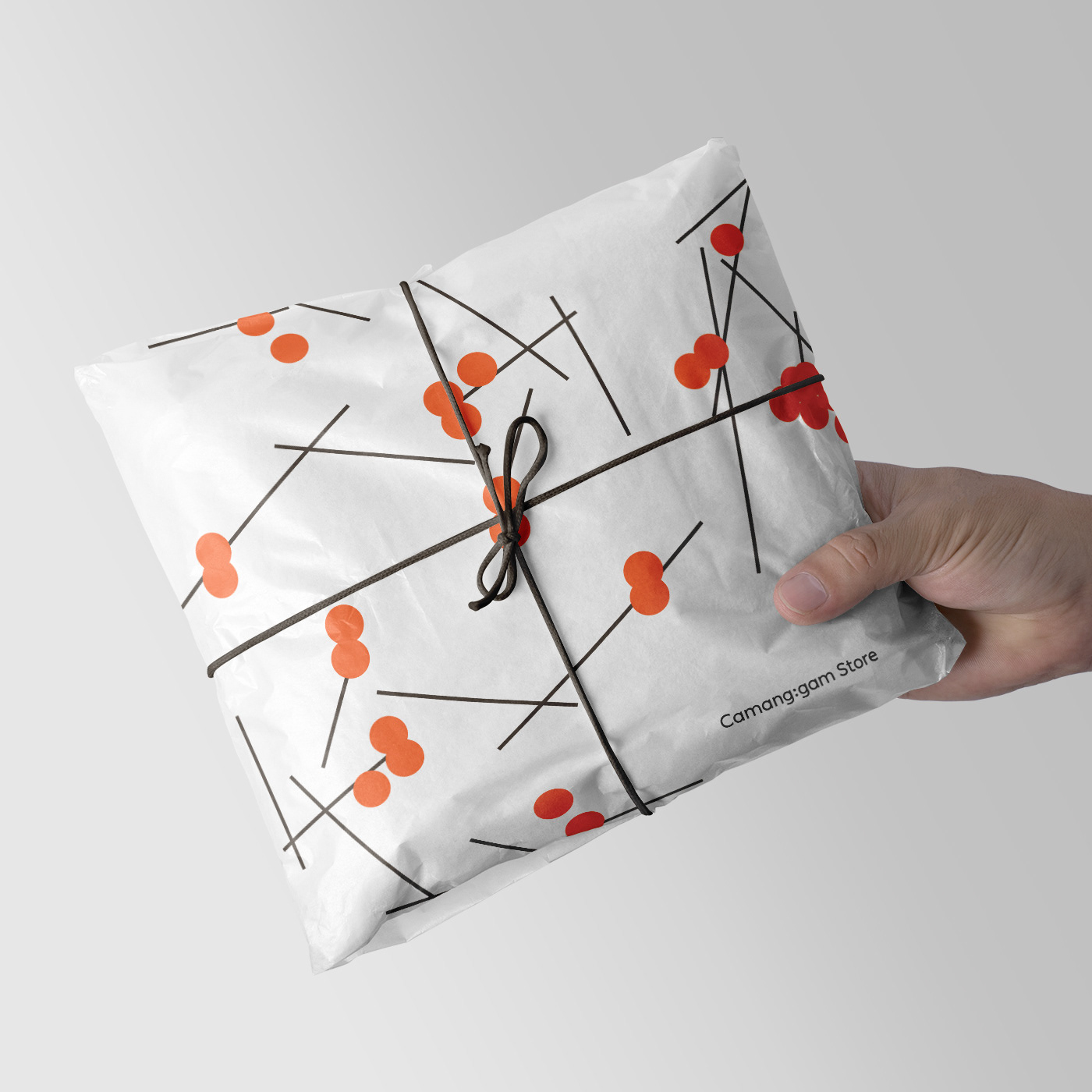
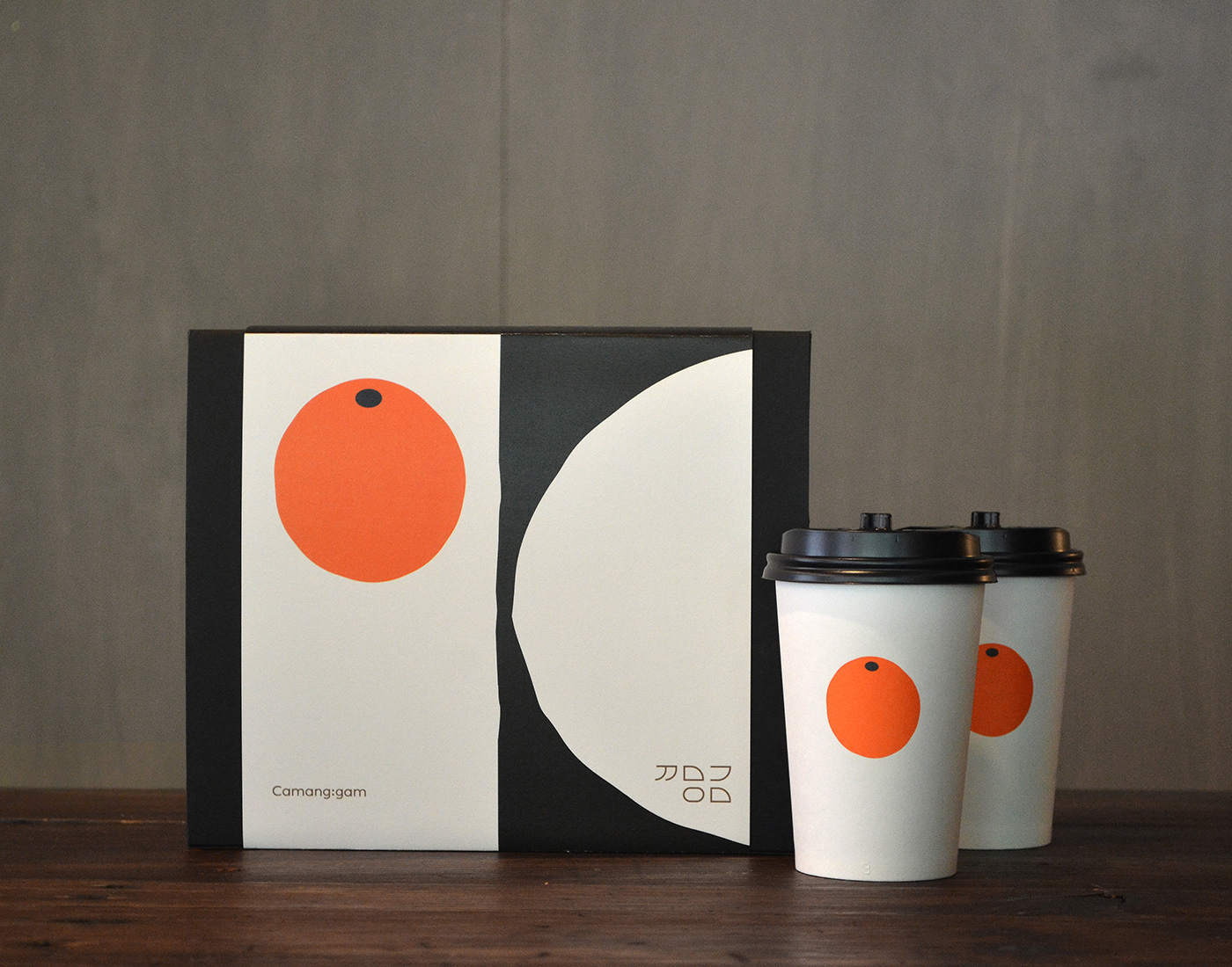
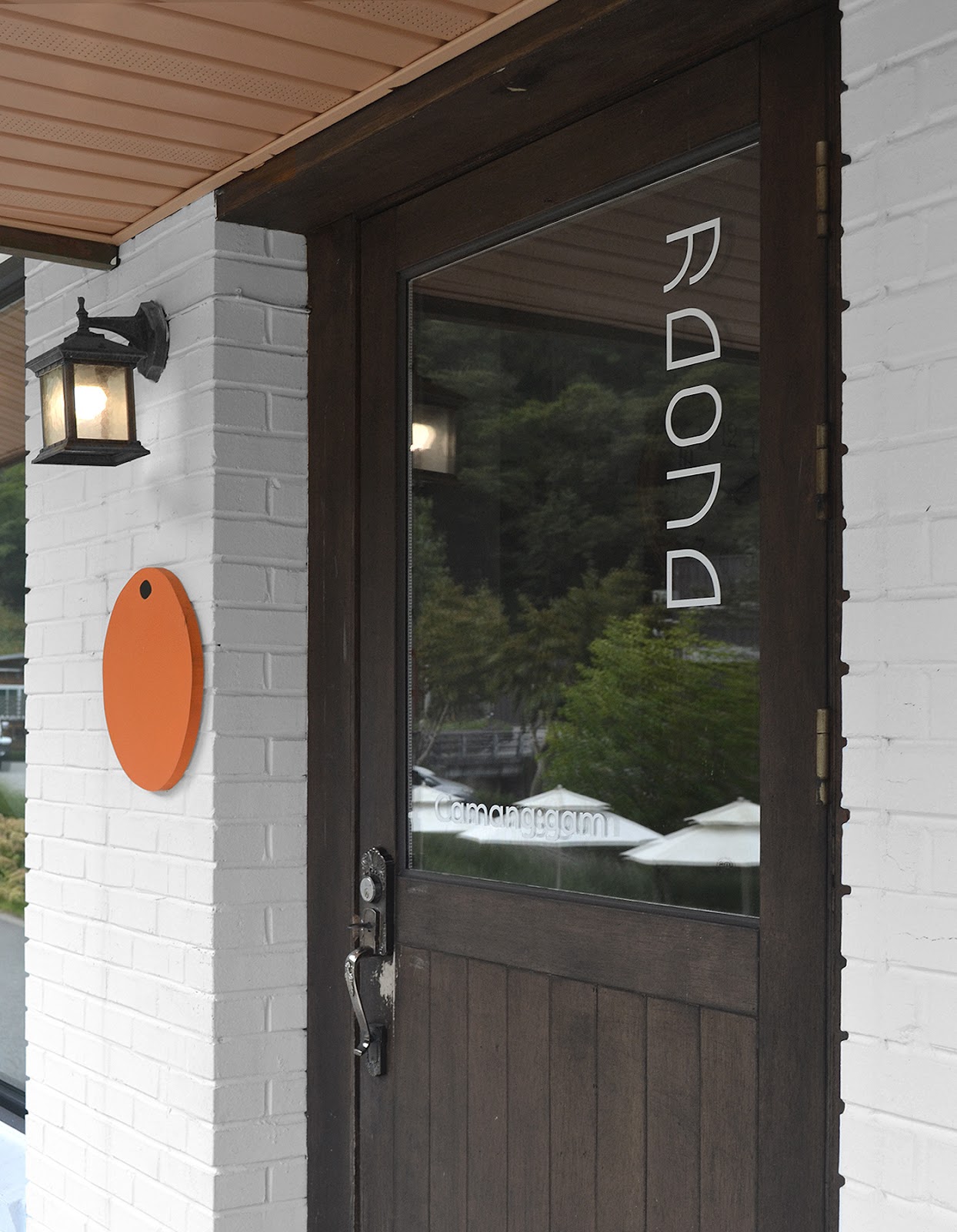
studio le_m shared a beautiful branding and visual identity project for Camang:gam. The name of Camanggam is derived from 'Mukgam', which means black persimmon in Korean. We would like to continue the tradition of the ink stick with the seeds of the black persimmon tree growing in the garden of the black persimmon Stay.

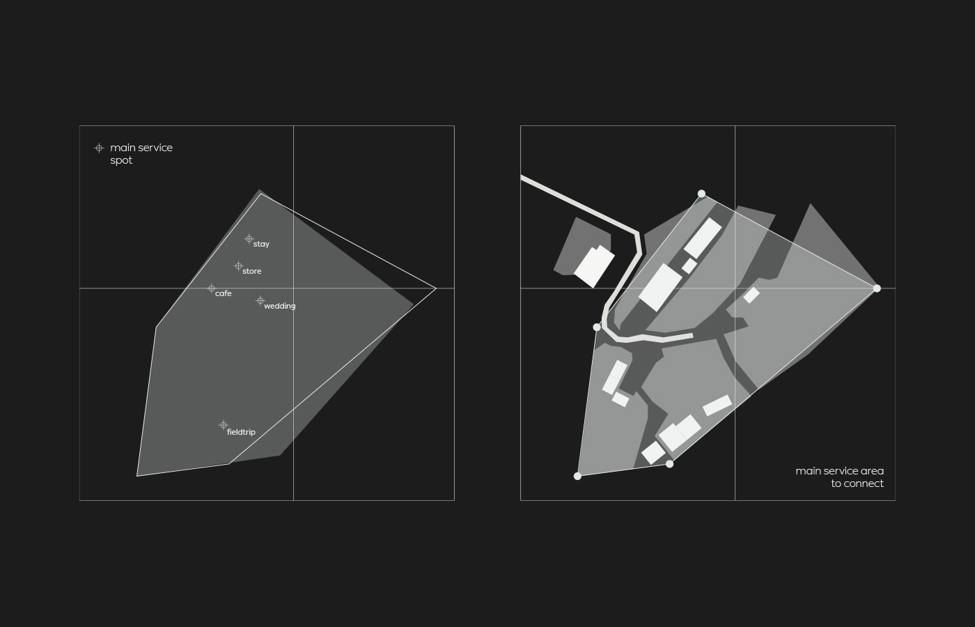
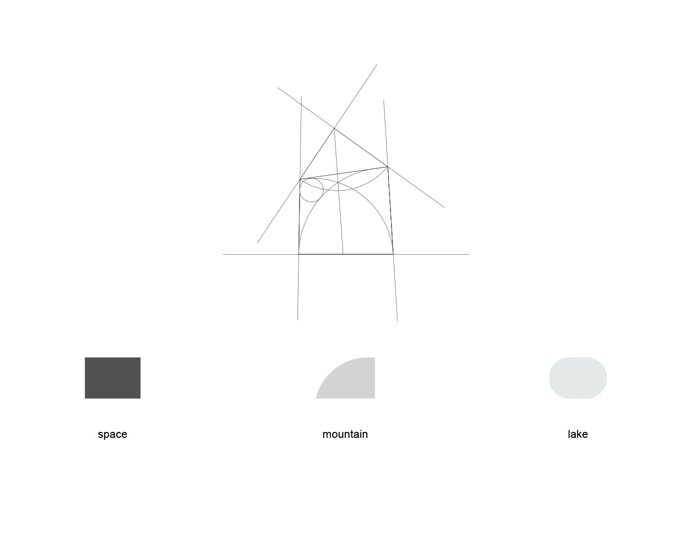
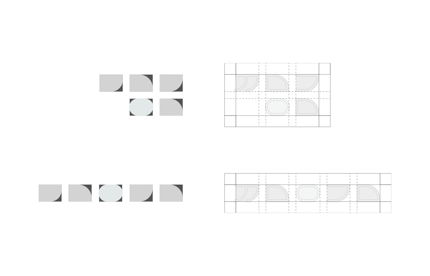
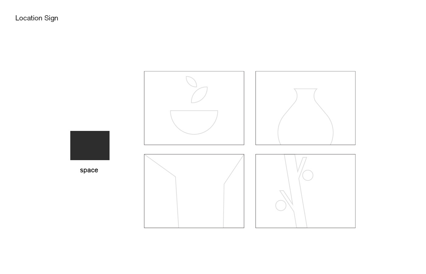
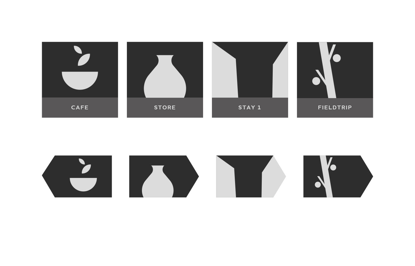
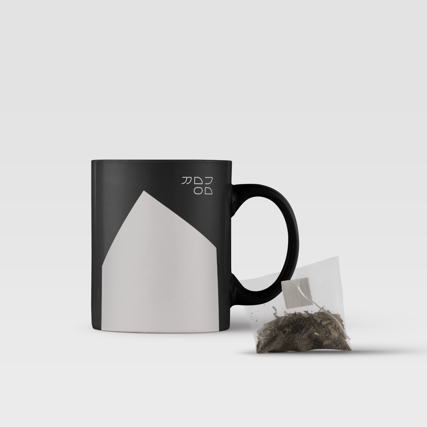
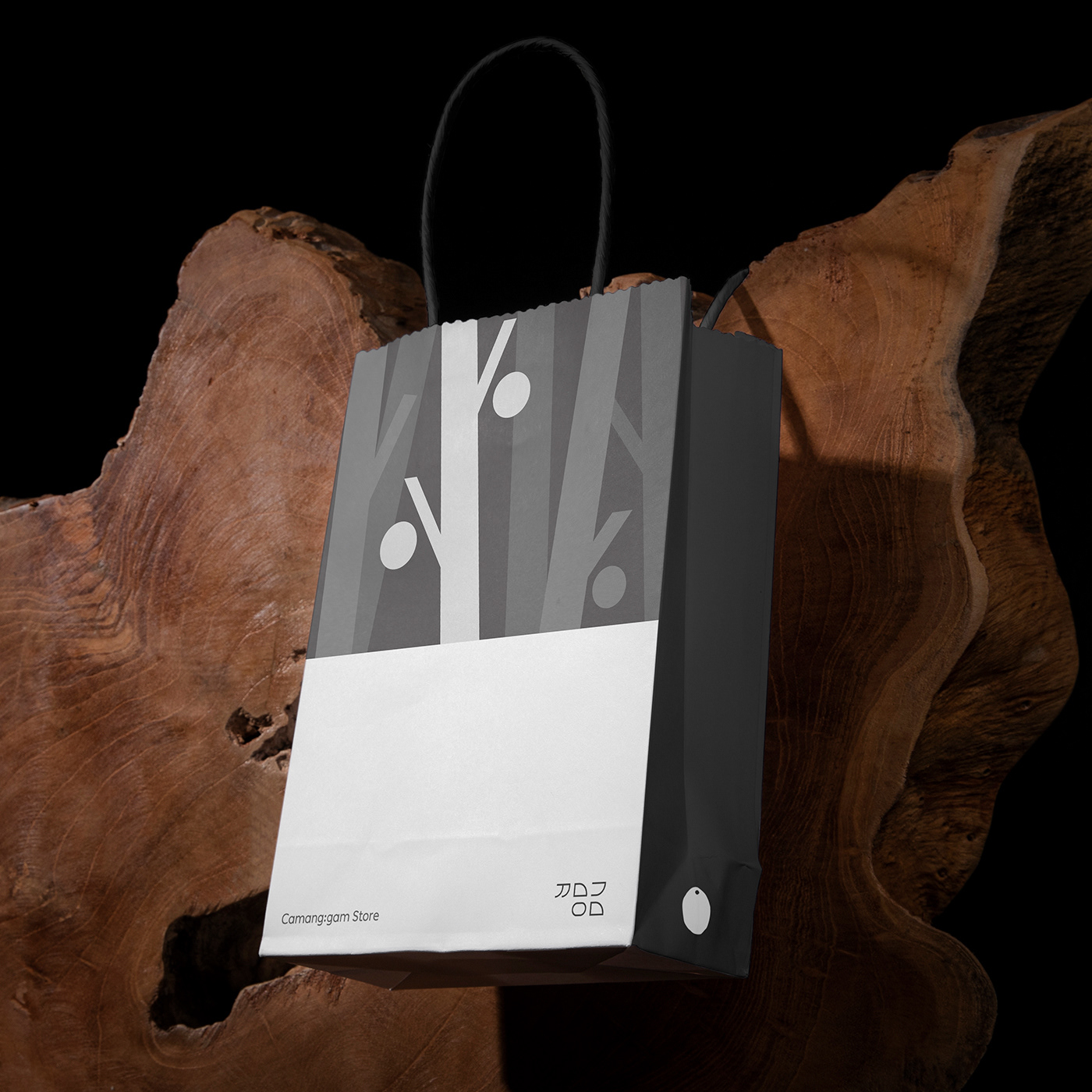
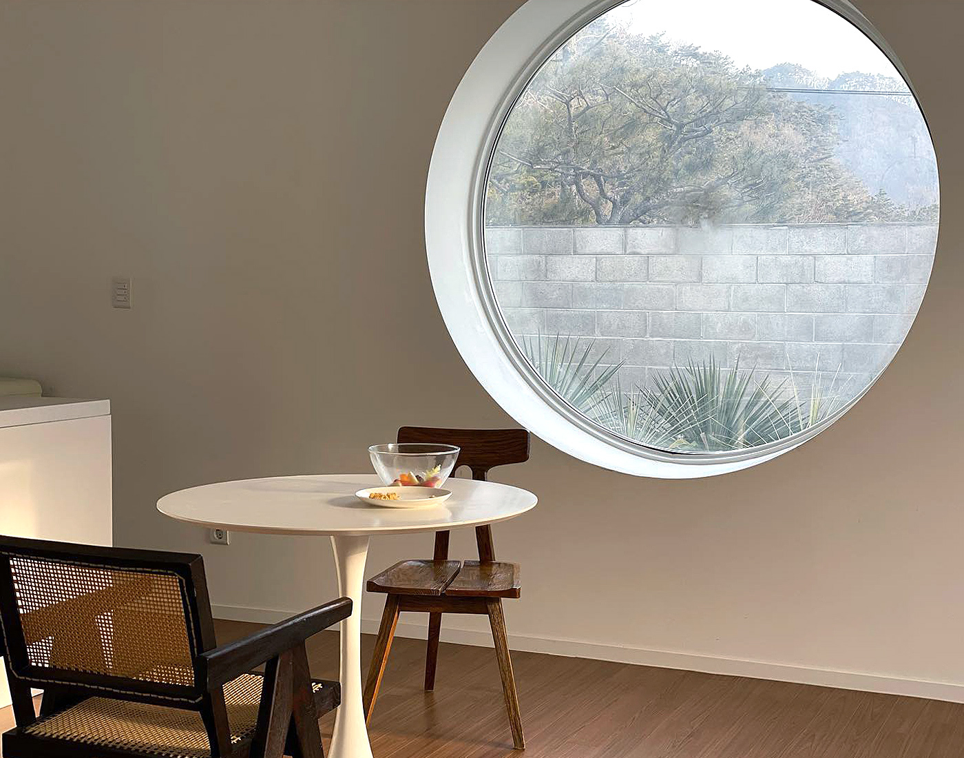
Inspired by the form of Camanggam's main area, we created the house shape which is used as our key graphic element throughout the applications.

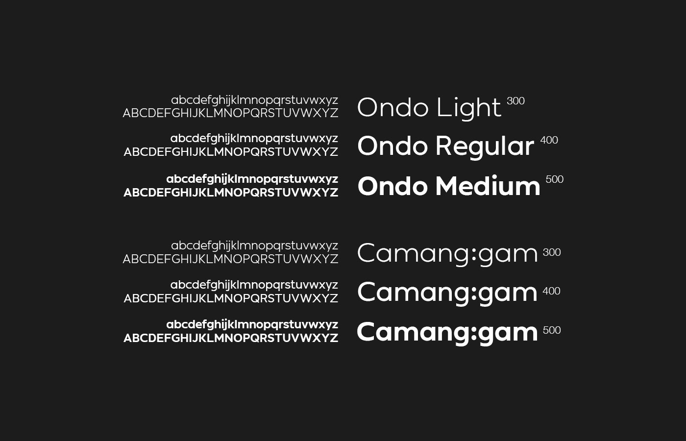
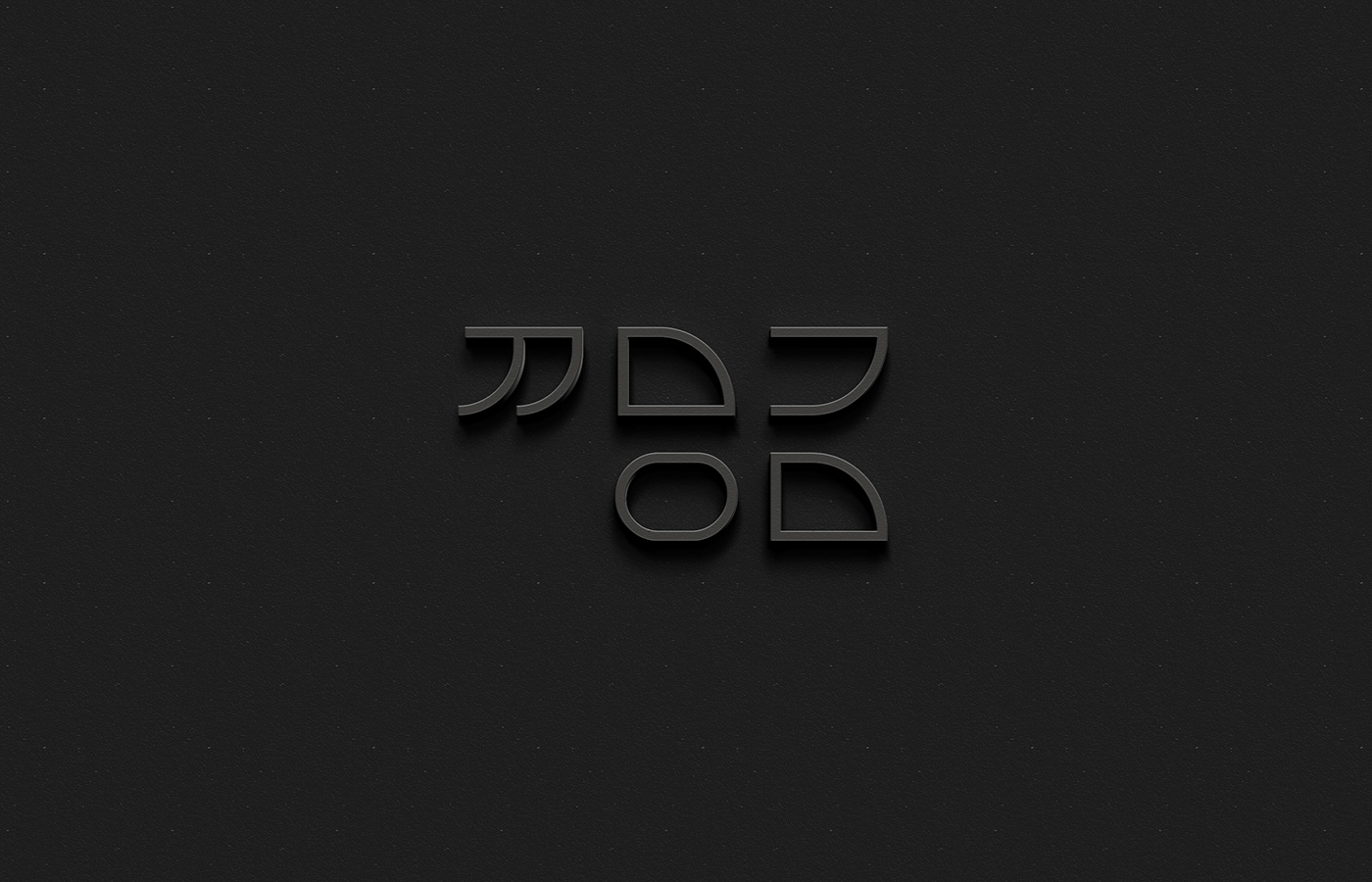
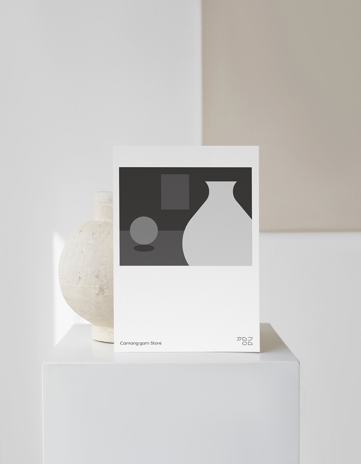
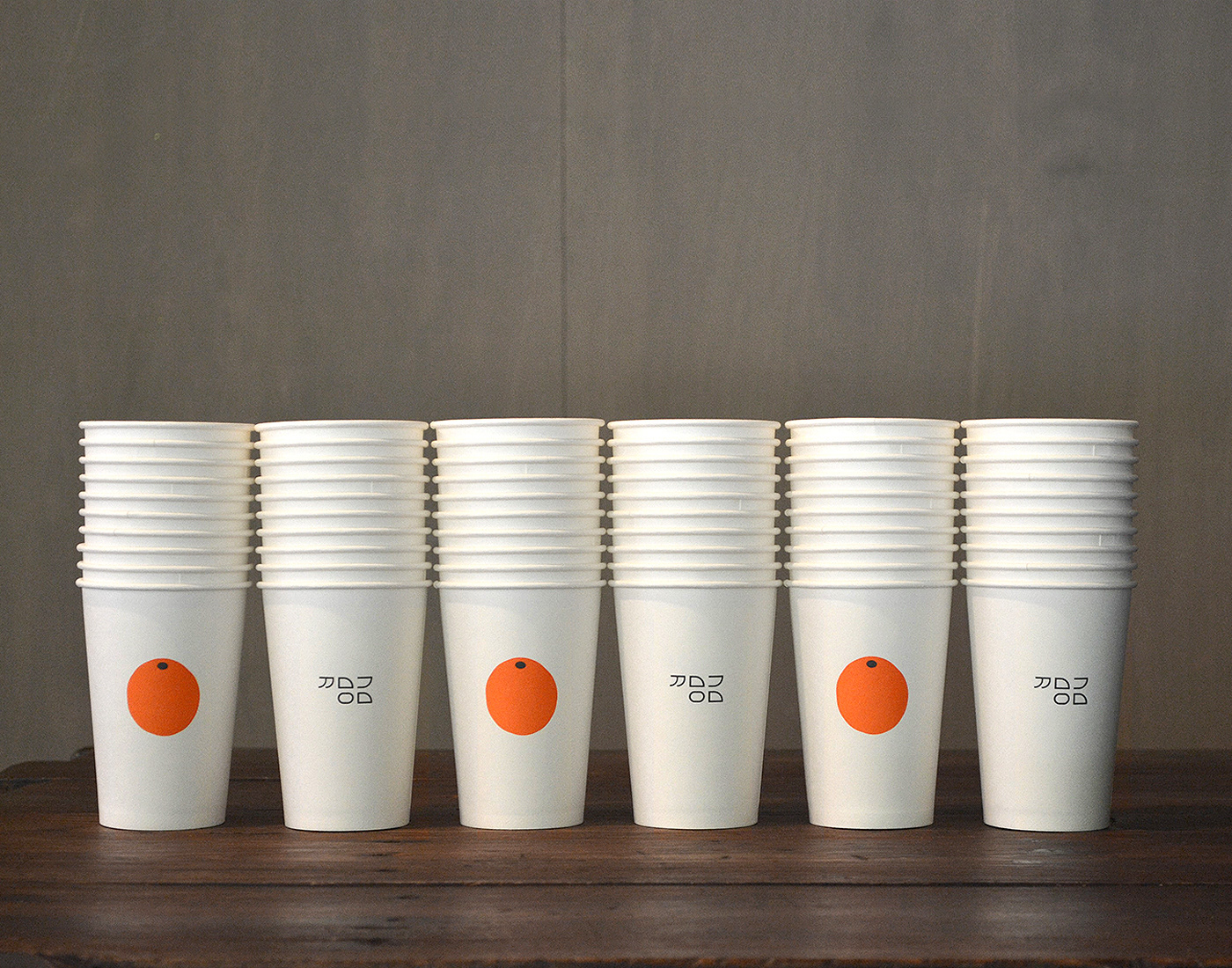
For the wordmark, we focused on the geometric shape of Korean alphabet, Hangul. We eliminated the vowels and simplified the consonants of (Camanggam) to emphasize geometric features such as lines, curves, circular and rectangular shapes the letters have.

art direction  brand identity branding  cafe design graphic ILLUSTRATION  logo Packaging visual identity

art direction  brand identity branding  cafe design graphic ILLUSTRATION  logo Packaging visual identityart direction  brand identity branding  cafe design graphic ILLUSTRATION  logo Packaging visual identityart direction  brand identity branding  cafe design graphic ILLUSTRATION  logo Packaging visual identityart direction  brand identity branding  cafe design graphic ILLUSTRATION  logo Packaging visual identityart direction  brand identity branding  cafe design graphic ILLUSTRATION  logo Packaging visual identityart direction  brand identity branding  cafe design graphic ILLUSTRATION  logo Packaging visual identityart direction  brand identity branding  cafe design graphic ILLUSTRATION  logo Packaging visual identityart direction  brand identity branding  cafe design graphic ILLUSTRATION  logo Packaging visual identityart direction  brand identity branding  cafe design graphic ILLUSTRATION  logo Packaging visual identityart direction  brand identity branding  cafe design graphic ILLUSTRATION  logo Packaging visual identity
art direction  brand identity branding  cafe design graphic ILLUSTRATION  logo Packaging visual identityart direction  brand identity branding  cafe design graphic ILLUSTRATION  logo Packaging visual identityart direction  brand identity branding  cafe design graphic ILLUSTRATION  logo Packaging visual identityart direction  brand identity branding  cafe design graphic ILLUSTRATION  logo Packaging visual identityart direction  brand identity branding  cafe design graphic ILLUSTRATION  logo Packaging visual identityart direction  brand identity branding  cafe design graphic ILLUSTRATION  logo Packaging visual identityart direction  brand identity branding  cafe design graphic ILLUSTRATION  logo Packaging visual identityart direction  brand identity branding  cafe design graphic ILLUSTRATION  logo Packaging visual identityart direction  brand identity branding  cafe design graphic ILLUSTRATION  logo Packaging visual identityart direction  brand identity branding  cafe design graphic ILLUSTRATION  logo Packaging visual identityart direction  brand identity branding  cafe design graphic ILLUSTRATION  logo Packaging visual identityart direction  brand identity branding  cafe design graphic ILLUSTRATION  logo Packaging visual identityart direction  brand identity branding  cafe design graphic ILLUSTRATION  logo Packaging visual identity

For more information make sure to check out Studio leM on studiolem.co.kr and follow them on instagram at @le_m.design.


Original Link: https://abduzeedo.com/camanggam-branding-inspired-geometric-shape-korean-alphabet

Share this article:    Share on Facebook
View Full Article

Abduzeedo

Abduzeedo is a collection of visual inspiration and useful tutorials

More About this Source Visit Abduzeedo