
An Interest In:
Web News this Week
- April 19, 2024
- April 18, 2024
- April 17, 2024
- April 16, 2024
- April 15, 2024
- April 14, 2024
- April 13, 2024
Some of Our Sources
- Mashable
- Technology Review
- Simplebits
- Abduzeedo
- My Ink Blog
- CSS Tricks
- Web Resource Source
- Android Headlines
- Willems Lab
- The Verge
Help Webnuz
Referal links:
Build a Web App with Pandas
A Web App to Show your Insights to the World
Pandas is one of the most popular data science libraries for analysing and manipulating data. But what if you want to present your data to other people in a visual manner? With Anvil, you can wrangle data with pandas and build a dashboard for it, entirely in Python.
In this tutorial, we're going to build a dashboard app using the Netflix Movies and TV Shows dataset by Shivam Bansal. We'll use Pandas to manipulate our data, then Plotly to visualize it and turn it into an interactive dashboard.
These are the steps that we will cover:
- We'll start by creating our Anvil app
- Then, we'll design our dashboard using Anvil components
- We'll upload our CSV data into Anvil
- After that, we'll have to read our data from our file
- We'll clean and prepare the data for plotting
- Using Plotly, we will build our plots
- Finally, we will add some finishing touches to the design
Let's get started!
Step 1: Create your Anvil app
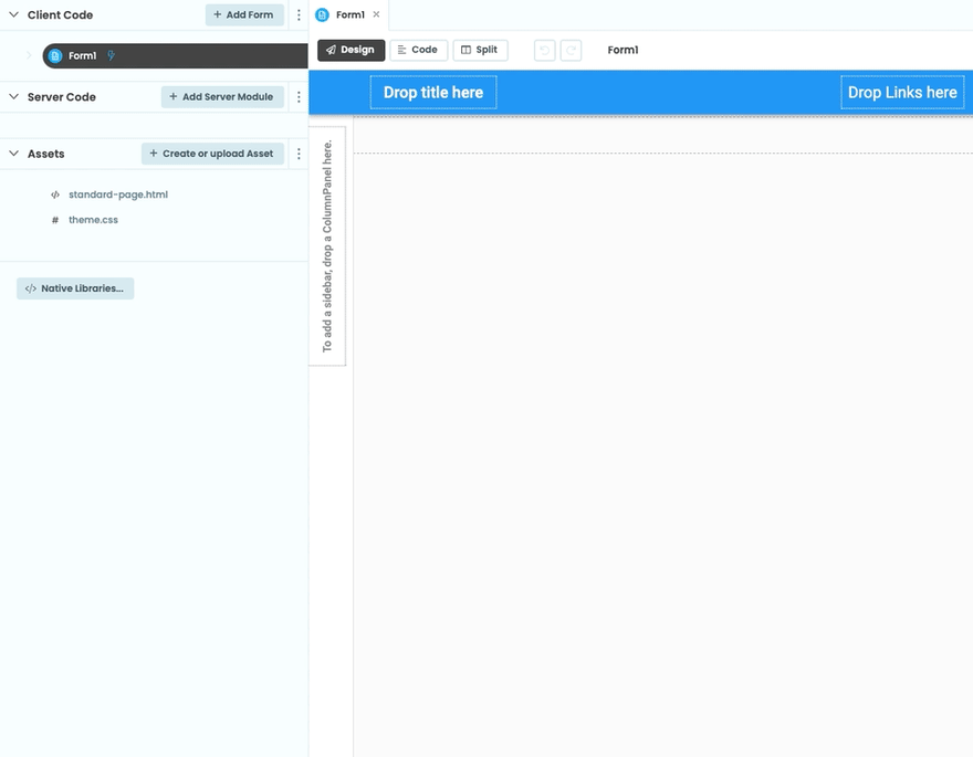
Go to the Anvil editor and click on Blank App, and choose "Material Design". We just want an empty app, so we'll delete the current Form1 and then add a new Blank Panel form:
Now let's rename our app. Click on the apps name, on the top left corner of the screen. This takes us to the General Settings page, where we can modify our apps name.
Step 2: Design your dashboard
We will build our user interface by adding drag-and-drop components from the Toolbox. First, add a ColumnPanel, where we will fit all our other components. Then, lets add three Plots into the ColumnPanel - we can adjust their sizes by clicking and dragging their edges (use Ctrl+Drag for finer adjustments).

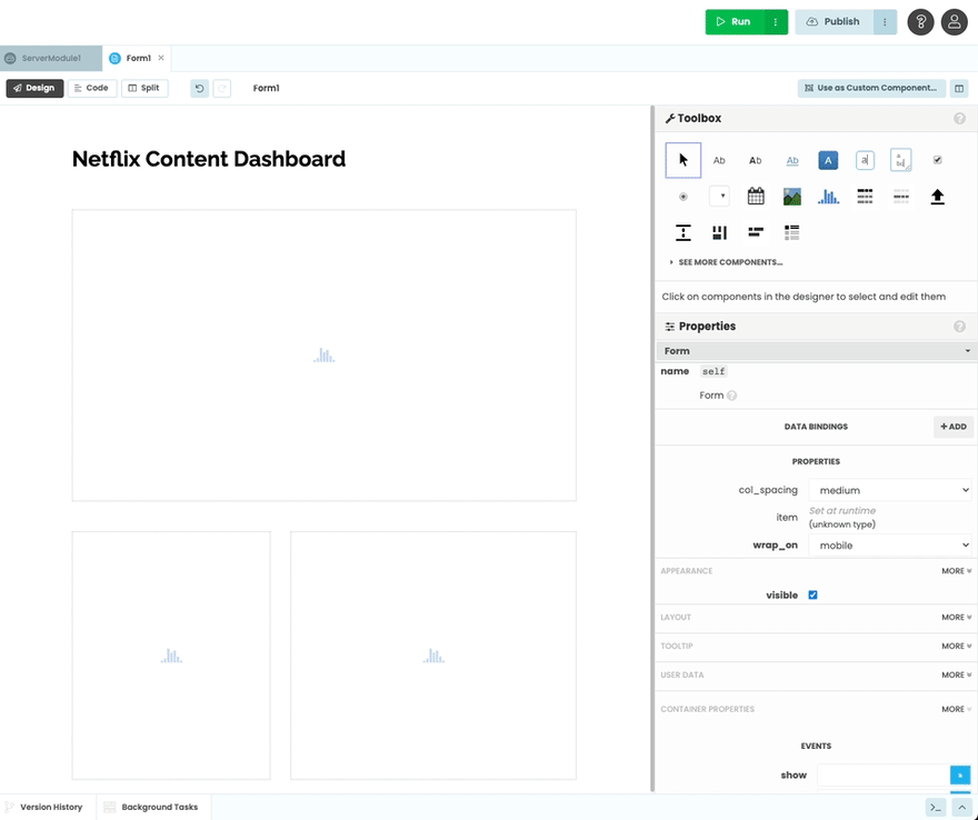
Well also drop a Label into our app and place it above the plots. Select your Label and, in the Properties Panel on the right, change the text to Netflix Content Dashboard. Set the font_size to 32 and, if you want, you can customize the font.
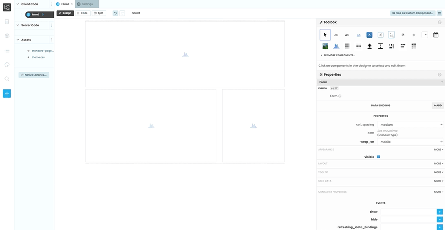
Finally, well set the spacing_above property of all the components to large (you can find this under the Layout section of the Properties Panel).
Step 3: Upload your data into Anvil
We need our data to be accessible to our code in Anvil to be able to work with it. Anvil can store files in the database, so we'll updload it into a table and look the file up by its name.
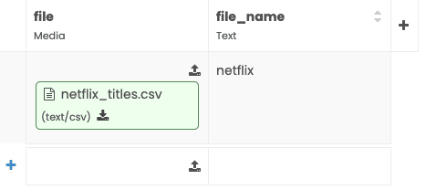
To do that, open the database window from the Sidebar Menu, and click the + Add Table button. Well call this table data and, by clicking on + New column, well create the following columns:
file(Media column)file_name(Text column)

Once our columns are created, well upload our CSV file into it. Click on the upload icon on file and select the file you want. After that, well give it a name on the file_name column: double click the cell and name it netflix.
Step 4: Read the data
Next, we need to read the data from our CSV. Go back to the App Browser and, under Server Code, click on Add Server Module. We will be writing our code in our Server Module, since we need to be in the server side to use pandas. If you want to learn more about the structure of the web and the differences between Client and Server code, check out our Client vs Server Code in Anvil explainer.
Import io and pandas at the top of the module and write the csv_to_df function, which will fetch the data in our data table and convert it into a Pandas DataFrame:
import ioimport pandas as pddef csv_to_df(f): d = app_tables.data.get(file_name=f)['file'] df = pd.read_csv(io.BytesIO(d.get_bytes()), index_col=0) return dfWith this, we are now able to transform our data into a dataframe.
Pandas is only available to the server on a Personal plan and above, or on a Full Python interpreter trial.
Data exploration
With our data in a DataFrame, we can start exploring it. For this, we will want to see print statements as we fiddle with the data, so well create explore a function in which well call our csv_to_df function and write our print statements.
@anvil.server.callabledef explore(): netflix_df = csv_to_df('netflix') print(netflix_df.head())We made this function available to the client side by decorating it as @anvil.server.callable, which means we can call it from the client using anvil.server.call to be able to see our print statements in our console. So let's do just that - add the following line to your Form1 __innit__ function:
class Form1(Form1Template): def __init__(self, **properties): self.init_components(**properties) anvil.server.call('explore')All we have to do now is run our app to see the output:
After that, we can continue adding print statements to our function on the Server and run it as we explore the data.
Note that
pandaswill assume you're on a narrow display, so it may not show all your dataframe columns. To avoid this, you will need to modifypandas's display width by adding the linepd.set_option('display.width', 0)to yourexplorefunction.
Step 5: Get the data into shape
Before we can plot our data, we need to clean it and prepare it for plotting. We'll do all the necessary transformations to our data inside a function that we'll call prepare_netflix_data, which we'll place above our explore function. That way, when we're done transforming our data, we'll be able to easily print out our results using explore.
The first thing we need to do is call our csv_to_df function to fetch our data.
def prepare_netflix_data(): netflix_df = csv_to_df('netflix')Our figures will only use data from the type, country and date_added columns, so we'll slice our DataFrame using the loc property.
netflix_df = netflix_df.loc[:,['type', 'country', 'date_added']]Theres also some missing values that well have to deal with, so that we don't include missing data in our plots. Pandas has a few different ways to handle missing values, but in this case well just use dropna to get rid of them:
netflix_df = netflix_df.dropna(subset=['country'])The country column contains the production country of each movie or TV Show in Netflix. However, some of them have more than one country listed. For simplicity, we're going to assume the first one mentioned is the most important one, and we'll ignore the others. Well also create a separate DataFrame that only contains the value counts for this column, sorted by country this will be useful later on when we input the data into our plots.
netflix_df['country'] = [countries[0] for countries in netflix_df['country'].str.split(',')]country_counts = pd.DataFrame( netflix_df['country'].value_counts().rename_axis( 'countries').reset_index(name='counts') ).sort_values(by=['countries'])Our date_added variable currently contains only strings, which is not a very easy format to work with when we want to plot something in chronological order. Because of this, we'll convert it into datetime format using to_datetime, which will allow us to easily order the data by year later on.
netflix_df['date_added'] = pd.to_datetime(netflix_df['date_added'])We'll return our transformed dataframe and the country_counts variable that we just created. This is how the full function should look by the end:
def prepare_netflix_data(): netflix_df = csv_to_df('netflix') netflix_df = netflix_df.loc[:,['type', 'country', 'date_added']] netflix_df = netflix_df.dropna() netflix_df['country'] = [countries[0] for countries in netflix_df['country'].str.split(',')] country_counts = pd.DataFrame( netflix_df['country'].value_counts().rename_axis('countries').reset_index(name='counts') ).sort_values(by=['countries']) netflix_df['date_added'] = pd.to_datetime(netflix_df['date_added']) return netflix_df, country_countsFinally, we can print the output of prepare_netflix_data inside our explore function, to make sure everything looks right.
def explore(): netflix_df = csv_to_df('netflix') # print(netflix_df.head()) print(prepare_netflix_data())This is what the output should look like when we run our app:
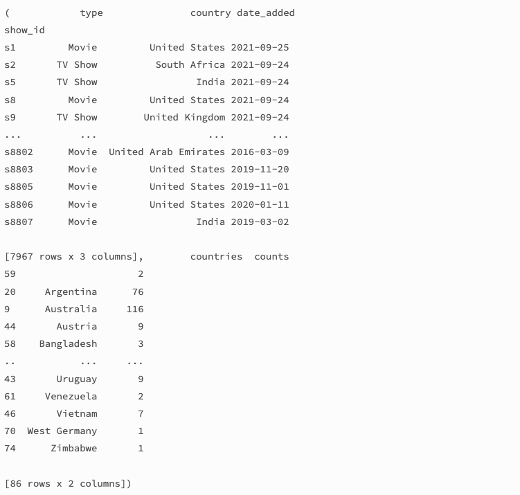
Now that we're happy with how our data looks, we can move on to building our plots.
Step 6: Build the plots
Our data is in a Pandas DataFrame, so we can only work with it on the Server, where we can access external packages. This means that well have to create our plots in our Server Module.
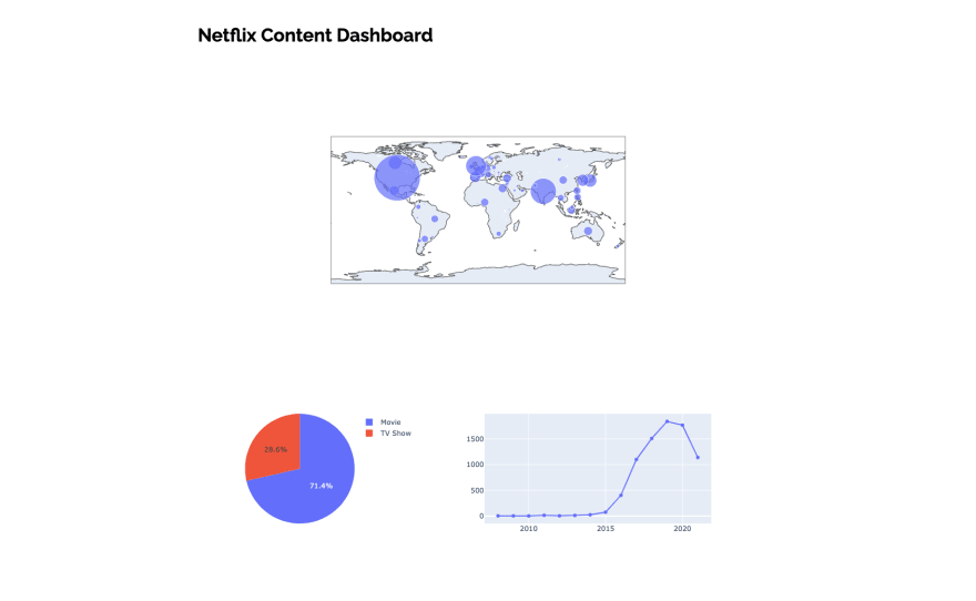
Our dashboard contains three figures:
- A map showing the number of films per production country
- A content type pie chart
- A line chart of content added through time
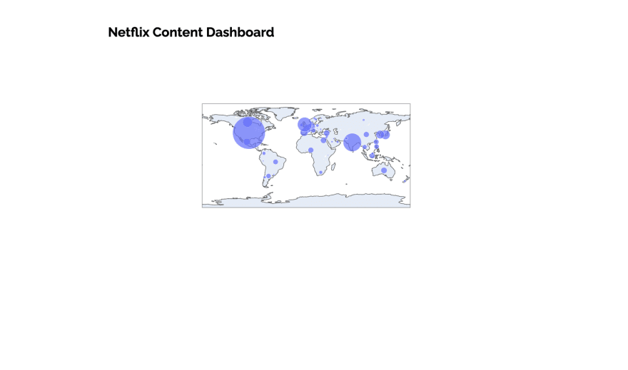
Now, we need to create them - import plotly.graph_objects at the top of the Server Module, and write the create_plots function, which should be decorated as @anvil.server.callable. Before anything else, we'll call our prepare_netflix_data function to fetch our transformed data. After that, we'll first create and return our map plot, using Plotly's Scattergeo.
import plotly.graph_objects as go@anvil.server.callabledef create_plots(): netflix_df, country_counts = prepare_netflix_data() fig1 = go.Figure( go.Scattergeo( locations=sorted(netflix_df['country'].unique().tolist()), locationmode='country names', text = country_counts['counts'], marker= dict(size= country_counts['counts'], sizemode = 'area'))) return fig1In order to display our figures, we will need to access the output our Server function in the Client side, so we'll call create_plots using anvil.server.callable inside the __init__ method in our Form1 code. Anvils Plot component has a figure property, with which we can set the figures that we want to display:
class Form1(Form1Template): def __init__(self, **properties): self.init_components(**properties) # anvil.server.call('explore') fig1 = anvil.server.call('create_plots') self.plot_1.figure = fig1We can check that everything is working like we want it to by running our app. This is how it looks so far:
Let's now do the same with our other two plots. We'll add a pie chart and a line chart to our create_plots function:
@anvil.server.callabledef create_plots(): netflix_df, country_counts = prepare_netflix_data() fig1 = go.Figure( go.Scattergeo( locations=sorted(netflix_df['country'].unique().tolist()), locationmode='country names', text = country_counts['counts'], marker= dict(size= country_counts['counts'], sizemode = 'area'))) fig2 = go.Figure(go.Pie( labels=netflix_df['type'], values=netflix_df['type'].value_counts() )) fig3 = go.Figure( go.Scatter( x=netflix_df['date_added'].dt.year.value_counts().sort_index().index, y=netflix_df['date_added'].dt.year.value_counts().sort_index() )) return fig1, fig2, fig3And we'll call them from the client in the same way we did our previous plot:
class Form1(Form1Template): def __init__(self, **properties): self.init_components(**properties) # anvil.server.call('explore') fig1, fig2, fig3 = anvil.server.call('create_plots') self.plot_1.figure = fig1 self.plot_2.figure = fig2 self.plot_3.figure = fig3With that, we have a functional dashboard:
Step 7: Finishing touches
With everything set up, we can move onto customizing our plots and styling our app. For my dashboard, I decided to go with a Netflix-like color scheme.
We'll use Plotly's built-in styling capabilities to modify the look of our figures. Let's start by updating the plots' markers. We need to add some lines of code to our current plots to set their colors, sizes and positioning.
def create_plots(): netflix_df, country_counts = prepare_netflix_data() fig1 = go.Figure( go.Scattergeo( locations=sorted(netflix_df['country'].unique().tolist()), locationmode='country names', text = country_counts['counts'], marker= dict( size= country_counts['counts'], line_width = 0, sizeref = 2, sizemode = 'area', color='#D90707' # Making the map bubbles red )) ) fig2 = go.Figure(go.Pie( labels=netflix_df['type'], values=netflix_df['type'].value_counts(), marker=dict(colors=['#D90707', '#A60311']), # Making the pie chart two different shades of red hole=.4, # Adding a hole to the middle of the chart textposition= 'inside', textinfo='percent+label' )) fig3 = go.Figure( go.Scatter( x=netflix_df['date_added'].dt.year.value_counts().sort_index().index, y=netflix_df['date_added'].dt.year.value_counts().sort_index(), line=dict(color='#D90707', width=3) # Making the line red ))This is how the dashboard looks with the modified markers:

Now, let's move on to modifying our plots' layouts, for which we'll use Plotlys update_layout inside our create_plots function. With it, we'll be able to change our figures's margins, set their titles and background color, and make other small styling changes.
fig1.update_layout( title='Production countries', font=dict(family='Raleway', color='white'), # Customizing the font margin=dict(t=60, b=30, l=0, r=0), # Changing the margin sizes of the figure paper_bgcolor='#363636', # Setting the card color to grey plot_bgcolor='#363636', # Setting background of the figure to grey hoverlabel=dict(font_size=14, font_family='Raleway'), geo=dict( framecolor='rgba(0,0,0,0)', bgcolor='rgba(0,0,0,0)', landcolor='#7D7D7D', lakecolor = 'rgba(0,0,0,0)',))fig2.update_layout( title='Content breakdown by type', margin=dict(t=60, b=30, l=10, r=10), showlegend=False, paper_bgcolor='#363636', plot_bgcolor='#363636', font=dict(family='Raleway', color='white'))fig3.update_layout( title='Content added over time', margin=dict(t=60, b=40, l=50, r=50), paper_bgcolor='#363636', plot_bgcolor='#363636', font=dict(family='Raleway', color='white'), hoverlabel=dict(font_size=14, font_family='Raleway'))return fig1, fig2, fig3Let's now change the background colour of our app to a dark grey. To do so, open theme.css, which is in the Assets section of the App Browser. Inside it, CTRL+F to find the body section, and add the linebackground-color: #292929;to it. This is how it should look:
body { font-family: Roboto, Noto, Arial, sans-serif; font-size: 14px; line-height: 1.4286; background-color: #292929;}After adjusting the plot sizes and changing our Label's color to white, our dashboard is ready to be shared! All you need to do now is publish your app to make it available to the world.

Clone the App
If you want to check out the source code for our Netflix dashboard, click on the link below and clone the app:
This app, as cloned, will only work if you're on a Personal plan and above, or on a Full Python interpreter trial.
New to Anvil?
If you're new here, welcome! Anvil is a platform for building full-stack web apps with nothing but Python. No need to wrestle with JS, HTML, CSS, Python, SQL and all their frameworks just build it all in Python.
Yes Python that runs in the browser. Python that runs on the server. Python that builds your UI. A drag-and-drop UI editor. We even have a built-in Python database, in case you dont have your own.
Why not have a play with the app builder? It's free! Click here to get started:
Original Link: https://dev.to/pcarrogarcia/build-a-web-app-with-pandas-5d86
Dev To
More About this Source Visit Dev To