
Some of Our Sources
- Slashdot
- Smashing Magazine
- Abduzeedo
- Vandelay Design
- Crazy Leaf Design
- Fudge Graphics
- Line 25
- Wal You
- Design Modo
- TechPowerUp
Help Webnuz
Referal links:
Rubber Band Animation using HTML, CSS and JS
Animations are really awesome to see on websites, right?
And the coolest thing about animations is that they are really easy to make, with just plain old HTML, CSS and sometimes a little bit of Javascript.
Let's see one fun animation that you can easily recreate : A Rubber Band Letter!!
To start we just need a <div> as the html :
<div class="bouncy"> B</div>Now, we need to style the bouncy div for better visibility. You can just copy the style below or style your own text which you want to animate :
html{ width : 100%; height : 100%; display : flex; justify-content : center; align-items : center; box-sizing : border-box; background-color : #010B14; color : #56f045; font-family : "Comic Sans", sans-serif;}.bouncy { font-size : 15rem;}A point to notice here is that I am not going to add animation to the bouncy class directly.
Quiz : Which rule of coding am I following here? Please answer in the comments below
Instead, I am going to add a new class with the animation property to create the animation, called bouncing :
.bouncing { animation : rubberband 800ms alternate ease-out;} rubberband Animation
If you don't know how animations are done, you can check out this great Introductions to CSS Animations by ljc-dev.
We are going to use keyframes for animations which define how the animation is going to look after some time. We generally do this in terms of percentages.
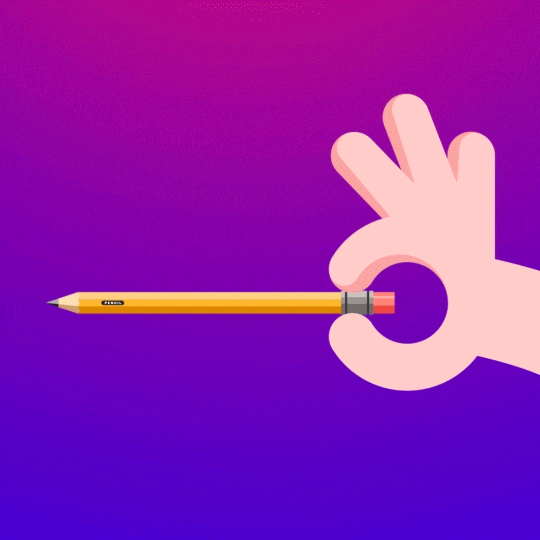
But wait, how does a rubber band look like? Let's see that with a rubber band...
Now that we know how a rubber band looks like, let create it using CSS keyframes and percentages :
@keyframes rubberband { 0%{ transform: scaleX(1); } 40%{ transform: scaleX(1.12) scaleY(0.75); } 55%{ transform: scaleX(0.85) scaleY(1); } 65%{ transform: scaleX(1.09) scaleY(0.85); } 75%{ transform: scaleX(0.9) scaleY(1); } 90%{ transform: scaleX(1.05) scaleY(0.95); } 100%{ transform: scaleX(1) scaleY(1); }}You can edit this if you dont't consider this a rubber band. It's just after my experiments, I found this to be good enough.
But wait, still this does not work?
It only happens once if you add the bouncing class directly.
Let's add the class to bouncy when mouse is hovered using Javascript.
const bouncy = document.querySelector(".bouncy");bouncy.addEventListener("onmouseover", toggleRubberBand);function toggleRubberBand(e){ bouncy.classList.add("bouncing"); bouncy.classList.remove("bouncing");}If we do this, there is an issue too.
THERE IS NO ANIMATION
This is because we are not letting the animation complete before removing the bouncing class.
There are two solutions for this :
1. Not Removing the Bouncing class
If we do this, the result is that the animation only occurs once. Now, we don't want that, do we?
Imagine a rubber band that only extends once!!
2. Wait for the right time
The better solution would be to remove the bouncing class once the animation has reached the end.
This is simple. We just need to listen for the animationend event to remove the bouncing class. The code for that looks like :
const bouncy = document.querySelector(".bouncy");bouncy.addEventListener("mouseenter", toggleRubberBand);function toggleRubberBand(e){ bouncy.classList.add("bouncing"); bouncy.classList.remove("bouncing");}You can directly play with the code here :
Hope you enjoyed this tutorial!! Do let me know your thoughts in the comments...
Original Link: https://dev.to/thevinitgupta/rubber-band-animation-using-html-css-and-js-6lk
Dev To
 An online community for sharing and discovering great ideas, having debates, and making friends
More About this Source Visit Dev To