
An Interest In:
Web News this Week
- April 27, 2024
- April 26, 2024
- April 25, 2024
- April 24, 2024
- April 23, 2024
- April 22, 2024
- April 21, 2024
Some of Our Sources
- Pearsonified
- TutsPlus - Design
- Vandelay Design
- You The Designer
- Inspiredology
- FanExtra - PSD
- Fudge Graphics
- 24 Ways
- Specky Boy
- Willems Lab
Help Webnuz
Referal links:
How to better design website layouts and elements - Part 1
Small things create a bigger impact on the overall design of your website. In a previous blog on web design principles I shared four pillars of web design you must follow. Now, let's see some rules, best practices and how to better design different website elements. Following these, you can take better design decisions for your website elements easily.
Let's get started
Hero layout
Hero section is the first thing people see. So here are some different ways you can design it.
Slipt Screen
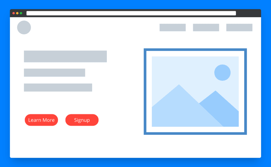
This is the most common layout we see on most websites where we put images on one side - text and call to action on another side. Here balance should be maintained for image and text, imagine this like two equal-width columns.
Example:

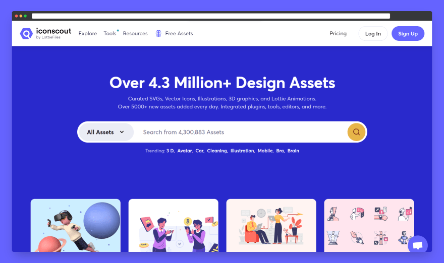
Feature highlight layout
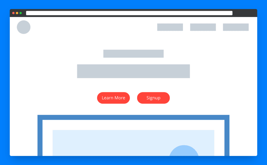
This layout is used when we want to highlight the top feature that instantly grabs the user's attention. You often find this layout with big text followed by a call to action button followed by a big image or video.
Example:
Featured image
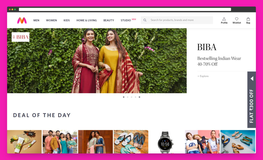
This layout introduces their brand with an image of their product. These layouts make sense when your brand is a single product like a shoe brand, a mobile brand, etc.
Example:

Other layouts similar to this layout
- Image carousel
- Video image
- Image as background
Boxes
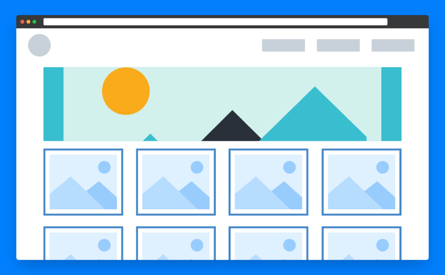
These type of layouts quickly grabs visitors into their products without letting them waste their time scrolling. We often found e-commerce websites using this layout. Also, this layout will be more effective if your brand is popular enough that visitors don't even need an intro to your brand.
Example:
Try out now
This layout quickly gives access to try the product from the hero section itself without signing up. This is like going shopping - trying the product - take it or leave it.
Example:
These are some popular hero layouts most websites use. Each layout has a different impact on visitors. So think before you decide on a layout.
Button design
The four stages in the life cycle of a button.
- Attract the visitor
- Tell the visitor they are about to click the button
- Tell the visitor they clicked the button
- Give feedback(Optional)
When you design a button make sure it goes through at least the first 3 stages of its life cycle.
1. Attract the visitor
First, make visitors feel it's a button. A button should contain a background colour, text/icon and a small shadow that brings a 3d effect to the button and makes it feel like a button.
Some rules and guidelines:
- Padding - It is recommended to have 2x height as width for spacing between text and border in a button.

- Priority - Design buttons based on priority. Prioritize based on importance.

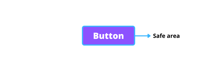
- Safe area - Leave some space around the button as a safe area. Why? - Safe area helps avoid overlap between two buttons and helps in the accessibility of buttons (when the user navigates the website by tabbing a blueish shadow appears around the button).
- Use icons - Icons + Text combined buttons attract more than normal text buttons. Always place icons on the left and text on the right. But if you are giving directions you are free to put them on the left or right.

2. Tell the visitor they are about to click the button
This step can be achieved by adding a hover effect and add a shadow ring around the button for accessibility. A slight brightening or darkening of the existing colour is enough or if there is an icon + text combo add a little animation. I see people overdo this step, it may look cool but not a better UX.

3. Tell the visitor they clicked the button
Add a click effect to achieve this step.
4. Give feedback (Optional)
Give feedback after a button click. In some cases this step is not required, in some cases, it is highly recommended. Feedback can be a popup or a toast or within the button. Let's say we are giving the feedback within the button.
Feedback is of two types,
- Waiting-feedback
- Completion-feedback
Waiting-feedback - This feedback tells the visitor some operation is going on, please wait. We often find this in loading operations.

Completion-feedback - Tell the user whether the operation is successful or failed or something. This feedback is not always necessary.

That's all about designing a button.
This is becoming big, so I divided this article into two parts. Part 2 in the next article.
In the meantime, read this if you haven't already:

I write every week. Follow for more .
Original Link: https://dev.to/itsrakesh/how-to-better-design-website-layouts-and-elements-part-1-594d
Dev To
 An online community for sharing and discovering great ideas, having debates, and making friends
More About this Source Visit Dev To